
Campbell Butler, Co-founder and Creative Director at Lovework Studio, shares how Cadmus’ rebrand blends Renaissance-inspired scholarship with modern digital design to reposition the platform for universities.
For those unfamiliar, who is Cadmus — and what was happening internally that made a rebrand necessary?
Cadmus is a global education platform focused on assessment for universities. It supports the entire assessment process end-to-end — from setting up the assessment and marking it, to providing real-time feedback, and ultimately delivering an analysis of how the assessment went and how the class performed overall.
The platform focuses on two key groups. On one side, you have educators who are often stressed trying to manage large workloads. On the other hand, you have students who can feel anxious or worried about assessments. Cadmus is designed to support both of these groups, helping create a more effective and successful assessment environment — which ultimately leads to better outcomes for the university as a whole. So it’s a very useful and genuinely helpful tool.

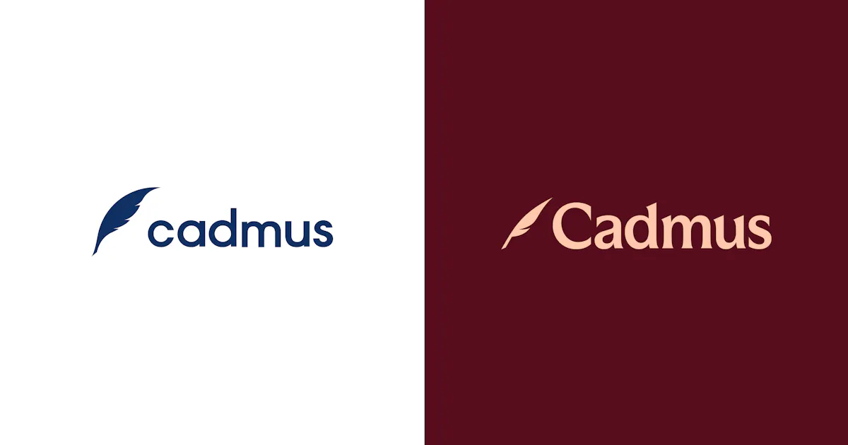
Cadmus Previous Identity
Cadmus originally emerged from a partnership with the University of Melbourne, a well-known university in Australia. The founders, Herc and his team, developed the platform within the university’s incubator hub, building it specifically for higher education institutions. Since those early days, the platform has grown significantly, with many universities across Australia and around the world now using it.
The name “Cadmus” itself comes from Greek mythology and carries a kind of Renaissance-like quality. It’s connected to the idea of a hero’s journey. We leaned into that concept by exploring themes from Greek mythology and the Renaissance throughout the identity. A lot of that direction stemmed from the distinctive and slightly quirky name. From there, we saw an opportunity to create a lighter experience through playful illustrated elements that could appear within the digital product while also being used in communications.
How has Cadmus evolved, and what does the new brand now communicate that the previous one didn’t?
A few things have changed over the years. When Cadmus first started, it was very much in startup mode — focused on building a tool that solved a specific part of the assessment process. It worked well for setting up certain types of assessments and integrating tools like AI checking. But at that stage, the scope was still relatively narrow.
During COVID, universities suddenly had to run assessments entirely online. That accelerated the need for secure digital environments where students and educators could conduct assessments safely and reliably. Cadmus quickly became essential for many universities during that period, and the technology had to evolve rapidly.
Since then, the platform has expanded significantly. It’s now a much more comprehensive end-to-end assessment system that supports a wide range of assessment types, real-time feedback, and collaboration between students and educators. It works across remote and in-person settings — whether that’s a fully online programme or a laptop-based exam in a physical classroom.

Image courtesy by Lovework.Studio
Another key shift is that the platform encourages students to complete their assignments directly within the system itself. That means students have access to the structure, resources, and scaffolding they need while working through an assessment, rather than relying on separate tools or external checking services. The result is a more integrated and supportive assessment process.
From a brand perspective, the story we wanted to tell was about that evolution. Cadmus is no longer just a single tool — it represents a complete assessment journey designed to help universities achieve better outcomes. Another important shift was connecting the brand more closely with the academic environments it serves. The original identity, created quickly in the early startup phase, looked more like a typical SaaS product — light blues, bright colours, and playful lines.
While it was clean and professional, it positioned Cadmus firmly within the B2B SaaS landscape. With the rebrand, the goal was to create a stronger alignment with the world of universities themselves — the kinds of institutions Cadmus works with, such as University of Cambridge, Yale University, and King's College London. The new identity reflects that shift, signalling a more sophisticated organisation that sits naturally within the academic world rather than appearing as just another SaaS product.

Image courtesy by Lovework.Studio
What led the team to introduce Renaissance-inspired imagery into the new identity — and what does that era symbolise for Cadmus?
The positioning line we developed with the Cadmus team centred on the idea of uplifting assessment. Assessments are often associated with stress — students feel pressure, and educators are managing large workloads and complex systems. The platform helps lighten that process by providing tools, templates, and technology that reduce administrative burden and make the experience clearer and more supportive for both students and educators.
That idea also reflected the personality of the Cadmus team themselves. They’re a very warm, energetic group, and we wanted the identity to reflect both their commitment to high-quality education and that lighter, more human side of their culture.
The Renaissance theme emerged from the name Cadmus, which draws from Greek mythology and hero stories — ideas that connect naturally to the history of education and scholarship. The Renaissance was a time when learning, discovery, and new thinking flourished, so it became a fitting reference point for the identity.
Image courtesy by Lovework.Studio
Rather than making the visuals feel old or academic, we played with that world in a more playful way. Renaissance-style illustrations were combined with contemporary student behaviours — for example, a lady with a bonnet dressed in historical clothing with her 2 cats but checking their phones or scrolling social media.
This blend of old and new helped create something that felt fresh and distinctive. Mythological elements like the kraken also appear within the digital experience — for instance on the 404 page — adding moments of surprise and personality throughout the product.
Ultimately, the goal was to elevate the assessment experience while making it feel more engaging and enjoyable, rather than something purely functional.

Image courtesy by Lovework.Studio
The new colour palette feels reminiscent of traditional academic institutions. Was that intentional — and what message were you hoping it would convey?
The palette draws heavily from traditional Renaissance artwork — deep reds, greens, and blues that you often see in classical paintings. Those rich tones helped anchor the identity in the world of traditional academia.
At the same time, we didn’t want the brand to feel too historical or heavy. Much like the broader identity concept, we wanted that balance of the old world meeting the new world. To do that, we introduced lighter pastel highlights that sit alongside those deeper tones. The contrast between the two creates a more contemporary feeling — something that references tradition without becoming overly formal or stuffy.
We also introduced softer backgrounds, like what we call the parchment background, along with darker neutral colours such as ink, which tie back to the quill symbol in the identity. Those colours form the foundation of the design system, supporting the rest of the palette.

Image courtesy by Lovework.Studio
The result is a system that can shift between different moods. Sometimes it feels light and fresh with the brighter pastels, while the richer tones and neutral colours help ground the product so it still feels like a sophisticated technology platform.
Ultimately, the intention was to align visually with the universities Cadmus works with, rather than following the typical B2B technology colour schemes. That alignment helps the brand feel more at home within the academic world.
The quill carries strong historical associations with writing and scholarship. How did you reinterpret that symbol for a modern, digital generation?
Cadmus already had the quill as part of its identity in the early days. It appeared in the logo and had become a recognisable symbol for universities using the platform. After several years in the market, that familiarity mattered — removing it risked losing an important visual cue for existing users.
So rather than replacing it, the decision was to evolve and refine the symbol. The team streamlined the design, increasing its speed and angularity while reducing unnecessary details so it would work clearly across different environments, especially on small screens and digital interfaces.
Another key part of the reinterpretation was bringing the quill to life through motion. Instead of a static mark, the team introduced animation that gives the quill a more natural behaviour — tapping, turning, and interacting within the digital environment. That movement helps bridge the historical symbolism with a modern, interactive product experience.
There’s also a practical reason the quill works so well. When people see a quill, they immediately associate it with writing. Because Cadmus is fundamentally a writing and assessment platform, the symbol naturally connects to both education and the act of creating work.

Image courtesy by Lovework.Studio
What was the most difficult tension to resolve during the rebrand?
For Cadmus, though, it was a very collaborative process. The team trusted us, especially during the strategy phase. We spent a lot of time in dialogue with the senior leadership team, defining what the brand should stand for and the key language that would shape the organisation. That trust made it possible to push the work further and connect more strongly with the sophisticated academic audience they wanted to reach.
Where things became more complex was in the execution. Cadmus operates across many touchpoints — physical events, the digital platform, their website, and social channels. The challenge was deciding how and when each of those elements should evolve, and how to implement the changes without disrupting the existing ecosystem.
Rather than introducing everything at once, the rebrand was rolled out gradually. The goal was to transform the brand in a way that felt natural, allowing the different parts of the system to evolve together.
"If there’s no friction in a project, then nothing meaningful has really changed. Real shifts naturally come with challenges."

Image courtesy by Lovework.Studio

Image courtesy by Lovework.Studio
In a landscape where universities already use other platforms, how did you position Cadmus so it didn’t feel like “just another tool,” but something fundamentally different?
Many competitors in the ed-tech space look quite similar. They tend to follow the same visual language as typical SaaS products, or lean toward colourful, almost primary-school-style interfaces with lots of bright colours. So we began by taking a deep look at the landscape. The question was simple: how do we stand out? Would it be through the symbol, the messaging, the colour palette, or the overall experience? In the end, it was all of those things working together.
The new identity intentionally steps away from the typical edtech look. Visually, verbally, and in overall tone, Cadmus feels quite different from its competitors. But importantly, that difference isn’t just cosmetic — it reflects the product itself.
Cadmus offers a much broader end-to-end assessment platform. Because the product had already evolved significantly, the rebrand became an opportunity to elevate the brand and communicate that shift more clearly.

Image courtesy by Lovework.Studio

Image courtesy by Lovework.Studio
What’s one mistake ed-tech companies often make when rebranding — and how can they avoid it?
The biggest mistake is jumping into design too early. People often start by creating a logo or visual identity without fully understanding the business behind it. When that happens, the result rarely works — because the people involved haven’t been part of the journey and the real problem hasn’t been properly defined.
The first step should always be immersion: learning about the organisation, understanding the product, and building a real connection with the founders and leadership team. Only when you understand where the business is today — and where it’s heading — can you start developing a brand identity that supports those goals.
For us, the visual outcome always comes from the business challenge. The brand should be a reflection of strategy, not something created in isolation.
