
Angello Torres is a Creative Director and Graphic Artist based in Argentina.
Can you tell us how this project came about? How did that conversation start with Carnaval?
I was recommended for this project because of a previous project called HighLife. From the first conversations, we knew with the client that the brand was going to have a spiritual image.
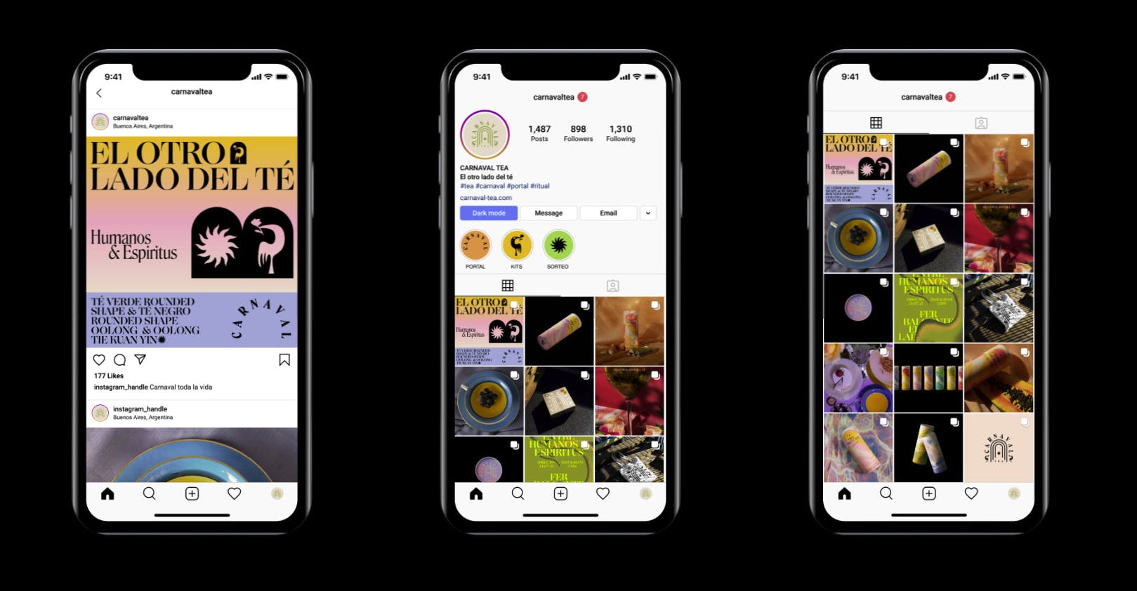
Carnaval Tea on Instagram
We talked a lot about new ways of drinking tea, ways that escape from the traditional.


How did the branding process go? Can you tell us more about it? Where did you start?
We worked on several mood boards at the beginning to define how far we were going to move away from traditional tea brands. We looked for different types of minimalist, energetic and spiritual worlds.
Carnaval Tea design elements
But what helped us to choose a path was the concept of ''Abandoning the flesh'', with this title we started to imagine what visual elements should be in the logo and graphics.
Were there surprising challenges you encountered along the way?
Yes, when choosing a visual path from the spiritual world you have to be very careful not to try to encompass everything.
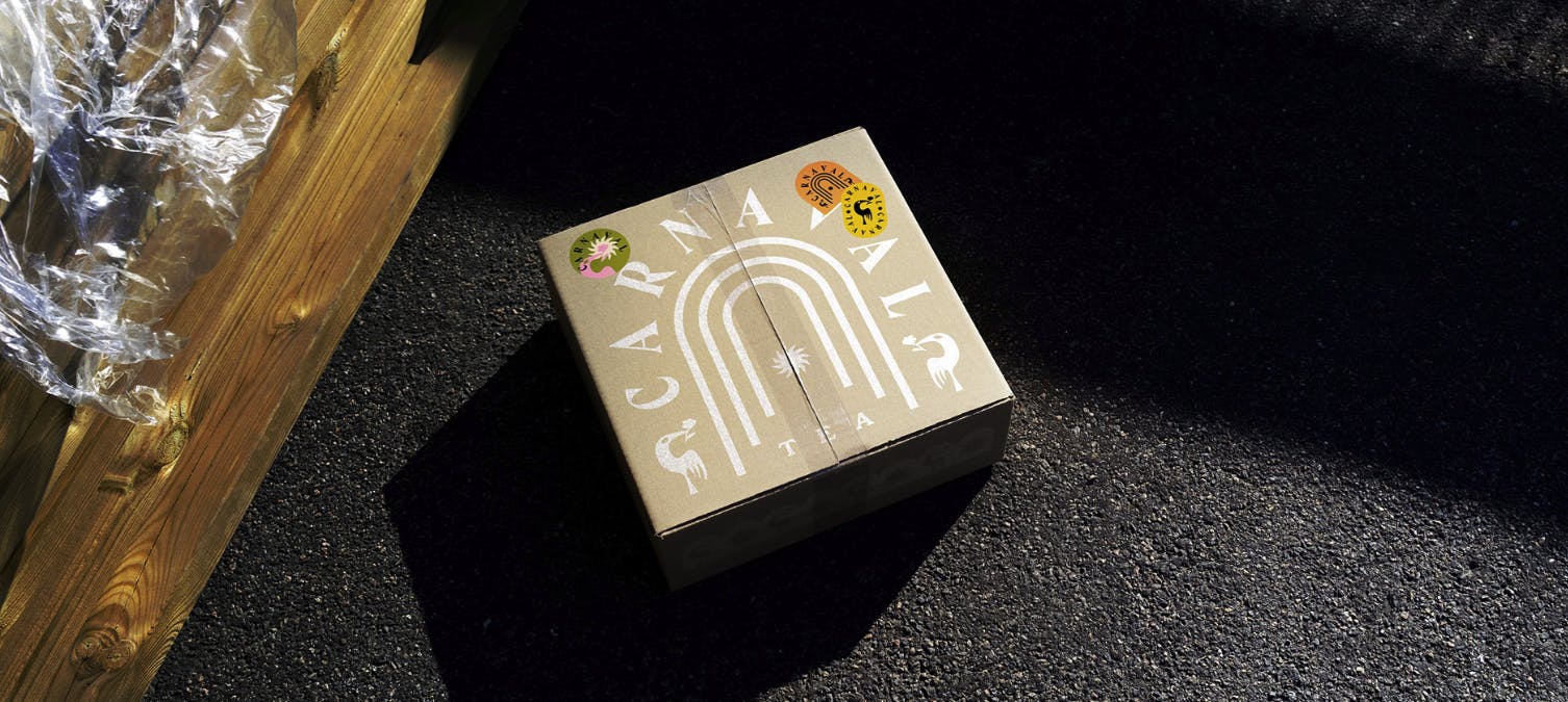
Carnaval Tea packaging
Our challenge was to find the main element of this world that would help us connect with our brand principles.
The concept of ‘portal’ is predominant in this visual identity. How did that concept come about?
The idea of the brand was always to connect people with the spiritual world through the product, so we created a story of how you can connect thanks to the portal. ''Abandon the flesh,'' to shed the human and enter the spirit world.
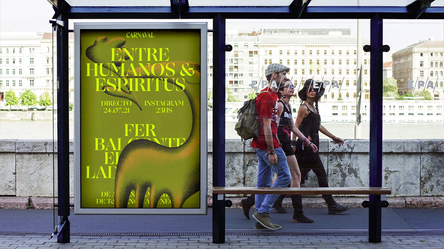
Carnaval Tea poster
Carnival would be the link between humans and spirits.
Carnival is the portal connecting the spiritual and physical worlds.
Carnival, the other side of tea.
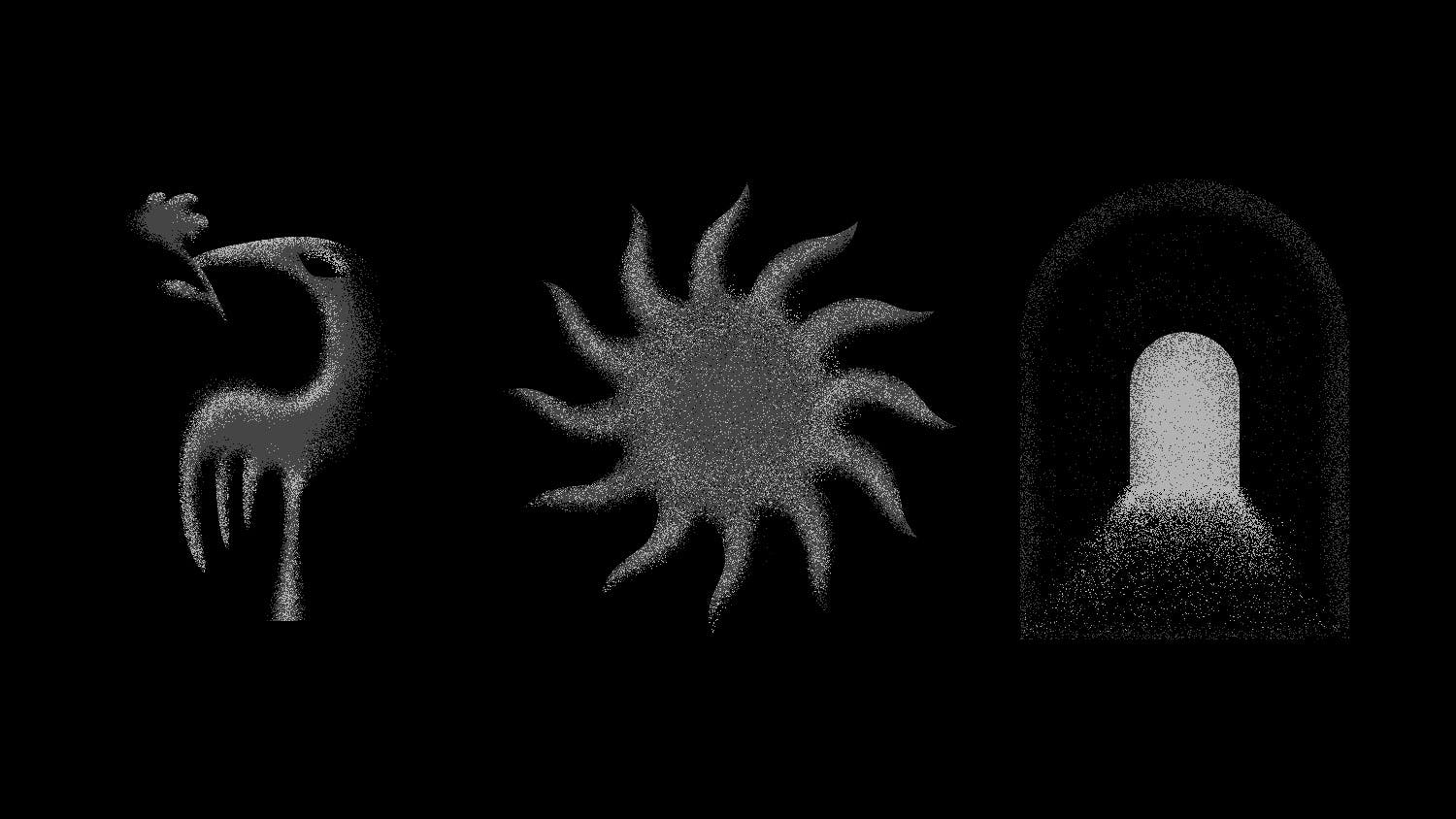
How did you conceptualize the logo?
With the main element already chosen and the ideas and concepts clear, it was very easy to work on the logo options.
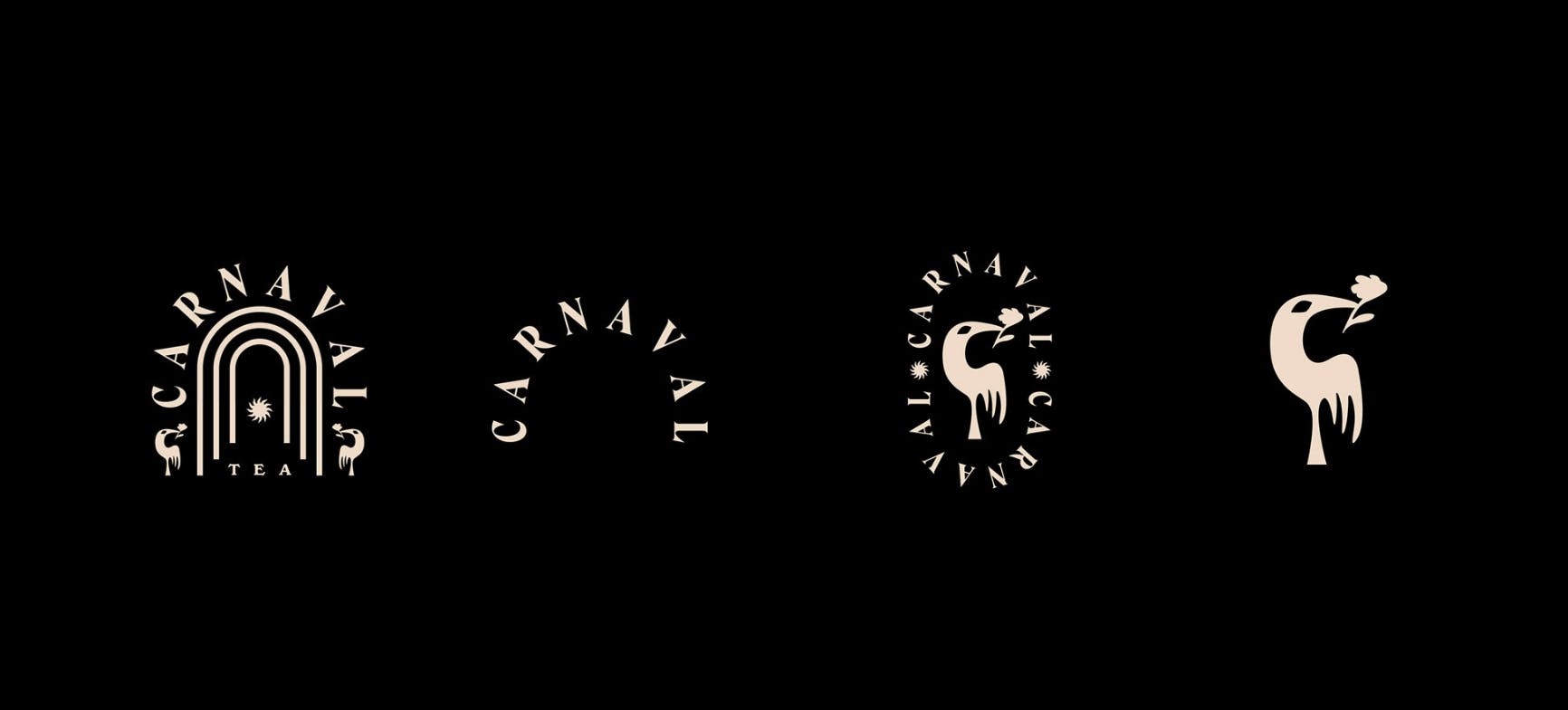
Carnaval Tea logo elements
We chose the option that went best with the packaging.
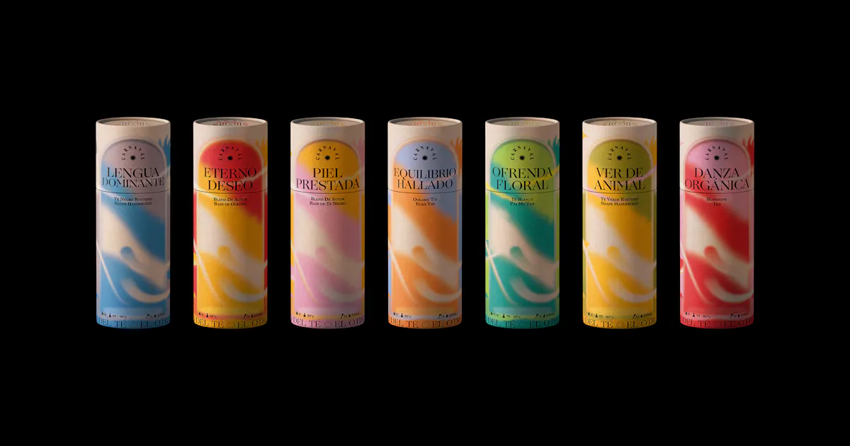
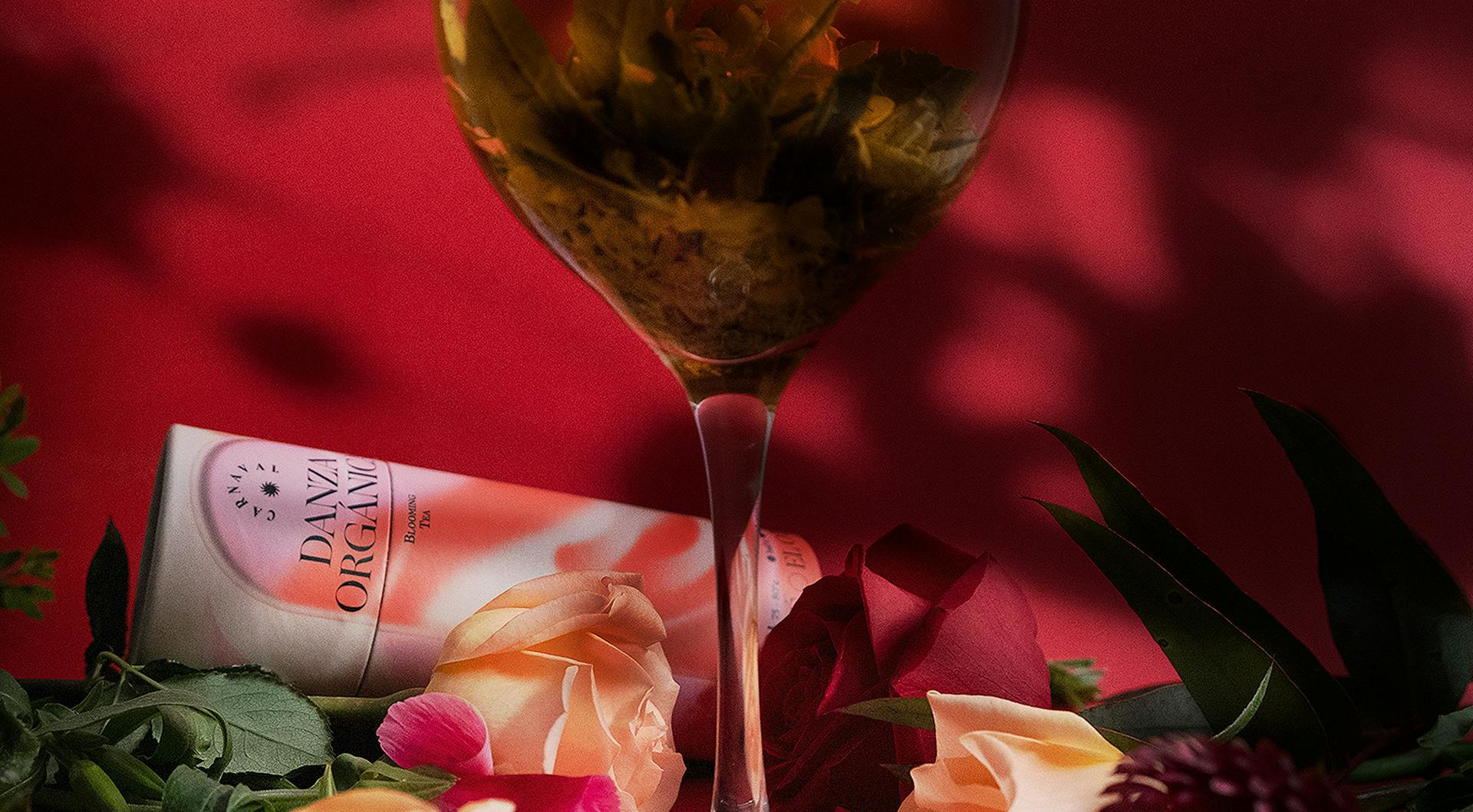
The packaging has a very ethereal design. How did you choose the colors and the shapes to help create the packaging?
The packaging design came from the idea of Portal, a phenomenon that connects us to new worlds, new pairings, new threads, new herbs, new consumption, and new habits. An unprejudiced experience that invites you to merge with tea, without schedules or restrictions.
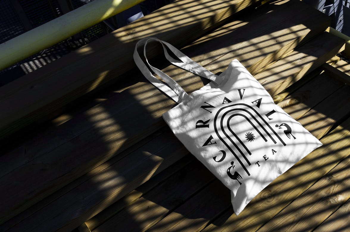
Carnaval Tea tote
The packaging aims to visualize the ritual of the portal that brings new experiences. Combining colors and shapes that come out of the portal. A ritual from start to finish inspired by the different holidays, and flora and fauna.
Lastly, do you have any advice for designers embarking on branding projects like this?
A good fantasy story can help make the branding process more comfortable.
Carnaval Tea photo direction
Changing the order of the processes is also very helpful. In the case of packaging, you can even ignore the logo and start working on the typographic landscapes and colors, the logo can be created by accident in the middle of that process.

