


Dina Janevski Farčić, Chief Marketing Officer at Centili, talked about their clever new logo, their rich illustration portfolio, and the importance of making employees feel proud.
Can you introduce us to Centili and the story behind its initial branding?
Centili is a global digital monetisation company, and we've just celebrated our 10th anniversary.
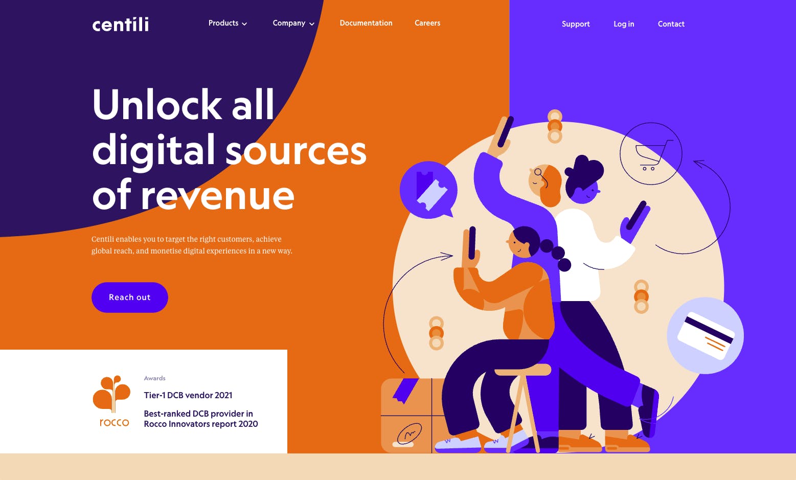
The initial branding was created when the company was founded – the name and logo were derived from a centillion and the concept of a "cent", as the 1c coin symbolises our payment business.
What prompted your rebrand? How did that conversation start?
We felt it was time to refresh our brand, both our strategy and our visual identity. We wanted to give the company a contemporary feel and create a graphical language that is more dynamic and better suited for the digital world.
Our upcoming anniversary was simply a great coincidence, so we used the opportunity to launch the new brand and website for the occasion.
Can you tell us more about the process? How did you decide which elements to change and keep?
We have an internal marketing team that coordinated the whole anniversary celebration and organised the rebranding project. But for the actual design work, we had a great opportunity to collaborate with an excellent design studio, Metaklinika.
They spent months developing our new visual identity, illustrations, animations and numerous other elements.
We looked at our heritage and strengths for the general direction and our plans and competitive advantage we wanted to build. It seemed important to ensure continuity but still be able to transform.
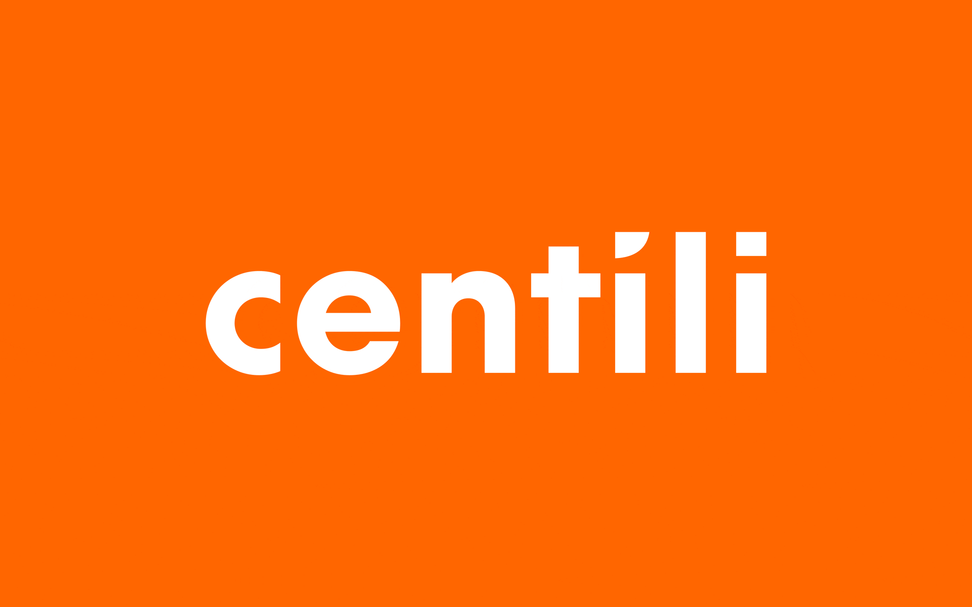
That is why we decided to keep the primary colour (orange) and the symbol "1" as the key element of our previous identity. Still, we gave Metaklinika full freedom to redesign the logo and create a fresh new visual language.
Can you tell us more about the conception of the new logo?
We were hoping to keep the number 1 as the symbol but wanted a more modern and cleaner look. The team at Metaklinika found a very clever way to include the symbol in the new logo without actually having a visual mark next to the letters, which would be a traditional way of doing it.
So, this new logo, with the symbol in the negative space, makes us look very contemporary and clean, is easily applicable to various touchpoints (primarily digital ones), and yet has our core symbol within – without stating the obvious.
What about your new visual identity and color palette? Is there a story behind them?
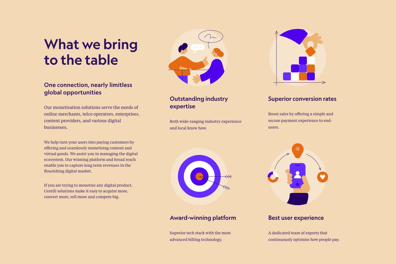
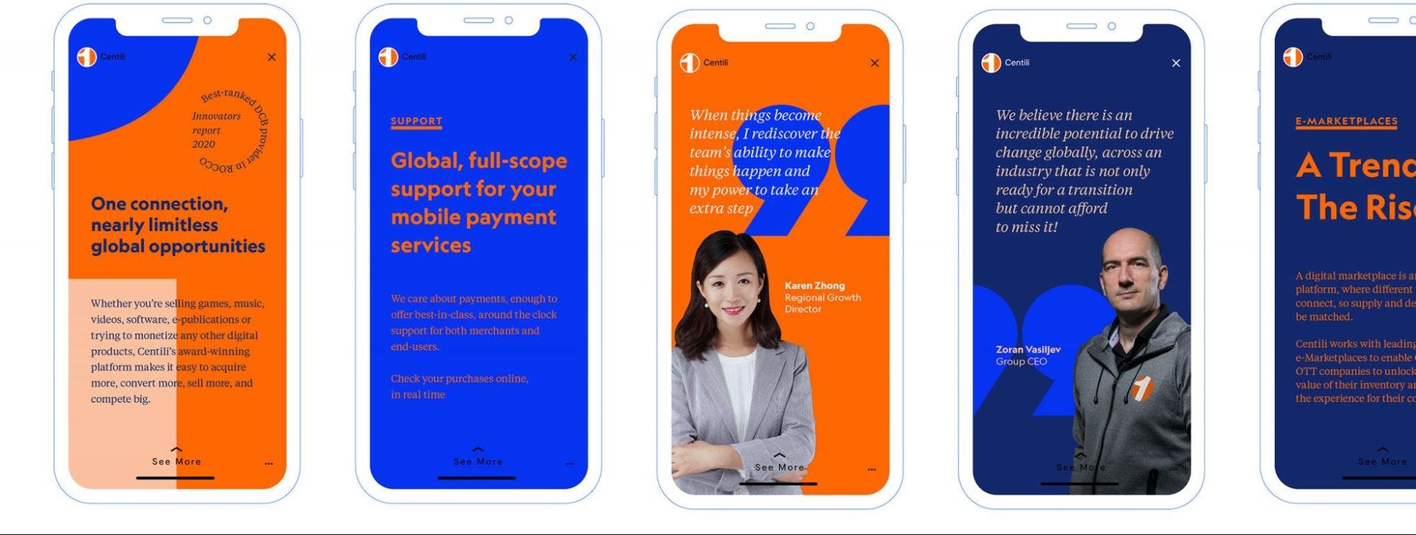
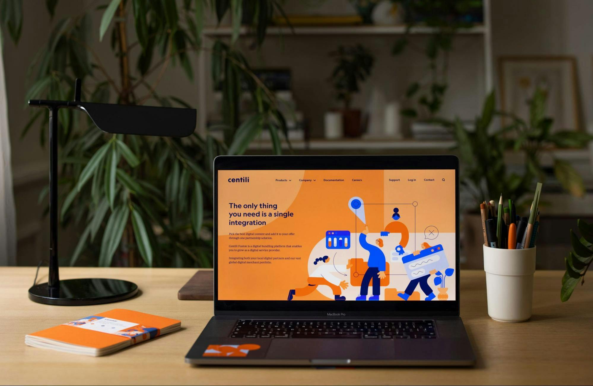
The vast array of graphical elements, patterns, illustrations, and pictograms is part of our new Centili universe. It enables us to appear fresh and authentic while being instantly recognisable.
It's an example of differentiation through communication, and it is now visible on all our touchpoints - from the new website and social media to our product interfaces.

We've based the colour palette on our signature orange colour. Still, we added new secondary tones mainly in the blue gamma, establishing a fantastic playground and a very vivid look, full of contrasts and playfulness.
Can you tell us more about your new iconography and illustrations?
Our new brand identity turns toward the representation of people, customer benefits, and the business verticals we operate in. We have developed a rich illustration portfolio that represents the industries we serve in, our customers around the globe, new platforms and solutions, and various business topics relevant to our everyday work. It's like a set of Lego bricks you can play with indefinitely.
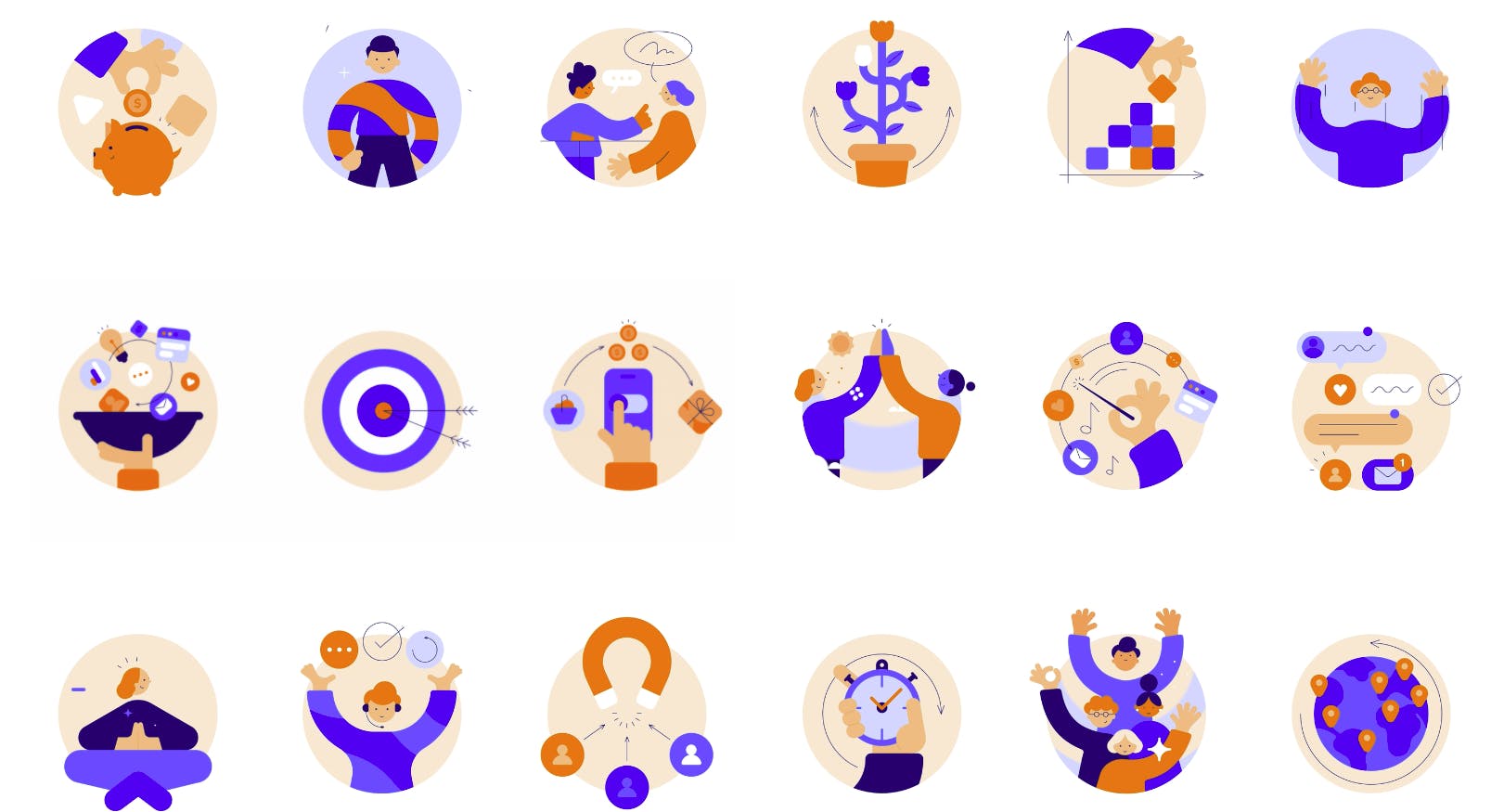
The modular illustration portfolio was crucial to envision and design since we decided upfront we would not be using photography but wanted to create our own visual language to have a unique appearance. The illustrators had to put in a lot of hours for it, but it paid off.
Do you have any advice for designers who will one day be part of a rebranding project?
I think it's essential to think upfront about where your brand will be most visible and represented most often. When designing, have those applications in mind, and have the given media in mind. It's easy to get lost in your own computer screen observing the logo on its own or form a habit and look at a typical set of stationery for every brand you work with.
So I would advise taking enough time to think about where this brand lives before designing. It's important to find the solution for the right problem, to make the brand recognisable and memorable in its ecosystem.
And speaking of the biggest takeaways, I would say that having a good identity makes employees perceive their company differently, and makes them proud of it.
And there is no bigger asset than having people feel proud of working for you or having partners proud to work with your brand. We should all aim for that.
What's next for Centili?
We are in an exciting period of transformation. We are pivoting our business model towards Platform-as-a-Service, and launching an enriched product portfolio. The way forward for us is to rethink, redesign, and keep adapting.
We look forward to new projects in which we join forces with partners globally to enhance the experience of digital monetisation and frictionless customer journeys across platforms and devices.