before

after
Mark Sloan, Head of Design at Mother Design (US), shares the journey of rebranding Ceria non-alcoholic and cannabis-infused beers to reach a broader market.
Can you tell us how this project came about? How did that conversation start with the Ceria?
It began as a Mother Ventures relationship, which is our creative ventures fund. Our CEO was introduced to the founders, and as those conversations took shape, part of our investment ended up being in design services.
The founders, a husband and wife team, Keith and Jody Villa, had such an incredible track record. Keith was the creator of Blue Moon, which is the largest craft beer in the world now. He spent a lot of years at MillerCoors as a brewmaster, and he has this deep expertise because he got his doctorate in the brewing sciences in Belgium.
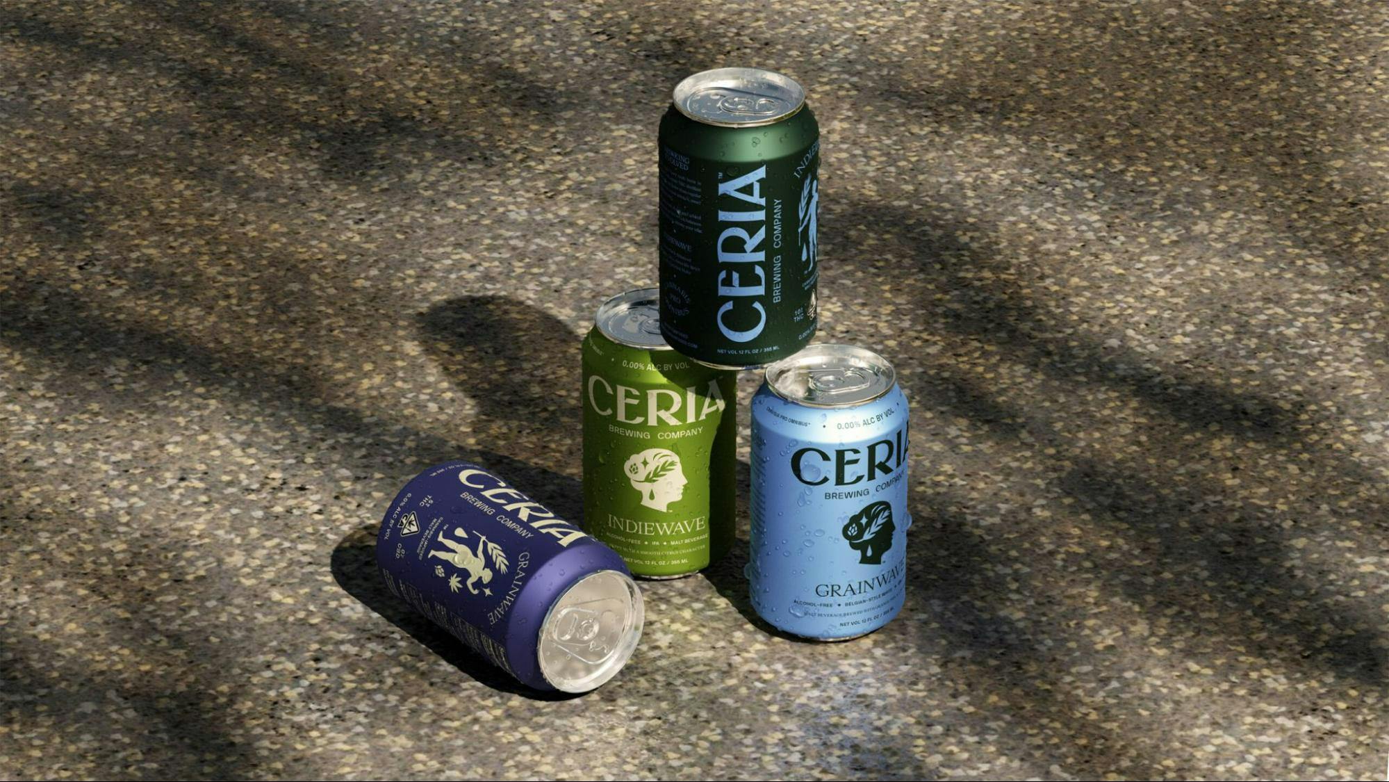
Ceria beer cans by Mother Design
He's one of the few people in the world that has an actual PhD in brewing, so we affectionately refer to him as a beer doctor. He's this amazing innovator, constantly tinkering with flavor profiles, new ways to brew, ways to innovate within the ancient science of brewing.
His work in dealcoholizing beer and infusing cannabis got us really excited. We came in to help evolve the brand and give it more of a chance to reach (and resonate with) broader audiences.

How would you describe the first iteration of the brand and how it evolved?
They had been on the market for three years before we got involved, not that much time to establish a brand in the market, especially with a new name and a new story.
But I think we got involved at a great position of strength because we felt like the name, the story, the presence of Ceres – the [Roman] goddess of agriculture and grain – was really strong so we didn't want to mess with that.
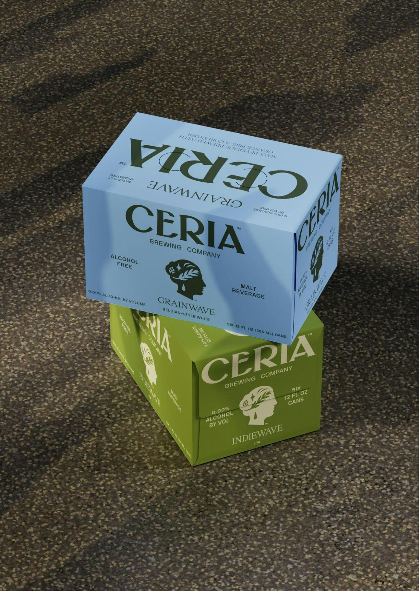
Ceria packaging by Mother Design
We didn't want to undo anything that was already generating brand love. They already had a relatively small but very loyal fan base in Colorado and neighboring states.
Our job was to evolve what was already there. We felt like the representation of Ceres was slightly complex. We felt like the typographic voice maybe didn't connote the same quality as the liquid itself.
Also, another consideration was the two distinct parts of their business. On one side, Ceria offers tasty alcohol-free flavors, and on the other, those same flavors but infused with cannabis.
How would you describe the rebranding process? How do you usually work on projects like these?
We always begin with auditing the competition, auditing the category, trying to get as broad a view as possible of where this product will be seen. Then from there, we develop insights based on that audit and identify opportunities for ways forward.
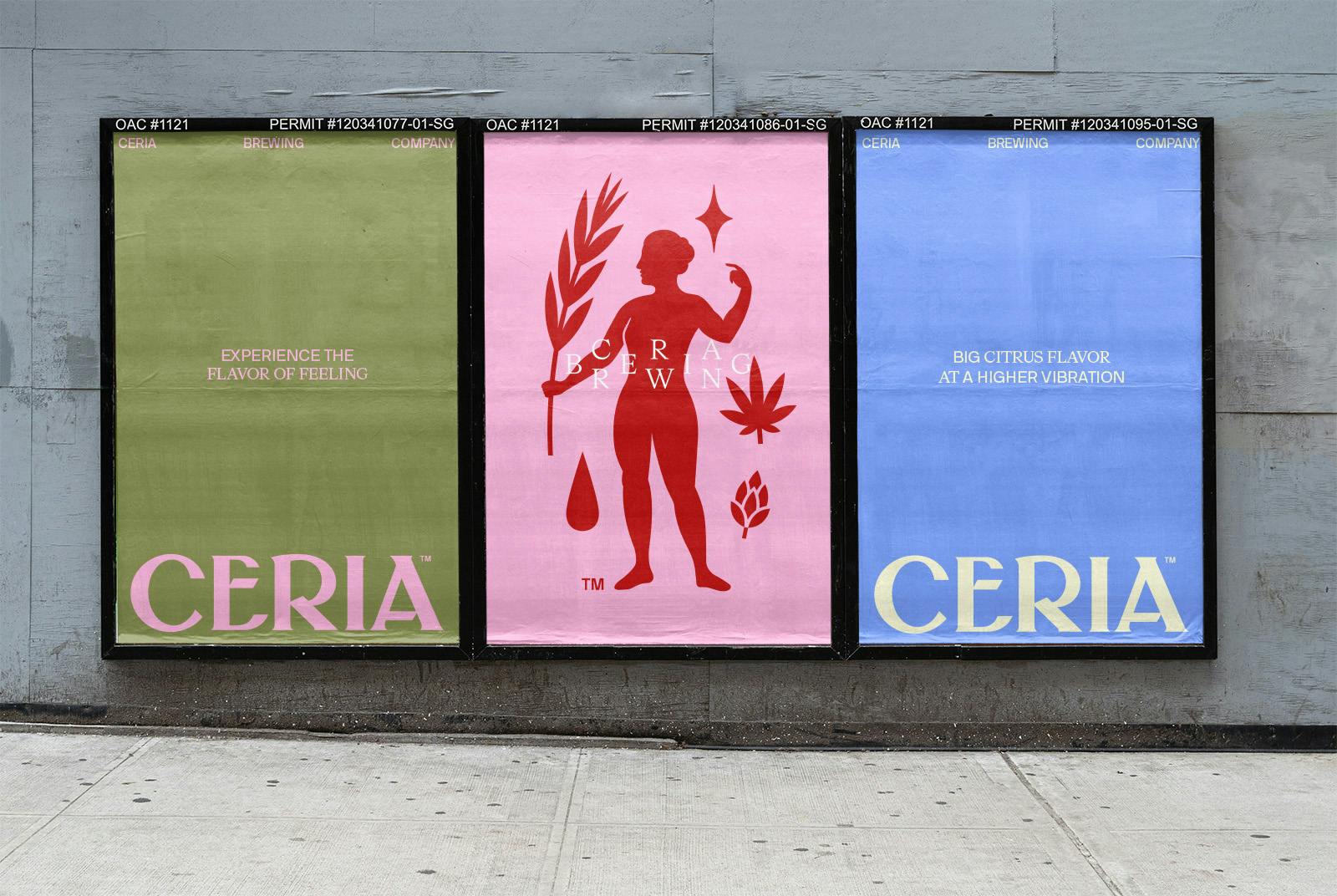
Ceria posters by Mother Design
We then move into writing the brief and establishing the foundational brand strategy. Then, we move into design exploration and building out all the assets.
"Without a solid brand strategy, design is almost certainly doomed to fail."
From an identity and design standpoint, one of the biggest challenges was how to create a distinction between two parts of the business but keep the same name and story across both, even though they would never really be seen at retail next to each other.
Can you tell us how the new logo was conceptualized?
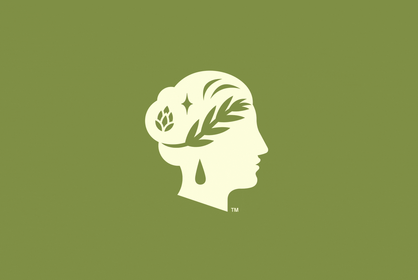
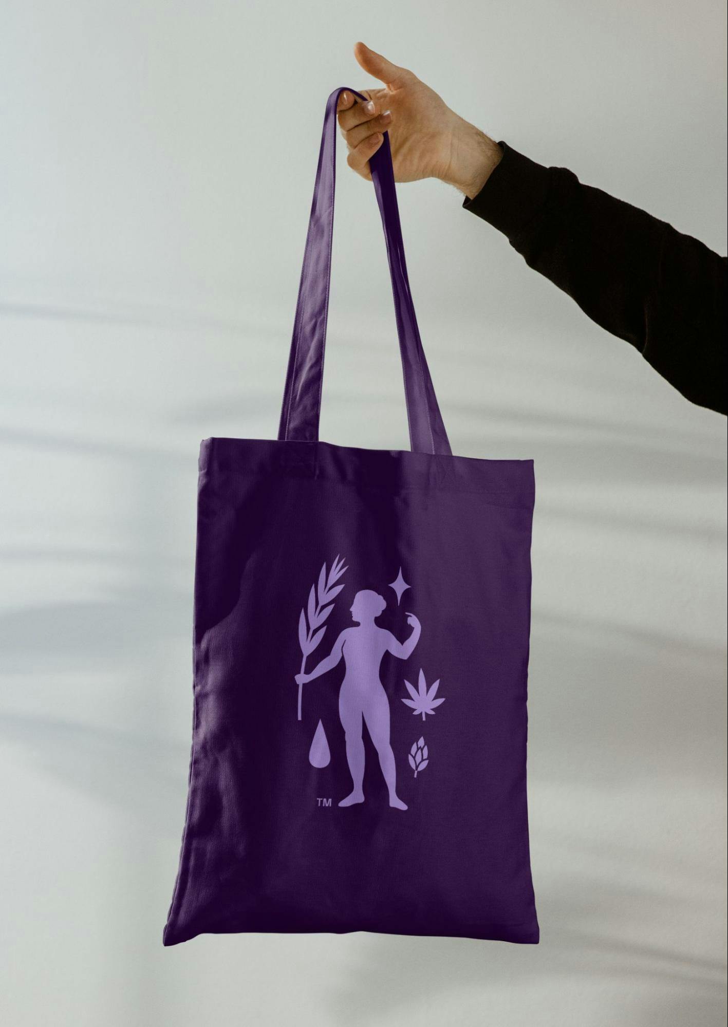
On the alcohol-free side, Ceres is represented in profile view as the head of the goddess. Then over on the cannabis-infused side, it's more of a full-figure symbol. Instead of having the elements of the liquid in her ‘crown of wheat’, they are represented around her body. We also intentionally treat the wordmark vertically for cannabis-infused and horizontally for alcohol-free.

Ceria logo from Mother Design
We are always straddling the ancient and the modern, because Keith, the brewmaster and founder, embodies this dichotomy as a person. He is this combination of ancient knowledge and a modern, innovative approach to brewing.
"In the typographic choices, we wanted to directly combine something that had a very classical feel with things that were thoroughly modern. "
Similarly, with the logos themselves, I think we worked really hard, internally, on every point and curve of those to ensure that they were as minimal as possible, but also had the proportions and overall presence of something that felt quite old.
It's this constant mix of old and new, which I think runs through the branding system.
How about your color palette? How did you land on these colors, and what do they say about your brand?
At the moment, they only have two flavors: an Indiewave and a Grainwave. One is more of a Belgian white style ale and similar to Blue Moon in flavor profile, and the other one is more of an India Pale Ale (IPA).
We wanted to assign colors to those flavors which felt like the drinking experience, but we have a much broader color palette for future stock keeping units (SKUs).
Ceria for non-alcoholic beer from Mother Design
Part of our color strategy was identifying a tonal range, which can be expanded over time. We will probably collaborate again the moment they have a third, fourth, and fifth SKU. It's still relatively early in their growth, but there's a full color palette waiting in the wings.
Also, we wanted to bring just a level of simplicity and reductiveness to the color pairings. We wanted things that were vibrant, that looked great in your hand and that might look great in your kitchen when they're sitting on the counter.
"A lot of times packaging really tries to grab your attention on-shelf, but then overlooks how that packaging might have a second life in your home. "
And so, based on our audience insights and on who we're trying to target, we just wanted to make something that people would be proud to hold and have around their own house.
So far all the pieces that we've helped them with make use of the blue dominant and green dominant color combinations, but we've charted out a future in which more colors are added to the mix. For the moment, the blues and the greens and the off-white are really serving us well.
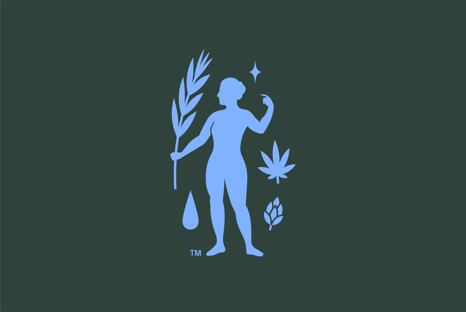
Ceria for cannabis-infused beer by Mother Design
As many pieces of communication as possible need to relate back to the actual products on shelf, we've tried to be pretty selective with how many colors we introduce because we know that there's so much more coming.
Can you tell us more about the typeface that you use? How were they chosen? Were they custom-made?
The logotype itself was drawn in-house. It was the result of interrogating the individual glyphs, how they sat together, and identifying where we could add unexpected moments.
"We wanted it to feel, at a glance, vaguely Roman or Greek-inspired; but once you take a closer look, there are some odd choices being made, some details which help it distinguish itself. "
Another interesting design consideration is that, in places like Canada, there is no color and no imagery allowed on any cannabis packaging. So one of the early considerations was: can the wordmark itself have enough distinction in such a limiting environment?
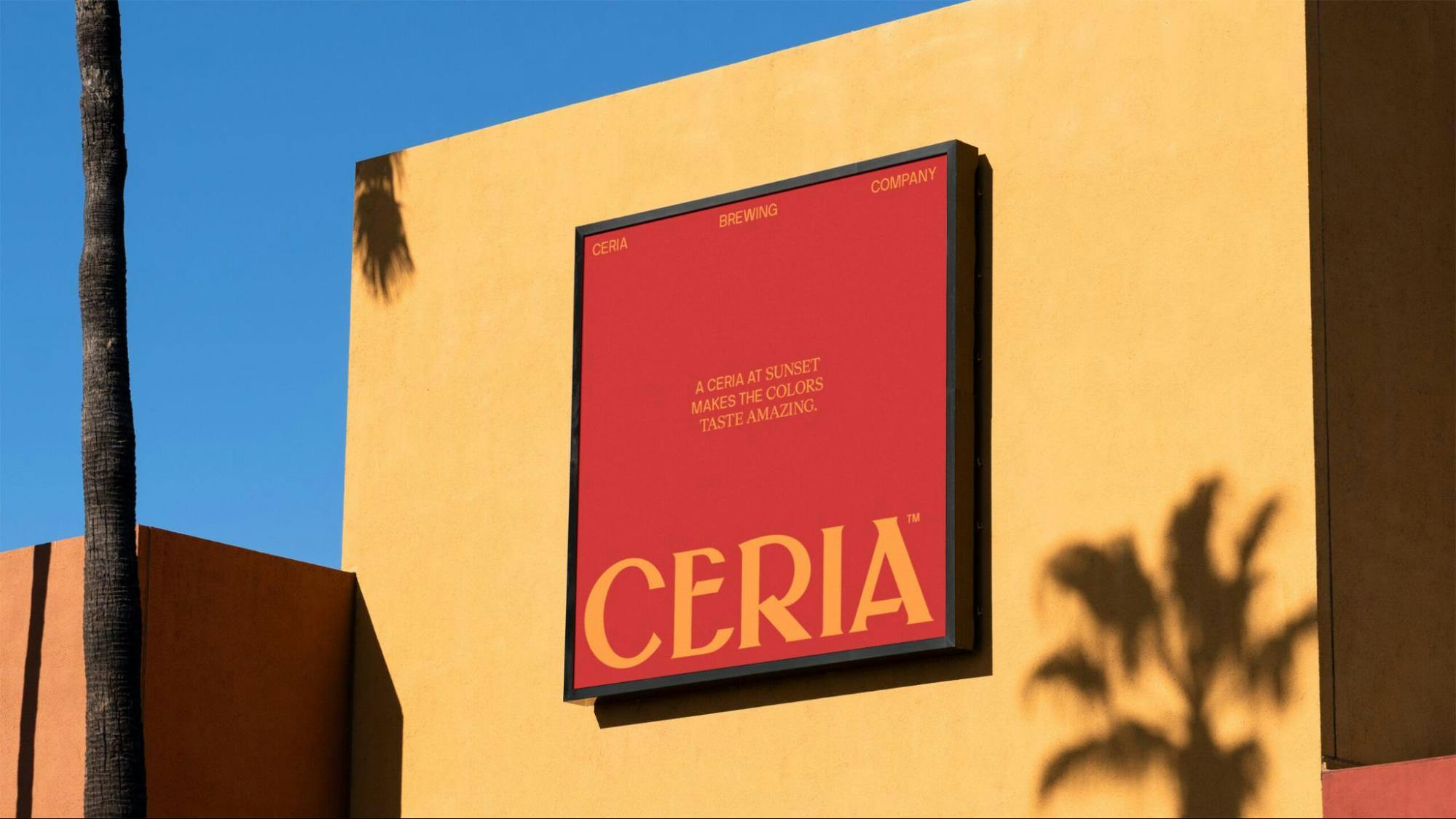
Ceria billboard by Mother Design
Then, speaking broadly about typography, we just made selections of NB International, as the sans serif, then HW Cigars as the serif because they had a relatively small budget, so we couldn't create something truly custom for them but those two typefaces had enough alternates and enough stylistic presence to be able to carry this system.
You have a couple of illustrations used in your branding. Can you tell us how they were designed and their significance?
We did the illustrations in-house and we're quite proud of them. One of the main considerations was: can we create illustrations that work in a wide range of color combinations, in both positive and negative forms?
One of the issues with the previous mark was that it couldn't be inverted. You had to add a holding shape in order to retain the positive and negative relationships of the face itself. This is very common for designers who are working on any mark that has a face.
Ceria graphic elements by Mother Design
For us, one of the big moves was removing the eyes, because that's usually the thing that starts to look a bit scary when inverted. And because Ceria is derived from Ceres, the Roman goddess of agriculture and grains, we wanted a throwback to that time in some respect.
What is your major takeaway from this experience? Or, do you have any advice for brands or designers embarking on rebranding projects themselves?
However long you think it's going to take, add 50%.
"I think that design, good design, is the result of moments of inspiration and experimentation, but also deep, contemplative thought and going back and forth between those things."
Pushing something forward, and then allowing yourself the time to really analyze it before you push it forward again, is very important for the process.
I think that sprints are very valuable for the world of digital product design and many areas of design, but if we're talking specifically about branding, it does require that deep contemplation mixed with quick bursts of progress.

