


Rick Byrne, Brand Creative Lead of DocSend at Dropbox, shares the fascinating transition of DocSend’s brand as a stand-alone start-up up until its Dropbox acquisition.
Can you talk to us about DocSend’s initial brand identity? Who started the past brand?
DocSend was founded in 2013. At the time, it was a bluish brand, very similar to Google’s blue. There was a logo of an arrow in an S-shape.

By 2019, the brand was purple and teal, created by an outside designer who developed the brand and guidelines.

A product designer (Ego Falona) was used to apply the brand to collateral when he wasn’t busy doing product stuff, but a lot of non-design based marketing people were also applying the brand very unevenly and they weren’t applying it per the guidelines. There was very stark contrasting colors, which was not how the brand guidelines imagined it.This was what I call Phase Zero.
I was brought in to tidy up the brand and make the company look a lot more professional, possibly with a view to acquisition. This would become what I call Phase One.
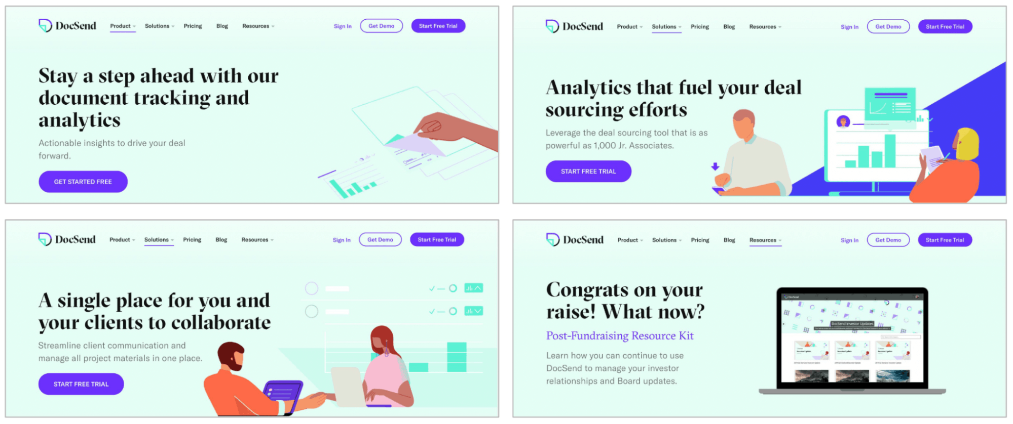
We also had outside illustrations at that time, but they didn’t really emphasize the product. Our animations and icons also didn’t look like a cohesive whole.
That was what I had been brought in to focus on: to make the marketing communications more polished, more professional, and bring it all together.
What were the first things that you did to improve upon the existing brand at the time?
The usage license for our illustrations at the time was about to expire, so I created a whole set of illustrations myself which really emphasized the product instead of the people (who were the focus of the previous illustrations). Afterwards, I started creating a new set of animations too.

When a new content and comms director came in (Cassie Pallesen), she also agreed that elements should be tidied up. It became more single-minded: to get better clicks, and look more professional.
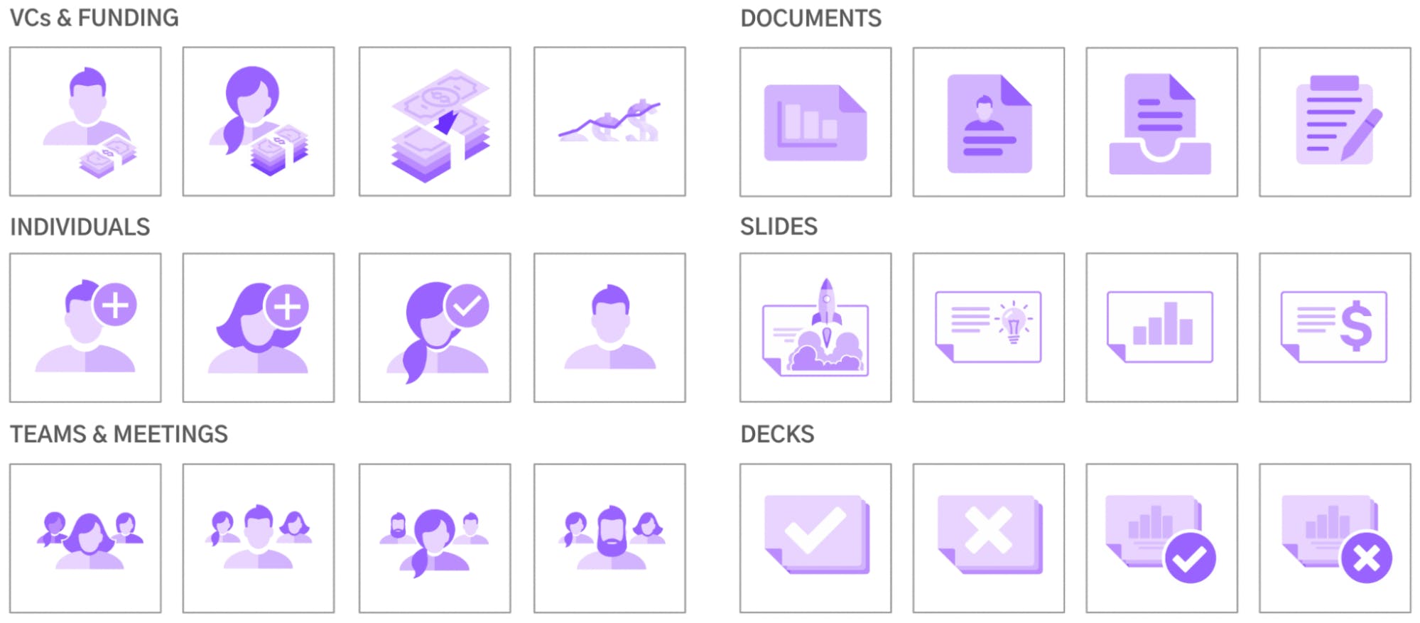
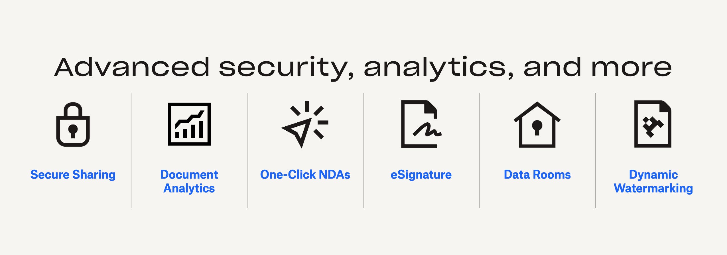
Along with the illustrations and animations, I also changed the icons on the site into a more cohesive style with the animations and illustrations, too.
Can you talk about how you developed the illustrations and animations?
Within the DocSend brand, there were a lot more subtle use of purples. However, in practice, the various non designers had used a lot of the starkly contrasting bright purple, bright teal, so I toned it down a lot for the animations. I also created illustrations for several cover reports. The upleveling of the brand involved 39 web pages being tidied up, 40 new illustrations being created and 26 animations–all by myself as a kind of creative one-stop-shop for the startup.
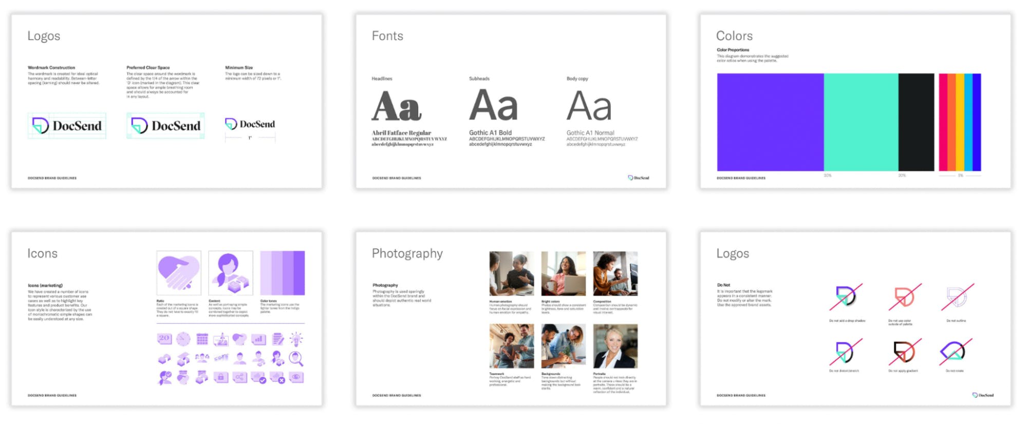
DocSend didn’t need a bigger team or go to an outside agency. We were able to do it in house because I was able to do all these things myself. I also put this all together into brand guidelines, slightly adapting the ones that already existed just so that there would be a cohesive whole of what the brand should look like.
What had been the effect of these changes to the brand?
What tended to happen before was that non-creatives just focused on the stark purple and teal completely. There was a lot of contrast and less of the subtlety that I had now brought in. Straightaway, we saw from Google Analytics numbers a massive jump in session duration on our webpages.
People were also looking at more pages in each visit and the bounce rate dropped dramatically. I like to think that this was because the site looked a lot more professional and presented a more cohesive whole for the content. That was essentially the big payoff that we were looking for, proving that the upleveling of the brand had worked. We saw from the metrics that it worked. That was great.
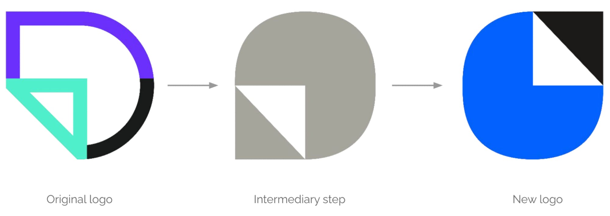
Dropbox acquired DocSend In March 2021. A few months after the acquisition, Dropbox’s Executive Creative Director, Liz Gilmore and myself, came up with kind of a halfway brand as there weren’t any assets in the existing brand library that covered what DocSend does. The logo was changed. The color palette used was a much more reduced selection of colors from the Dropbox palette. The headline font also changed to Sharp Grotesk 23.
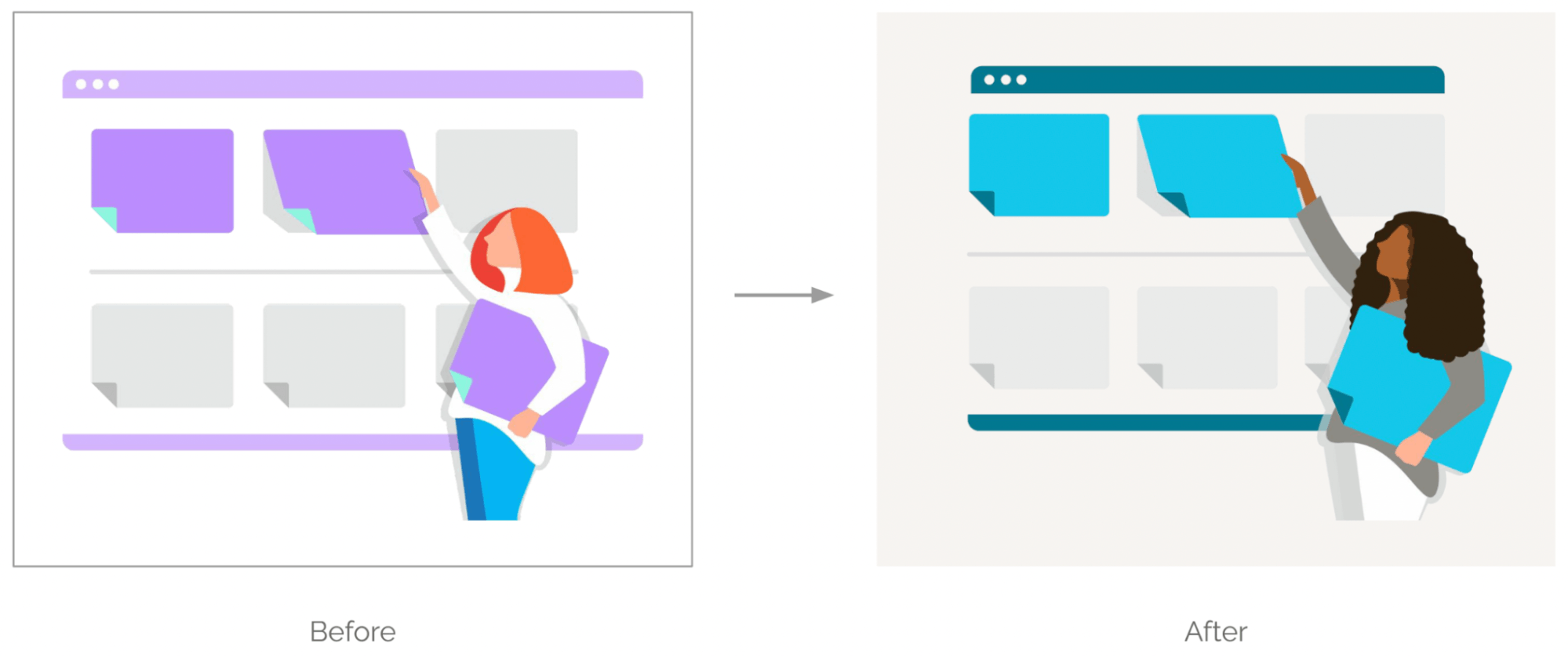
In the meantime, all existing material illustrations, icons and animations were just re colorizing into Dropbox’s Zen and Ocean blue. Understandably this was what I call the blue phase or Phase Two.
How was the experience of transitioning the brand after the Dropbox acquisition?
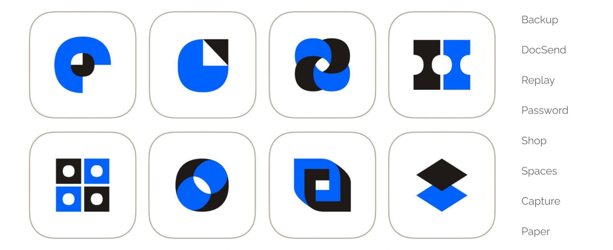
The new logo had to tie into the existing suite of Dropbox logos, which all use Dropbox blue and this black called ‘Graphite’.
When I recolored the existing illustrations I also emphasized more DEI (Diversity, Equality, and Inclusion) reflective people to mirror the society wide emphasis following George Floyd’s death.
Then I recolorized the icons which was very straightforward as a simple swap. I surprised myself when I saw that the icons were now stronger.
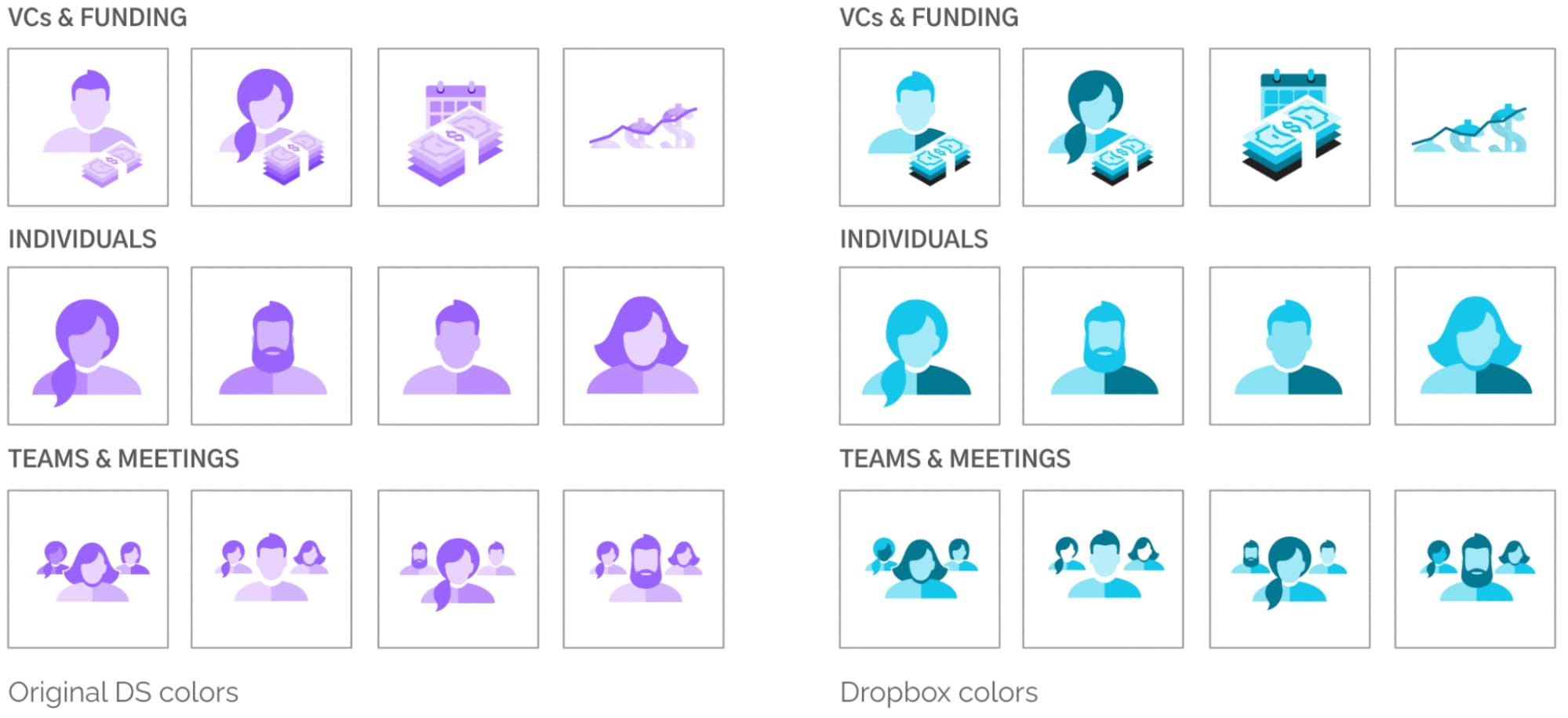
It’s amazing how much color changes the tone of branded material.
What were the effects of this transition to a more Dropbox-like visual identity?
It’s looking a lot more like Dropbox, but it’s still not actually Dropbox’s brand. The Google Analytics did show that the session duration remained roughly the same, but more pages were being looked at per visit and the bounce rate went down.
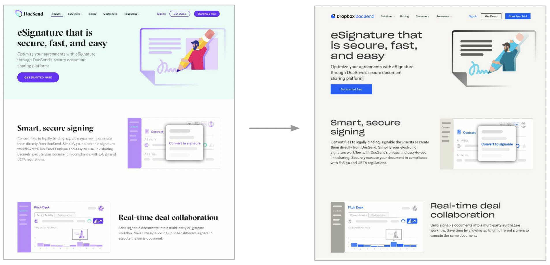
Looking more like Dropbox definitely helped, but getting the brand up to a professional level (Phase 1) created the biggest jump in DocSend’s metrics.
We also started tidying up pages as we went along to make them much more single-minded in what they communicated to the user coming to the site via a search engine.
What were the differences between the different phases of DocSend’s rebranding?
For Phase 1 (getting the brand up to a more professional level) the changes occurred in a rolling manner over time by looking at the illustrations and icons as separate sprints. One quarter I focused on illustrations. Animations were the next quarter. Icons and bringing the whole system together were the next quarter. I was tidying up a lot along the way and everything started falling into place.
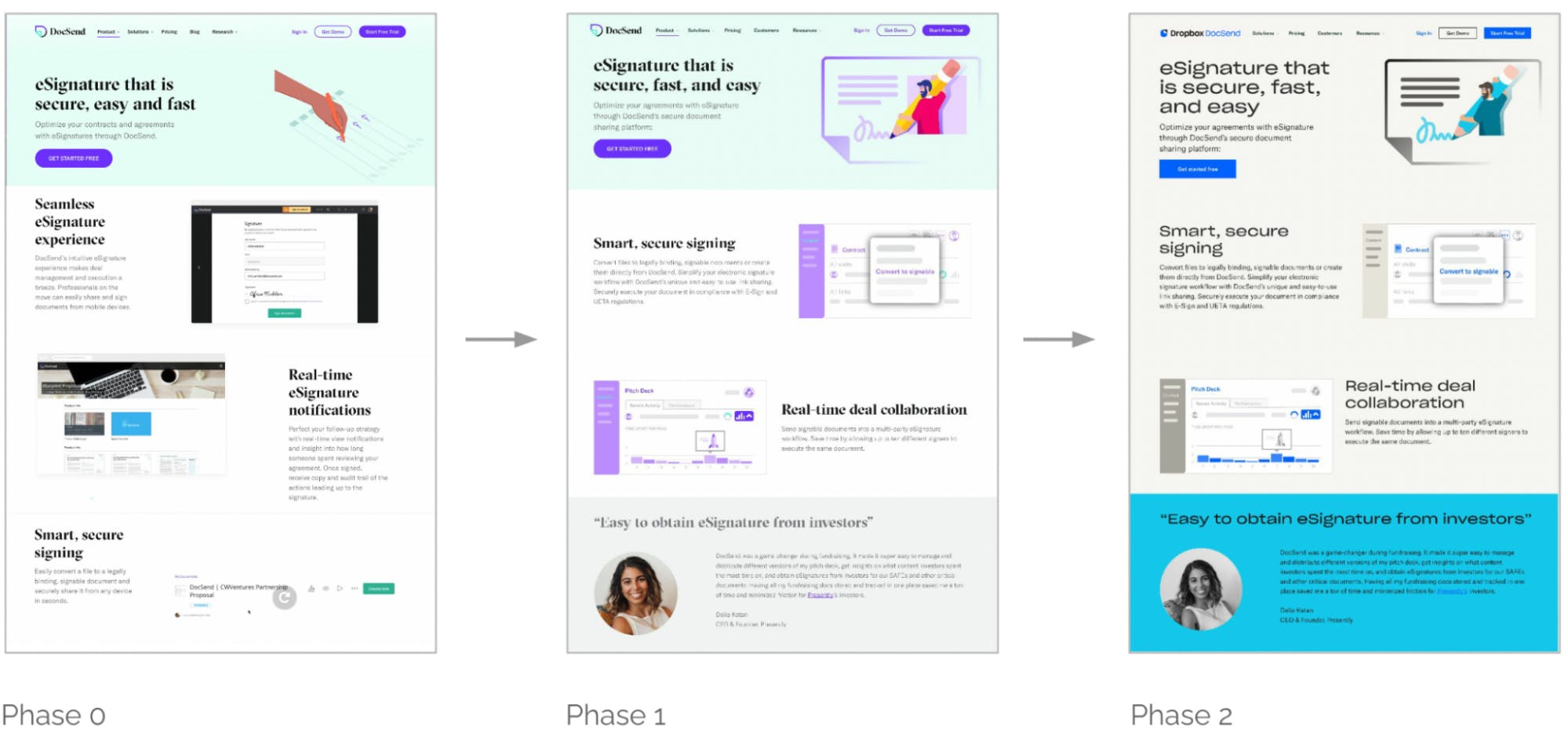
For Phase 2, which is the bluer brand, we shifted over all at once. We had all the webpages set up with recolored illustrations, animations and icons ready to go but not pushed live. Then one day, tying into a pricing launch, we switched it over on a Thursday evening. We had the Friday and the weekend to find any bugs before all the press releases went out on Monday.
We only had one glitch in all that. It was a good process in terms of planning. It was myself, a developer (Colin Duwe), and the director of content and comms (Cassie Pallesen). Dropbox was very impressed with how so few people could create assets and switch out the brand so quickly.
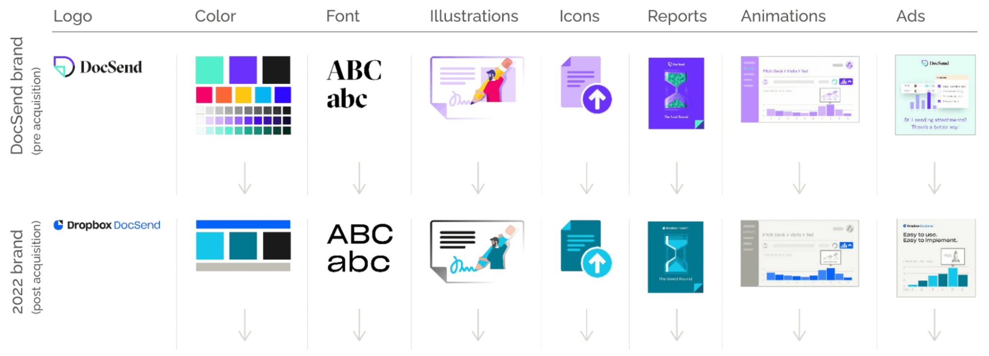
Now we’re in Phase 3 which involves fully switching over to the complete Dropbox brand. Instead of switching all at once like Phase 2, we’re doing this as a rolling change not tied to any specific date or release.
What would you say are your learnings or challenges through the phases?
Phase 1 was the most interesting because I felt the brand had a lot of promise, it just wasn’t executed very well. No one had been focusing on the brand as it’s own end and it was managed by a lot of non-designers.
Then when I tidied up webpages or whitepapers the metrics went up. Not surprisingly people like looking at more professional-looking webpages and reports.
But overall, what caused the biggest jump in metrics was getting it to look more professional, not necessarily what the brand specifics were. The brand was elevated, so people took it more seriously. They trusted the information they saw on the page.
Because of this our potential customers were more likely to click on whatever links you send them to or to fulfill the action you are looking for them to take.
Phase 2, largely involved a lot of recolorizing along with adding the new Dropbox DocSend logo to everything. At that point, people already had this belief in DocSend’s brand promise. A key learning was the fact that switching out the logo, recoloring assets and saying “we’re now Dropbox” didn’t dramatically change the metrics like we thought it would.
It’s actually the brand and the brand professionalism that causes more of a shift than necessarily what logo you put on it.
For Phase 3, because we are now part of Dropbox, it’s only a matter of time before all of the previous DocSend material goes away. Non-design people tend to apply the DocSend brand very unevenly, or think that as long as its material produced by the company, it must be on brand. However the collateral or assets they are using may be from a version of the brand that actually doesn’t exist anymore. As a result of this I ended up being a kind of brand guardian.
Luckily for me, the Brand Studio team at Dropbox were able to create a whole suite of icons, illustrations and product screens over time for DocSend’s Marketing and Sales channels. Much kudos and thanks to them!
For someone reading this, what would be your top advice? What’s your major takeaway from this project?
In phase one, for example, the main takeaway was seeing what needs to be done and slowly advocating to do it over time. I didn't set out to overhaul the brand. I just did it step by step and the brand got overhauled over time. It wasn't really a rebrand, it was more like a tidying up.
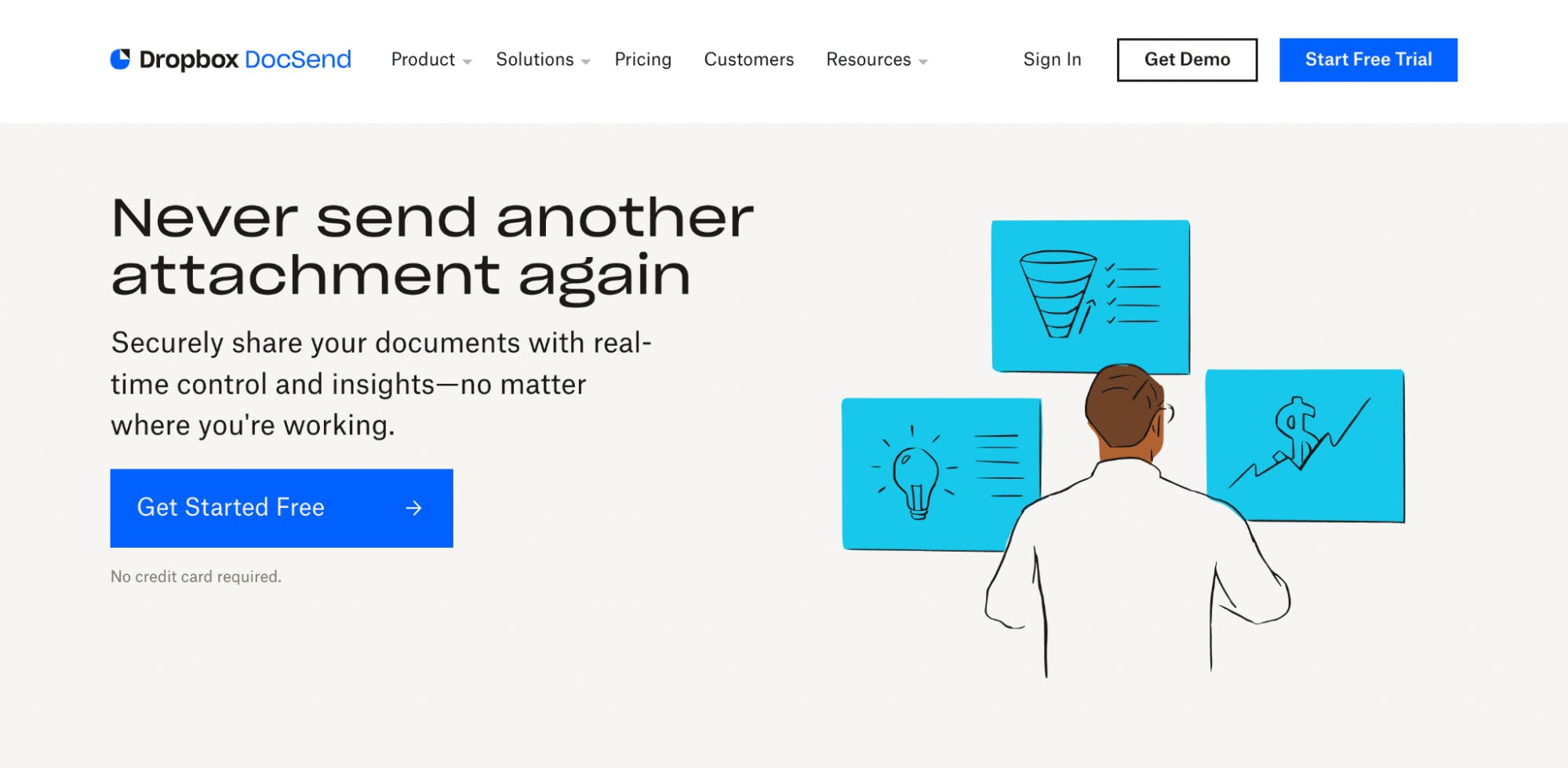
When we were told we needed to change the brand due to the acquisition, I thought to myself ‘the beautiful brand I just finished months ago is all going away’. However I did realize that it was inevitable for any startup that gets acquired. So, even as someone who had created the brand, I was also the biggest advocate for the branding change.
And, since these kinds of shifts are inevitable, it was going to be very hard to try and hold out in resisting the change, so I decided to embrace it instead.
Since this is about managing a brand after an acquisition, I started reaching out to the brand team at Dropbox, getting to know them and their processes because I knew it was only a matter of time before I would have to work along side them.

