
before

after

A conversation with Fernanda Bartels from Extantia Capital on aligning brand, mission, and messaging in a highly regulated climate investment space.
What sparked the creation of Extantia, and how did climate tech become the heart of your mission?
Extantia started as an idea in 2019, but things officially took shape in 2020.
The focus on climate came naturally—there was a clear gap in the market, and the urgency was growing. CleanTech 1.0 had already made waves, but a new generation of climate innovation was just emerging. We saw a chance to back founders who were genuinely moving the needle.
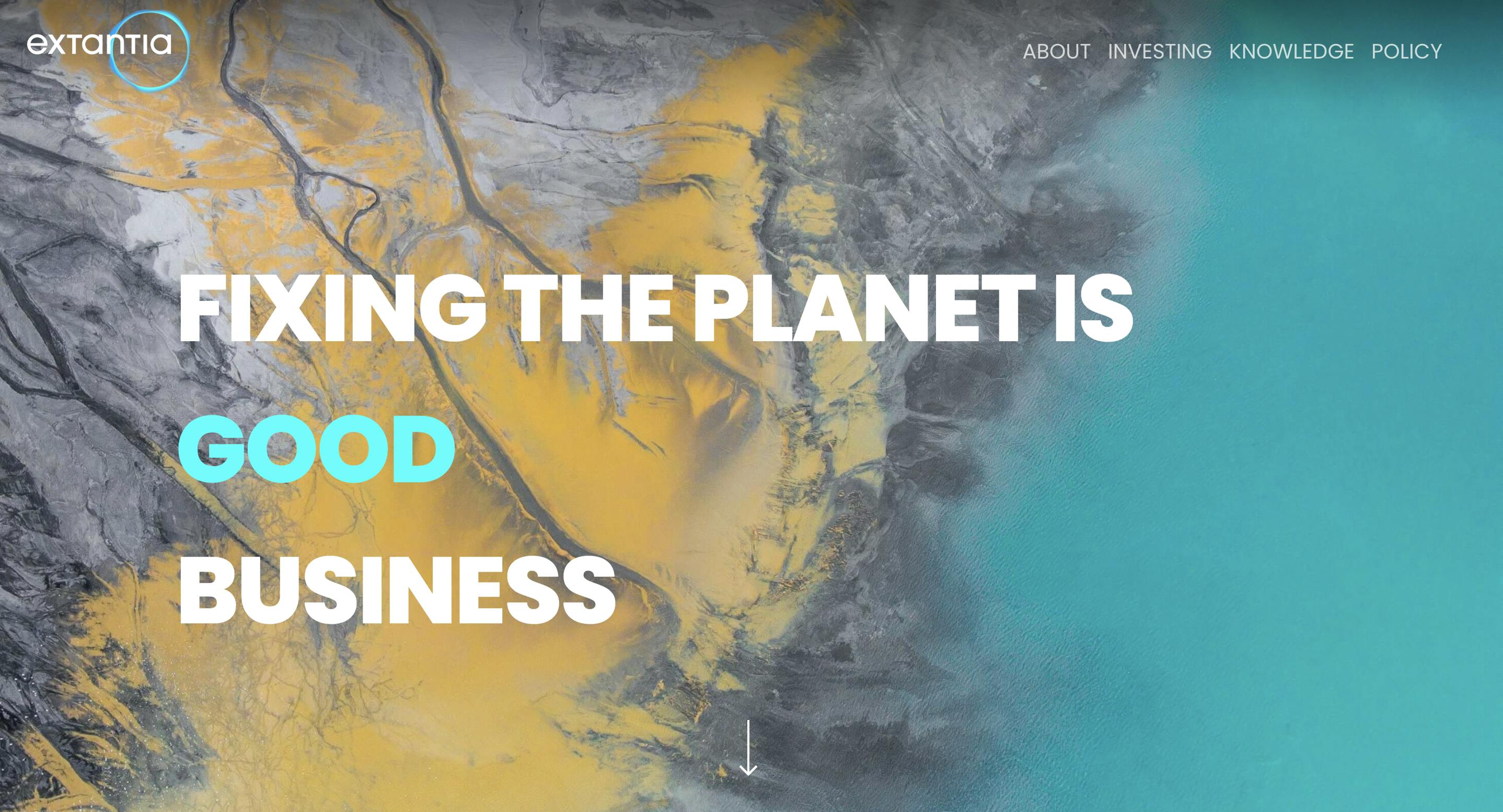
Extantia Old Homepage
It also came from frustration. In Europe, no one was supporting climate tech founders at the earliest stage. So we stepped in. Extantia became one of the early movers, and over the past five years, the space has matured massively. That growth is also what drove our rebrand—we wanted our brand to reflect how much we’ve evolved, both in story and direction.
Even the name “Extantia” speaks to that. It’s derived from Latin and means “to go beyond.” When brainstorming names, the goal was to find something unique—memorable, easy to Google, and meaningful. It needed to reflect our mission: pushing beyond the status quo, and building a sustainable and resilient future that supports economic growth.
For those not familiar with venture capital, at Extantia, we raise capital from limited partners—pension funds, family offices, insurance companies—and invest in early-stage startups aligned with our investment thesis. If you check out our portfolio, you’ll see a strong focus on verticals like energy, industrial processes, carbon removal and buildings. That’s because from day one, we asked: What’s the biggest lever in fighting climate change? So we doubled down and kept digging into where those opportunities lie.
Today, we have five partners managing three funds — including a fund of funds (investing in other fund managers) and our €204M Flagship fund where we are currently deploying from.

Image Courtesy by Extantia
How did the rebrand help clarify Extantia’s climate mission without losing its depth or speed-focused identity?
When we worked on the rebrand, it really came down to one thing: understanding what Extantia stands for at its core.
The company had already evolved a lot since the early days, and the rebrand helped us make that story clearer. It wasn’t about reinventing ourselves—it was about highlighting what was already there, dialing it up and creating a new and bold visual language.
From the beginning, we knew who we were: a technical fund that gets into the weeds with founders, especially in deep tech. That’s been our DNA. But we also knew we needed a brand that could communicate that technical depth and feel accessible — future-focused, fast-moving, and practical.
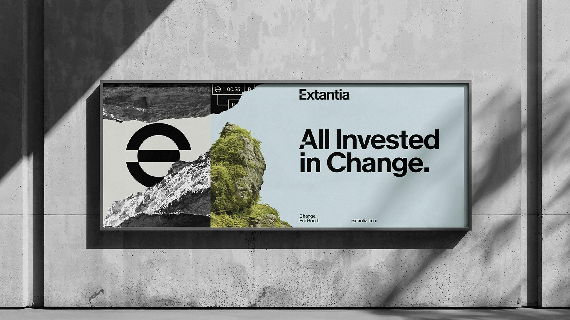
Image Courtesy by Extantia
So we worked to make sure the new brand reflected that balance. As VCs, we’re backing founders early on their big ideas. That means we need solutions that can scale — and scale fast.
In the end, I think the rebrand sharpened the edges. Yannick helped take all these elements — our mission, our story, our speed — and turn them into something that visually and emotionally clicked.

Image Courtesy by Extantia
Many VCs use sustainability as a buzzword. How does your brand cut through the noise and show real impact—to both startups and investors?
Sustainability has become a buzzword, sure but for us, it’s about making “green” or “sustainable” a no-brainer. Our message is simple: these solutions should be better, faster, and cheaper—and also happen to be sustainable. That’s how we shift the narrative. Sustainability isn’t the headline, it’s the standard.
We focus heavily on the economy, industry, and what we see as a new industrial revolution. That’s what really sets us apart. While others talk mainly about saving the planet, we focus on building solutions that can transform the systems and scale.
That’s also what our brand reflects. It’s optimistic. It’s future-facing. We're not here to preach, we’re here to build. For us, sustainability isn’t just about the environment. It’s about economic transformation and growth. That’s how we break through the noise.
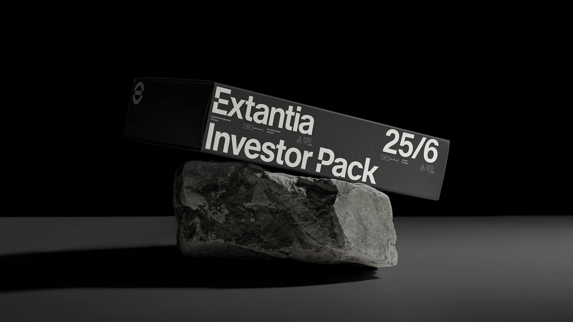
Image Courtesy by Extantia
Can you walk us through the process of creating Extantia’s new logo? Is there a hidden meaning behind it?
I remember listening to a podcast about branding that really stuck with me. It said that the best logos are the ones you can draw in a few strokes—simple, clear, iconic. Think of Nike’s swoosh. That mindset shaped how we approached our own logo. It wasn’t about making something flashy or overly clever. It was about clarity. Simplicity. Something that just worked.
So for us, the logo wasn’t the starting point—it was the outcome. The real work started way earlier, digging into who we are and what we want to communicate. We started with the strategy: what we’ve done so far, what we stand for, who we’re not, and how we imagine Extantia’s future. We talked about our values, our audience, and what kind of energy we wanted the brand to give off.
Image Courtesy by Extantia
That’s when Yannick came in—he led the rebrand and immediately got what we were about. He asked the right questions and helped turn our story into a new, exciting visual language. One thing that came up a lot was this idea of being a “technical” fund. We go deep when we talk to founders. But we’re also fast, bold, and optimistic. The brand needed to carry both—depth and energy.
Image Courtesy by Extantia
We looked at a lot of visual references, mood boards, and design directions. There was a NASA-style futurism, old map references, technical drawings, industrial feels, and even a bit of future nostalgia. It was fun and super exploratory. In the end, we didn’t just pick one—we pulled from different directions to create something unique that reflected our tone. Not overly sleek or corporate. Just smart, confident, and sharp.
The logo is an abstract “e” but it’s layered.There is a nod to expanding the planet and a subtle reference to a financial symbol, combining sustainability, resilience and investment in one. It reflects us— balanced, structured with a futuristic edge. The shapes, the colors, the way it all comes together—it’s technical, bold, and full of momentum. Just like us.
The whole process was super iterative. A lot of input, a lot of feedback, a lot of circling back to get it right. But in the end, we landed on something that doesn’t just look good—it feels like Extantia.
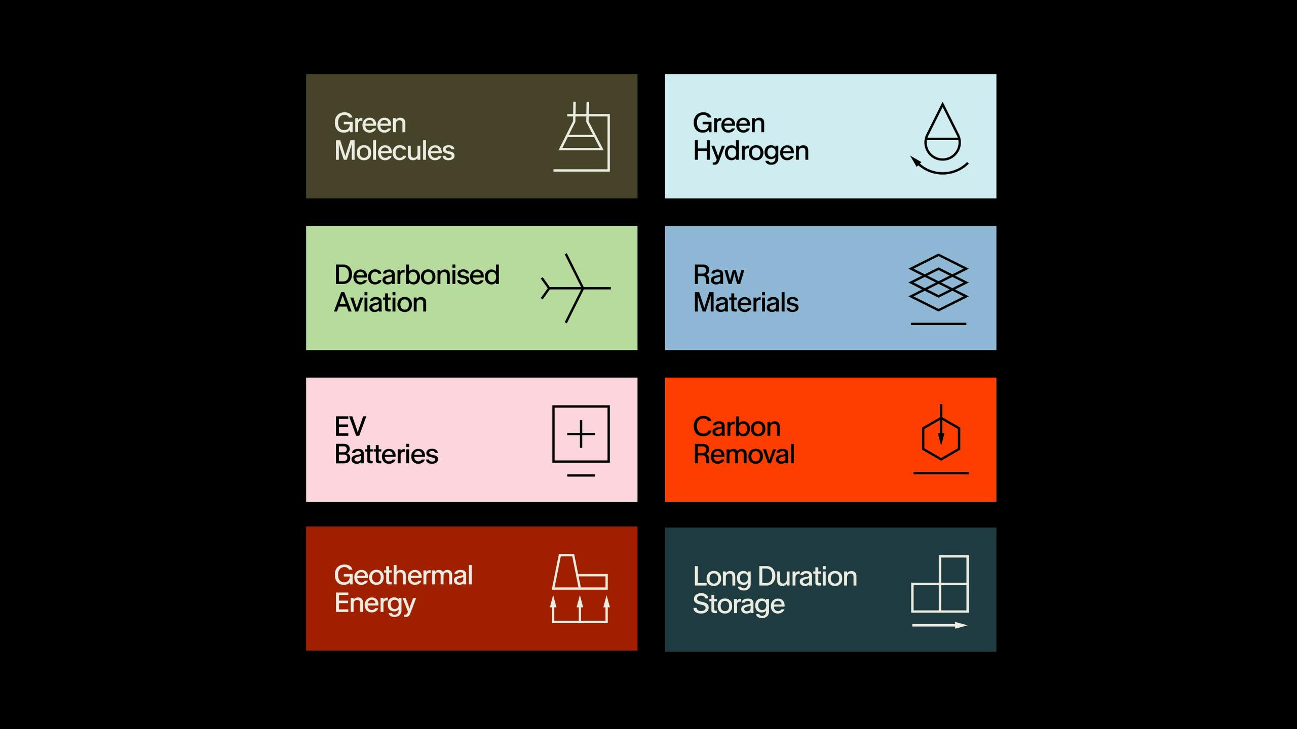
Image Courtesy by Extantia
What made Studio Zur Strassen the right fit for Extantia’s rebrand—and what challenges did you face along the way?
Finding the right design partner is tricky. There are tons of great studios out there, but for us, it came down to one simple thing: we liked Yannick’s work, and he got us. That gut feeling of “they understand what we’re trying to do”—that’s what made it click.
It’s a bit like hiring. Sure, you want someone with the right skills, but you also want someone you feel like you can actually work with. Yannick was a no-brainer. We’d seen what he’d done before, and we felt confident he could take our brand to the next level. But more importantly, he understood the vision behind it.
From the start, there was a lot of input from our side. He structured the whole journey around that—diving into what we were thinking, what we wanted, and how we saw Extantia evolving. We had multiple sessions, constant back-and-forth, and he brought in different people depending on the stage—like a copywriter when it was time to sharpen the message.
We’re still working with him on a regular basis, and what’s great is that the relationship feels collaborative. He is also working with some of our portfolio companies.
Image Courtesy by Extantia
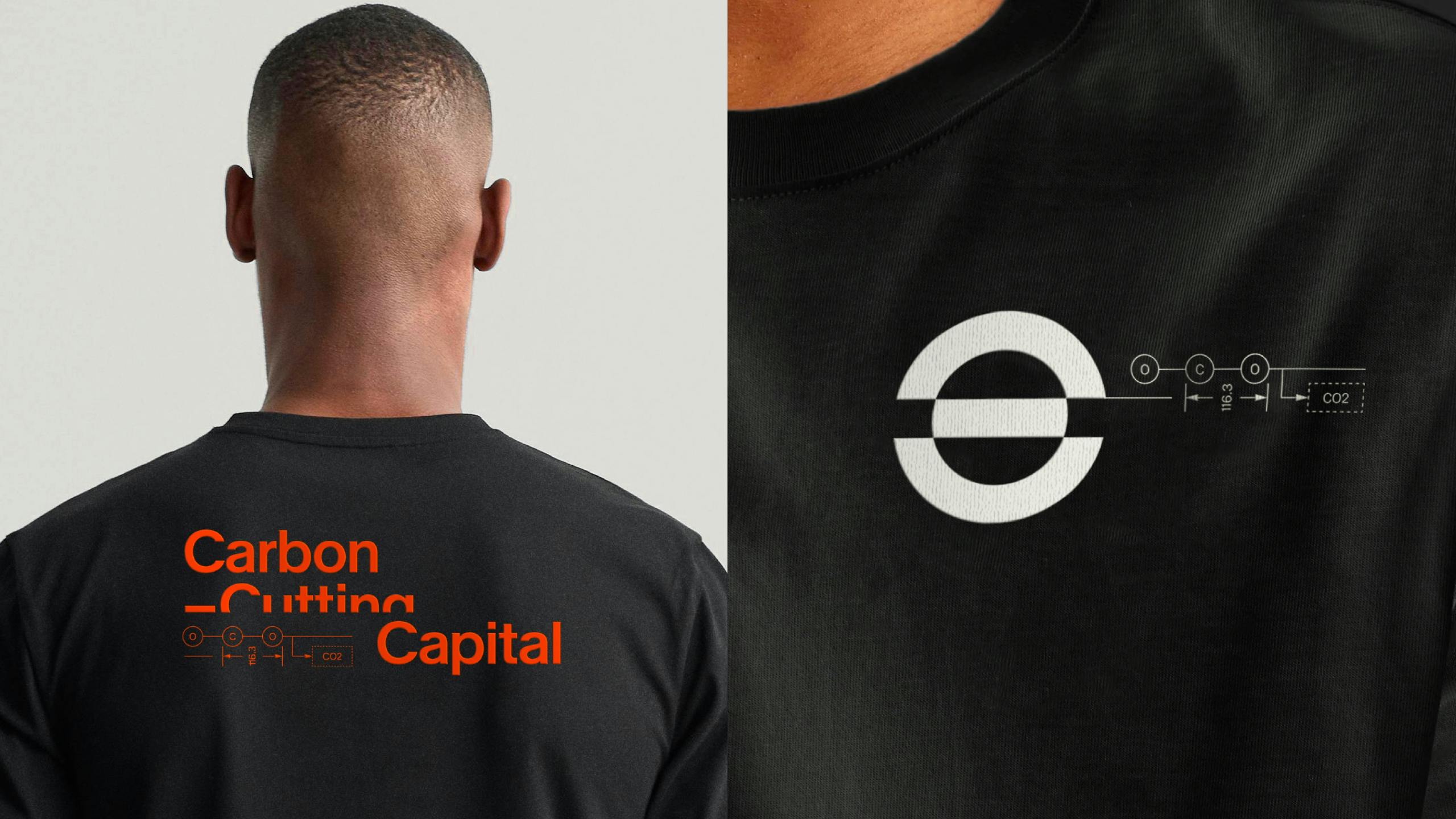
Image Courtesy by Extantia
Of course, not everything was smooth. At one point, we had a meeting with the whole team and we showed a preview of what we’ve been working on. Our team had many opinions and we could have spent the whole day discussing which colours they prefer or how they feel about certain images.
In the end, we had to wrap up the session and bring it back to the core group to decide the way to move forward. Too many cooks can slow things down. But we found a balance. The broader team still had strategic touchpoints and felt connected to the process. It was a challenge, for sure—but also necessary. You want buy-in, but you also want progress. We managed to get both without dragging the process out too long.
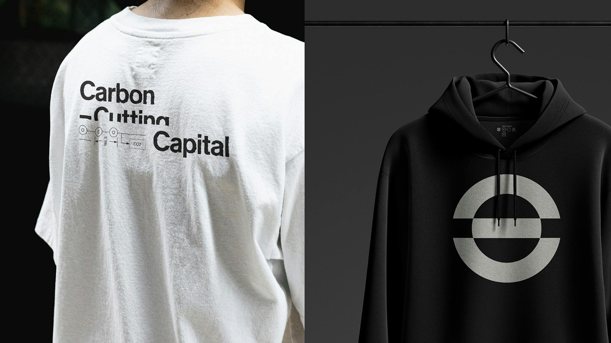
Image Courtesy by Extantia
What emotions or messages did you want the new color palette to convey?
We wanted the colors to reflect our values—our passion for what we do and the fact that we see ourselves as pioneers.
One of the key themes was optimism. Climate is a tough space—it’s easy to feel overwhelmed. But we see it as an opportunity. So the idea was to be boldly optimistic. The colors needed to support that feeling while also inspiring others to stay hopeful and keep pushing forward.
There’s a hint of blue to bring in some lightness, grey and black for that industrial feeling, green to connect to nature, and orange to add energy—without being loud or overused. It’s not about being in-your-face; it’s about the details. Subtle choices that spark confidence.
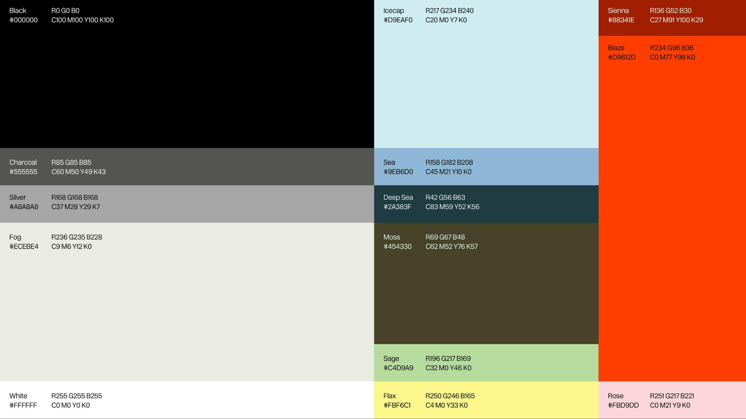
Image Courtesy by Extantia
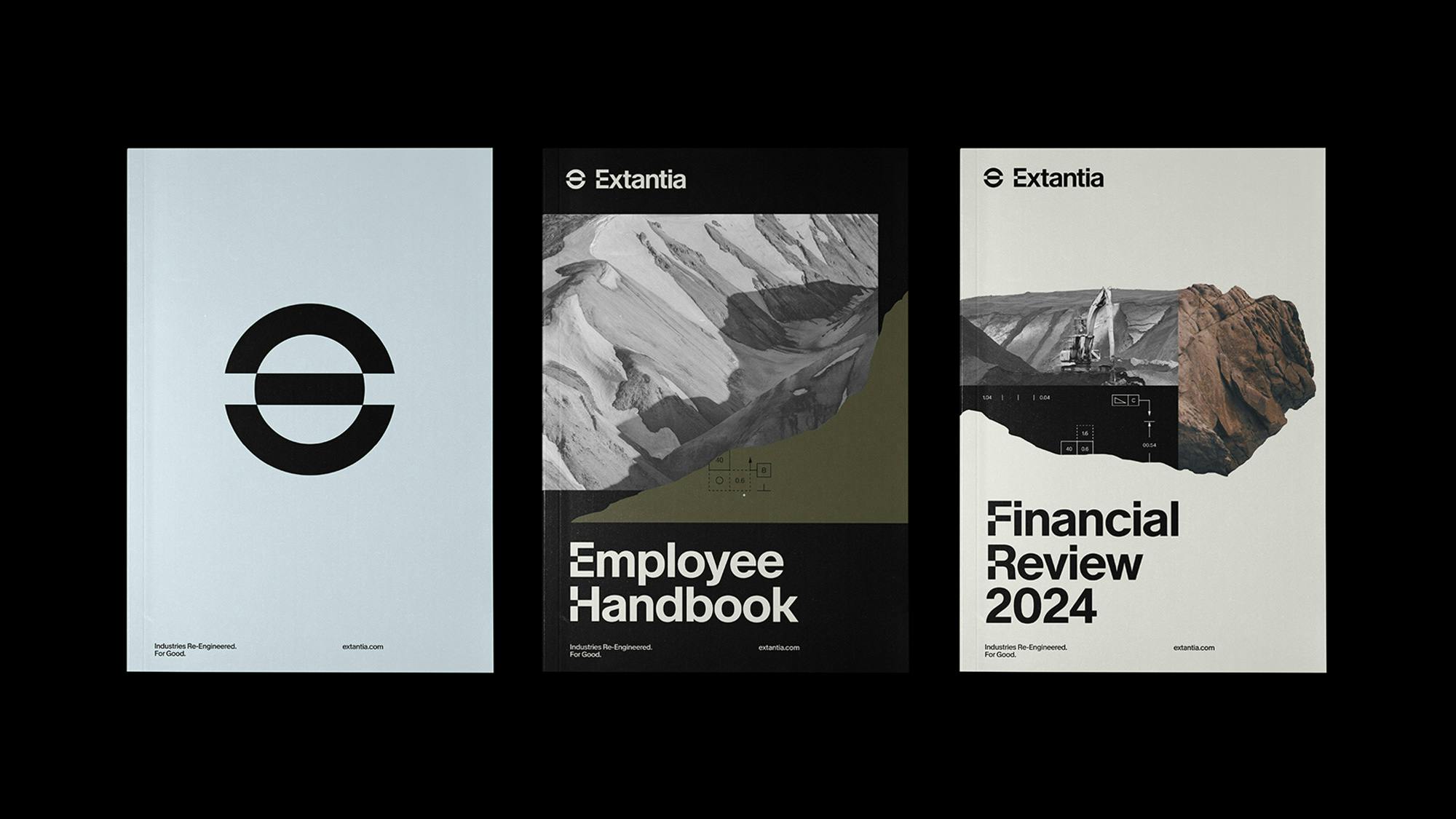
It’s also a mix that nods to both nature and industry. That contrast is important to us. One of my favorite elements isn’t even a color—it’s the visual collages. They give the brand a unique look, something that feels different from the usual stock photos some brands might use. Combined with technical drawings, they speak directly to the kind of people we work with—engineers, builders, creators. But in a way that still feels fresh, cool and unique.
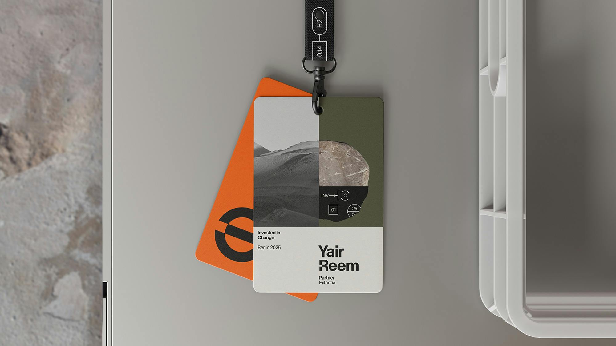
Image Courtesy by Extantia
Transparency matters a lot in climate. How did the rebrand help you communicate your impact more clearly?
As a venture capital fund in Europe, we’re classified as an Article 9 fund—which means we’re highly regulated. There’s a lot of reporting involved, especially on the deep green end, and with that comes the need to be clear, accurate, and transparent.
That’s why messaging became a huge focus for the rebrand. We wanted to make it crystal clear what we do, how we invest, and how we think about impact. It wasn’t just about looking good—it was about being understandable and credible.
The rebrand is also part of our efforts to position ourselves as thought leaders in this space. It gave us a stronger visual language to match the way we see the market evolving. It’s that combination—tight messaging paired with thoughtful design—that makes the communication really land.
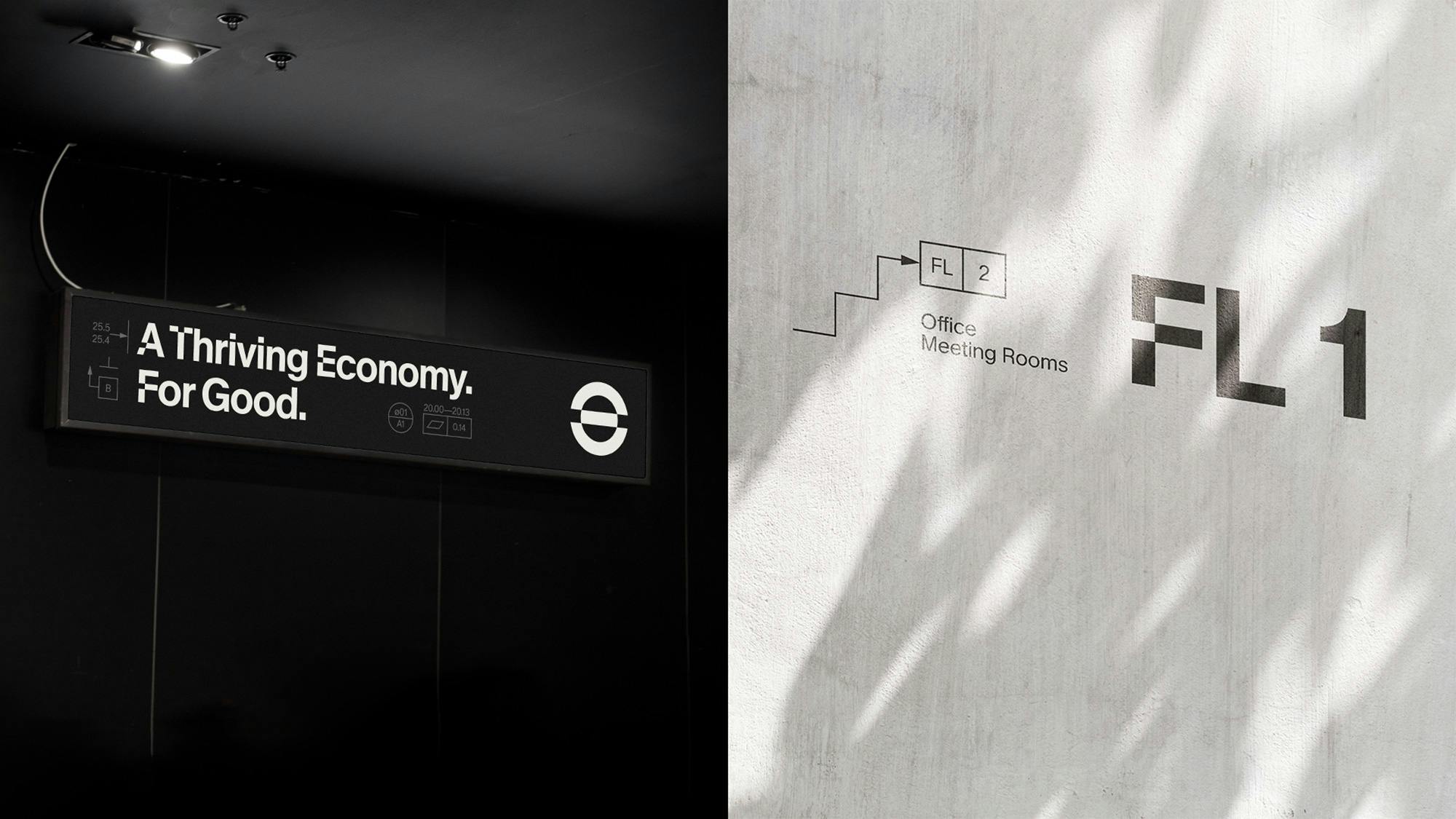
Image Courtesy by Extantia
Has the rebrand changed Extantia’s core values, or is it still focused on the same climate mission?
No, our core values are still very much the same. From the beginning, we’ve focused on decarbonization—looking at the biggest sources of emissions and identifying where we can create real impact. That mission hasn’t changed.
What the rebrand did was bring more clarity and structure to how we communicate it. Our investment thesis was already there. We’ve always considered the bigger picture—climate policy, macroeconomic forces, technological shifts—but now we’re expressing that thinking in a more direct and consistent way.
I think when we started this process,
"The rebrand wasn’t about reinventing ourselves—it was about editing, polishing, and elevating."
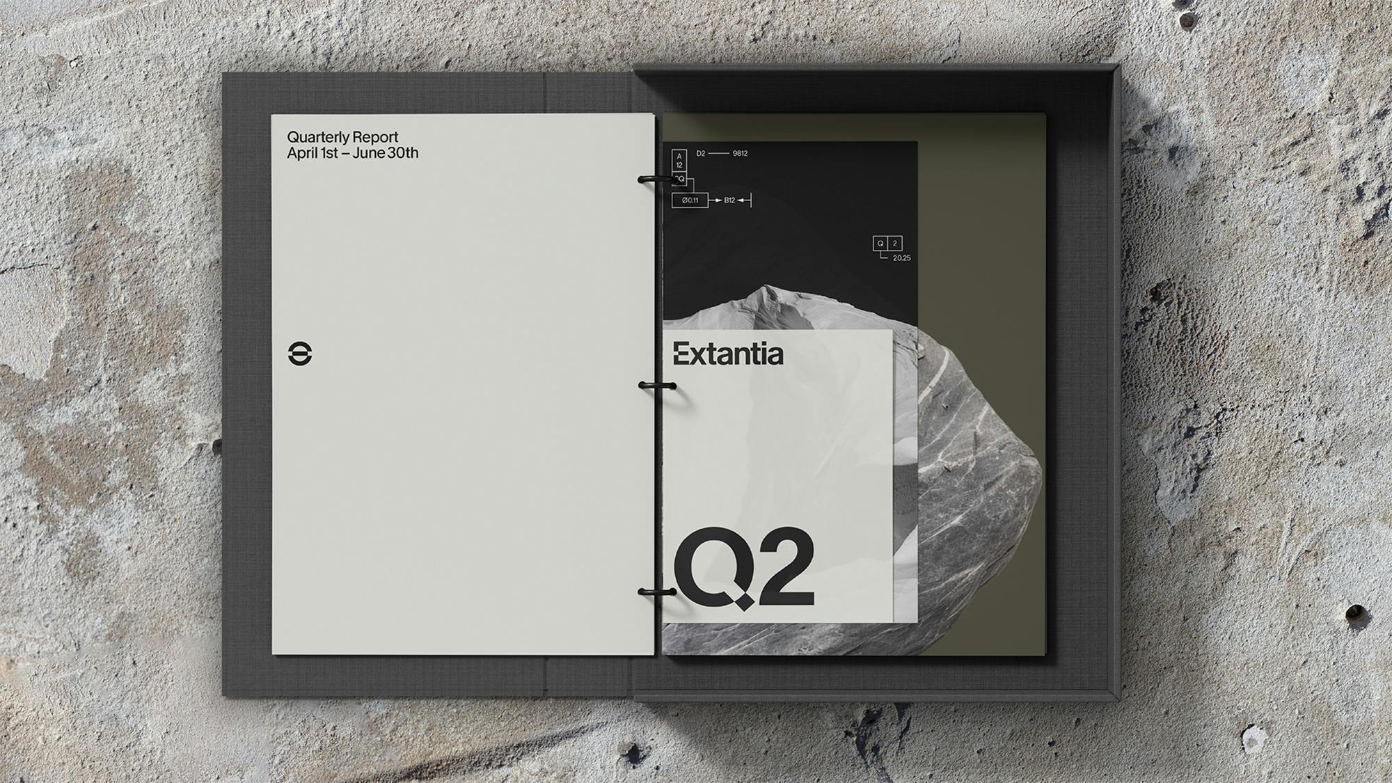
Image Courtesy by Extantia
and making sure the visual language matched how we think about ourselves and how we present ourselves. There was a slight disconnect before between our internal identity and our external image. The rebrand helped close that gap.
The way we work hasn’t shifted. We’re still backing climate pioneers, still looking at opportunities across sectors. But now, how we talk about it—and how we look while doing it—feels much more aligned with who we’ve always been.
So no, we didn’t change our core. We just got better at showing it.
On a personal note, which part of the rebranding process are you most proud of? Any memorable moments from the journey?
For me, it was having the right partner by our side—someone who truly understood us. That sense of “they get it” made all the difference. I enjoy collaborating and working with Yannick, so seeing someone translate our vision into a visual identity we couldn’t have created on our own—that was really exciting.
What stood out was Yannick’s ability to listen, empathize, and see things from our point of view—while also bringing his own design and strategy mindset. That balance made the process not just effective, but enjoyable.
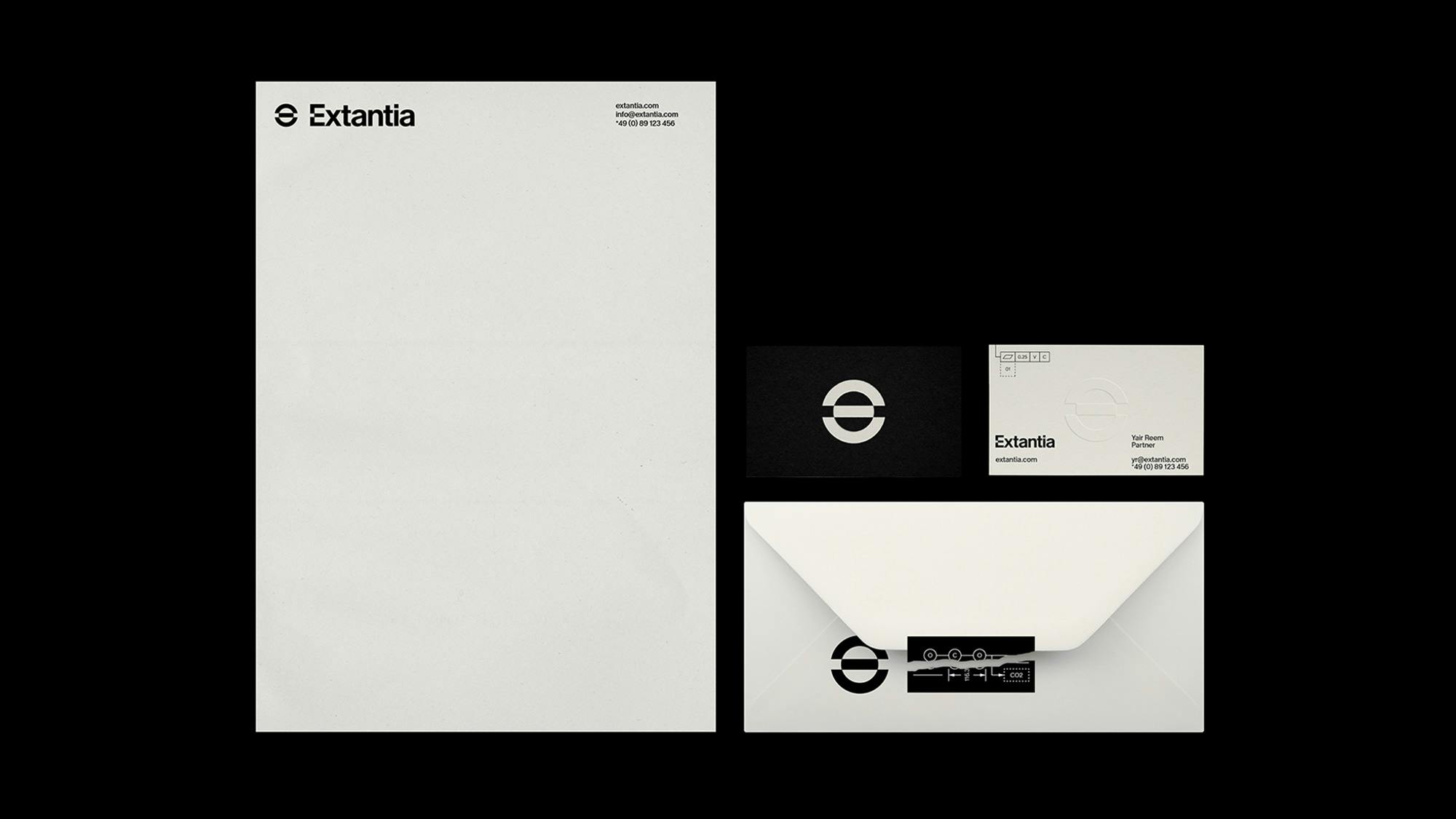
Image Courtesy by Extantia
I’m really proud of the outcome, of course—but also of the process itself. It was full of challenges, feedback, and different perspectives from across the team. We had to balance a lot of voices and still keep things moving.
