
Nic Brandenberger, VP of Consumer Marketing at Fandom, talked about how they built a task force from various departments to help with the rebranding, the stories behind their new logo and slogan, and the vocal response to the changes from their engaged community.
What prompted Fandom’s rebranding? When and how did the conversation start?
The idea of a rebranding became tangible and compelling in 2020, when the team saw a number of elements converging toward a unique, consumer-noticeable change in Fandom's brand experience: we’ve decided to migrate our Gamepedia wikis into the Fandom domain.
At the same time, we’ve planned for a significant refresh of the Fandom product experience and also kicked off a major initiative to drive more engagement amongst our 315 million monthly unique visitors.
There was no way we could pass on this opportunity to modernize Fandom’s brand expression, and support all of these initiatives with an additional, strong signal for creators, fans and employees. The stars only very rarely align in such a way that a brand can genuinely claim that it’s “all-new”, but they did for us.
What was the rebranding process like?
We’ve had a great starting point in that our company’s vision and mission was clear. With that clarity in mind, we’ve focused first on refining our brand positioning as well as our core brand propositions for creators and fans.
We conducted quantitative research into our target audiences’ needs, wants and barriers, and — in combination with regular brand health surveys — were able to synthesize critical insights to form a brand strategy framework.
While staying true to existing brand attributes and traits, we then started to translate the core strategic tenets into key branded assets, including logo, colors, typography, patterns, and more.
Moving away from familiar brand building blocks is always painful, and can often create various forms of resistance at first. Especially given that Fandom is a young company, with a diverse employee base, and operating in aggressive growth mode, the company made a conscious choice to involve the broader employee population from the early stages of brand identity work.
A multifunctional brand task force, composed of leaders from the community, product, content, design, marketing, and sales organizations, was formed to ensure a transparent and engaged brand redesign process and relevant representation for decision-making.
They regularly shared progress and even conducted surveys amongst employees to bring them along on the journey, hear their aspirations and hopes for the brand, but also take note of concerns and doubts about specific elements of the re-branding efforts.
We’re extremely blessed to have an amazingly talented in-house design team, enabling Fandom to deliver the entire rebranding effort, including distinctive assets, documentation and guidelines, internal and external design templates, operational assets, brand swag boxes, and even fit-for-use marketing executions — all within just a few months!
Can you share the story behind your new logo?
The new Fandom logo needed to fit with our new strategy, authentically reflect the soul and history of our brand, while modernizing and differentiating our brand, and provide a flexible platform for Fandom to communicate with its audiences.
We started exploring a wide range of options before converging on a manageable number of logo routes, from simple but playful variations of letterforms, to visualizations of wayfinding and navigation, concepts of discovery and exploration, as well as ideas around passion.
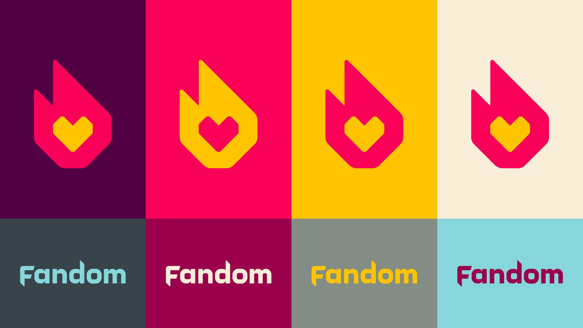
A somewhat subconscious decision in favor of our new logo “Fire & Passion” was actually taken surprisingly early on, and then rationalized and formalized over time through a diligent process of refinement, experimentation, and elimination:
Fire & Passion delivers against all the evaluation criteria, but is also strikingly intuitive and easy to understand.
It feels celebratory and authentic to our brand’s mission, reflects the passion of fandom experienced by our fans and creators every day, and it pays tribute to the history of our brand in obvious and less obvious ways. Ultimately, it was easy for the brand task force to get excited about what this logo could do for the brand, and stand firmly behind the logo choice.
And notably, all this was done in-house without the help of an agency.
Can you tell us more about the conceptualization of your slogan?
“For the love of fans” not only captures the brand’s positioning as a platform that powers people’s fandoms, but also puts in words what the logo design implies, and ultimately why most Fandom employees get out of bed every morning and out to work. This brand is truly built for fans, by fans.
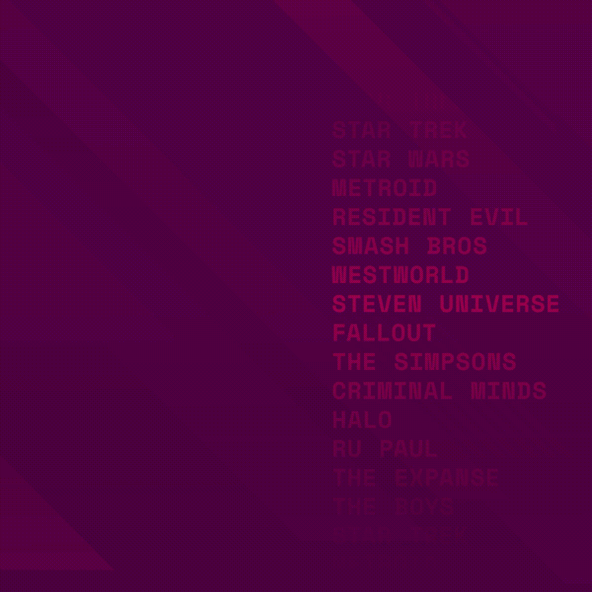
An important criteria for our brand tagline was how well it could flex for various fandoms and fans. As the world’s largest fan platform with over 250,000 wikis serving hundreds of millions of fans, we understand and cherish the diversity of fandoms and people in our communities.
“For the love of fans” is made to be hijacked by our fans and creators.
We will use it, as a brand, to communicate the breadth and depth of fandoms on our platform, but it can just as easily be adapted to fit an individual’s passions.
We hope to enable our fans and creators to play around with it and get wild!
Do you have any advice for others thinking of rebranding to improve brand awareness?
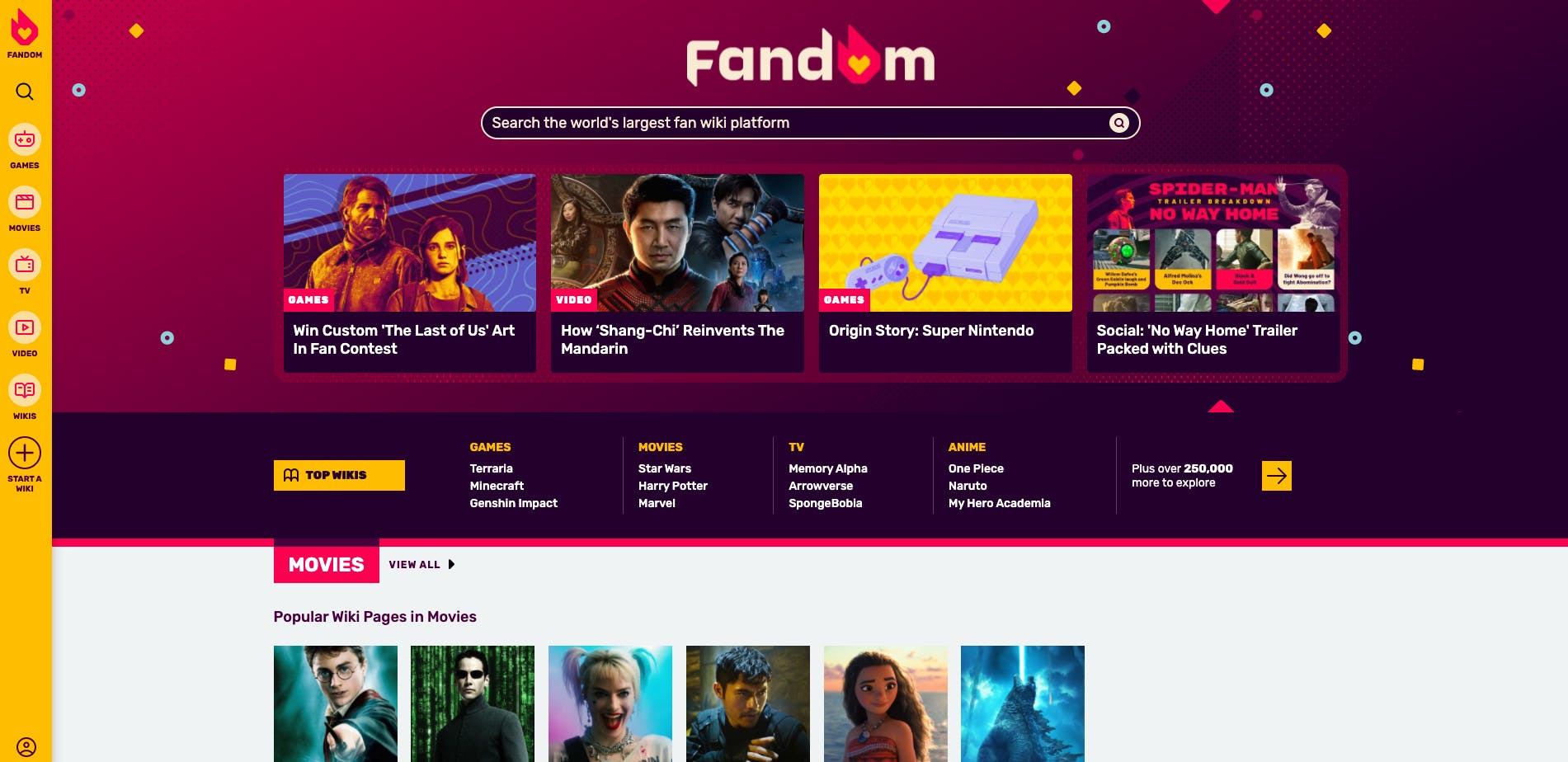
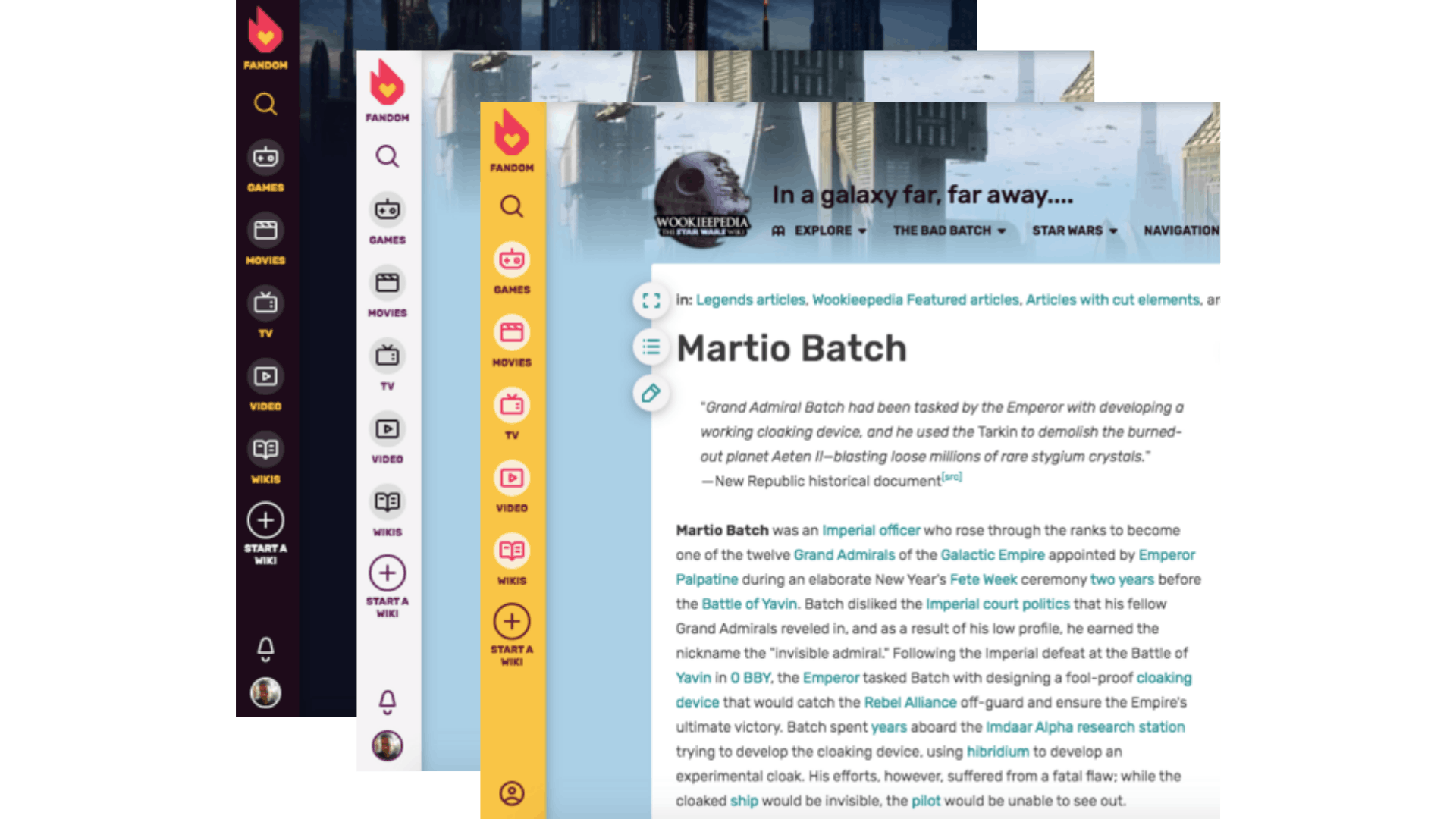
Our rebranding efforts focus on supporting the stronger visibility of Fandom as a platform provider across devices, while still leaving the majority of platform real estate to content providers which create the wiki pages.
We’ve leveraged new brand colors to accentuate the Fandom global navigation, attract attention and eyeballs to the broader offering of Fandom, drive cross-wiki visitation, and ultimately generate a rising tide that lifts all boats.
A rebranding effort can help significantly amplify broader and deeper evolutions of the end-to-end customer experience. But to drive awareness, different brands may need to activate different levers in different ways, depending on how the product can be effectively communicated to, as well as experienced and shared by respective audiences.
General advice for developing awareness-driving strategies would be to intimately understand usage occasions for the brand (why, in which context, and when are people using it?), and usage behaviors and patterns (how--long, often, deeply etc.--are they using the brand?) and then deliver coherently and consistently against these motivations and behaviors across the customer journey touchpoints.
If you can spend media dollars, use them when and where the audience will be most receptive to the messaging.
How would you say is diversity manifested in Fandom’s new look?
We connect with our community frequently and deeply, and we are consistently in awe of the diversity of people, perspectives, and ideas amongst our fans and creators. It is the driving force behind the sheer breadth of fandoms on our platform, and the richness and depth of the content within each of them.
Our total brand experience reflects diversity through the people on our site and the breadth and depth of content they generate and consume. This is why our efforts around diversity go way beyond brand strategy and identity, and also encompass efforts to drive discoverability of fandoms, search, navigation, engagement with content, and promotion of our communities.
“Our mission is to build a place of joy without judgement, where you belong, simply because you’re a fan.”
We are laser-focused on enabling our fans and creators to create incredible content, and share it with the world. If our brand redesign effort can add a tiny bit of value with a modular tagline or a customizable avatar (coming soon!), then we are the happiest of all campers!
How has the reception to the rebrand been like?
Fandom has indeed several audience segments which are heavily involved, spend significant amounts of time in the experience, and are highly passionate about their fandoms. The most engaged segments will naturally perceive any changes to their experience more immediately and more acutely than others, and also be more vocal about it.
Brand logos (and colors, in particular) are often difficult to assess in a criteria-based way, leaving room for subjective judgement and preferences, making it objectively difficult to please everyone. As expected, we saw a few comments on our staff blog post on the rebrand, expressing dislikes over some color choices.
Yet, in our most recent “Community Connect” event, a forum for the platform's top creators to connect with Fandom leadership, the vast majority of our creator community expressed an overwhelmingly positive reaction to the rebrand, including color choices.
We will continue to proactively field comments from the community, provide perspective, and moderate discussions about our brand’s evolution on Discord and other forums.
Brands need to evolve at the speed of culture, technology, and consumer behavior. Doing so becomes an imperative for success, especially for a brand like Fandom, positioning as both a reflection and a barometer of pop culture, and serving a predominantly young, dynamic, and promiscuous audience.
It may take a bit of time until everyone can find their way around the new experience and be familiarized with the new brand look and feel.
But needless to say, we’re extremely excited about our new brand and we feel very confident in our choices around the redesign efforts, given our diligent approach including consumer surveys, multiple employees, and community involvements during the redesign process, as well as usability research studies all suggesting measurably improved experiences behind the changes.