


Jonny McCauley, Co-founder and Head of Design at Fresco, shares his experience, not just rebranding, but renaming the Fresco brand.
Can you introduce us to Fresco and the exciting things it is doing these days?
What started 10 years ago with a connected weighing scale, has evolved to become a technology platform for connecting the world’s appliances, recipes, and home cooks.
Today, we’re partnered with some of the world’s biggest appliance manufacturers including; BOSCH, Electrolux, GE Appliances, Instant Brands, Kenwood, LG Electronics, Panasonic, and Thermomix, to make their appliances smart so that they can engage better with their consumers.
Over the last year, we’ve had a lot of exciting things happening within the company. We unveiled our new brand and evolution from Drop to Fresco in April. We also raised $20 million in financing which will be used to accelerate the creation of a world-leading experience for the connected kitchen.
What made this round so poignant is that it was led by three of our appliance partners; Instant Brands, Vorwerk, and a third that will be announced later this year as part of a new partnership. This shows our unique ability to unite the world’s leading appliance manufacturers around our platform and finally realise the smart kitchen that we’ve been hearing about since the 1950’s.
We’re also looking to double our headcount over the next 24 months, so it’s a really interesting time to be a part of team Fresco.
Walk us through your company’s brand identity through the years. How were the past brands conceptualized?
Drop started with a connected weighing scale and supporting app so that a home cook could accurately measure each ingredient by simply “dropping” them into the bowl as they stepped through a recipe. It was this desire to simplify the chore of cooking that led to our initial verbal and visual identity, “Drop”.
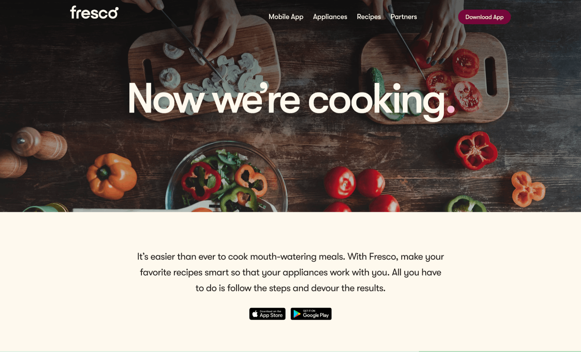
Given our founders had design backgrounds, to date all design and branding has been done in-house. Our original identity was conceptualised by the founders in the days leading up to their first investor pitch: simple, fun, and had a visual style synonymous with a lot of other Silicon Valley startups at the time. However, as time progressed and we began to partner with global appliance brands, our own brand evolved to better complement our partners.
We needed a brand that was unique and recognisable but one that allowed our partner brands to shine through rather than competing with them for attention.
About this current rebranding, how did it come about? How did that conversation start?
Drop had evolved from the most simple connected scale to bringing connectivity to millions of appliances, to building a platform for any connected appliance in the world.
As a result of this significant transformation, our brand both visually and verbally no longer represented the current or future state. We needed to come together and refocus the brand around one great idea.
Also, the name Drop itself wasn’t distinctive or unique enough, which made discoverability and ownability extremely challenging. We wanted something relevant to what we did as a technology platform at the heart of the smart kitchen but original enough that we could own the word.
How did the rebranding process go? Was it all smooth, or did you encounter challenges?
We were fortunate to work with the leading NYC branding agency, Character, which helped elevate the brand to a whole new level. After an extensive research phase, examining our broad offerings of both B2C products and B2B services, they managed to bring together and distill all of the different facets of our business into one cohesive brand.
During the process, Character helped develop and refine our brand positioning, document our new verbal identity, and help showcase our new visual identity.
Surprisingly, one of our most significant obstacles in the process was finding a suitable name that resonated with both our employees and partners while at the same time being available to trademark and own the online presence. As a company in both the technology and cooking industries, it was imperative that we found a name that expressed these areas effectively. We wanted a name that was bold and reflected the innovation we are pioneering; and also something warm and enticing to emulate the feeling you get when preparing and sharing a meal with loved ones.
The selection process involved multiple naming workshops with our branding agency Character and internal teams. We also enlisted the help of a specialised naming agency, Igor, who helped is hone in on a shortlist of suitable names. After considering over 1000 names and conducting trademark searches on over 20 shortlisted names, we finally got it down to one suitable candidate, Fresco.
A big change was to your name and logo. Can you walk us through how they were conceptualized?
The name has a few connotations that collectively represent our work in both technology and cooking/food:
- Just like al fresco dining became a way for us to connect during the pandemic, Fresco allows friends and family to come together to enjoy delicious food.
- As a company that is firmly rooted in design, the name also speaks to fresco as an art form.
- Lastly, “fresco” translates to “fresh” in Italian which represents both the fresh ingredients that go into a home-cooked meal and also the fresh, pioneering concepts we are forging as a technology innovator.
The logo reflects our brand idea of connecting dots in the kitchen between appliances, recipes, and the home cooks who put it all together.
Your color palette has also changed. How did you land on these colors and what do they say about your brand?
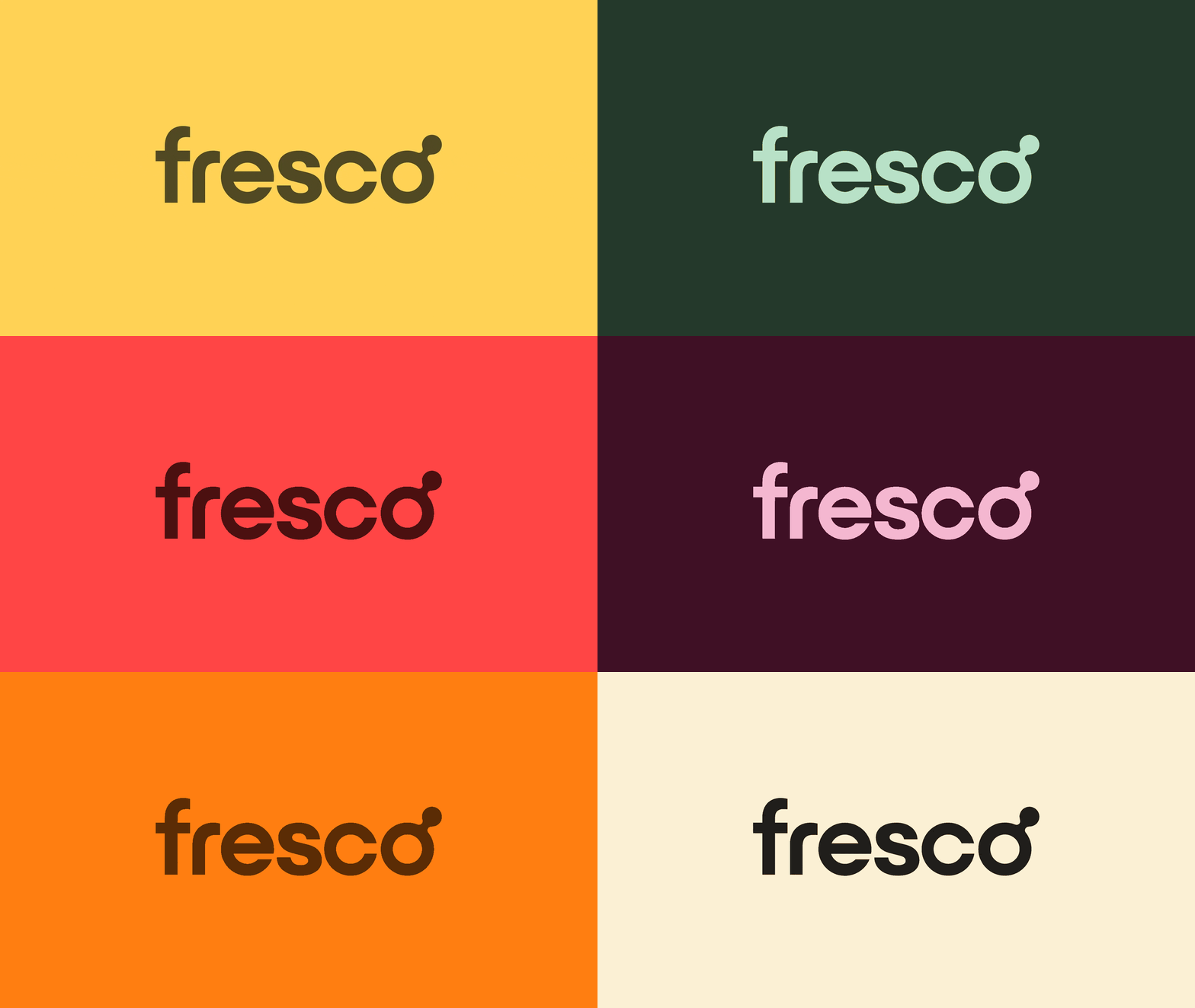
The new color palette uses rich, warm, and vibrant colors that represent the foods we see in our kitchen every day (aubergine, tomato, rocket, carrot, summer squash). Simply put, our palette was made to be delicious, just like the food that home cooks prepare with Fresco.

As accessibility is one of our core design principles, all colours and combinations were extensively tested to ensure they met AA accessibility standards.
You also make use of illustrations and other graphic elements. How were these designed?
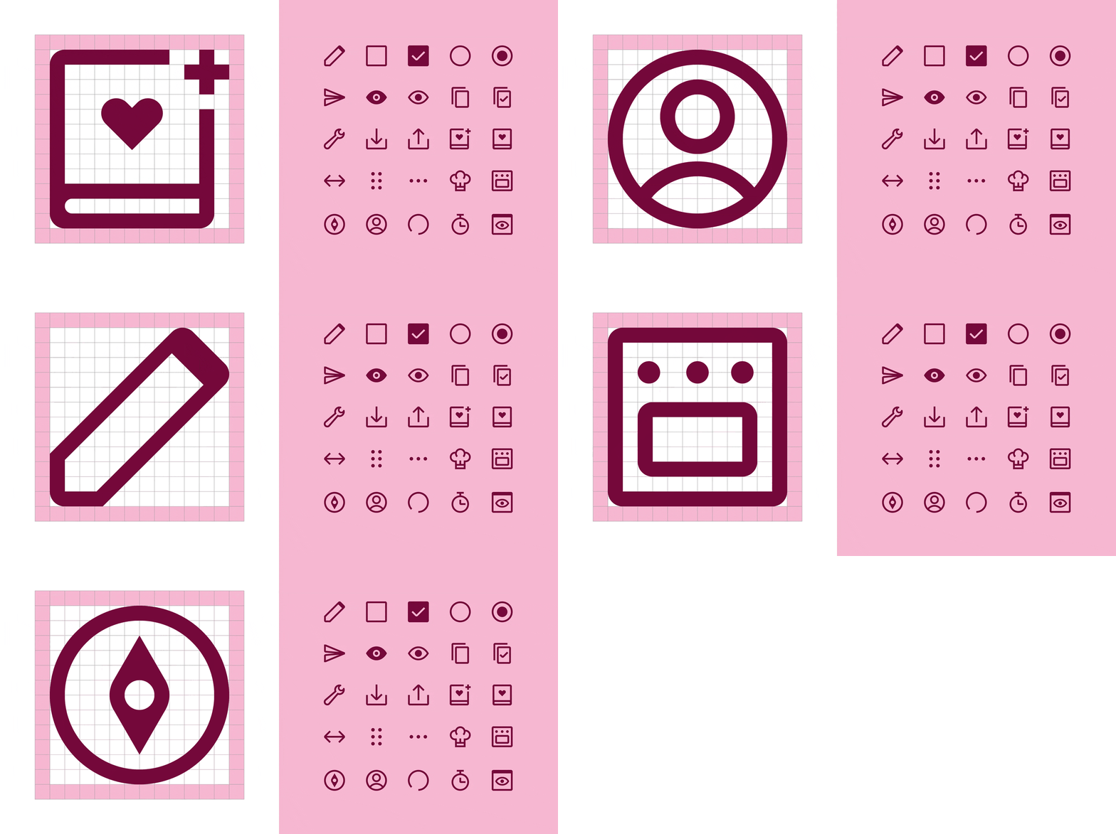
Illustration has always been a core part of our visual style so for the new brand we simply built upon what we had done to date. Our new graphic elements are the visual backbone of the Fresco brand and are designed to emulate our actions when preparing food (prepping, slicing, baking, seasoning, and binding).
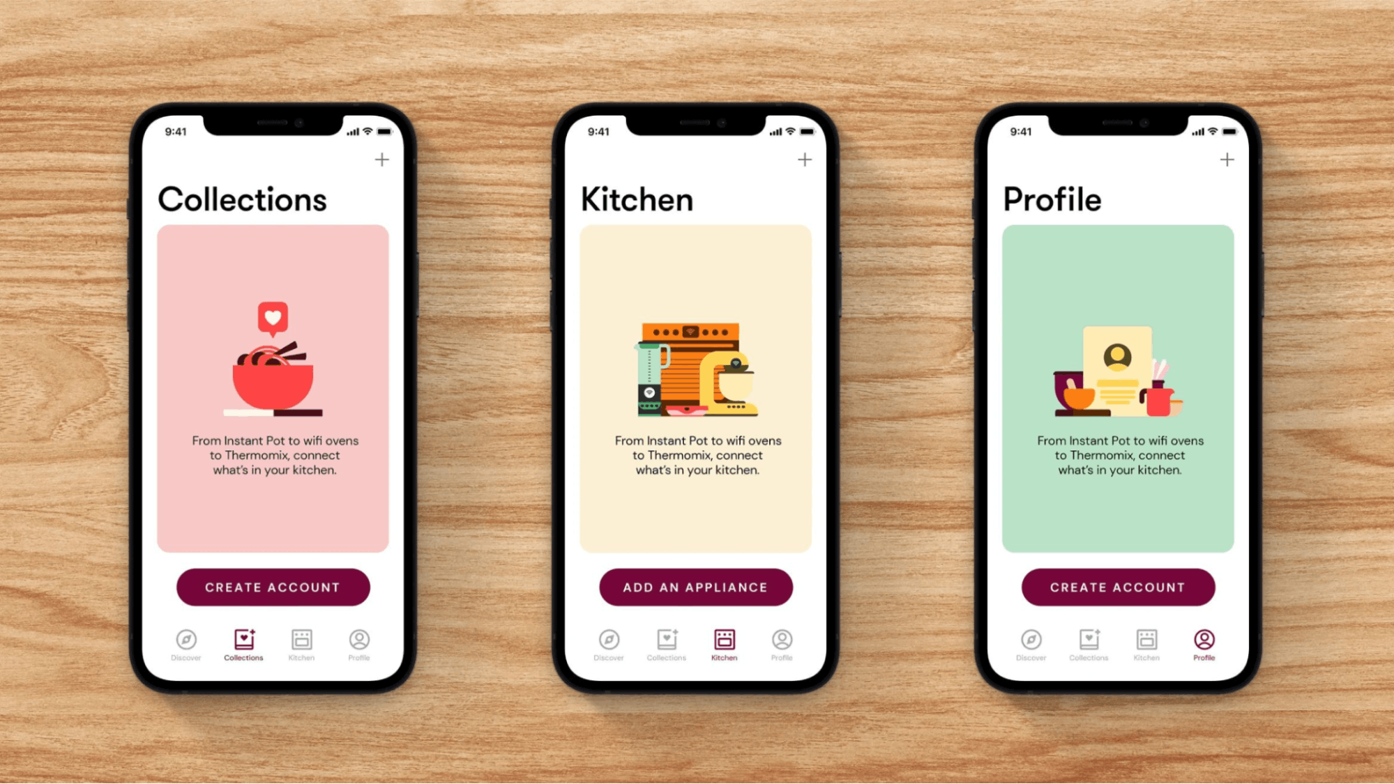
The circular elements used extensively throughout our illustrations compliment our core brand idea of connecting dots in the kitchen.
What is your major takeaway from this experience? Or, do you have any advice for brands or designers embarking on rebranding projects themselves?
Rebranding your company is not a decision that should be taken lightly as it is a long and difficult process.
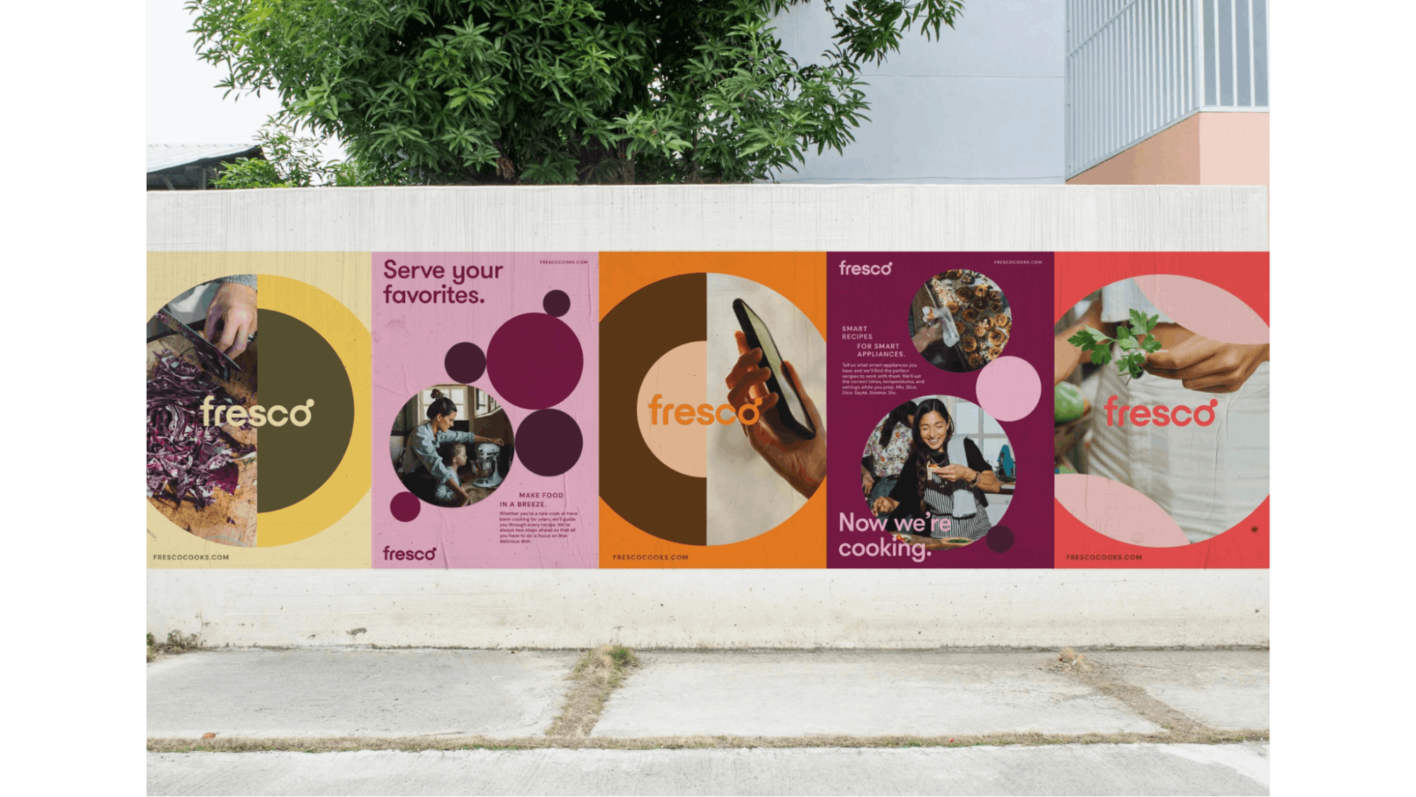
There are so many elements that need to be updated; from redoing external brand touch points (social media accounts, websites, apps etc.) to the internal systems used by every team in the company (document templates, presentation themes, wiki’s etc). There are literally hundreds of touch points that will need to be updated so make sure to allocate enough time to tackle everything ahead of the launch.
More often than not, rebrands can be unpopular with existing customers. So to avoid a backlash or bad press, your messaging around the rebrand needs to clearly articulate why you are changing your brand.
Make sure your key stakeholders and employees are involved in the project from the get-go. This is something that needs to be loved by your people and adopted early so that when you launch, they can be your biggest advocates when promoting your new brand.


