before

after

Lee Mincy, Director of Brand & Creative at Gong, discusses the evolution of the brand, rebranding to appeal to enterprises, and how their design decisions make sure Gong stands out among other tech brands.
Can you tell us more about Gong, and how its branding has evolved throughout the years?
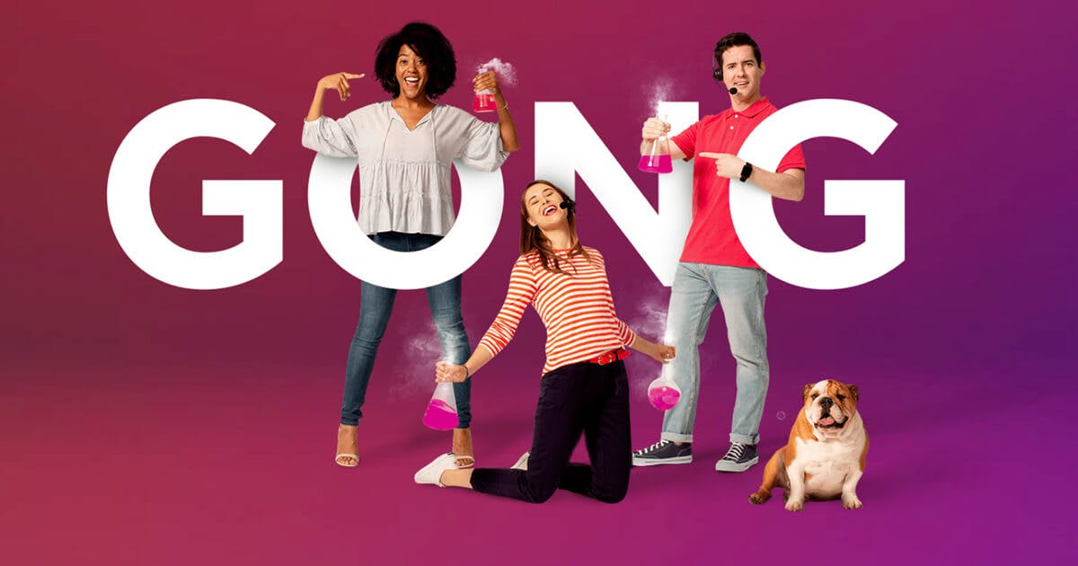
Gong started out in 2016––a young company that was seeing incredible growth. We’re about empowering people to sell. We’re all about helping individuals be the best they can be, converting salespeople into sales superstars.
Our brand messaging has always just shown people, thought bubbles, and social stuff, elements that represent collaboration and empowerment. We never really bring up our tech.
Gong's old hero banner with Bruno the company mascot
Initially, we had this simple logo that was just a stock thought bubble combined with the word Gong.
From there, it evolved slightly to proportioning the word ‘Gong’ in a more natural way in the thought bubble. This simple combination connected with people and was incredibly bold and memorable from the start. But to me, it always looked kind of contrived and lacked typographic refinement.
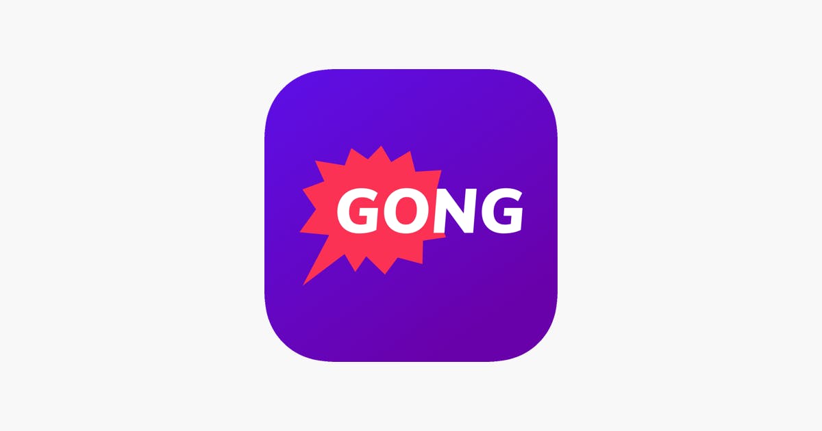
Previous Gong app icon
Backing up the logo was a visual identity system equally as bold and emotional. It featured people floating on top of a flat purple and pink gradient. We also had a mascot––Bruno the bulldog––that was featured heavily on our old site.
Humble and genuine, it just worked to connect with our audience and let them know we were there to support them.


What prompted this rebranding? How did that conversation start?
Udi Ledergor, CMO at Gong, was looking to take the next step in Gong’s maturity.
We connected immediately on a shared fascination with branding and the belief that it had to be memorable, approachable, with human-like qualities. Here was this B2B startup, born out of the technology of artificial intelligence. But in business, people don’t care about the tech as long as you solve their problem, empower them and help them achieve their full potential.
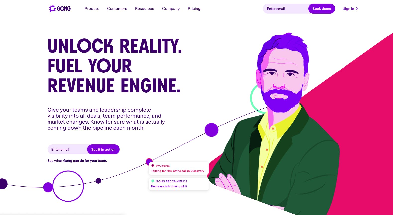
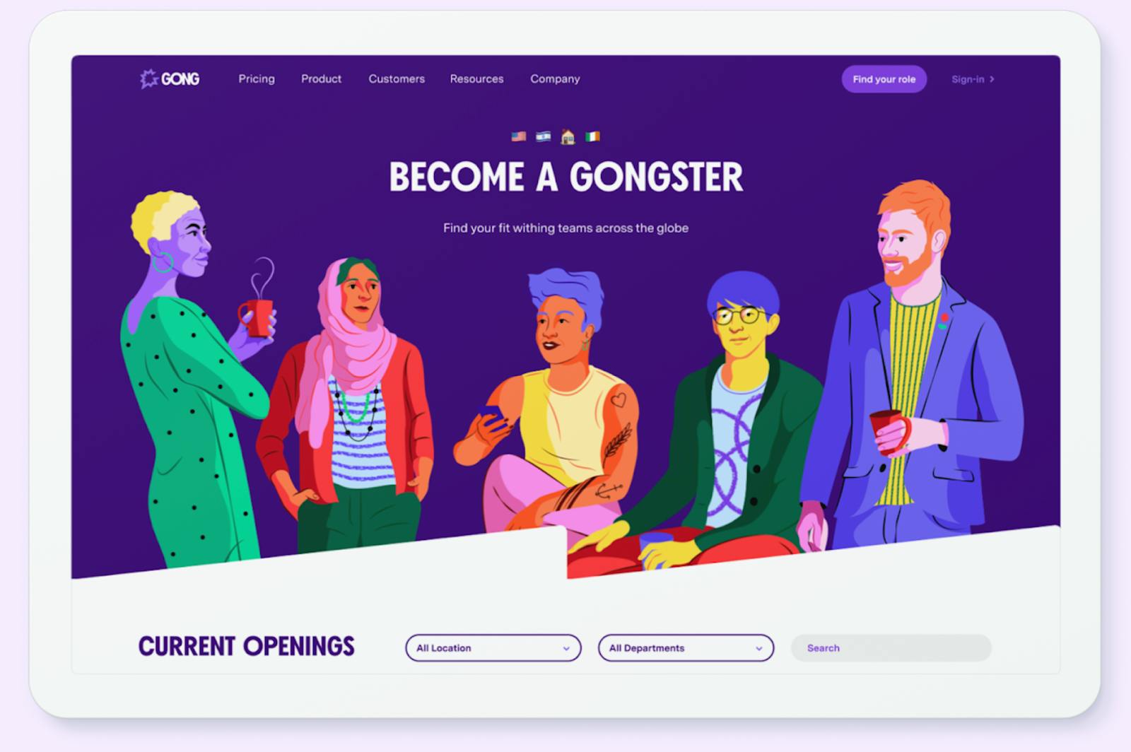
A look at Gong's new homepage
This drove our focus on people, emotional brand experiences, bold, confident identity. But Udi knew there needed to be more in order to take the next step for Gong. He hired me and we agreed the brand needed to evolve.
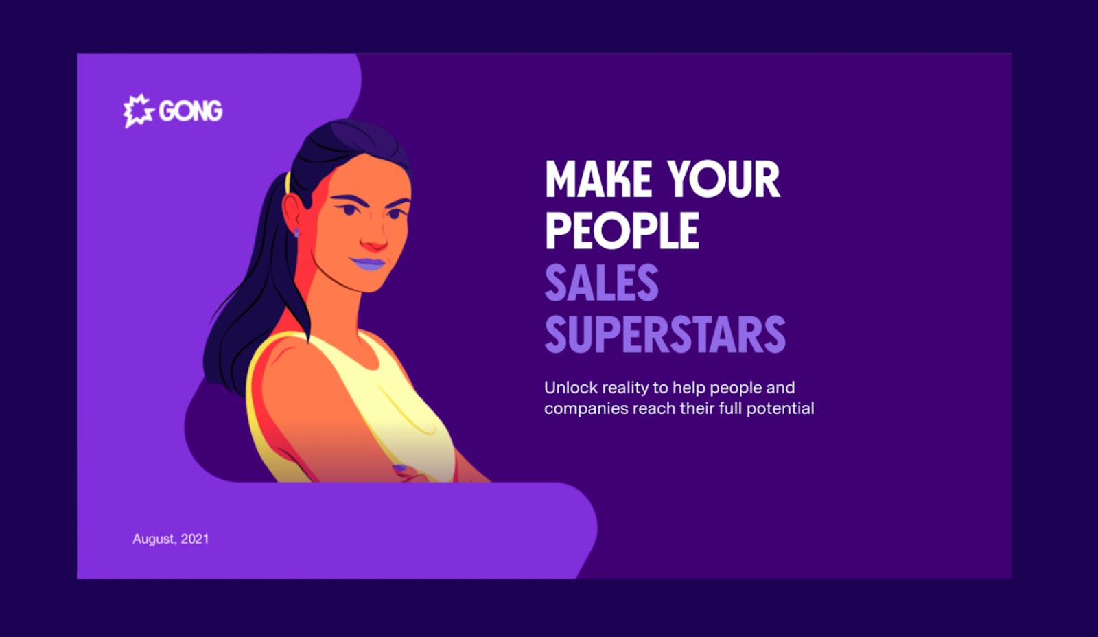
"We wanted to go after big enterprise companies, and in order to do that, we needed to evolve beyond our tech roots and mature to the part. The goal is to look like a dependable partner that’s going to be around for years and years."
Our first challenge was updating the logo to look less overt and more confident. If you look at the evolution of great brands like Zendesk or Atlassian, for example, you see how they started out with very contrived metaphors as logos. It felt like they needed everything tactical in marketing to be said, right in the logo. This is common with startups. But over time, a company may realize that less is more, that confidence is better conveyed through abstract meaning and form.
A more confident approach
I would argue that companies seeking to evolve their brands for the enterprise space evolve a logo that is timeless, elegantly designed, confident, and memorable. Craftsmanship is everything. Let tactical marketing cover off on the brand promise.
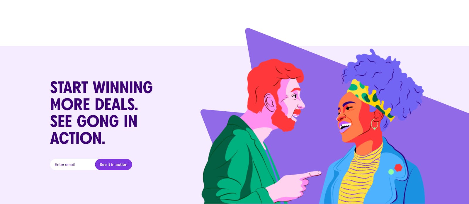
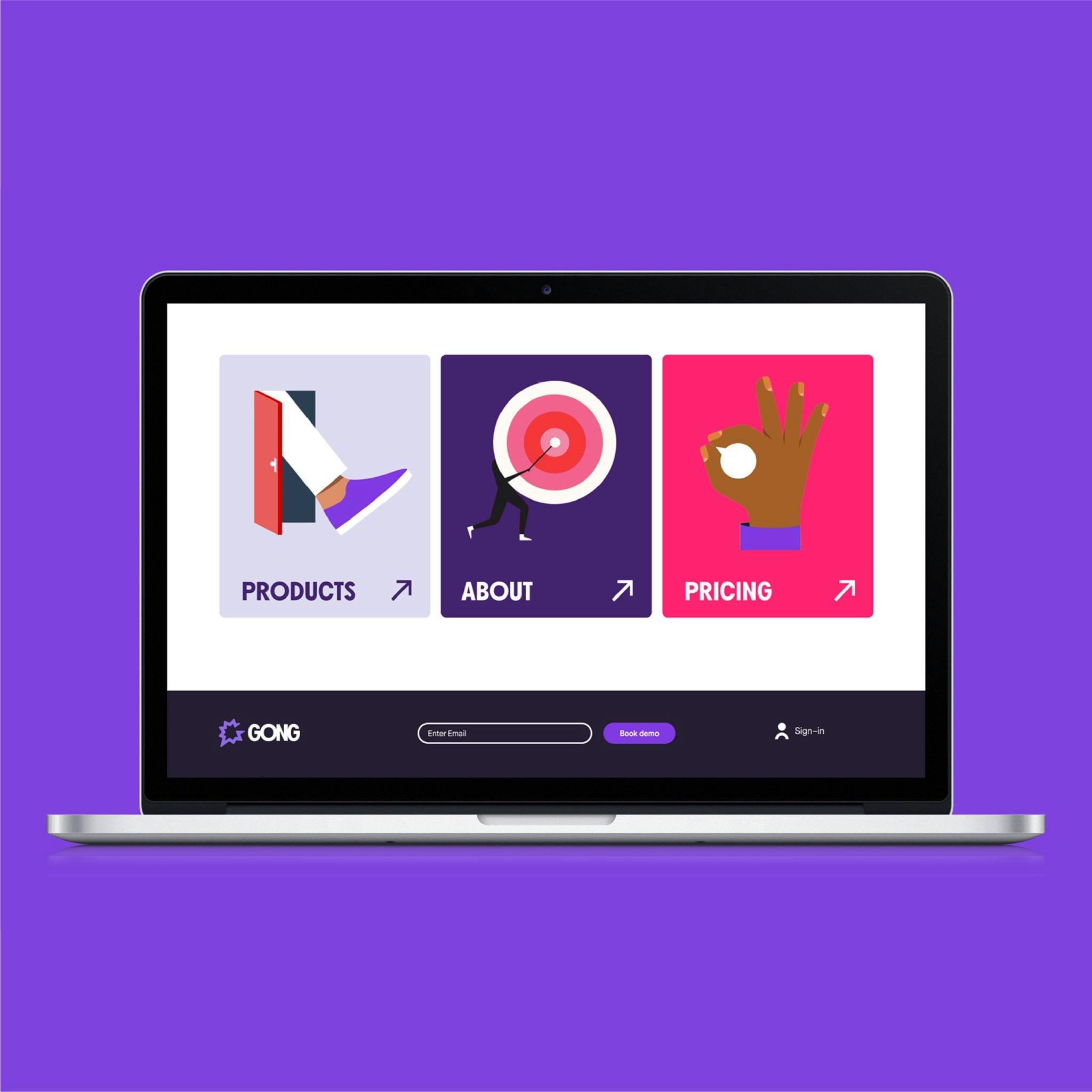
Gong's call to action
The logo need not convey such overt messaging. A confident logo doesn’t try to be cool or say anything overt. It’s just a visual metaphor that should be memorable, like a name.
Once you evolve a confident, approachable look, people will want to know more about you and they’ll likely read on.
Can you walk us through the rebranding process?
This rebranding required a lot of study, creative exercises to reveal our true values, and a long look in the mirror. An agency called Moving Brands helped us through this process of self-discovery. Together, we prioritized a list of new values that would define our future identity.
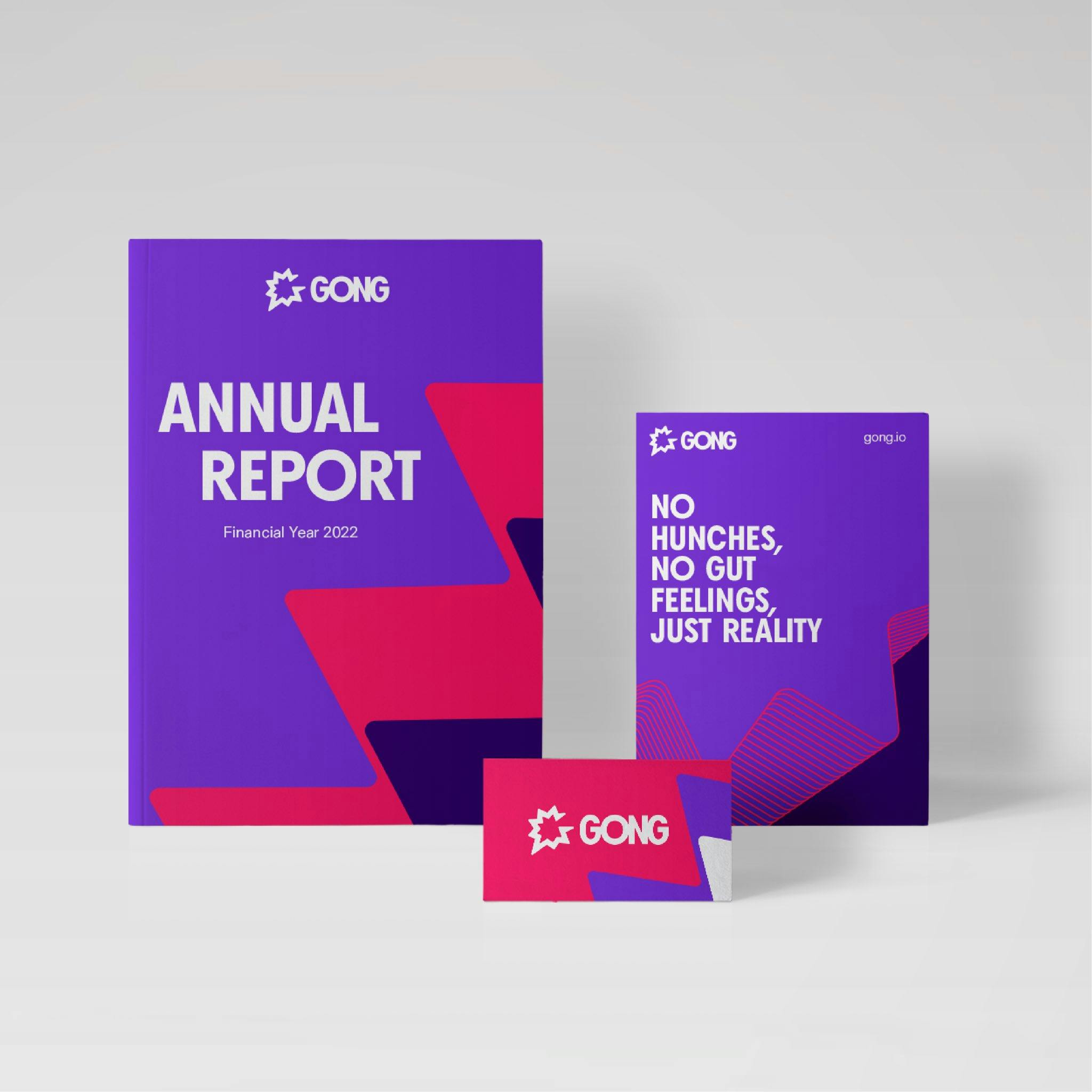
From these, we constructed a persona: a brand personality with specific traits that would ultimately drive all design elements and writing styles. Ours would remain unabashedly purple, pink, and proud.

New animated logo for Gong
To execute this bold new look, we asked Moving Brands to do initial exploration to help us find the right look-n-feel. Once a final look was selected, they would dive deep to deliver a library of visual pieces: shapes, colors, textures, icons, fonts, and compositions that our internal team could then apply to finished design pieces. In this way, we could employ the agency for their creative talents, while allowing our internal team final say in how the brand wore these new clothes.
What were the challenges you experienced during the rebranding process?
One of the things I focused on was getting the agency to really understand us, our product, and our customers.
"We didn’t just want a designer assigned to the job. We needed a team that understands our business, our founding mission, the customers we supported, and the competitive space."
Finding a top agency is one thing. Spending the time to teach their teams about your business in another.
All too often I see companies who just sign a contract and walk away, confident the agency will deliver something unique. But this approach always results in superficial ideas and expected creative solutions. It’s crucial that a brand leader spend the time with agency teams, explaining the true nature of the business and sharing past efforts at writing and design.
Gong design elements by Moving Brands
Another challenge is the almost unavoidable politics of rebranding. Internally, there are many opinionated people who may not like the design decisions we make. So we’ve had to socialize the creative journey every step of the way.
You have a core brand team, and you make the decisions with that core team, but you socialize these decisions with a larger team so that people become a part of the journey. A few years back when I was finishing up the branding of another well-known tech company, we were filming a retrospective on the process. I asked a founder what he thought of this exciting new brand and, on camera, he admitted never really seeing the logic of it.
Can you tell us more about choosing the color purple for your brand?
Purple is an emotional color that is slightly different and we're not afraid to say so. It’s bold, and social, and out there. It’s opinionated. And combine with pink, you’ve got an even more bold, extroverted personality that looks anything but tech.
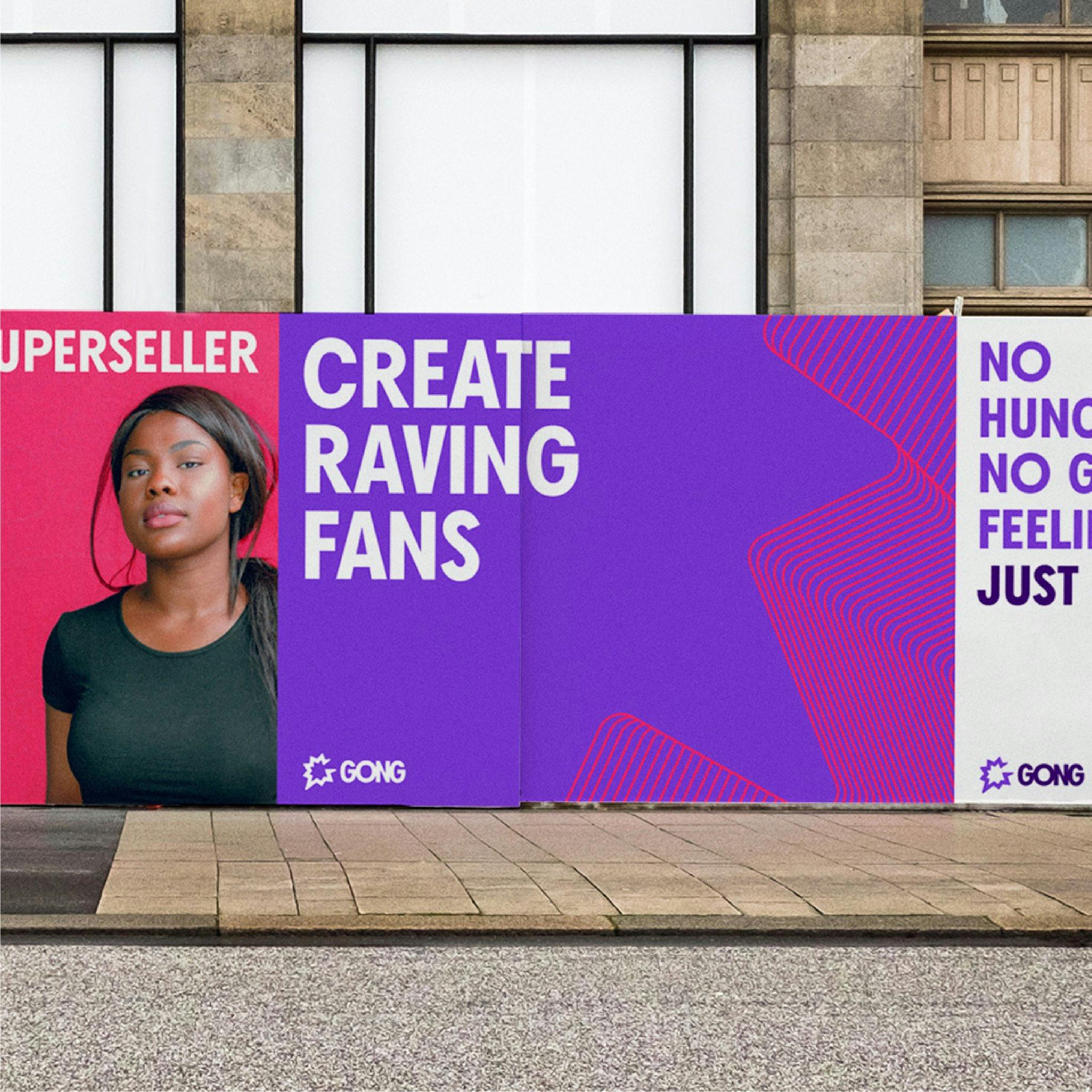
Gong’s new brand identity hits the streets
To me these colors are grounded in ambition, energy, creativity and the qualities of being social and expressive. That’s really what it’s about.
What’s the story behind your new updated mark?
We did a lot of exploration around the current thought bubble with the type in it, and it was felt that the logotype need not be forced into the bubble to be memorable. Rather, it was the abstractness of the burst mark that we found energetic and social.
Next, how to combine this mark with a typeface? Often in tech you see a colorful, beautifully designed mark that is balanced with a clean, modern, understated sans type. This allows the mark to dominate visually. What we preferred was an abstract monochrome burst as our mark, combined with an expressive block type that is equally as bold. Each letter in our final logotype is tightly tracked together suggesting the gregariousness of people.
Gong showing off its new extroverted personality
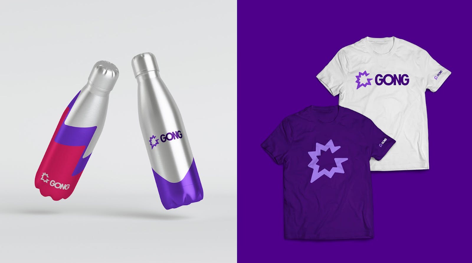
Gong SWAG
The mark itself is fairly simple, although there’s a lot working behind the scenes, like the subliminal ‘G’ for Gong and the many points of the mark that suggest conversation. But all of these points reflect being social and connecting people to us. It’s a simpler version of the burst that allows for this strong typeface, BN Axel, next to it.
"Our new mark is gregarious, it’s social."
Some designers suggest the mark and type together are too busy. I disagree and think we’ve achieved the right balance: it’s a distinctive mark that stands out amongst the crowd.
Can you tell us more about the illustrations on Gong? How did they come about?
The old brand leaned too much on Bruno as company mascot, plus a limited library of people photos. These elements connected well with customers in the beginning. But to really scale marketing efforts and look more like an enterprise company, we needed an extensive new library of brand consistent elements for designers to draw from.
Gong illustrations from Estudio Santa Rita
Of course we hated using stock photography. But the brand needed to show our customers as unique individuals who come from all corners of the globe and lead exciting lives. Stock can achieve this and is easily sourced. But then you look like every other company on the internet. We needed an ownable style to celebrate people: colorful illustration was the obvious answer.
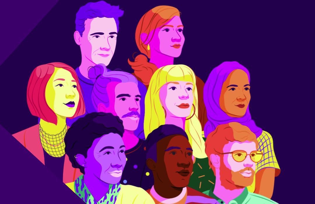
Celebrating people one illustration at a time
After researching countless artistic styles, we discovered one from a team in Spain that celebrated diversity, emotion, ambition and all of the values we believed in. They do all of our illustrations now and serve to humanize our brand experience wherever customers find it.
Do you have any advice for companies, teams, or designers who will work on rebranding projects?
Find professionals––the best brand strategists, designers, and writers you can afford.
Educate them like crazy on your brand, your customer, their pain-points, and how your product solves a problem. Share customers stories so the agency can live the customer experience and start to become believers. Select a small core team of internal marketers who can make the tough decisions, but socialize progress as it happens.
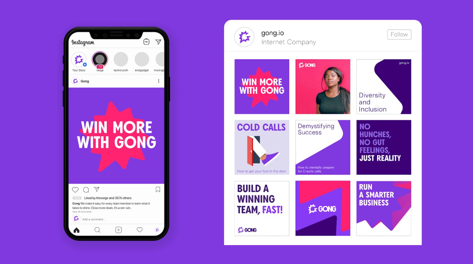
Gong on social media
Use the agency for what they’re good at—thinking creatively and designing great ideas. Choose those ideas you love best. Then let your internal team decide how to implement the new system.