before
after
Ruben Casteleyn, Marketing and Communications Director at Knokke-Heist, and Fre Fonteyne, Creative Director at Skinn Branding Agency, talk about the successful way they’ve rebranded the beautify city of Knokke-Heist into one that shows its diversity and quality.
Can you introduce us to Knokke-Heist?
Ruben Castelyn: We are an upscale seaside resort that draws comparison to the likes of the Hamptons in the US or Sylt in Germany.
While some may have preconceived notions of Knokke-Heist as being a bit snobbish or overly high-end, the reality is that we are much more than that. Our community boasts a population of 35,000, which includes plenty of full-time residents, second-home owners, and a thriving tourist population who both visit and work here.
Knokke-Heist hero image
Fre Fonteyne: Knokke-Heist can be compared to New York City with its five boroughs, but with an added touch of elegance. Each borough or zone in our city has its own unique identity, strengths, and advantages.
Despite their differences, when you bring them together, they form one cohesive city: Knokke-Heist. This was precisely the goal of our recent rebranding efforts. We aimed to connect each of these distinct areas without compromising their individual identities.

How did the rebranding come about? How did that conversation start?
Ruben: One of the main challenges we faced was finding a way to balance the goals of both locals and tourists under one brand. That was precisely the issue we aimed to address with our new branding efforts.
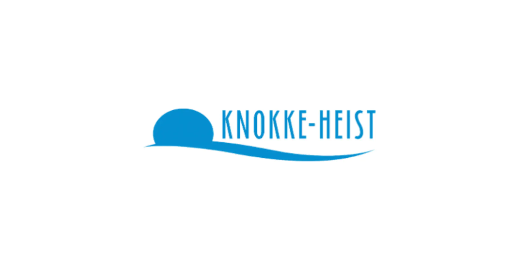
Our logo had remained unchanged since the 1980s, and while it was eventually updated with a more contemporary font and style in the early 2000s, we recognized the need for a more comprehensive overhaul.
"Historically, our focus had been on promoting the most upscale area of Knokke-Heist, which is well-known for its wealthy residents, but we realized that we needed a more inclusive approach to better reflect the diverse goals and interests of both locals and tourists."
The reality is that visitors to each of the different areas of Knokke-Heist would have very different experiences, leading to a mismatch between the experience we promised and the experience we delivered.
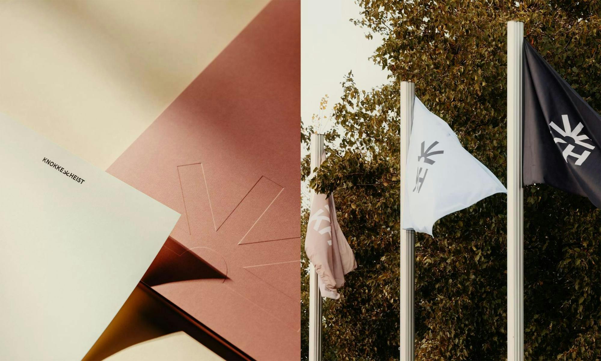
Knokke-Heist on stationery and flags
This disparity had even caused some frustration among the local community. Although it wasn't a widespread issue, we recognized the importance of addressing it as quickly as possible. This was one of the primary motivations for our rebranding efforts.
Our focus was not solely on creating a new logo, tagline, or style, but rather on finding a new challenging position that would better reflect the diversity of experiences available in Knokke-Heist.
Talk us through the rebranding process. Was it smooth or did you encounter challenges?
Fre: Historically, each service within the city had its own distinct identity or the freedom to create one. The main challenge we faced during the rebranding process was finding a way to create a cohesive brand that every service within the city could adopt, and that would effectively represent Knokke-Heist as a whole.
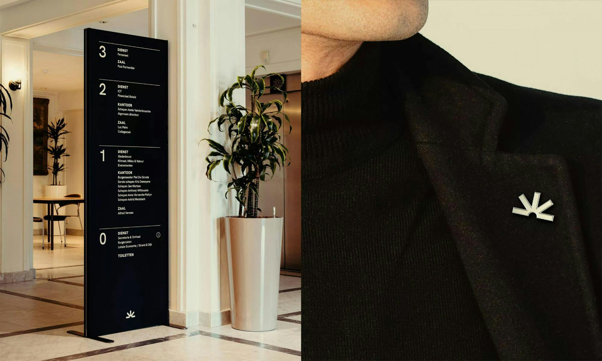
Knokke-Heist branding on pins and posters
Ruben: One of the most important steps we took was to ensure that everyone had a voice and felt heard. We wanted to make sure that the sensibilities of each of the different zones and boroughs were taken into account.
"Once it became clear that the new branding efforts would allow each area to maintain its distinct identity while still being united under a single unifying artwork, we received positive feedback from all stakeholders."
Fre: It was essential to ensure that the change was not just superficial, but that it represented a cultural fit for the brand. And a challenge for both the city itself as the audience it serves. Ultimately, it was crucial to change people's mentality and encourage them to embrace the new brand in order to achieve a successful outcome.
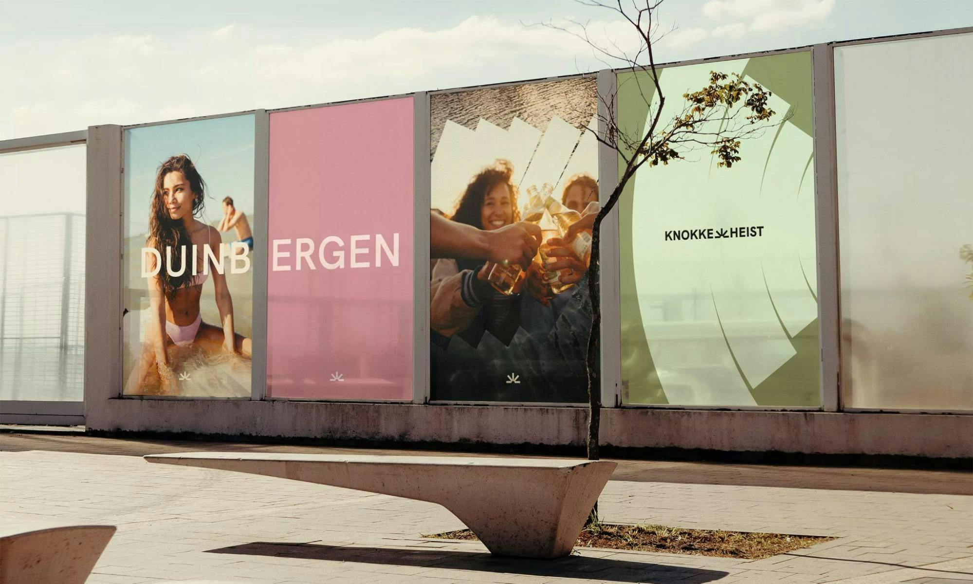
Knokke-Heist billboards
Ruben: We made a concerted effort to involve everyone in the process to ensure that they felt ownership over the new brand. We held a pre-launch event a month before the official launch, which generated significant buzz among the local community.
How would you advise other companies so that their rebranding would be as successful as yours?
Ruben: The success of our rebranding effort can largely be attributed to the fact that Knokke-Heist is a highly respected and beloved brand. Our community takes great pride in the city and often boasts about owning second homes or simply residing in the area. This strong word-of-mouth buzz is highly effective in generating excitement around news and events.
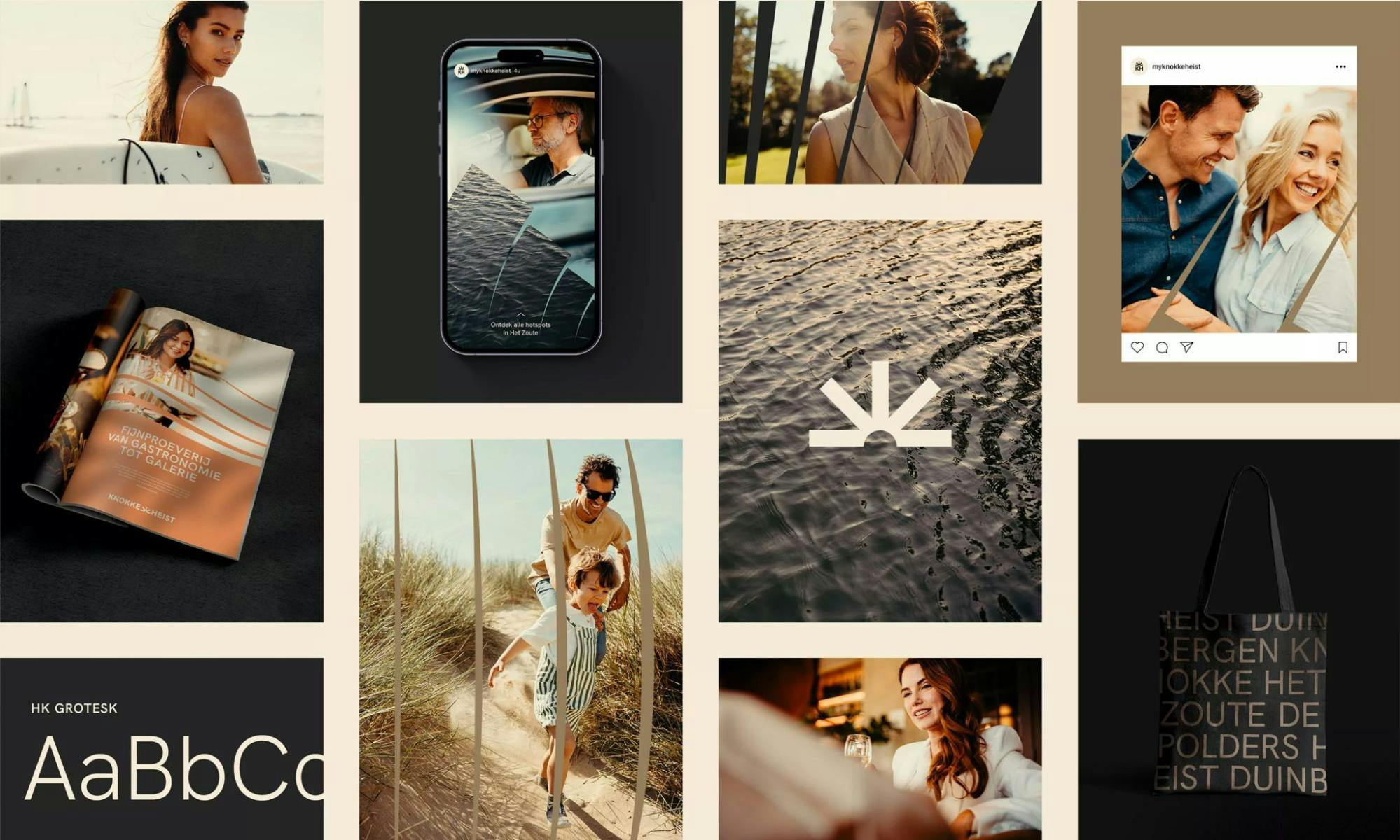
Knokke-Heist brand collage
Fre: The foundation of any successful rebranding effort lies in understanding the needs of your clients. We began by conducting interviews with various stakeholders: residents, second-home owners, tourists, and workers. By taking the time to listen to each group, we were able to gain valuable insights that informed the entire rebranding process.
It was crucial to ensure that the needs of all four stakeholders were taken into account throughout the process, and this approach was key to our success in reaching our ultimate goal.
A big change was to the logo. Can you tell us how it was conceptualized?
Ruben: Unlike many branding exercises that are solely focused on creating a new logo, our primary goal for the rebranding of Knokke-Heist was not centered on the logo. In fact, we approached the process from a different angle. Even if the logo had remained unchanged or simply undergone a color change, we would have been satisfied, as our focus was on developing a comprehensive and cohesive brand position.
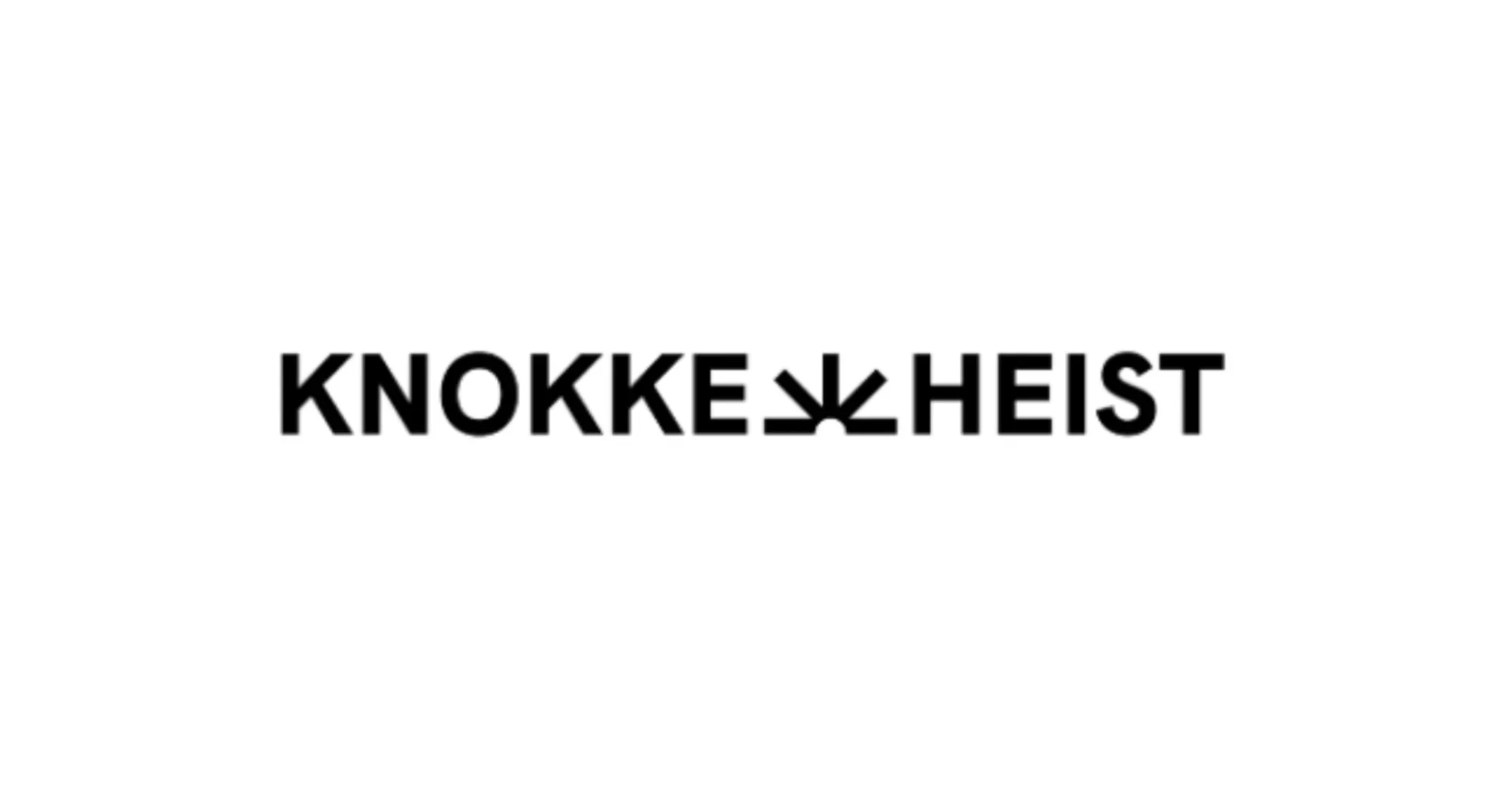
Knokke-Heist logo
Fre: We had the opportunity to challenge Knokke-Heist's brand identity, and through our exploration of the city's values of quality, diversity, and innovation, we found inspiration for the concept behind the brand. Starting from a core idea that permeates every aspect of the brand, we sought to capture the diversity and quality inherent in each of the city's five boroughs.
"Our logo, The Waver, symbolizes the connection between the five boroughs, fusing them into a single brand and community. By showcasing the diversity of each area while highlighting their interconnectedness, we aimed to tell a cohesive and compelling story about the city and its possibilities for both residents and visitors."
Photos and videos are a major part of your visual identity. Can you tell us more about the direction you went with?
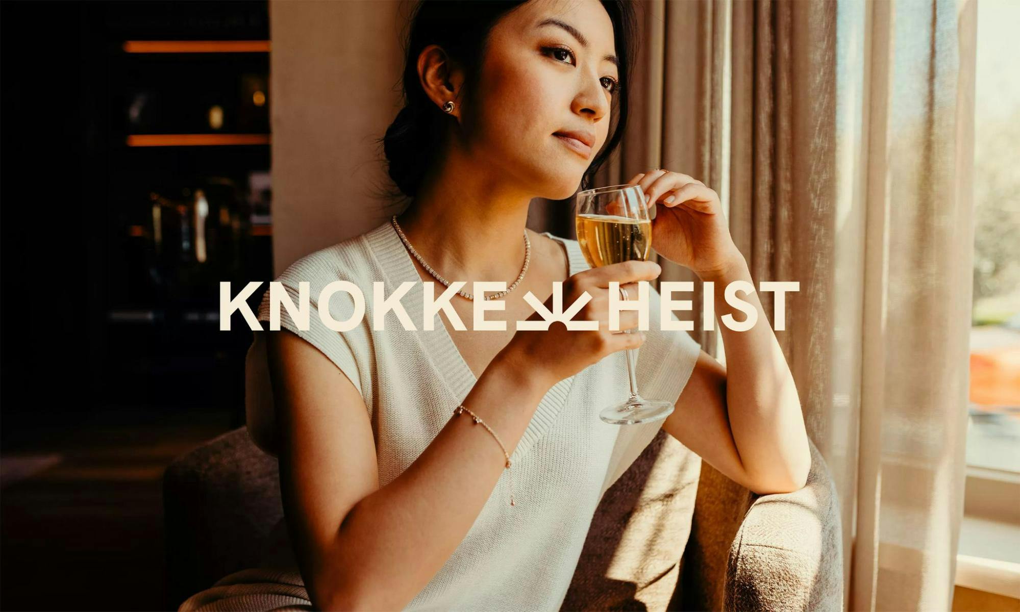
Ruben: While Knokke-Heist may not be a historical town, our city boasts a high quality of life and picturesque areas, even if they are only around 100 years old. To showcase the city, we chose to emphasize the people and stunning photography.
Regarding tourism, we focus on four primary themes: art (with almost 100 art galleries in a 2 square mile radius), gastronomy (including numerous Michelin-starred restaurants), nature (featuring beautiful beaches and one of the largest nature parks in Belgium), and shopping experiences.
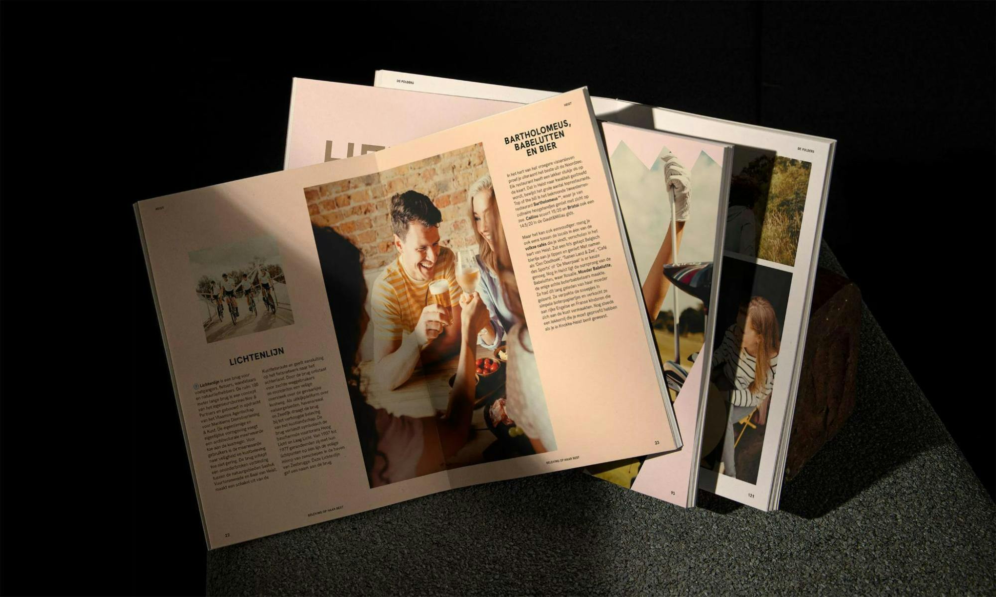
Knokke-Heist guide
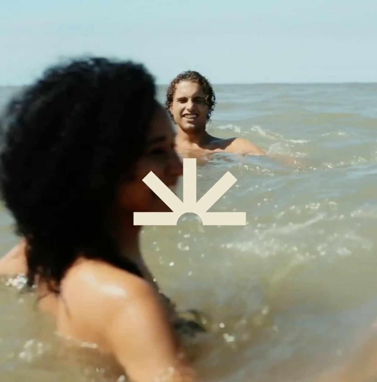
Fre: Rather than focusing solely on promoting the city itself, we took a different approach and sought to connect with the local community through more humanistic photography. By capturing images that felt more personal and relatable, we were able to establish a warmer and more intimate connection with both residents and visitors.
Through this new approach, our photography became more powerful and effective in conveying the unique character and charm of Knokke-Heist.
Can you tell us more about your color palette? How did you land on these colors?
Fre: To embody the concepts of diversity and quality, we didn't limit ourselves to one or two specific colors. Instead, we sought to incorporate a range of colors that would reflect the diversity of the city itself. By starting with a strategic approach, we were able to translate our vision into a multi-colored design that resonates with the community.

Knokke-Heist photography
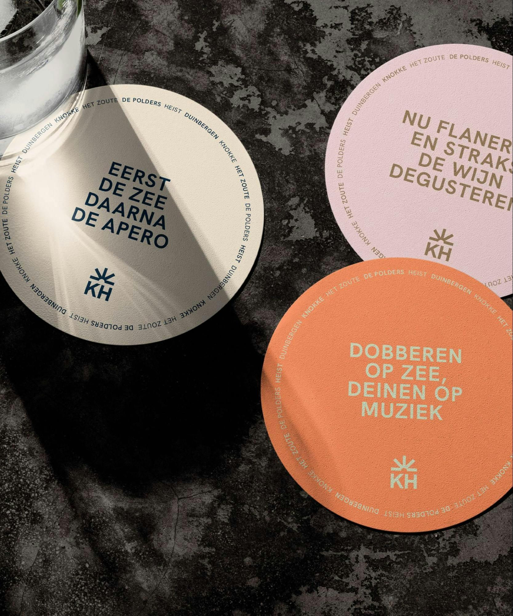
Each borough of Knokke-Heist has its own unique color palette, with distinct hues and tones that reflect the character of that specific area. For example, the nature park is associated with a specific shade of green, while certain squares in the city feature a unique pink color.
Every color we used was inspired by an actual location or element within the city, with red hues drawn from rooftops and blue tones taken from the sea. The sand color, which is prominently featured throughout the brand, was drawn from Knokke-Heist's coastal location.
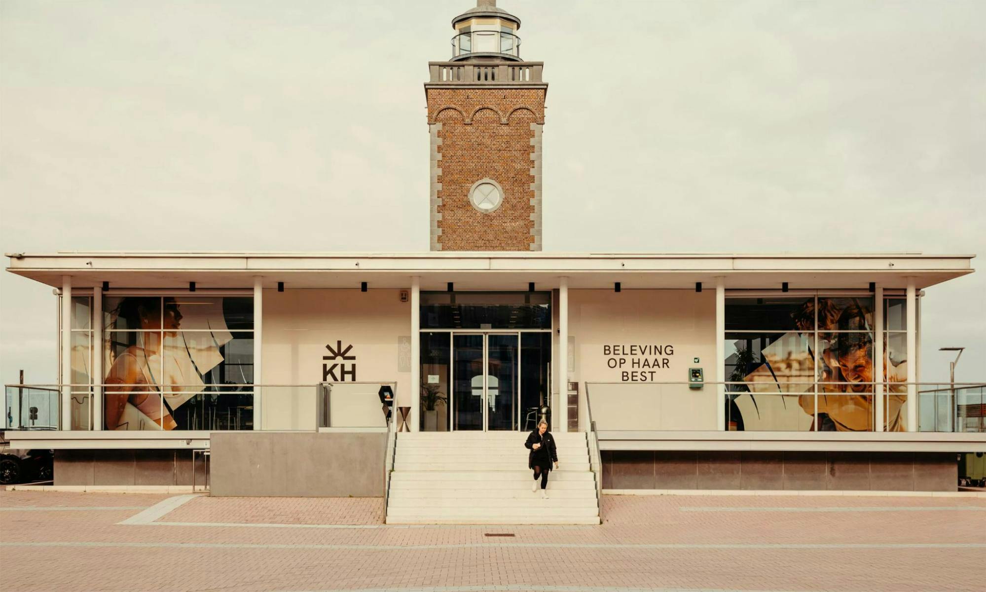
Knokke-Heist branding on establishments
Ruben: With almost 2,000 community-organized events taking place each year, we recognized the need for a broad color palette to effectively communicate the diverse range of messages associated with our brand. We sought to incorporate a wide array of colors that would allow us to work with the branding over an extended period of time.
The last thing we wanted was to discover that we had exhausted our design options or color choices after only a few months, leaving us unable to effectively visualize the broad range of activities, diversity, and messages associated with the Knokke-Heist brand.
How did you choose which fonts to use?
Fre: As we had over 3,000 people who would be working with the fonts, we chose to work with Google fonts. This choice allowed us to ensure that the brand's font was both practical and accessible across all platforms and tools, without sacrificing the quality or integrity of the brand.
While some may argue that using Google fonts could undermine the brand's image, we believe that it was the best choice for our client. By providing a universally recognized and easy-to-use font, we were able to give our client the independence and flexibility they needed to work with the brand across various tools and platforms.
Knokke-Heist font
Using Google fonts also allowed us to avoid the complexities of purchasing licenses for over 3,000 employees. However, we were careful in our selection process and chose a font that would align with the brand's DNA.
What is your major takeaway from this experience?
Ruben: I'm proud to say that the Knokke-Heist community has fully embraced our rebranding efforts, which were designed to be implemented top-down and supported by entrepreneurs and residents alike.
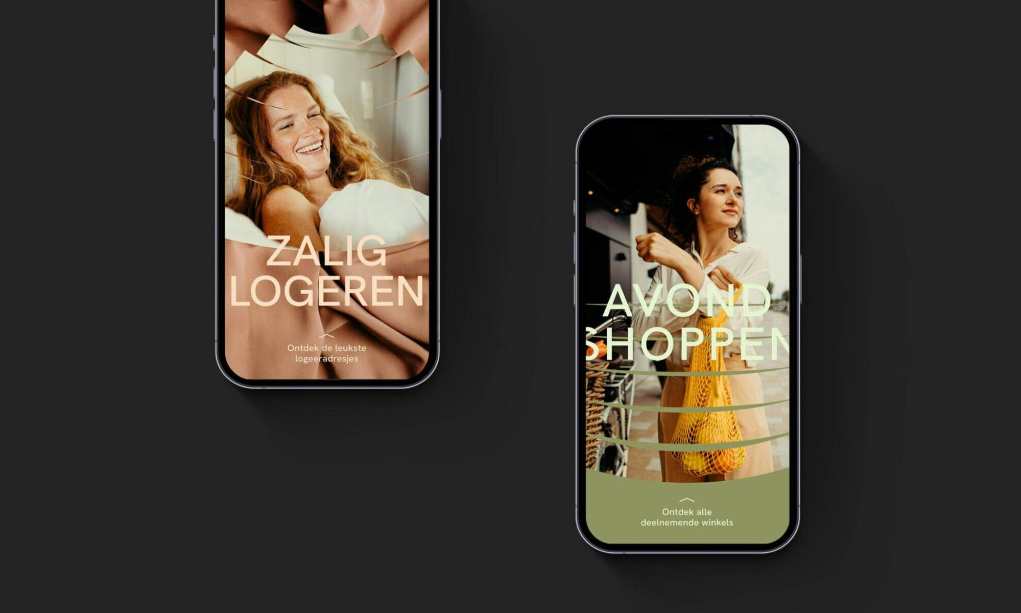
Knokke-Heist on mobile
The overwhelmingly positive response has been a point of pride for us, as the new branding offers a wide range of possibilities without becoming monotonous or boring, and is user-friendly for those who work with it on a daily basis. The community's enthusiastic support has been a major factor in the success of our rebranding effort.
Fre: I'm thrilled that we were able to take on the challenge of creating a brand for Knokke-Heist that defies convention and sets a new standard within our country. It's rare for cities to take on such a large-scale branding challenge, and I'm proud of our team for delivering exceptional results that truly reflect the city's DNA.
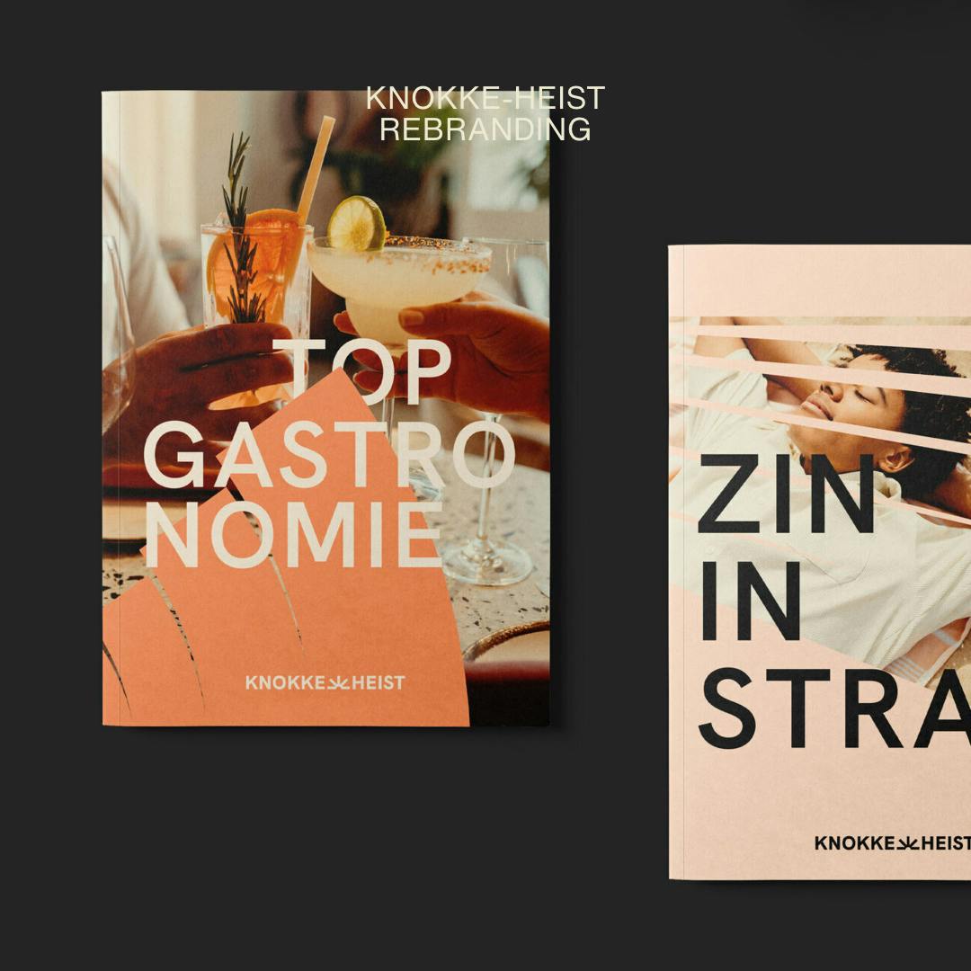
Knokke-Heist books featuring the new brand
Our success is a testament to the hard work of our team and the partners we worked with, and I am personally proud of the opportunity we had to create something truly extraordinary. Despite the challenges we faced, the end result was well worth the effort.

