


Logan Treadaway is a Communication Manager at Mama Foundation for the Arts, whose mission is to make a joyful noise, to uplift the Black musical treasures of Gospel, jazz and R&B, and to heal and inspire through the power of collective music-making.
Tell us about the Mama Foundation for the Arts.
Vy Higginsen's name has been associated with gospel, jazz, and R&B music for years. As one of New York City's premiere radio disc jockeys, she has built a solid reputation for identifying good music and developing a sound that resonates with music lovers. This knack led her and her producing partner, Ken Wydro, to create the legendary musical, Mama I Want to Sing in 1983.
Mama was an international hit and is one of the longest-running musicals in the history of American theater. Many consider the success of Mama to be the start of Mama Foundation. However, it wasn't until Vy's own daughter's school cut arts programming from the curriculum that she decided to make a change.
Inspired by world tours of Mama I Want to Sing in Europe, the Caribbean, Japan, and the United States, where the music liberated children on the margins, Vy created Mama Foundation for the Arts to help re-establish Harlem as an artistic and cultural centerpiece of the world. Mama Foundation is a Harlem cultural organization with a two-decade history of amplifying African American arts and inspiring generations of musical leaders.
Blending tradition and innovation, uniting family and community, and always fueled by music and joy, Mama Foundation has carved out a singular and invaluable programmatic identity. From long-running original musical productions with international audiences to performing live on the Grammy Awards with SZA, to being the only Harlem organization to provide completely free musical training to young people, Mama Foundation is poised for growth for generations to come.
You rebranded in 2021. Can you tell us what prompted that decision? How did that conversation start?
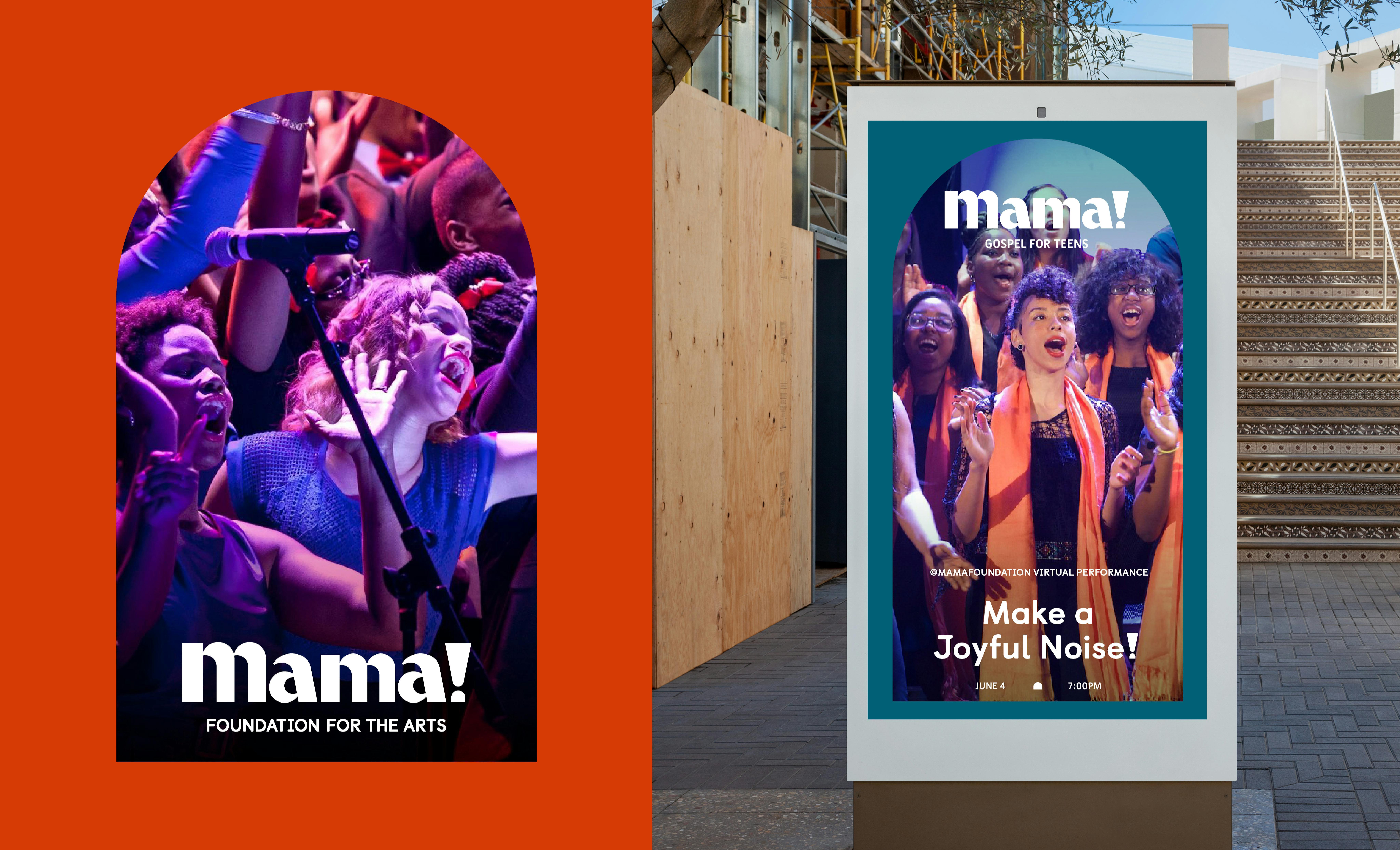
Our previous brand identities have focused on our Harlem roots, using our signature Brownstone as the backdrop for much of our brand identity. The rebrand of the Mama Foundation began with the generous support of the Upper Manhattan Empowerment Zone.
In fall 2020, Mama Foundation developed a comprehensive three-year strategic plan which included a rebranding of the Foundation. After engaging in a robust discovery process, Mama Foundation was found by ThoughtMatter. ThoughtMatter began by having conversations with all stakeholders here at the foundation, speaking with everyone from vocalists who have been a part of the organization for years, to instructors, and even Vy and her daughter, our Artistic Director Ahmaya Knoelle Higginson.
We’d love to hear more about the rebranding process. Where did you begin? Did you encounter any challenges that stood out for you?
The ThoughtMatter team began by listening to stories and experiencing our performances through Zoom in order to paint a clearer picture of what we at the foundation were looking for. Through these workshops we were able to reveal the importance of open, uplifted arms in gospel music.
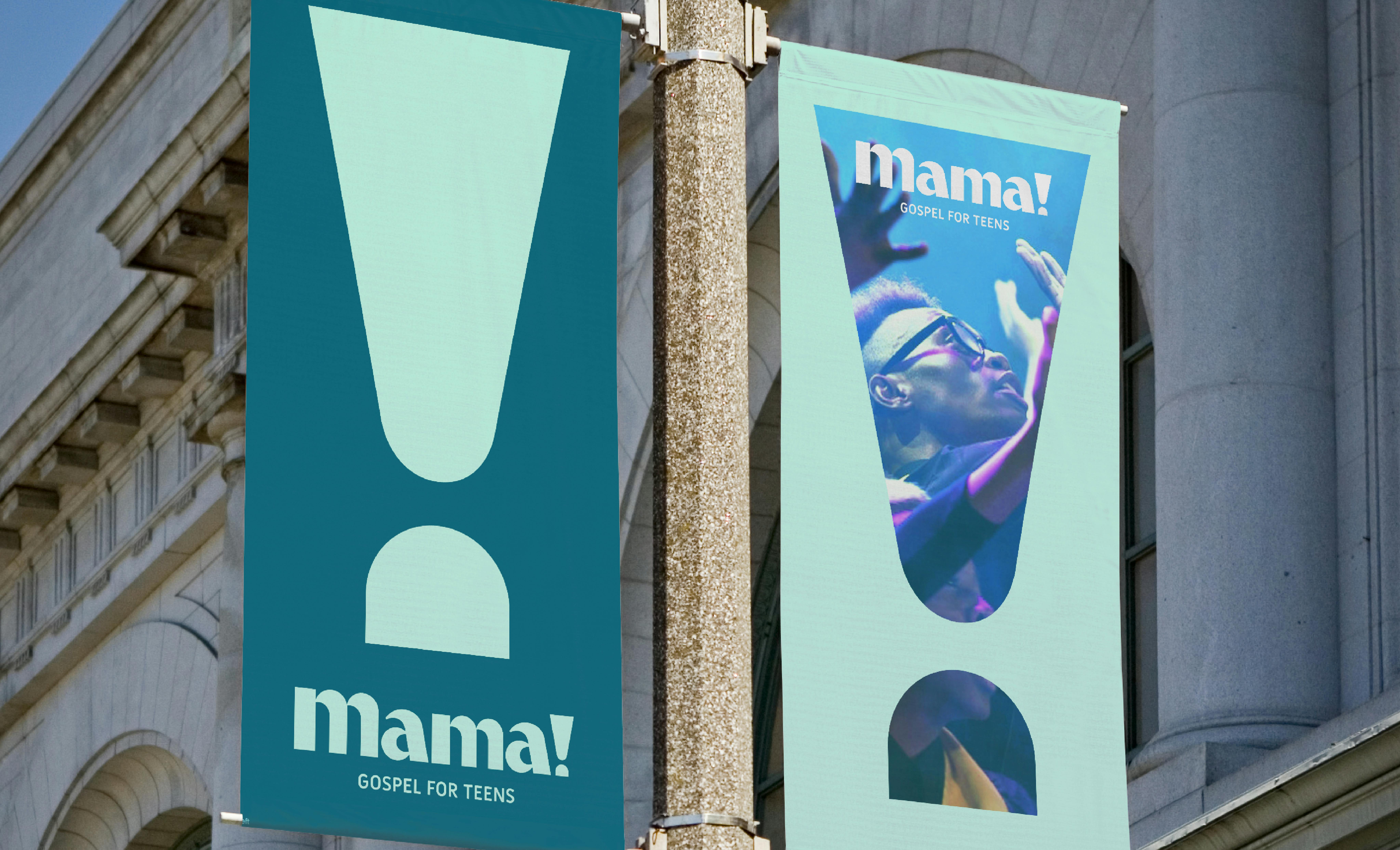
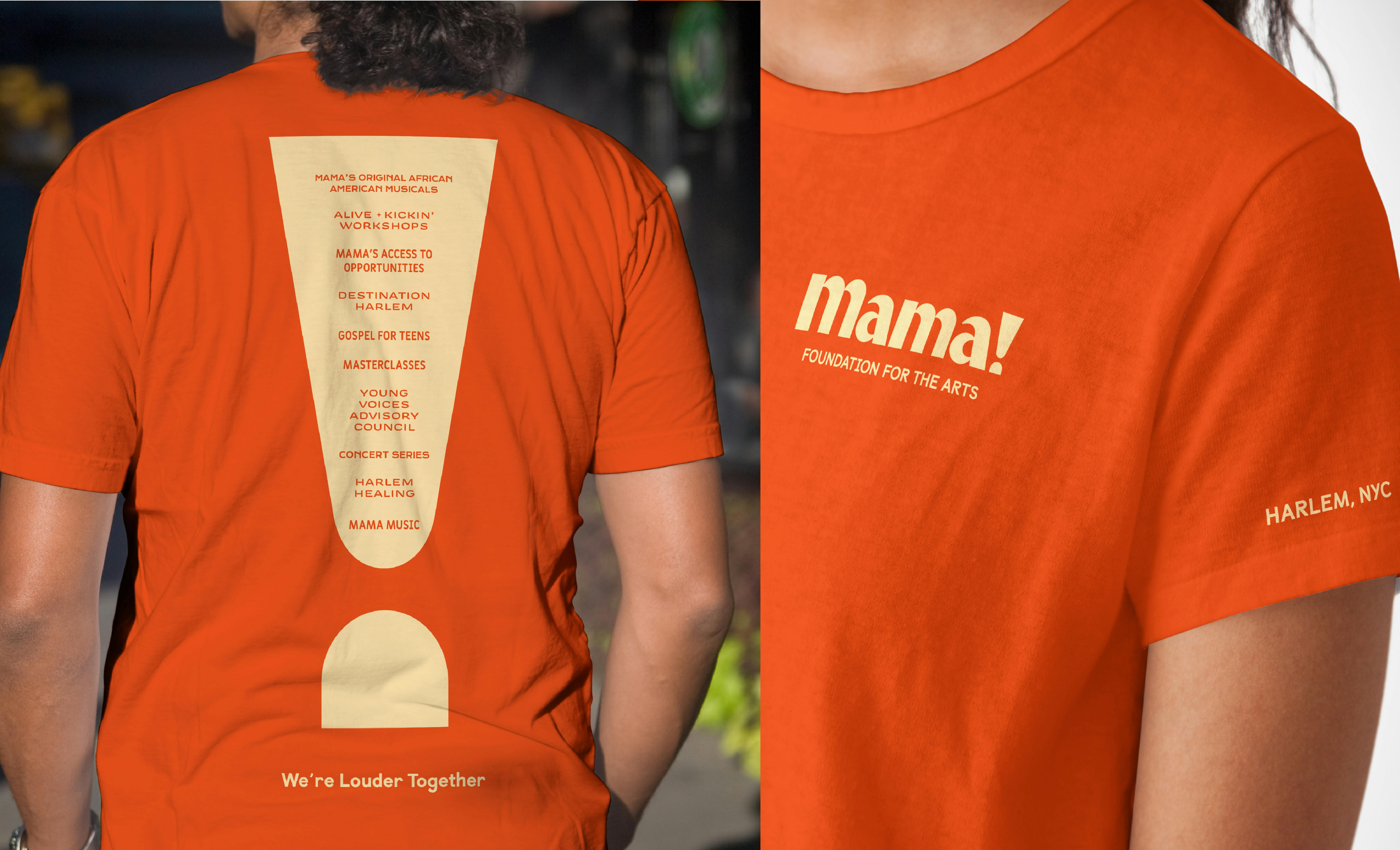
Bringing these insights to their designs, ThoughtMatter mirrored this visual representation of joy, the act of projecting one’s whole self and one’s voice, by using an exclamation point.
The symbol became an anchor for the new brand; an expression that seeks to command attention and acts as the visual manifestation of our promise to be seen and heard. Our only challenge was settling on a look that fit the Mama Foundation best. ThoughtMatter did an amazing job with every design, and the most difficult aspect was choosing which screamed “MAMA!” the most.
A big change was to your logo. Can you tell us how your new logo was conceptualized and what it says about your brand?
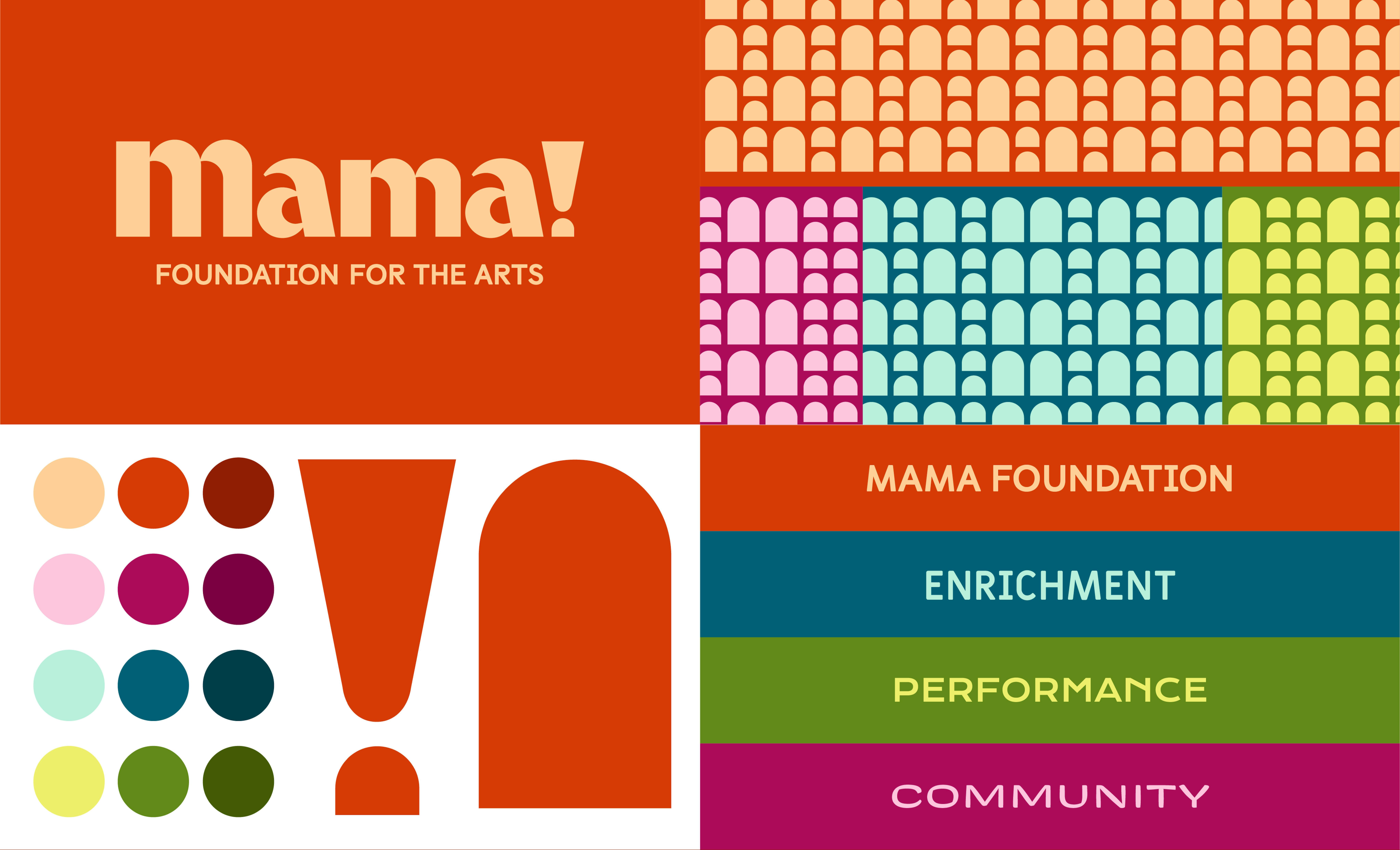
For our primary logo, we wanted something that reflects the history of the foundation and the spirit of gospel. The letterforms are drawn from arched windows and the archway of a stage. The logo is punctuated with an exclamation point, uplifting like arms in praise. The exclamation point is bold, uplifting and indicates a high volume. It is the visual manifestation of our promise to be heard.

You make use of bold colors in your new visual identity. How did you land on which colors to use?
For our colors, we wanted to establish colors that could represent the Mama Foundation and its core pillars. The brand is composed of four main colors: amber, fuchsia, teal, and lime. Each color has a light and dark accent as well, and each color is representative of a pillar: parent brand (amber), community (fuchsia), enrichment (teal), and performance (lime). These colors were selected by analyzing the essence of what each pillar meant to the Foundation and colors that represent the feelings we want to evoke for each pillar.
A prominent design element you use is the arched window. How did you decide on this, and what does it signify for your brand?
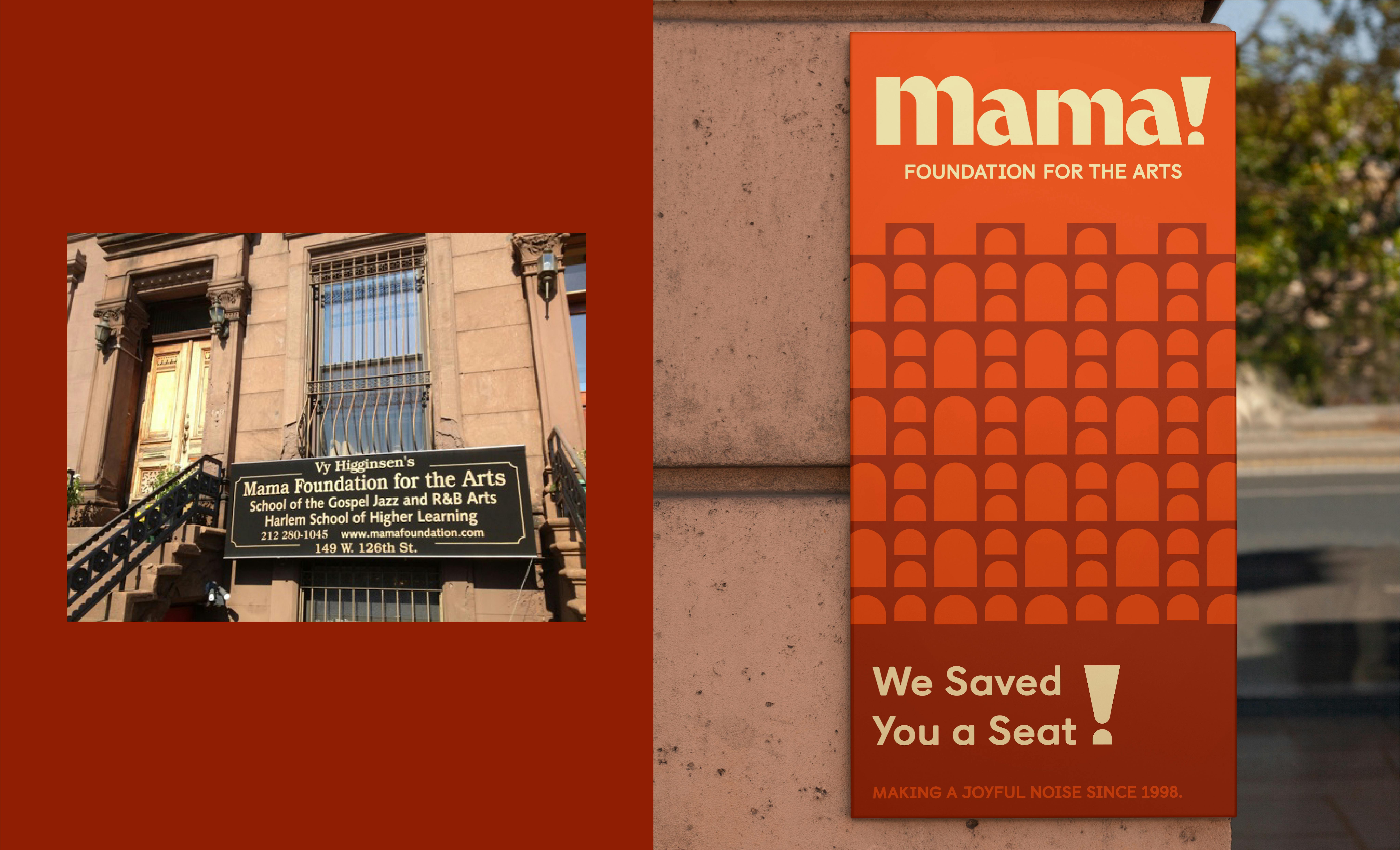
The arched windows honor the Mama I Want To Sing legacy and are a symbol of access to history, to the world of gospel, and to the foundation.
Lastly, looking back at the experience, what would you say is your main takeaway? Or perhaps advice for designers who may be undertaking rebranding projects themselves?
Our advice to any designers looking to undertake rebranding projects: know your organization! Having a thorough understanding of your organizational history, what you stand for, and what you want for the future is the key to creating a brand that reflects your business perfectly.
On top of that, our takeaway is that ThoughtMatter is an amazing company to work alongside in order to create a brand that fits like a glove. We can’t thank them enough for their hard work and dedication to Mama’s mission!
All assets courtesy of ThoughtMatter.

