


Ahmet A. Sabancı, Head of Strategy at NewsLabTurkey, shares NewsLabTurkey’s purpose, how they’re bridging old media and new media, and how communicating their brand helped them with the redesign experience.
Can you briefly introduce NewsLabTurkey to readers that may not know about you?
NewsLabTurkey is a nonprofit organization based in Turkey. It focuses on the media and especially journalism and digital media in Turkey.
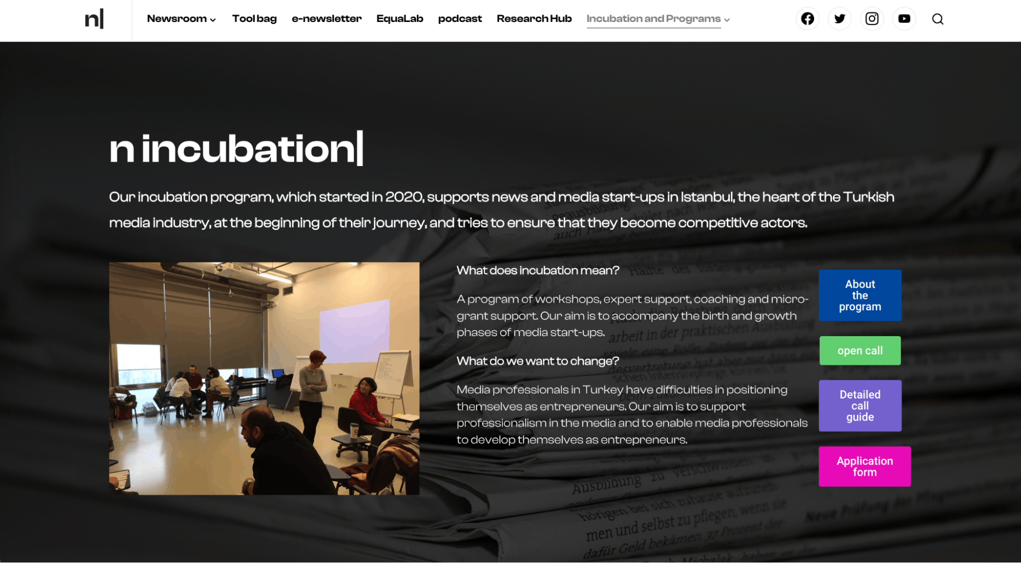
Our goal is to make sure that we help both the journalists and all media professionals so they can be advertisers, tech developers–all drivers to the media ecosystem. It helps journalism become more sustainable and long-lasting.
We have incubators, training, and mentorship programs. At the same time, we also create resources like articles, podcasts, and videos, as well as a weekly newsletter.
Let’s look from a brand perspective. How would you describe your brand identity through the years? How were the past brands conceptualized?
We actually didn’t have the resources, time, nor energy to think about designing a brand before. A basic logo, and simple website and form design choices were made along the way. We never had time to think about it in a deeper context.
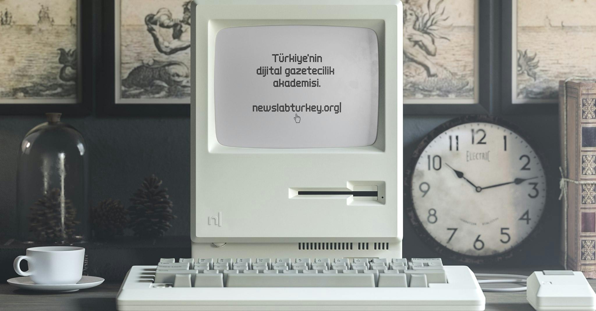
Last year, however, we finally had the chance to discuss what we need, what we are doing, and how we can create a bridge between old school media and the new generation of digitally-focused media.
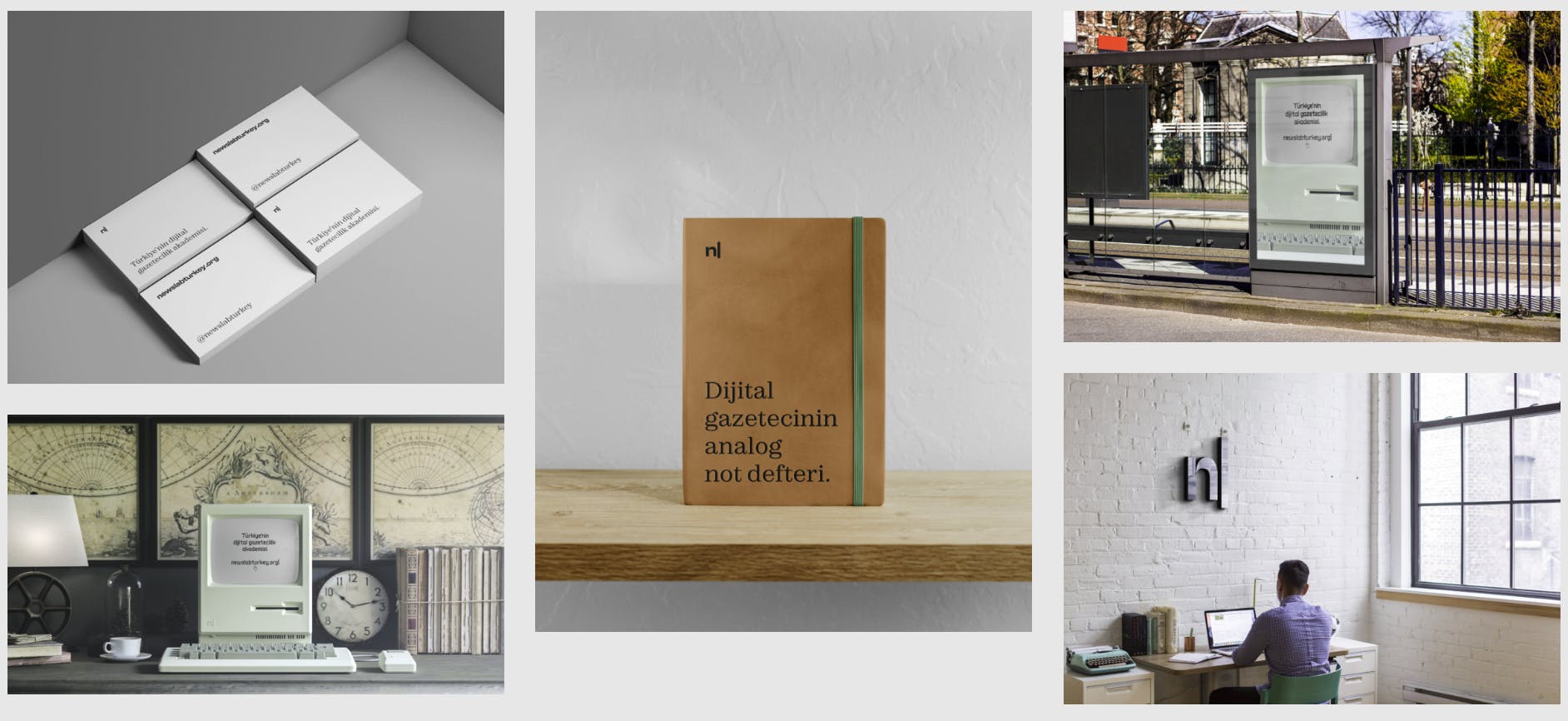
We finally had the opportunity to modernize, professionalize, but also be in sync with what’s going on both digitally and non-digitally. We were finally able to develop a brand identity that could be both.
About this current rebranding, how did that conversation start?
I was probably the person who started the process. I said that we needed to focus on a full brand identity.
After that, it was basically talking about what this brand identity encompasses and what kind of stuff we are going to need.
Even though we have different people who specialize in different fields, I am probably the one obsessed with the design side of things–while it’s not something I do professionally, it’s definitely something I care about.
How did the rebranding process go? Did you work with anyone? Was the experience smooth, or did you encounter any challenges along the way?
It was more of finding someone we know and trust to do something like this. Thankfully, Oğuzhan Öçalan, who did the design for us, was someone I knew very closely and knew his work well, so he had been a safe choice for us.
Knowing the designer definitely made things easier for us because I already knew the kind of work he does and his strengths. It was an easy conversation for us to start working with him.
Basically, it was a couple of early meetings to talk about the kinds of things we need, the kind of work we are doing, and our future plans.
We were quite lucky because that was mostly it. We didn’t need too much of a change or to rework the process because through our communication, he figured out what we needed on the first run.
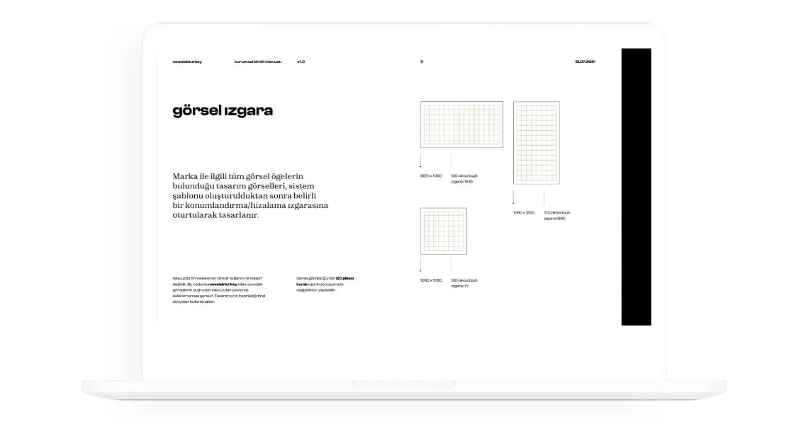
After that, he also helped a lot in the implementation process. He made sure that we have everything in place, and that we have all the templates we were going to need. He made sure that things like our newsletter also follows the design and brand identity we have–it was quite a smooth process.
A big change was to your logo which includes the cursor that’s a major part of your visual identity. Can you tell us the story behind it?
We wanted to focus our brand identity to digital transformation and how it's affecting media and journalism. Our organization focuses on creative solutions on that front. Until the logo came in front of us, we never really thought about whether the cursor can be a good symbol for that.
But the cursor is an important symbol for any media creator, especially journalists. It’s the first thing you see when you start writing something. Using that cursor, it signifies a starting point.
It actually helped us figure out what our brand identity is in essence because the work that we do, such as mentorships and incubator programs, we provide a starting point for many people. This digital starting point is the first thing you see when you start something. Using it is quite fitting for our brand.
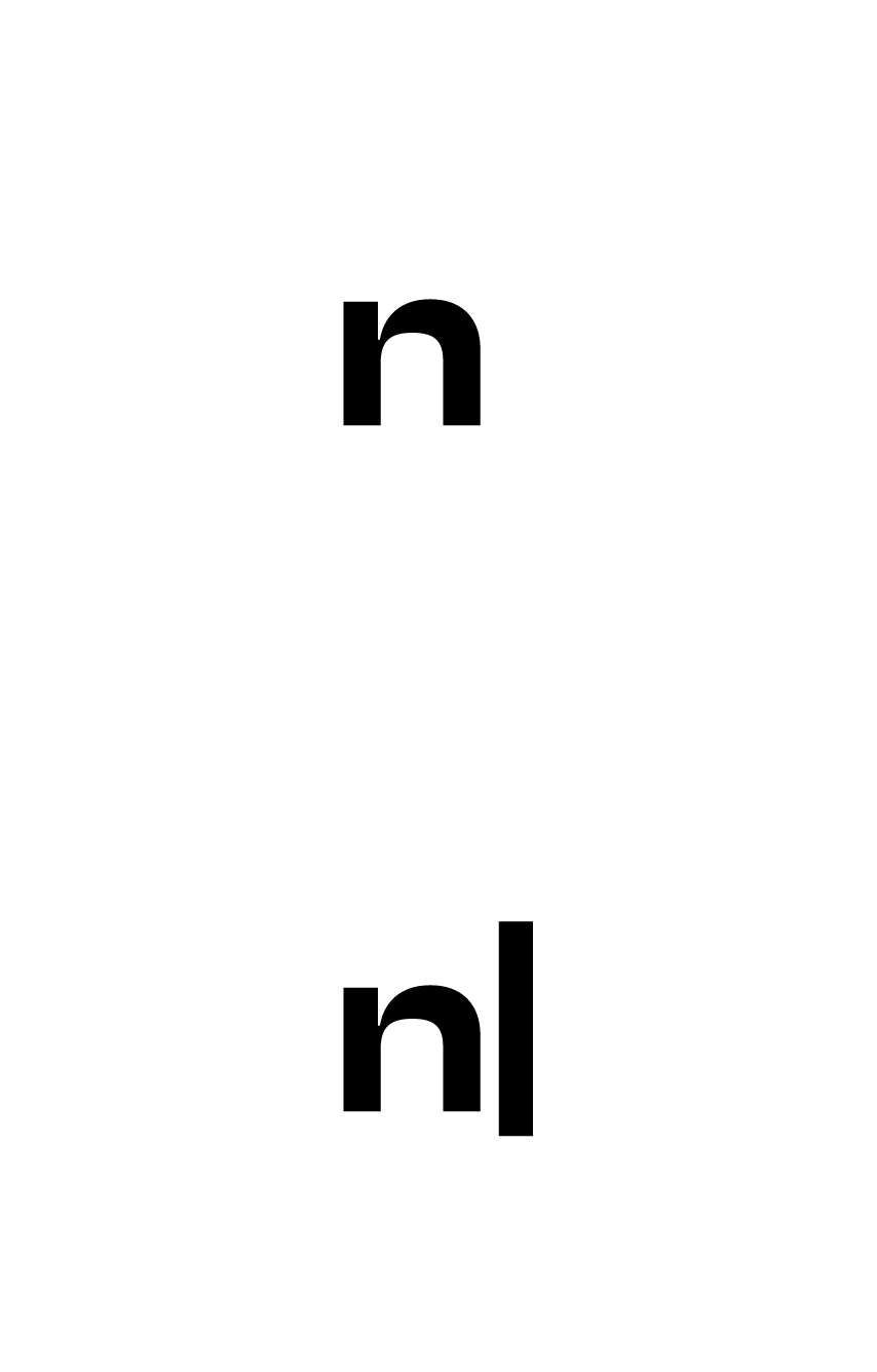
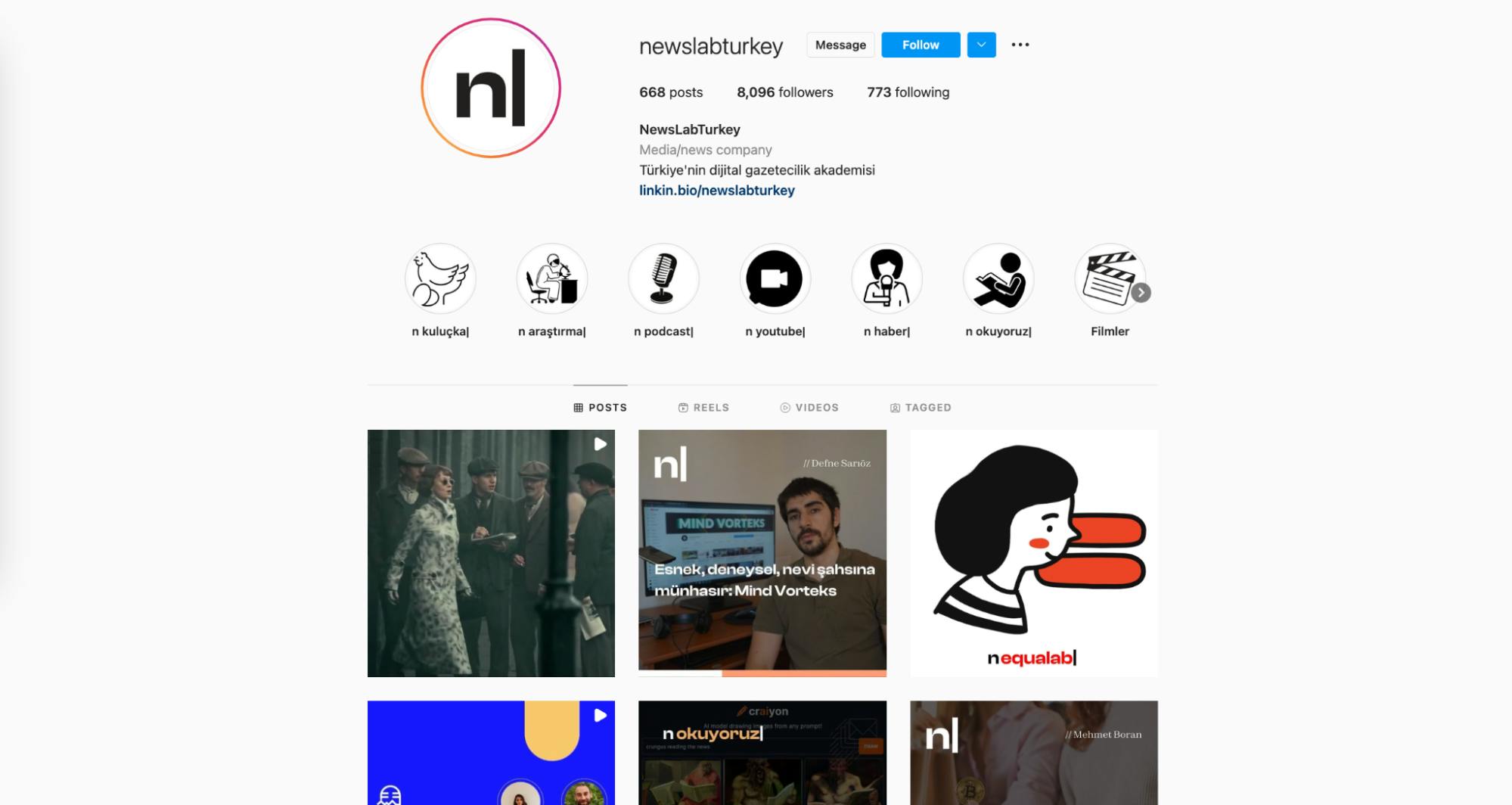
We especially liked how useful it can be. For example, in our sub-brands, we use the cursor as some kind of encompassing tool. It starts with ‘n,’ but for our sub-brands, it ends with the cursor.
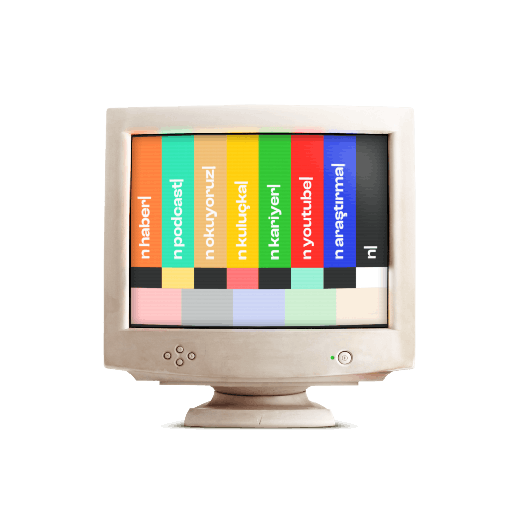
It can be used to create some movement in the brand itself. You can use it as a gif or use it in different ways. So it's definitely also quite useful for these sub-brands as it is for the logo.
Inspiration for this rebranding is the mixture of retro and modern, such as the use of early computer visuals and sounds in your brand launch. What do these elements say about your brand?
It's also a good way to symbolize this digital transformation we are having. These old computers are quite retro or vintage, but when you think about it, it’s pretty much 20 years ago. It’s quite old, but it signals how fast digital transformation is.
At the same time, we are using them in our new brand. It’s a good way to signal how fast digital transformation–especially for media–is happening. It’s a good way to say that we’ve been keeping track of all of that, that we’ve been here throughout the whole process.
What is your major takeaway from this experience? Or, do you have any advice for brands or designers embarking on rebranding projects themselves?
It was definitely a quite lucky process for us. We were able to clearly communicate the idea behind this new brand, that our designer quite easily understood what we needed and what we were trying to say with our brand identity.
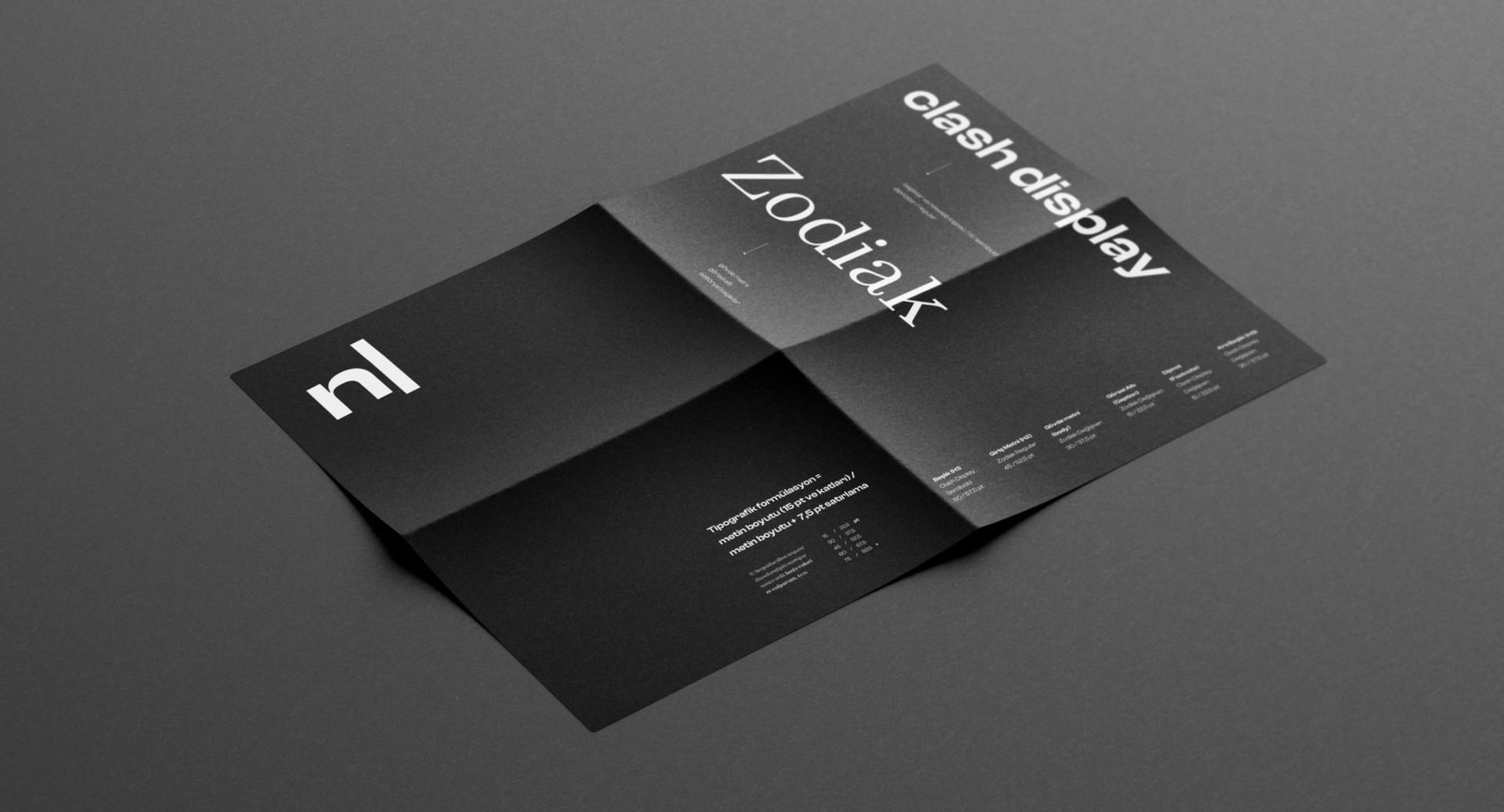
Being able to communicate your idea for your brand and being able to say what you want to say with your brand is quite important, especially when working with a designer.
One of the most important things I saw throughout this process is that when the designer know what you want to do with your brand, your organization, or company, they can come up with really great ideas.
It’s quite important that the person who is going to be in touch with the designer, or communicating with the designer, knows and is able to communicate the brand itself, because that's one of the most important things for the designer–to make sure that they are creating an identity.
Do you have any concrete tips you can share about communicating your brand?
Be clear about what you want to do in the organization or under that brand. You can say that brand is about X and Y, but when you have a clearer idea about the brand or organization or what you want to achieve in the next five or 10 years, this definitely gives a much clearer idea for outsiders as well as the designer.
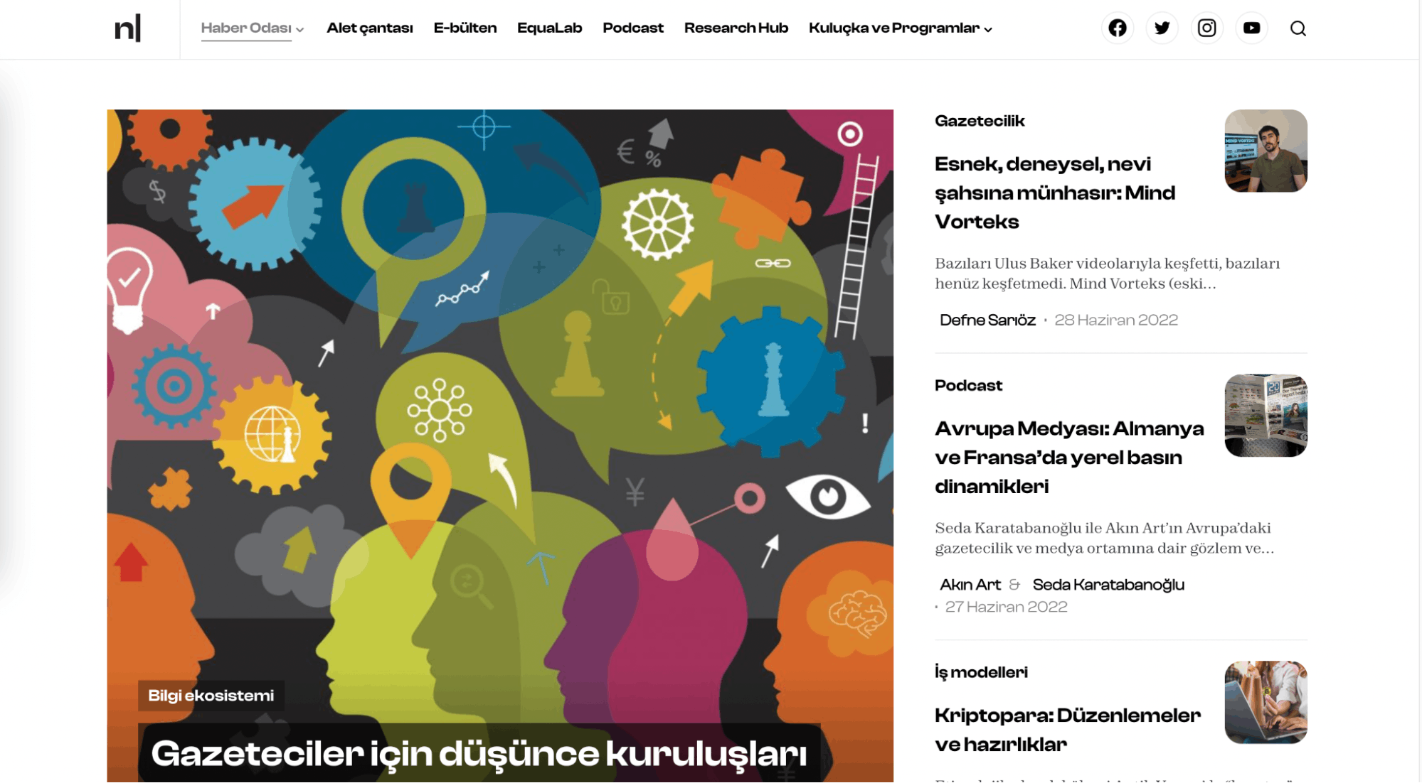
Brand identity, especially the identity of organizations, are related to the future or what you want to achieve under that organization.
If you don't have a clear idea or if you have trouble communicating that, it will probably make things quite hard. This is true not just from a design perspective. It's something you should be having throughout the whole process. You need to make sure that your goals are clear.
You also need some kind of ambition, because design is an art form. It needs some kind of emotion to convey, whether it's obvious or whether it's in the background.
So if you can communicate that emotion, that ambition behind the brand, to the designers, it definitely helps that development process.

