

Varun Kabra, Chief Marketing Officer at Proton, shares how Proton unified its brand identity across multiple products and how its brand strategy will help them to unlock the vision of a better internet where privacy is the default.
Can you introduce us to Proton and the brand’s identity through the years? How were the past brands conceptualized?
We launched as ProtonMail in 2014 through crowdfunding. The idea was to build an accessible end-to-end encrypted email. This was the first step in our purpose of making privacy accessible to everyone and laid the foundations of Proton’s mission and purpose in the years to come.
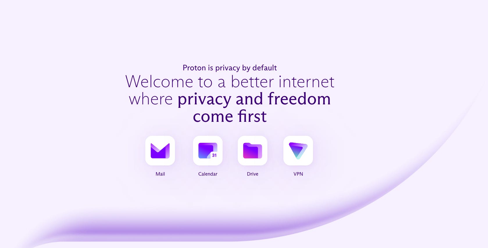
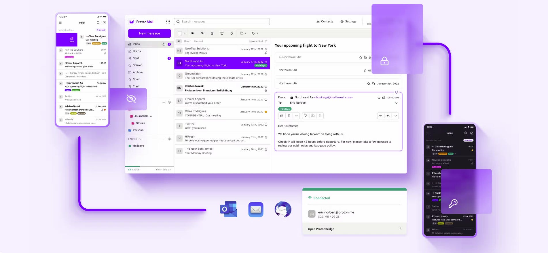
Over the last eight years, we have grown, with the support of a dedicated community of millions, from the world's first easy to use encrypted email service to an ecosystem of privacy-first services. Today, our services include Mail, Calendar, Drive, and VPN, and we're adding many more things so that our users can enjoy the best of the internet at every touch point without compromising their privacy.
When it comes to our identity, the ProtonMail brand was designed to reflect the functional benefits of our encrypted email service. The logo was a morphing of an envelope to signify email and a lock to signify security.
The look and feel was very techie and outlined the notion of security in broad terms through encryption. It worked well for ProtonMail, but it didn't encompass everything we wanted to do for Proton.
As we grew, we added VPN to our portfolio, then we added Drive and Calendar. Our initial identity grew organically. Proton VPN had a very different style compared to ProtonMail and so did Drive and Calendar. Even though people referred to us, not as ProtonMail, but Proton, we lacked a coherent design system that can reflect our vision of a unified privacy-by-default ecosystem.
About this current rebranding, how did it come about? How did that conversation start?
Once we launched our third service, Proton Calendar, it became very difficult to communicate about Proton without having a master brand.
Since we are a community-first company, we also leaned into our users' feedback and realized that they thought that ProtonMail, and Proton VPN were separate brands, and not part of the same company.
Our website and color palette were also often criticized because they were not saturated enough, and felt outdated. We also lacked consistency across our UI/UX through our different services.
We view Proton as more than just a portfolio of privacy first services. Our vision is to build a better internet where privacy is the default. This will help build an alternative to the current surveillance capitalism oriented internet.
Since all of Proton's services are built on the same bedrock of these principles whether it's privacy, transparency, accessibility, scientific accuracy and community-first, we needed our brand identity to also reflect those values.
We concluded this is the best time to invest in unifying and bringing our brand together which will allow us to explain what we stand for.
How did the rebranding process go? What were the steps to your rebranding?
Before we started the rebrand work, the first step was to research and understand all the aspects that make Proton what it is today. We did extensive market research to understand the industry, our competition and prevalent cultural trends to decide where our brand should live.
Then, we researched the perceptions, behaviors and expectations of our existing users and our target audience to understand what they love, what they do not like, and what they expect from the new brand. Finally, we looked into our guiding principles, our values, our goals, our personality and our history to ensure whatever we do is authentic to us.
Once we had all of these elements in place, the first step was to put it together into a sound brand strategy which includes the core pillar of our visual design, our narrative, and everything else.
Input was taken from internal stakeholders, including customer support, engineering, as well as our community. In fact, having our users voice on this project was critical to its success.
We went for an endorsed brand structure to reflect our ecosystem with Proton being the company's master brand and each of our services with their own sub-brand. This decision informed all the visual aspects of our new identity. The execution was done through strong partnership between our internal brand & design teams as well as external agencies.
Going deep into all these aspects was very important for us, because the brand is not only a visual representation of our products but it’s also who we are as a company, what our values are and everyone at Proton needs to live & breathe the brand.
How did you position Proton, because a lot of good branding starts with good positioning. What angle did you choose?
The new Proton brand identity has been crafted to reflect Proton’s core values and support in positioning Proton as an easy-to-use ecosystem of privacy services. We are a company making privacy accessible to everyone, and our brand needs to make it clear.
Our brand needs outline our core differentiators:
- We stand against tech monopolies and governmental oppression
- We believe and employ transparency in everything we do, from communications to code development by adhering to open source technologies
- We believe in mathematically proven privacy by using end-to-end encryption
- We put people’s privacy first by using an alternative business model that is not based on data collection
I think it was important for our brand, and our story to reflect that privacy should be the default and not an option. When we say, "What is Proton delivering?" We're delivering privacy by default on the internet.
Can you tell us how your new logo was conceptualized? Were there other options that nearly made the cut?
The underlying concept for Proton’s visual brand identity is based on the representation of the role Proton wants to have on the internet to achieve its vision of a better and more private internet. The role of a change-maker, guiding people on an alternative path and empowering them with the choice of tools that give them back control over their data.

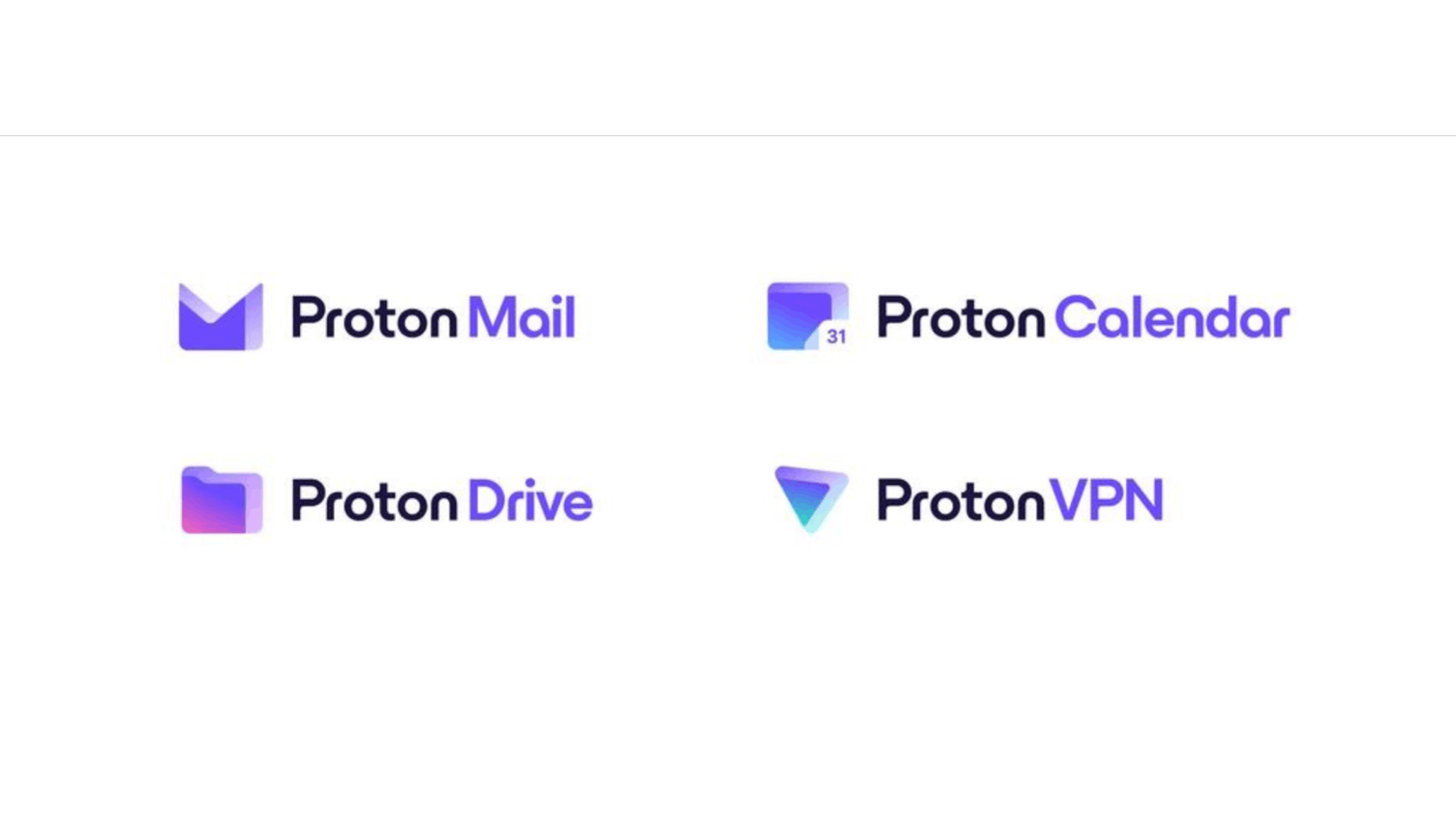
There is a master brand that endorses each of the sub-brands. This means that the brand logos also share a similar rounded illustration style, which the primary brand has. The color purple is still a key part of every sub-brand, even though there are nuances.
If you think about the Proton master brand logo, what you see is the P.
The idea of the P is to represent the alternative path, a path to an internet where privacy is the default. So if you choose Proton, you're turning away from the path which has been laid out for a better direction.
The Proton P also has a shadow, conveying the depth and the dimensionality of the internet. You can also see this depth reflected in our sub-icons or sub-brand icons. There’s also a hidden optical illusion of a 3D entrance as we think of these services as portals of the alternate internet that we are building.
We think of ourselves as an activist brand. We think of ourselves as leading the global movement of privacy. Our brand signifies the choice that people have to make, whether they go on the path that has been laid out for them or choose the alternate route where privacy is the default.
Your color palette has also changed, with a more vibrant version of the purple people know you by. How did you land on these colors? What do they say about your brand?
Proton’s primary color is purple, and it has historically been our color since 2014, but in a more muted and cold shade. With the rebrand of Proton, we took the opportunity to enrich our heritage color and make it more bold and compatible with light and dark backgrounds.
The reasoning behind choosing this color strategy is to ensure a family resemblance while enabling each service to stand out.
The color palette features the Proton purple and a set of shades and highlights as the main brand color, complemented by one accent color per service used in smaller proportions as well as a collection of purple + accent color gradients.
Every icon starts with the Proton purple and then fades into the service color. The aim here is to create an immersive, warm gradient and depth effect that contributes to the icons’s family resemblance.
We kept the global color purple for Proton as well as the original service colors (light purple for Proton Mail, green for Proton VPN, blue for Proton Calendar) to ensure the continuity of the Proton brand image and to reflect the individual identities, audiences, and communities of each service.
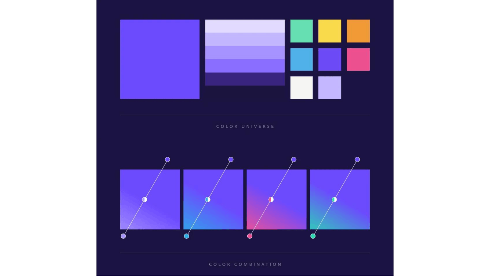
As we grow and build the brand, maybe in the future, there'll come a choice where the balance might change. Maybe the accent colors become more and more prominent for each of those brands. At this moment, the family resemblance must be shown, but at the same time, our users shouldn't be confused and think that it's the same product.
It's always a brand challenge when you do these things. As of now, we feel we have struck the right balance of family resemblance and the unique thing each product offers, but a brand is something dynamic that we will keep evolving.
Can you tell us more about your new typography? Why were they chosen, or were they custom-made for Proton?
Being a Swiss company, we chose the font, which is produced by a Swiss design agency based in Basel–Dinamo Typefaces. We used the ABC Arizona variable font.
We use two styles from the ABC Arizona family: the Sans and the Flare. All our writing will use Sans, with its straightforward style and technical touch, while our headlines use Flare, a more human font, nearly-but-not-quite sans typography, that makes a bolder statement.
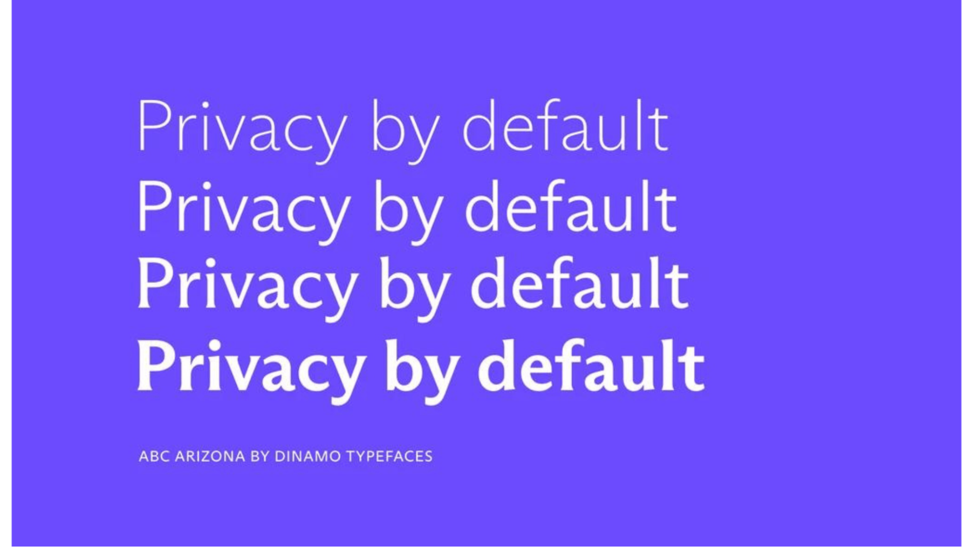
We chose a font that can be used to tell stories, a font with empathy and warmth that reflects how Proton is different and that defies the expectations of the tech world, which regularly favors bold, sans serif typography.
Having a Swiss design agency do this work was a conscious choice that we made to showcase our our Swissness!
What is your major takeaway from this experience?
I don't think there is one takeaway, I think there are many. First, finding our true essence as a brand and representing it visually through time and patience. Everything took longer than expected. Working with multiple designers, and multiple agencies, internal and external.
It wasn't like we commissioned an agency and got out of it, we wanted to challenge ourselves as well. The bottom line is that you have to be patient and always be aware that it will take longer than expected.
Second, we were quite afraid our community would not love the new brand as much as the previous one because change can be uncomfortable. We're glad to have involved our users as much as possible, for a smoother transition.
The other lesson is the effort that goes into building and successfully launching a new identity. It wasn't just the brand team. It was the work of the whole company. It's not just that you come up with a great design and then you slap it on everything and it works. You have to live it. You have to commit to it. You have to reflect that on all touchpoints in order to be authentic.
Right from how customer support answers our tickets today, to how it is reflected in engineering sprints, to our design principles, rebranding is not a quick effort. It's a beast of an effort.
There are many paths we could have taken when working on it. It's never about what is visually great. I think what's important is, is it authentic? And is it a decision that you will be comfortable owning? Is it reflective of who you are?
Don't worry about right or wrong. It's about whether you are able to own it and live by it.
Do you have any advice for brands or designers embarking on rebranding projects themselves?
If anybody wants to kick off the project of rebranding, it's very important to do a brutal analysis of who you are. Internal team, customers, industry peers–if you don't know who you are, then it's hard to represent it visually.
A lot of times I find that people decide on rebranding because of various reasons. It could be external, it could be "I don't like this design," or because it feels dated. That should never be the reason. It should always be whether or not your current identity represents who you are and what you want to be.
Second is to speak to your community. Understand what they find attractive. Build a brand strategy to highlight these qualities and reflect the same in your visual styles. Give yourself enough time to research and creative development, but try to stick to a timeline and adopt a gated decisions strategy.
Build a gated decision strategy. I think that’s very important. Set boundaries for creation. It'll save you time, money, and headaches. You can go in many directions, but you have to sometimes stop, pause, and make a decision.
The best way to set boundaries is a very clear brand strategy and a very clear visual creative brief, everything else should be measured against that.
Lastly, bring fresh minds into the process internally and externally, because more perception and eyes sometimes will help you find potential issues, like the brand could be resembling other brands or it can mean something else in a different language.
