
before
after

Interview with Ollie Ellis, Associate Creative Director at Dalziel & Pow explains how the RW&CO rebrand went far beyond a logo, focusing on a toolkit that could evolve with time. From workshops that tested ambition to creating an identity that’s both timeless and flexible, he highlights the balance between consistency and adaptability in fashion branding.

Bernadette Engel, Strategy Lead at Dalziel & Pow reflects on the strategy side, noting that true impact isn’t in drastic visual change but in how the brand is embraced internally. For her, RW&CO’s strength came from the team’s adoption of the new identity, turning it into a “living brand” shaped by its people.
Can you tell us about Dalziel & Pow?
We’re a global strategy and design studio, and we’ve been around for over 40 years. We work with businesses of all scales and sectors across strategy, branding, and experience design. We are based in London, but we operate globally, with much of our work overseas, partnering with some really exciting brands.
Then over the years we have expanded our offering to include branding, strategy, and experience design, really diversifying our services and our work around all corners of the world.
RW&CO is a well-loved Canadian fashion brand with a strong legacy. How did Dalziel & Pow first get involved, and what led the collaboration to expand from a store design project into a full brand transformation?
RW&CO is a Canadian retailer based in Montreal with over 20 years of history and more than 80 stores nationwide. They’re part of a group we’ve worked with before, and when they first approached us, it was around a store design project. We already had some good relationships with their team, which helped open the door.
From those early workshops in Canada, it quickly became clear they wanted more than just a store refresh — they were looking for transformation across the whole brand. Our vision for the store experience, the ‘lifestyle collective,’ became the jumping-off point for the next chapter of RW&CO.
At Dalziel & Pow we always take a holistic view to projects, because successful brands aren’t built on logos alone — it’s e.g the people, the place, and every touchpoint working together. That’s why we use a framework we call the 6Ps, which helps us look at the brand world in totality. From there, the project naturally evolved into creating a new brand platform, a redesigned visual identity, and a full brand playbook.
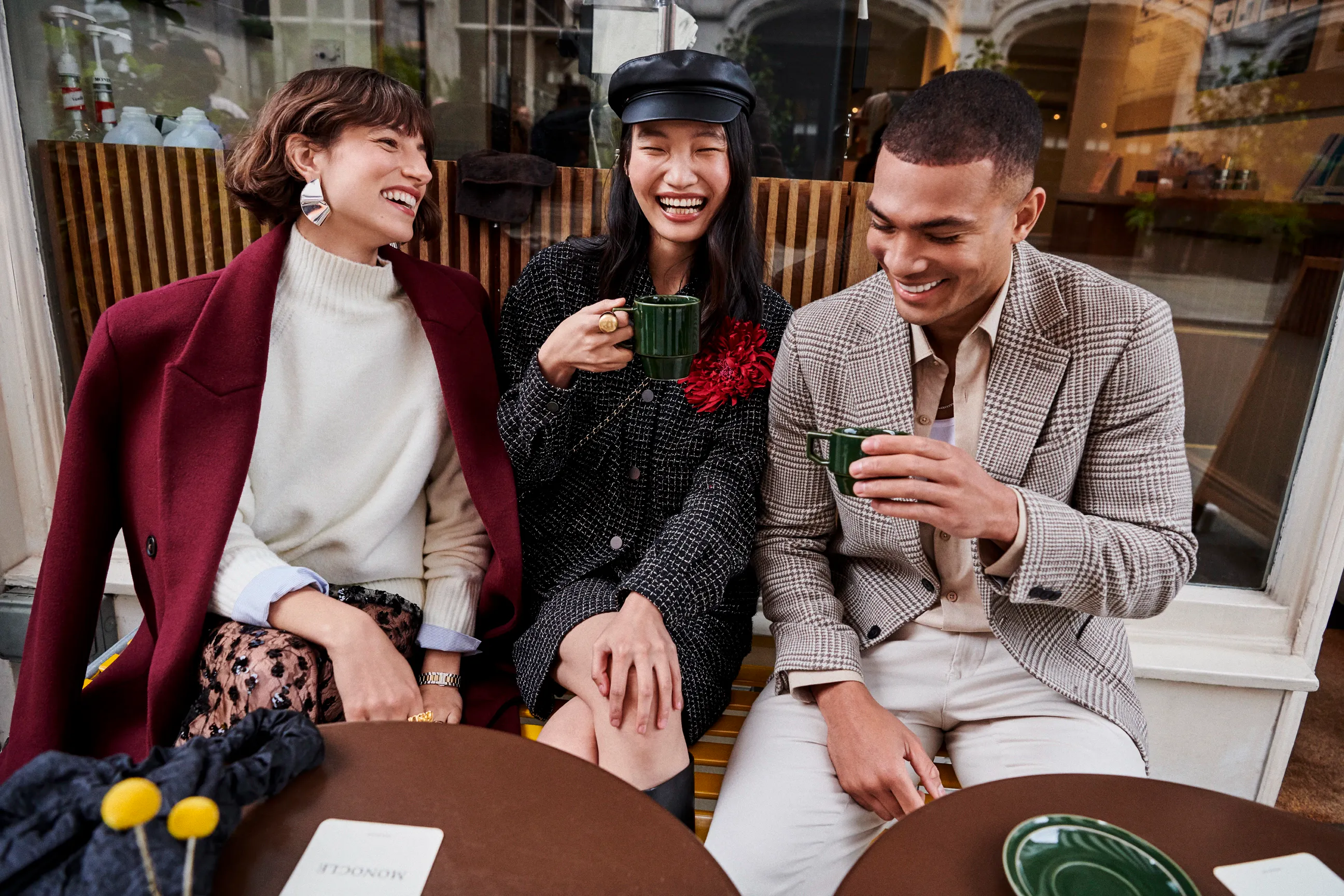
Image courtesy by RW&CO
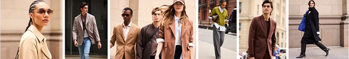
Image courtesy by RW&CO
Every project is different, but what’s a common thread? When you approach a rebrand, what’s the first thing you look for in a brand’s DNA before you start shaping its new identity?
We have a tried-and-tested methodology. No matter the project, it always begins with the strategy phase. It’s about talking to people, getting under the skin of the business, aligning on goals, and asking: what’s the vision for the future? Where does the brand want to go? How can we best set up the brand for long-term success?
Bringing the whole business together in that conversation is key. When you define ambition collectively, it creates the foundation for everything that follows. From there, our process follows three stages: define, create, and deliver.
In those early workshops, how do you gauge how far a client is willing to go? Do you deliberately push the boundaries to test ambition, or is it more about finding what feels authentic for them?
That’s a big part of the early stage. What’s been released so far is just the identity design — but this is a bigger project, with a retail experience piece on the way very soon.
We always spend time understanding how a brand behaves internally as well as externally. It’s about having those conversations across all touchpoints, seeing where we can push, and also recognizing what feels right for them. With RW&CO, it was a really fruitful collaboration — they wanted this process. Of course, sometimes you need to show clients what’s possible, even if it makes them a little uncomfortable, but we’d never put unnecessary pressure on them. It’s always about doing what’s right for the brand, and in this case the collaboration worked beautifully.
"That purpose — empowering people to write their own style of story — guided everything we developed."
Fashion is fast, branding is slower. How do you balance crafting an identity that feels timeless while staying relevant in such a trend-driven space like retail fashion?
With a brand like RW&CO, the goal was long-term transformation, not just a short-term campaign. They already have more than 20 years of heritage and a strong position in the market, so there was confidence in who they are and what they stand for. That gave us the trust to think about evolution, not just reinvention.
The challenge is to create something that feels timeless but also has enough flexibility to evolve. We do that by building a brand toolkit: core elements that stay consistent, and a wider palette that allows the brand to adapt and flex in different settings — whether that’s playing up messaging, dialing it down, or reacting to new campaigns.
So really it’s a balance: establish timeless foundations, but design in flexibility so the brand always feels fresh and new.
The new RW&CO logo feels refined & balanced. Can you walk us through the thinking behind it, and how you made sure it works both practically and distinctively in the fashion landscape?
The logo evolved into something more refined, balanced, and crafted — but there were also practical considerations. With fashion brands, a logo has to work everywhere: from large-scale storefront signage to tiny applications like tags and clothing. Creating something strong and consistent across all those uses was really important.
Of course, the logo is only one part of the identity. A big part of this project was building a wider system across typography, color, and tone of voice, so the brand could tell its story in the best possible way.
This was about evolution, not reinvention. RW&CO is a trusted, loved brand, so we wanted to keep that heritage intact while still differentiating them from competitors. They’re not a ‘shouty’ brand, so the design had to feel right for them — nuanced, confident, and distinct from competitors. That’s part of our methodology: look at the competitive landscape, then find the white space the brand can truly own.
Image courtesy by Dalziel & Pow

Image courtesy by Dalziel & Pow
The new palette introduces orange and electric blue. What was the thinking behind those choices, and how do they support the brand’s story?
Color was a big part of shaping this new visual identity. RW&CO isn’t a fast fashion brand — they’re about quality, elevated fashion for men and women. That meant grounding the brand in a refined, neutral palette to feel timeless and versatile, while using bold colors like orange and blue to add vibrancy at key moments.
We devised a colour palette that can be applied across packaging, social media, and soon in the 3D retail environment, where it can really bring the brand to life. The palette was designed to be flexible: dial it up for impact, or tone it down when needed.
One of the goals was also to increase brand presence in everyday touch-points. For example, shopping bags now use more vibrant colors — subtle tools to draw attention, build recognition, and help RW&CO engage a new generation of consumers.
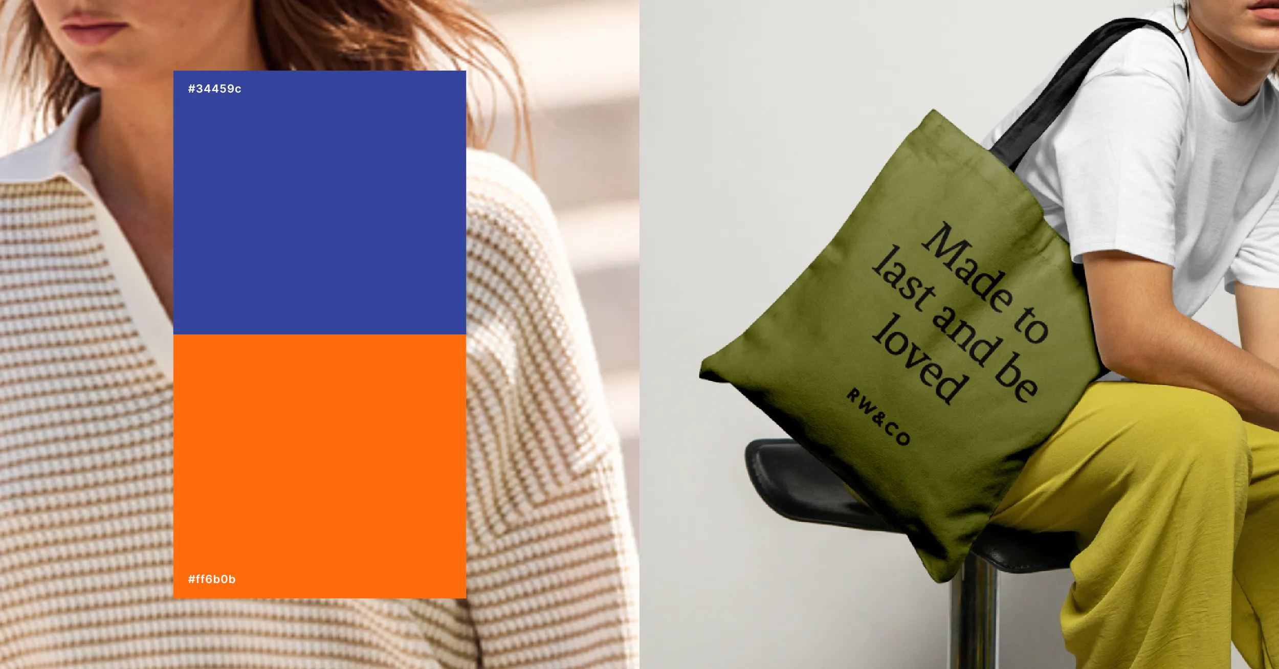
Image courtesy by Dalziel & Pow
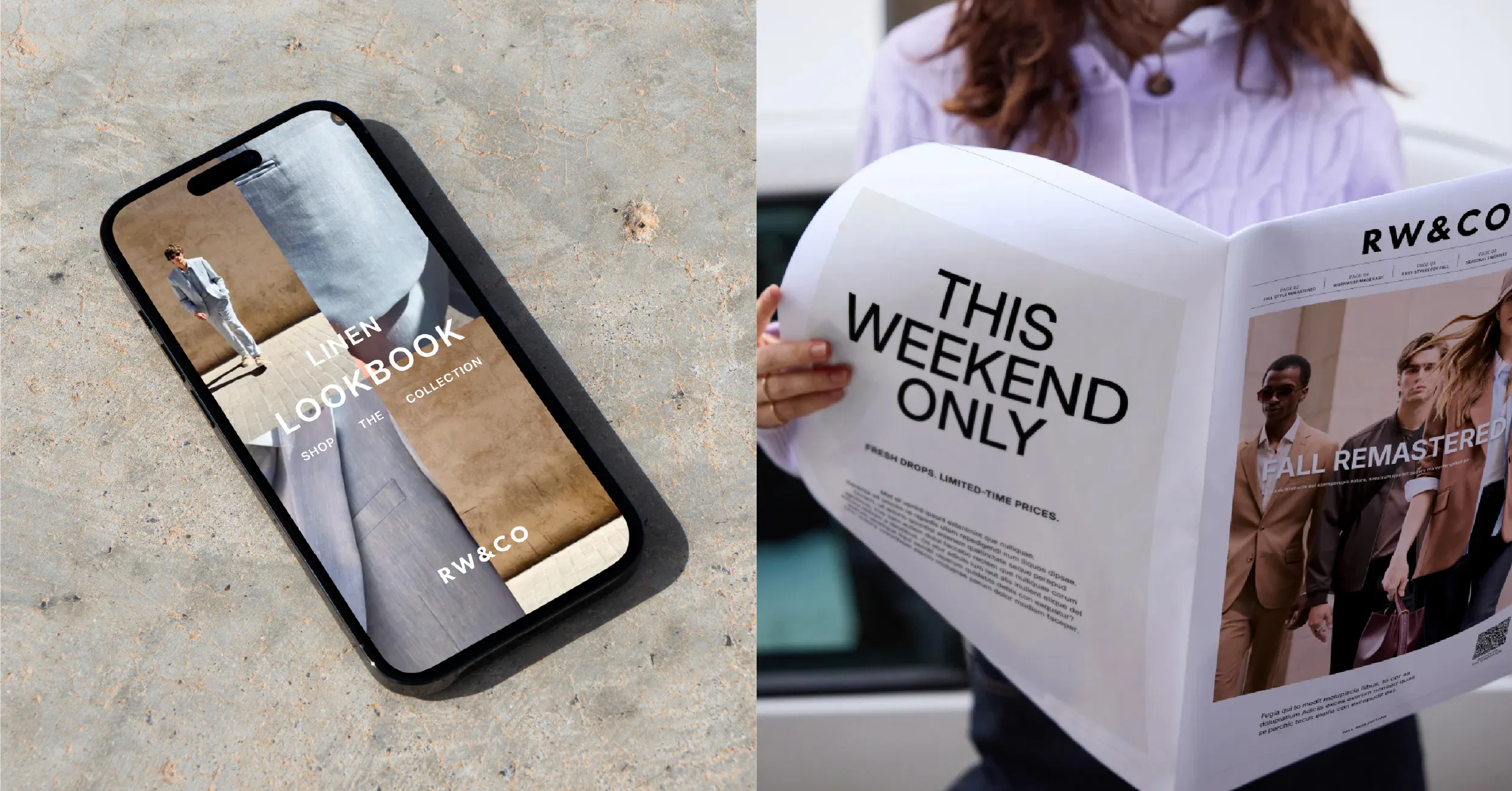
Image courtesy by Dalziel & Pow
RW&CO’s new purpose is about empowering people to write their own style story. How did you bring that idea to life across visuals, tone of voice, and brand experiences?
That brand purpose — empowering people to write their own style story — really guided everything we developed. It started with understanding them through workshops and making sure the idea of empowerment ran through both the fashion and the experience.
Visually, we leaned into street-style photography that shows real people living in the clothes, offering inspiration on how to style them. With a broad dual-gender range, it was about making the brand feel relevant and relatable.
Tone of voice was another key tool: speaking at eye level, with confidence and passion. Campaigns on social media, including a creator-led initiative with Canadian influencers, helped extend that idea by showing fresh ways to style RW&CO pieces.
And of course, the store itself is a critical touchpoint — it’s about lifestyle curation, inspiration, and elevated services. Together, these elements formed the toolkit to deliver on that purpose.
"The impact isn’t measured by how drastic the visual change is, but by how it’s adopted internally."
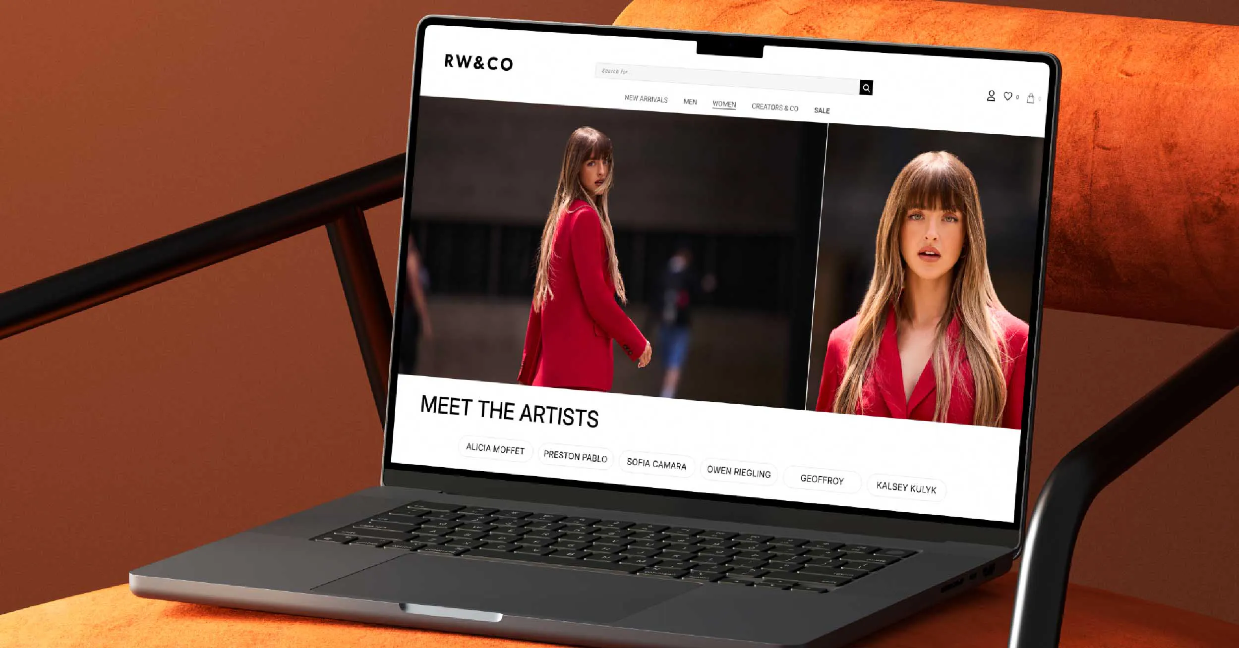
Image courtesy by Dalziel & Pow
What did the timeline for this rebrand look like, and what challenges did you face along the way?
A project like this goes beyond just a visual identity. It included store design, a new brand platform, and a wide range of touchpoints — so it’s been an ongoing process of bringing everything to life.
What made it such a smooth journey was the partnership. We were really on the same wavelength as their team, which made the whole process feel collaborative and creative. Of course, there were practical considerations — things like how the new identity would be applied consistently across clothing tags, stores, and digital platforms. But because RW&CO were so committed to this transformation, those challenges became opportunities to get it right.
In the end, it’s always about setting the brand up for long-term success. That means not just creating an identity but ensuring it’s embedded at every level of the business. Once that alignment happens, things move quickly. For us, it’s been a true partnership — hand in hand with their team, shaping a future-facing brand together.
Every project has a challenge that teaches you something new. What did this rebrand teach you, either as a creative or as a team?
Bernadette:
For me, the impact isn’t measured by how drastic the visual change is, but by how it’s adopted internally. It’s about the people — how they take the new identity and turn it into a living brand. That’s my key takeaway from this process.
Ollie:
This has been a great partnership with RW&CO, and the big part of that was really understanding their needs early on and getting under the skin of the brand. That made our job easier down the line, but just as importantly, the internal buy-in meant everyone was on board and excited. It’s a really positive setup for the future.
