


Vitaly Pecherskiy, Co-Founder and COO of StackAdapt, talked about saying goodbye to their startup days, how large companies choose a new logo, and why they focus on speed for their video campaign.
Can you introduce us to StackAdapt, your mission, and the early days of your brand?
The three of us, Ildar Shar, Yang Han, and myself, co-founded StackAdapt in 2014.
Prior to launching the company, Ildar and I worked at an agency so we saw a clear need for a next-generation advertising platform. Once we met Yang, who just moved to Toronto from New York where he was building financial trading platforms, we knew we had a great team to see if we could get a minimum viable product to market.
We felt that we could offer a better platform that would use artificial intelligence (AI) and machine learning (ML) at its core, would be intuitive to operate, and be built around delivering results to advertisers.
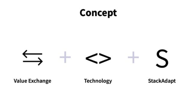
To launch a website we needed a logo, so Yang simply typed it out and used a color accent to emphasize the word “ad” within our name.
It was symbolic of our scrappiness as a startup, we didn’t care much about these details, but we were passionate about technology and solving client problems, so we threw ourselves into that from day one.
What prompted your rebranding? When did you and your team start thinking of rebranding StackAdapt?
We were one of the companies that were fortunate to benefit from changes in consumer behaviour during the pandemic, and we saw explosive growth in the past 18 months.
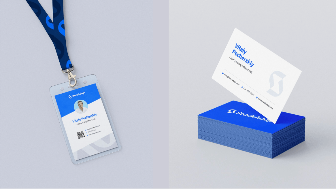
Earlier this year, we crossed the 350-person mark and it was apparent that we had some bottlenecks in branding that were limiting us from making a larger impact on the market and the logo was one of those things. We needed a logo that would give us more flexibility as we continue scaling our organization. We felt the time was right to refresh our brand.

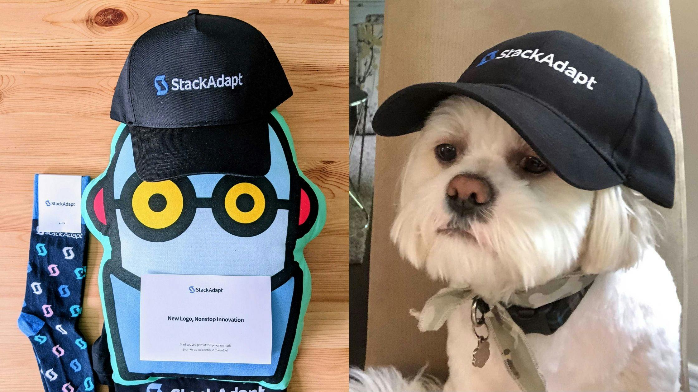
We are very proud that all of the work on the new logo was done internally as we have a really talented team who brought many great ideas to the table. When we rolled out the new logo at a virtual company meeting, you should’ve seen Slack light up with all the excitement and positive comments.
It was really emotional for me because I felt I was saying goodbye to the startup days.
What I didn’t realize at the time was how excited I am to enter the growth phase of our company. Now, looking at our new branding and logo, I can’t imagine it any other way.
How did the process go? Were there any pitfalls or problems that you encountered?
The process was pretty smooth, but very quickly turned into a fork in the road between a new typeface for the existing logo or a more dramatic and modern design. We fully developed both paths before choosing the final version.
Our internal teams presented 40 options that dramatically modernized our brand--from the exotic to fresh, but practical options. The challenging part was whether we should go with a bigger change or stay closer to what we had originally.
Within the marketing team, we narrowed it down from 40 to 20 concepts. The team tested them against the various challenges we faced in the past with our old logo, and narrowed the choices to two options before presenting to the executive team. The first option was an adaptation of our old logo, but with a unique and visually balanced logotype. The second option was a fresh design that combined elements of what made our brand recognizable, but with a new icon.
Our executives chose the brand new approach, which was forward-looking and provided the flexibility we needed to continue evolving our brand, all while showcasing elements that made us successful in the first place.
As I mentioned, our team loved it immediately. Many asked that day how they could get apparel or merchandise with the new logo, and the feedback from our key external stakeholders has been the same. Everyone wants some fresh swag with the new logo on it!
Are there any significant learnings or takeaways from this major rebranding?
Your audience will probably not be surprised that it took us a few phases to land us on the final design.
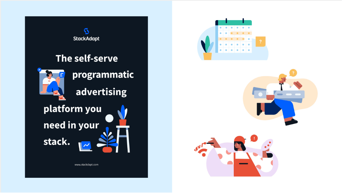
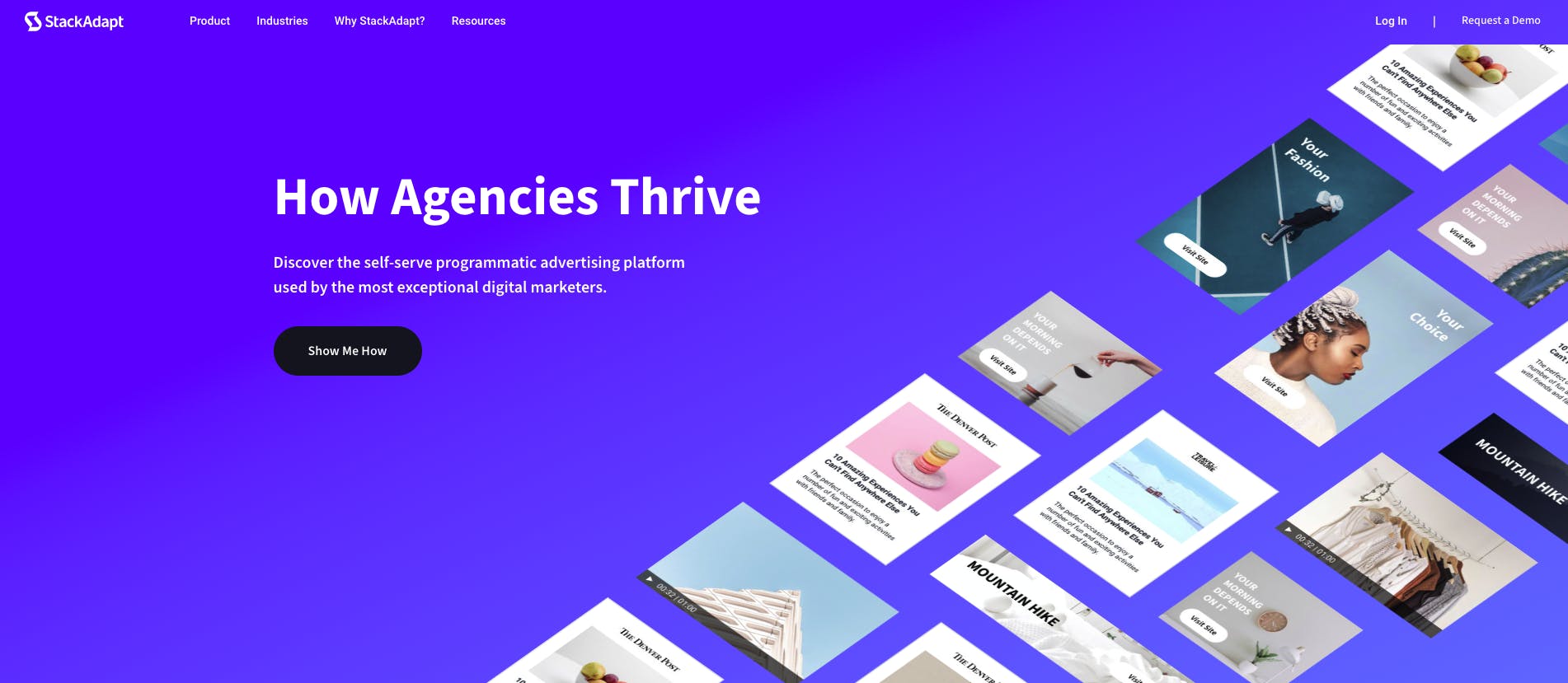
We knew we wanted to create a logo that would represent StackAdapt as the bigger organization that we have become. A brand that provides a comprehensive solution to help all who seek to innovate in digital marketing from individual media buyers to the larger agency or the in-house marketing organization of a large brand. A brand that delivers results.
Some brands have a history of making dramatic changes to their logo. While it works for some, I would not recommend this to everyone. I think there is a fine line to be walked here. Yes, it’s good to continue evolving your brand to stay relevant, but it’s important to answer the question of “why?” when you want to do dramatic rebrands and logo redesigns.
Too many organizations fall back on their brand as the reason for any slowed growth. As a result, they burn a lot of resources trying to market themselves better, while instead they should perhaps spend more time with their customers to understand their evolving needs, over-invest in their product, or level-up their team.
I am happy with the way our brand journey unfolded because it was never about trying to ignite growth: it was to keep up with our growth.
Can you tell us more about your video campaign, “Speed that makes the difference?”
An excellent, strategic agency partner, Atreo, led us through a process to assess potential positions that StackAdapt could occupy based on our unique abilities overlaid on what our customers care about the most. That’s how we landed on the concept of speed.
A programmatic platform not only has to deliver great results, but also needs to be intuitive and easy to use while allowing an experienced user to get to a properly prepared campaign in just a few minutes. The StackAdapt platform is very focused on user experience and continually adding capabilities that allow our customers to do more and do it faster.
That’s why StackAdapt has earned the highest customer satisfaction scores on G2 for 5 consecutive years. We deliver exceptional performance while focusing on the experience that maximizes the productivity of the media team.
What has been the reception to your rebranding so far?
It’s hard to imagine that we didn’t have this brand all along. It feels very fitting and natural. I haven’t heard a single person comment that they wish we had kept the old logo. Our customers have given us dozens of unsolicited positive comments too, which is always appreciated.
What's next for StackAdapt?
There is always a lot going on at StackAdapt because we just never slow down building our platform.
Two advertising channels that I am most excited about are connected TV and programmatic audio. We see a big demand from advertisers because StackAdapt democratizes those channels and makes it very easy to run advertising the same way only the world’s largest brands could do just a few years ago.
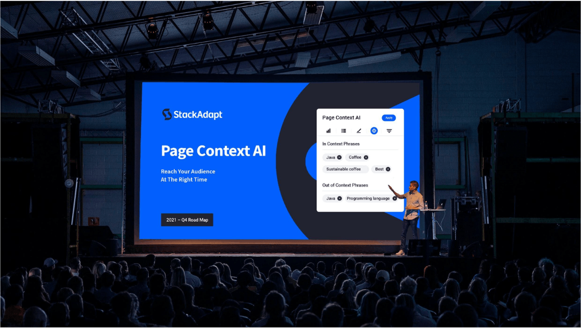
Lastly, we are doubling down on our patent-pending Page Context AI technology for contextual advertising. We are seeing big demand from advertisers looking to target users in the moment when they research their or their competitor’s products, and we are seeing some really strong performance results from it-- so we’ll be busy commercializing it further!