
Kelly Finnerty, Director of Brand and Content at Startpage, talked about how comments from fans helped spur their brand refresh, the elements they knew they needed to change, and going with your gut when it comes to final decisions.
Could you introduce us to Startpage and its initial branding?
I joined Startpage in 2019, so I can only share its brand history second-hand.
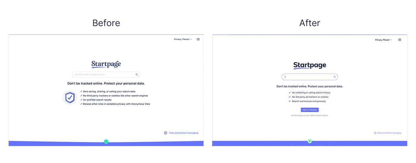
What I do know is that the original branding strove to differentiate our private search engine with the “picture-perfect” styling of notorious “Big Tech” brands who spy on and track people. This is apparent in the previous brand identity’s use of hand-drawn illustrations and frilly fonts.
Regarding the brand colors, which we’ve largely maintained, it shows that Startpage is not your traditional tech brand.
The vibrant “Startpage Blue” signals a clear line drawn between privacy-respecting tech and the primary blue used by invasive Big Tech brands like IBM, Microsoft Bing, Cisco, and Facebook.
What prompted this rebranding? When did the conversations about changing the visual identity start?
There were multiple moments where the entire team was questioning the branding.
From comments from fans on social complaining that our icon had nothing to do with search, to internal concerns that some of our illustrations were “creepy,” we knew change was necessary, but we wanted to make informed improvements.
Brand change is complicated. It requires a lot of time, energy, and money.
Not only does such an effort include in-depth strategy, research, design, and development work, but even more significantly, the process demands an extensive team and loyal user consensus.
To ensure that we were making the right decision, we performed market research, polled loyal users and I solicited opinions from my professional network and even family about Startpage’s brand visuals and messaging.
By doing this research, we uncovered qualified data revealing that people found the current branding dated and unclear.
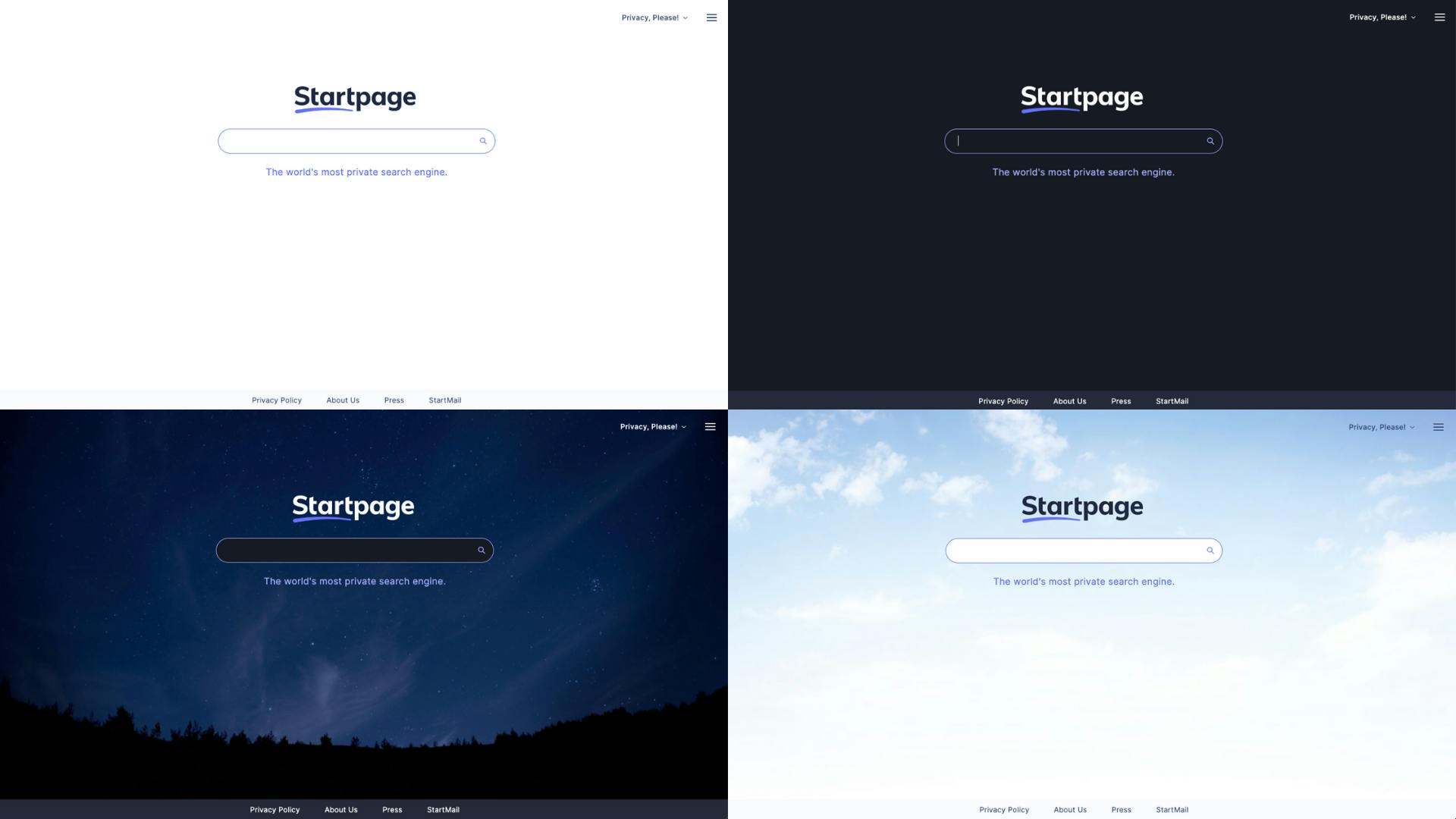
When a user sees the Startpage blue border around their window when privately browsing with our proxy Anonymous View, they know they are safe.
How did you decide which elements of the previous brand needed to change, and which elements could / must stay?
We decided to proceed with a brand refresh versus a rebrand.
I felt confident that Startpage’s existing brand ethos, audience, and core values continued to be firmly rooted. Meaning the desired change was more about making the brand visuals better connect with our purpose.
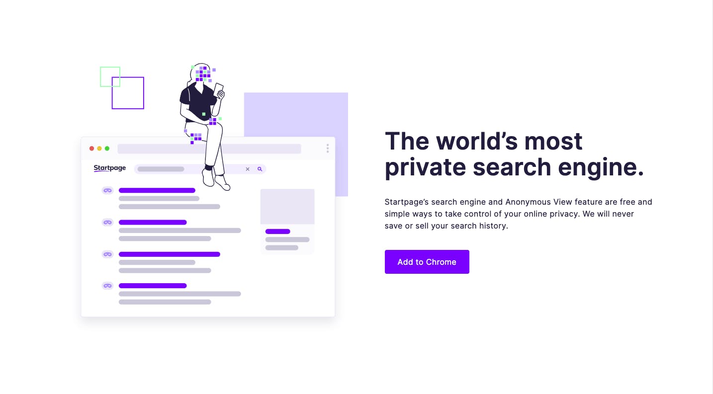
The new icon instantly depicts our core offering of private search while incorporating our core brand colors and swoosh. The evolved illustration involves a more elegantly hand-drawn style and a new pixelation theme across all visuals to express how anonymous a person is when searching on Startpage.
We carry these throughout our new illustrations used throughout our new site design and into treatments in photography that we will be using on our blog and across social media.
Tell us more about the process. Was the process smooth, or were there pitfalls?
There were so many iterations on the tiniest of details throughout our brand refresh process.
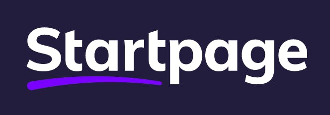
One specifically nuanced conversation was around the shape of the swoosh underling “Start” in our logo.
Our incredibly talented and patient Director of Design, Mary, did an amazing job putting together multiple options of differentiated swooshes.
They were truly all so similar, but the one we chose at the end still feels just right.
How did your logo’s redesign come about? What about the typeface?
The new, refreshed logo has an updated swoosh underlining “Start” to reinforce key brand messaging of “Start your search with Startpage.”
Previously, the brand lacked a tie-in to its name. The new typeface created by Dutch designer Jeroen van Eerden is digital-first with distinct disappearing t’s to represent how Startpage anonymizes search online.
We wanted something that was distinct and distinguishable as Startpage versus one that any brand could buy online.
That said, the typeface is still easy to read and modern.
What would you say was the biggest thing you learned from this experience of rebranding Startpage?
When we landed on the new branding, it just felt right. It truly did. Even today, when I see the logo on our homepage, it feels like it’s been our one and only logo.
Therefore, my takeaway is to pay attention to the data and listen to all of the feedback—but trust your gut feeling for your final decision.
What’s next for Startpage?
Startpage’s innovative team is launching more and more privacy-respecting search features.
This year we released, Private Shopping, Currency Conversion, Stock and Crypto Info, and Language Translation.