


Jake Cosmai, Marketing & Communications at Sunshine Coast Airport, shares their strategic move to rebrand with a new visual identity that forgoes the usual elements among airport brands.
Can you introduce us to Sunshine Coast Airport and the brand’s identity through the years? How were the past brands conceptualized?
Sunshine Coast Airport is one of the fastest-growing airports in Australia, and facilitated more than 1.3 million passengers in the 18/19 financial year.
Breaking a record for the most passengers ever in April 2022, our airport is embarking on an exciting journey as we progress development on car park expansion projects, a terminal expansion that will double the size of our current terminal, along with becoming the home of Australia’s newest low-cost airline, Bonza.
About this current rebranding, how did it come about? How did that conversation start?
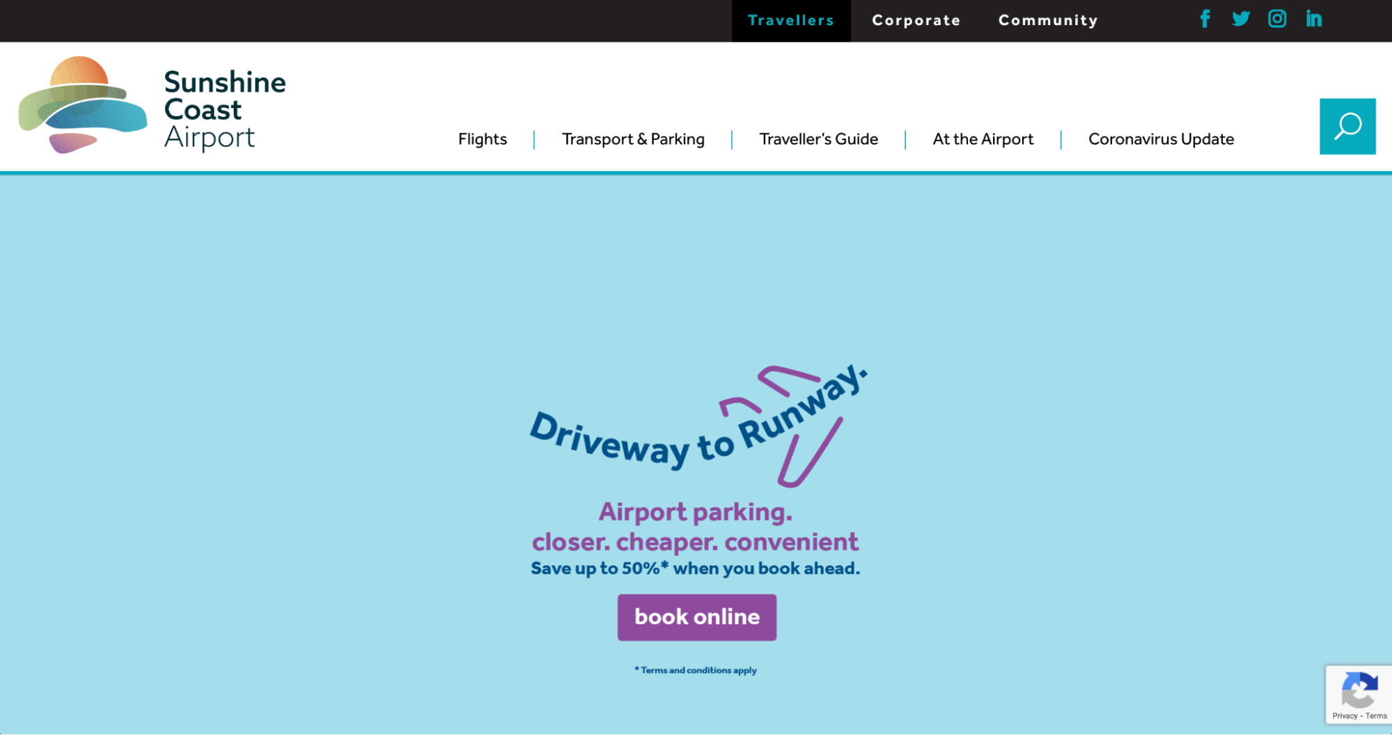
Taking Sunshine Coast Airport in a new direction, with exciting new projects and possibilities for our region with more connections and improved infrastructure, this is where the conversation came about for our rebrand.
How did the rebranding process go? Was it all smooth, or did you encounter challenges?
No doubt we encountered challenges. There were many stakeholders, both internal and external to the organisation that needed to be considered, along with feedback and community engagement taken on board.
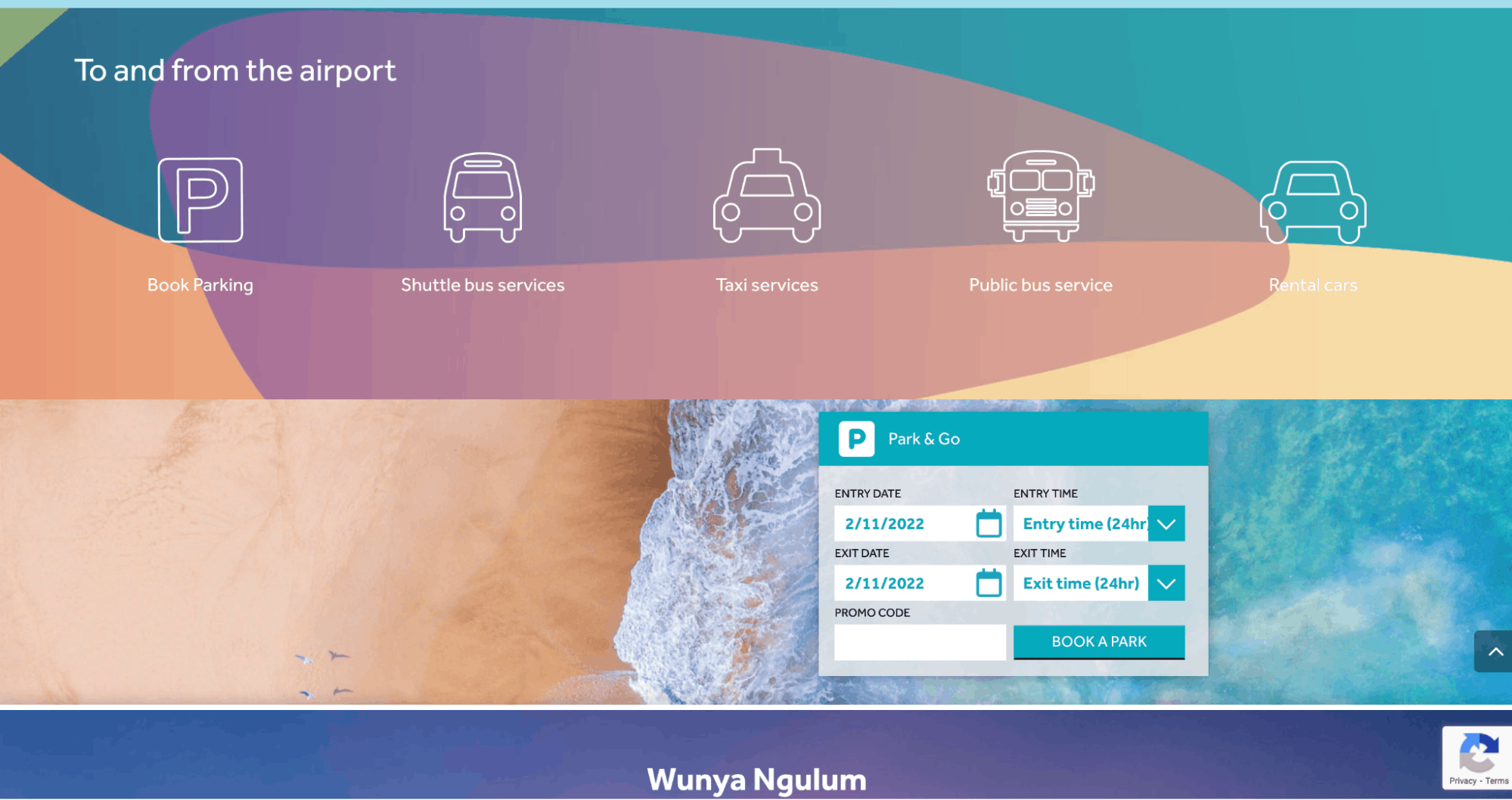
Some of the challenges we encountered included our new brand’s identity, and our bold approach to move away from more traditional airport logos which exemplified classic transport and aeronautical features (i.e. connecting lines, wing tips, aircraft etc.)
A big change was to your logo. Can you tell us how it was conceptualized?

A centerpiece of the brand, the Sunshine Coast Airport logo is a visual representation of our brand essence, ‘the natural choice’.
Deliberately different to other airport logos, and not featuring typical elements associated with aviation, we wanted to ensure the logo was synonymous with our wider region.
Organic flowing lines and an abstract painted style reflect the pristine landscape of our region and also the myriad of opportunities that make it a natural choice for residents, travellers and business people alike.
How about your color palette? How did you land on these colors, and what do they say about your brand?
The vibrancy of the Sunshine Coast Airport brand comes from its spectrum of colours. The primary colour palette is inspired by the beautiful region – its skies, ocean, flora, fauna and abundant produce.

The colours of our logo specifically reflect the colours of our region – the sun at sunrise, colours of the hinterland, oceans and waterways, and the sky at sunrise and sunset.
Can you tell us more about the fonts that you use? How were they chosen? Were they custom-made?
Our primary font is Effra, a highly legible sans-serif typeface.
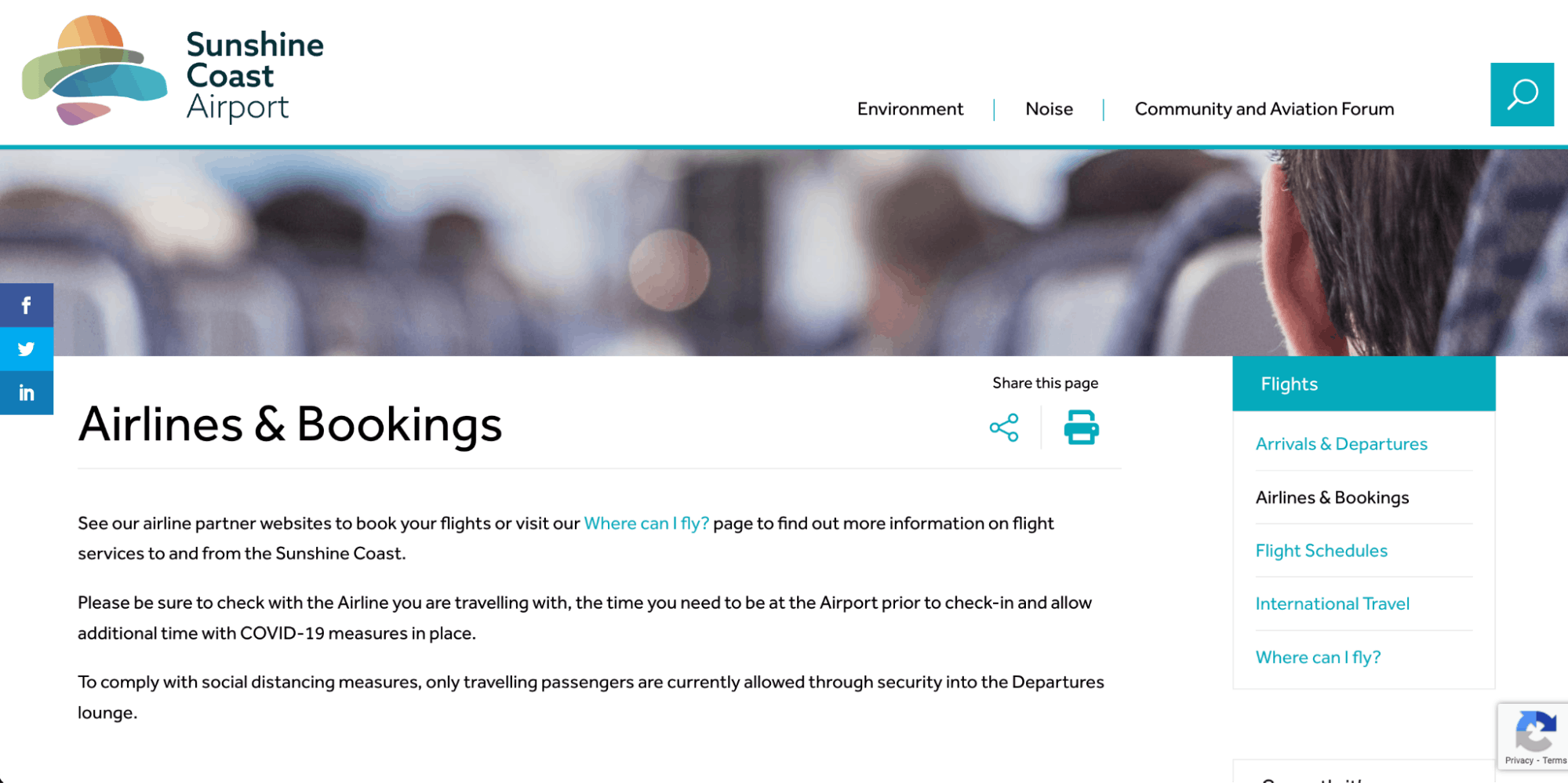
The Effra typeface comes in a wide range of weights which allows us the flexibility to be quiet and subtle or bold and strong to clearly get our message across.
For instances where Effra is not available, the popular and widely-used Arial font is used.
How about your use of photos and videos? Do you have a particular photo or video direction to keep these assets on brand?
Nothing tells our brand story like a well-chosen image. The Sunshine Coast Airport’s photographic story can be grouped into three broad tiers:
1. Our airport and people
Photography of our airport and people should be shot on site to capture the vibrant energy of the airport.
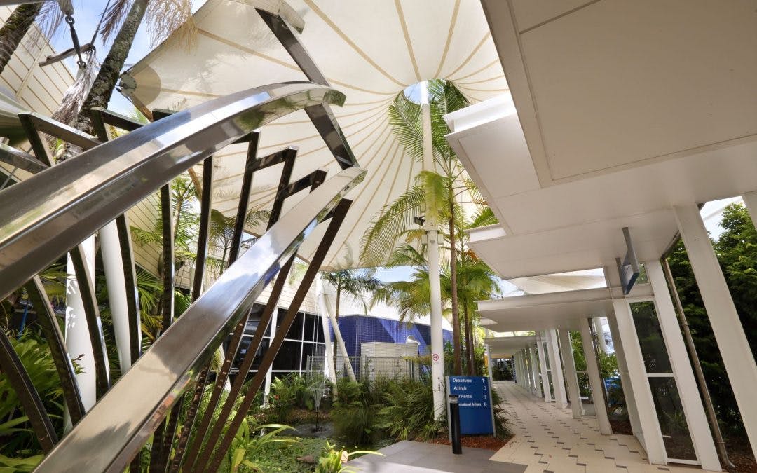
Images should feature subjects shot in natural light, set against the colours of the Sunshine Coast Airport brand. For when people do not have to be identified in a shot, consider the use of closeups, or subjects taken in striking silhouettes.
2. Our passengers & community
We know our region is built on its people. As such, we showcase our local people, businesses and visitors in our photography and brand collateral. Our people photography should be:
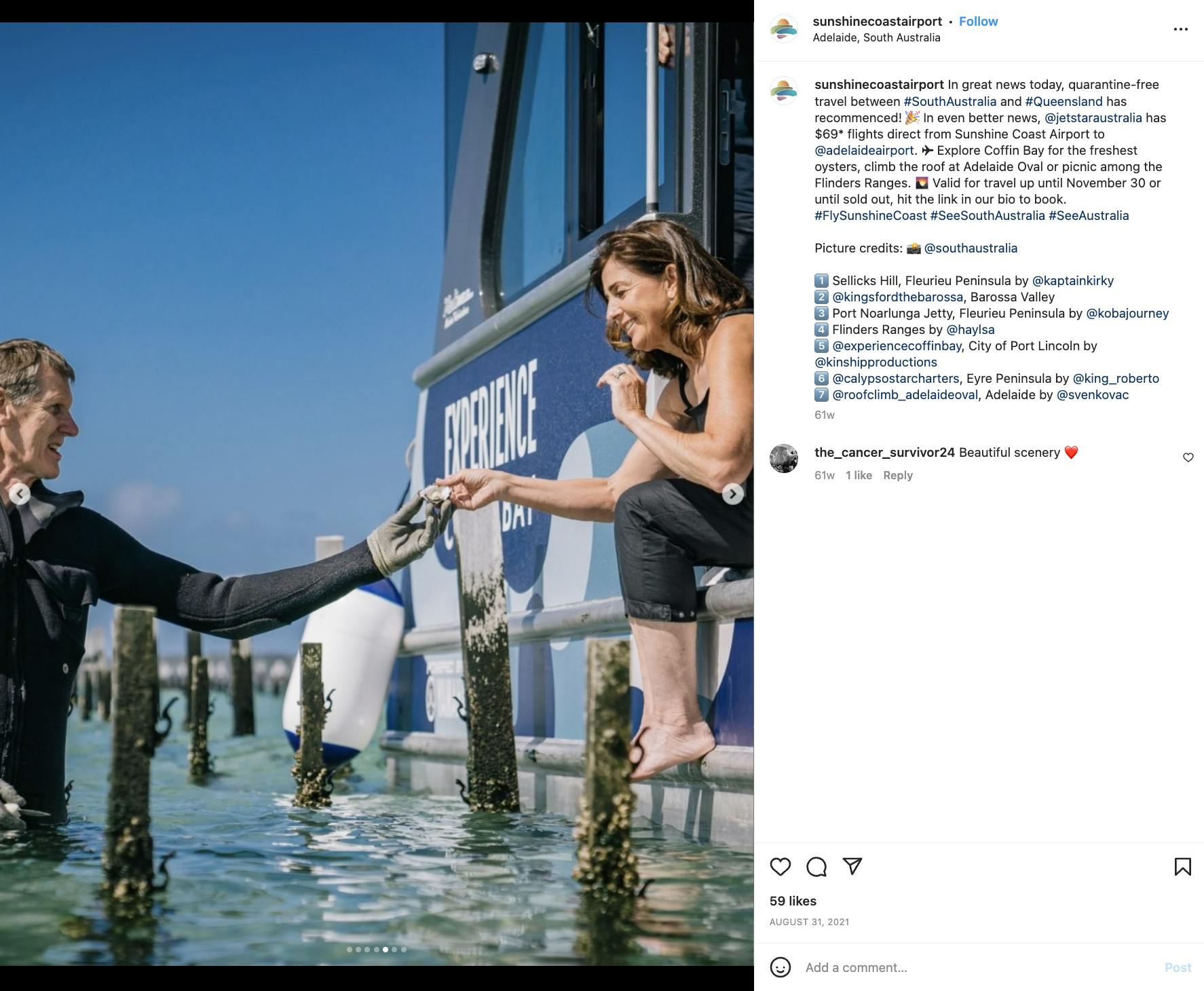
- natural candid imagery of real people
- shot in real local locations where the people live, work or visit.
3. Our region
The natural environments of the Sunshine Coast region are close to our hearts and we share and showcase them proudly in our photography, giving people a reason to choose to work, stay and play here.
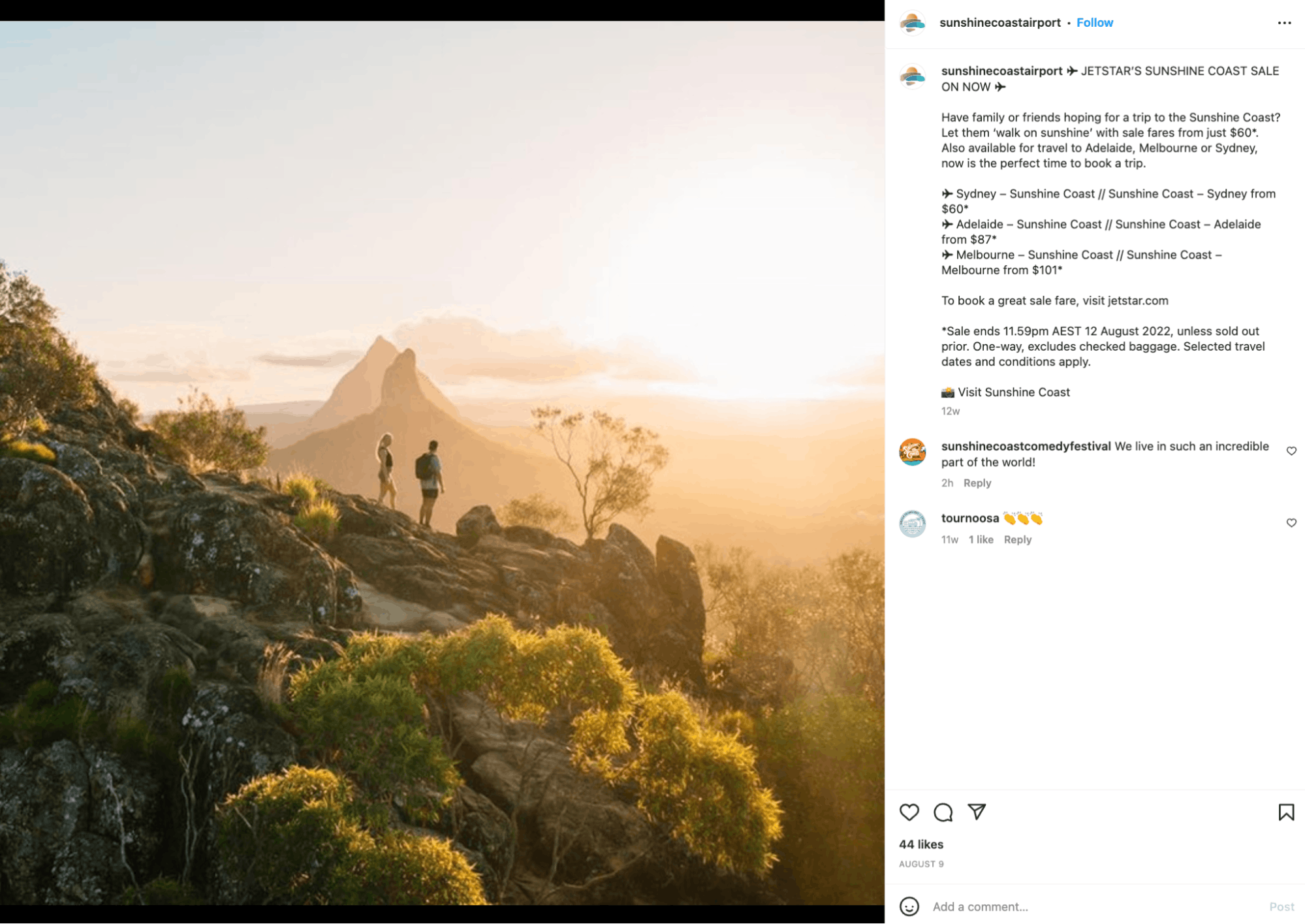
Our photography closely reflects our brand personality:
- Warm and bright
- Refreshing and exciting
- Naturally engaging
- Original and real
- Worldly and inspiring
Do you have any feedback or advice for other designers embarking on a rebranding project?
Feedback we would give to designers embarking on their own rebranding experience, would be twofold:
Reflecting on your brand as it currently stands, and asking yourself why you have started this journey in the first place. Why am I deciding to rebrand, and what are my objectives? Who am I hoping to target (or not), and what do I want my audience to think or do differently once we have rebranded.
Be brave, and true to your brand personality. It’s easy to fall back into a state of comfort, but embrace the opportunity to ensure the brand looks, feels and acts different to the old.
For us, our new brand specifically moves away from what most airport brands communicate (i.e points, arrows, straight lines for connectivity), while our new brand embraces the colours of our region, blending together (people, business, opportunities for both aero and non-aero related business) and is a stark difference to our old visual identity.
