


Ashley Mirakian is the Chief of Marketing and Audience Development at The Atlanta Opera and she talked about how they used the concept of ‘turning opera upside-down’ into their 40-year-old company’s new logo and brand identity.
Can you introduce us to The Atlanta Opera, its beginnings, and its initial branding?
The Atlanta Opera is now more than 40 years old, but the branding and logo was never a major focus. It was more utilitarian. Is it clear? Yes. Is it understandable? Yes.
So, when our world was turned upside down by the pandemic, we took that as inspiration. Let’s embrace our challenges and show that we can think and operate differently.


Can you tell us the story behind your new logo?
The idea was inspired by a clear and decisive vision of how we wanted to change the typical direction and path of our opera company. In our discussions of the changes we were making, we just kept referencing the phrase of "turning opera upside-down" that eventually it seemed like a missed opportunity if we didn’t update the logo to reflect that visually as well.
What’s the significance of the upside-down ‘Opera’ and the link between the ‘A’ in ‘Atlanta’ and the ‘A’ in ‘Opera’?
With ATLANTA clearly guiding and joining with the upside-down OPERA, it literally connected the two words both physically and metaphorically. Neither word is bolder or less dominant as they previously were. They now have similar typeface weight, size, and importance. A balance and mirror-like reflection to show how Atlanta and the world of opera have become a partnership.
Our values as a company include courage and innovation. Seeing this symbol every day reminds us that we don’t have to accept “the way things have always been,” we can adapt and challenge the status quo to better serve our community.
What has been the reception to your rebranding so far?
Overwhelmingly, reactions have been positive. We’d like to send a big thank you to those who made time to write to us about it and comment on social media.
If they don’t love it, that’s okay. Our artistic quality stands for itself, and our brand motto this year is, “Come As You Are.” Art is meant to stir reactions and start conversations.
Our board members have embraced it fully, and we knew it was the right move when they had no questions about its intent or vision. It’s a simple “yes,” but in terms of how it reflects where we are at our core, it is powerful. Merch sales are through the roof!
Do you have any advice for companies or designers also thinking of rebranding themselves?
My advice is to take a chance. As long as your rebrand captures the essence of your organizational guts, you can’t lose.
What’s next for The Atlanta Opera?
We’ve created a film studio and we now know exactly how to produce outdoor opera if and when we want to, not just if we need to.
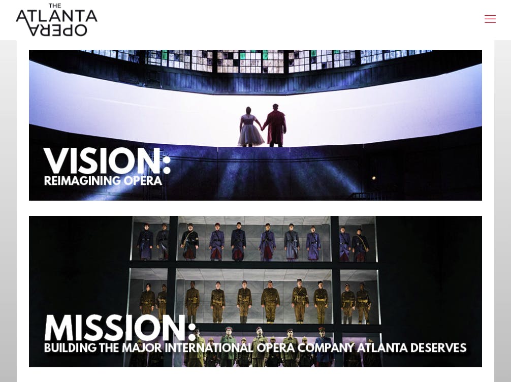
Now that we’re a global business because of our media company (Spotlight Media), we can say without hesitation that we are living up to our mission, which is building the international opera company that Atlanta deserves. Atlanta has a great history of hustling and defying expectations. We’re doing just that in the opera-verse.
