

James Maddison is the Chief Marketing Officer at TradingView, and he talked us through the experience of rebranding TradingView, the story behind their new powerful slogan, “Look First / Then Leap”, the logo proposal they bought for $10,000, and more.
Hey James, can you introduce us to TradingView, and what your initial cloud logo stood for?
TradingView is a social network and charting platform where people chart, chat and trade global markets. We have around 30 million traders and investors visiting us each month, analyzing everything from stocks to cryptocurrency, forex to futures.
Our history began over a decade ago, and our early product proposition focused on creating the best interactive charts for traders and investors and making them accessible – at low or no cost – to everyone across the internet.
So our cloud logo symbolized just that: the cloud representing ‘the cloud’ of cloud computing, and the line chart highlighting our chart-led product offering. It was a humble design, but at the time nobody was doing any of this. So it worked incredibly well at conveying not only our brand identity but also the cutting edge nature of our product.
How does your new brand align with TradingView’s mission?
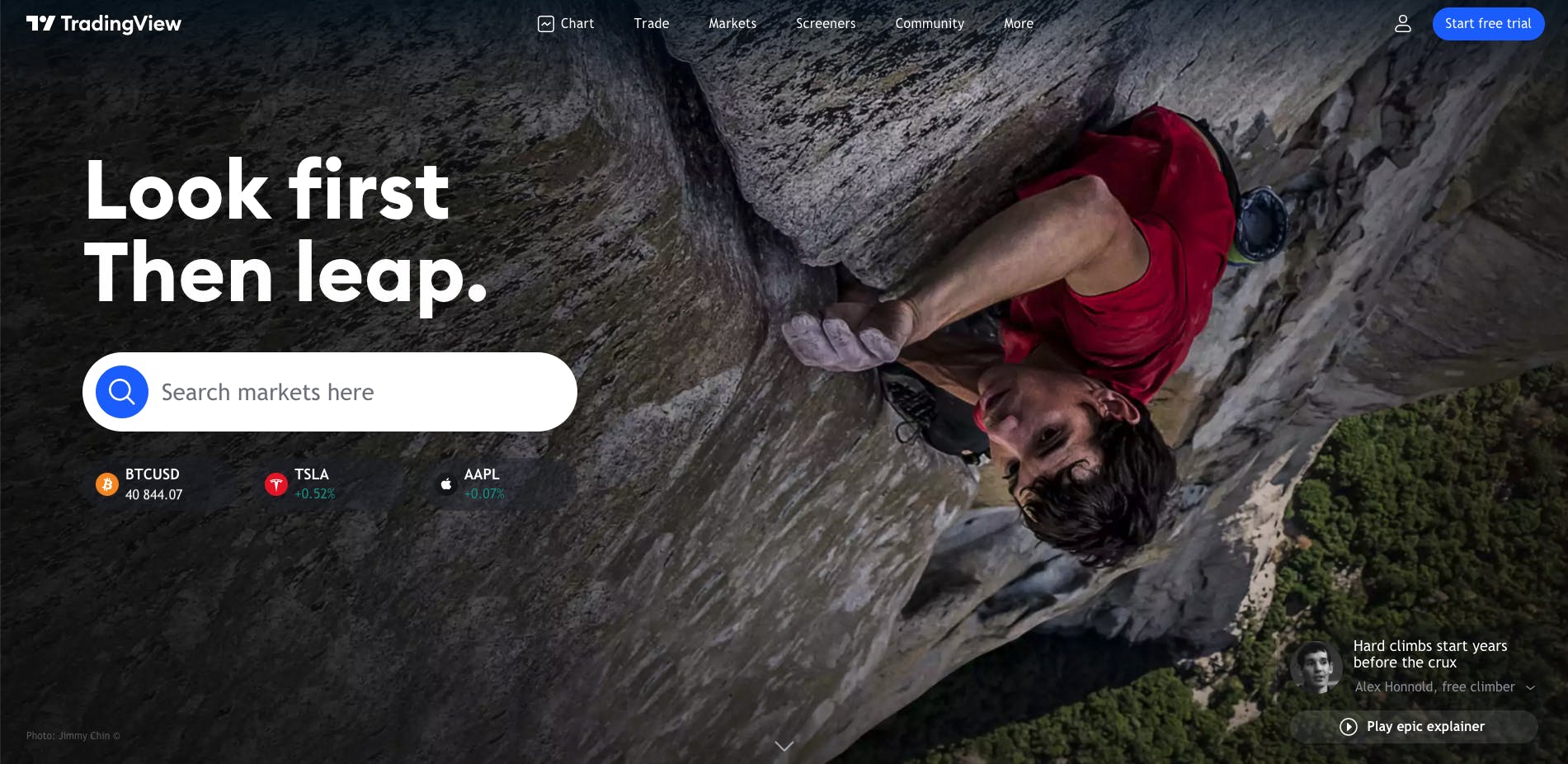
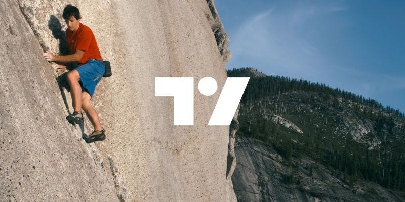
Our new logo is composed of three separate marks. The leftmost right angle represents a frame, a nod to our charting product and heritage. The dot in the center represents an eye and the act of looking, which is what our users are doing on TradingView on a daily basis: analyzing markets. Finally, the upwards right slash is a simple representation of the outcome all our users would like to see: profit. Together, the three elements form a slightly abstracted ‘TV’ monogram, which we think looks ace.
Our vision of the world we’d like to help build is that of ‘Always an informed decision’. That – whoever you are and wherever you happen to be – having access to the right financial tools and data helps increase your odds of becoming successful, whatever success means to you.
This is because financial success unlocks more resources and flexibility for you to act independently – so you can more easily pursue whatever it is you find personally meaningful. Our new brand starts with this vision and then goes further with a public-facing call to action for traders and investors to Look first / Then leap.
What prompted you to rebrand, can you walk us through your thinking here?
Tens of millions of people visit us each and every month. We’re in the top 70 websites in the world, according to Alexa Rank, we’re the number one investing website globally, according to SimilarWeb. Yet ask the average Jo on the street and they wouldn’t be able to tell you who we were.
Our former brand was well-designed, but due to its exclusive focus on our product (financial data visualization), there was an air of anonymity and forget-ability to us.
Our power users could talk about us all day long, but first-time and casual users were just as likely to find us, get the info they needed, then bounce. So the conversation really got going when I joined the company, nearly 18 months ago. My thinking that we needed a more memorable brand gelled with the company’s co-founders own thoughts and so, pretty early on, we began making plans for what we’d change and why.
Can you walk us through the rebranding process? Was it all smooth?
Is any act of creation ever completely smooth? No. For us, it was a long journey and not always an easy one.
We kicked things off by interrogating our first principles: why does TradingView exist? How does our product help our users? Why do people trade and invest in the first place? From this, we formulated a brand narrative that gave us a succinct vision: Always an informed decision, and a starting point visually: the iconography of the American Dream.
The thinking – backed up by survey data at the time – was that there’s a strong propensity within traders to be masters of their fate, captains of their soul. They have a high affinity towards maximizing their freedom by increasing their wealth and, at the same time, reducing their dependence on traditional forms of employment. And so, if you want to appeal to such free spirits, where better to start than with the long established, sometimes maligned but never forgotten, narrative of the American Dream?
Unfortunately our early attempts, which we worked on with the assistance of a design consultant, fell a bit flat. Back then, we felt a strong typographic-led route was the way to go; big, massive, in-your-face text. But it was too loud and worked against the objective nature of the financial data that our product visualizes. It was like putting propaganda in the middle of a newspaper--it just felt wrong. So we had to ditch that route. Not long after, we started working with the design agency Pentagram.
Early concept work with them focused on mellowing the design language somewhat and more evocatively articulating our vision, which became the slogan Look first / Then leap. Once we nailed this, we really started to get somewhere. The logo came not long after, and from there our internal design team then went into overdrive. I’m really proud of how they took all the design elements we’d discussed in theory and crafted a holistic new homepage from them. That was the real crux of the challenge for us but they handled it all in their stride and did an amazing job. I believe the final result really sums up everything we wanted to articulate about TradingView.
Are there things you wished you knew before rebranding?
Looking back, if there’s one thing I wished I’d been told before I went into this process, I think it would be:
Don’t limit yourself to what’s already in front of you.
We tried for a long time to incorporate elements like the old logo into the new design, and bold pictures of athletes into the thin headers we had at the time. It was only when we said, ‘let’s not worry about all these things anymore’, and started designing outside of constructs we thought inviolable, that we began to make real headway.
How did you come up with the slogan “Look first / Then leap”?
My original idea was to use the slogan “Chart big.” Don’t just dream big, actually plot out a path to achieving that success. When we started working with Pentagram, however, we also started working with marketing legend John Grant and he came up with this masterclass of our current slogan. We switched to that and never looked back.
The reason it works, in our opinion, is because it balances the product offering: TradingView is where you ‘Look First’ with a bold and memorable call to action: ‘Then Leap’. That also perfectly introduces our association with our athletes and extreme sports imagery, too.
In life, anything important shouldn't be undertaken without preparation. At the same time, when the big moment finally arrives, you have to actually commit or enter the arena, so to speak. Otherwise, you’ll forever be on the sidelines, and what a waste that would be.
So for us, LFTL is also a call to action for what you do outside of trading, too. And that’s another reason why we love supporting athletes, they embody this mantra with every climb/ski/adventure.
Your users seem very vocal about your new brand in both good and bad ways, any thoughts worth sharing?
Well, I guess I would say to them that a brand is only as powerful as the feelings you associate with it.
Our new branding is young and it’s only just started its journey. So, I’d really not obsess all that much about the specific arrangement of pixels you see on your screen at the moment, but rather, on the ambition and intention that lay behind them.
We do big things, bold things. We’re not afraid to take risks and continue to build the best home for traders and investors worldwide. That’s what you should see whenever you look at TradingView.
Can you share some behind-the-scenes look with your partnership with famous athletes?
Our collaboration with our athletes brings to life the slogan “Look first / Then leap” and it’s really exciting to finally be able to publicly announce our partnerships with Alex Honnold, Caite Zeliff, and Leo Houlding.
Having had lots of chats with the three, I can tell you they’re all genuinely incredible people who do amazing things and yet remain so humble about all of it. Everything's no big deal. We’re only really just getting started with these partnerships, but you should expect more big and bold cinematography featuring the athletes to come down the pipeline soon.
TradingView’s youngest fan, Ezra, sketched a proposal for a new logo, any comments?
I love it. I can clearly see a T which changes into a V depending on how much you tilt your head to the left, which I think is a great play on Ezra’s part to the inherent subjectivity of the viewer, and how the specificity of one’s exact positioning in space and time routinely changes our innate perception of objective reality.
It’s a pretty accurate representation of the markets in 2021, not to mention this whole new TradingView logo debate. And he’s backed it up with a kick-ass mountain in the background, a subtle nod to our athletes and probably the mountains we all have to climb in life as well.
The kid’s a genius, which is why we paid him $10,000 for the rights to his work.
What’s next for TradingView?
Oh, many, many things, but they’re mostly all a secret for now. On the brand side though, I can say to look out for a big new ad that'll be coming out from us soon. I’m in love with it and hope you folks will be, too.