
before
after

Inside the Twelve Labs rebrand with Sean Barclay, Lead Product Designer and systems thinker behind the new look.
Can you share with us TwelveLabs’ origin story and how the company has evolved since?
The company has evolved quite a bit. It all started back in 2018 with Jae, Aiden, and SJ—three of the five co-founders—who met while working at the Korean Cyber Command. They were tackling serious national security challenges that required better video understanding technology.
They quickly realized the existing tech just wasn’t up to snuff. So they brought on Soyuong and Dave, and together, the five of them founded TwelveLabs. Basically, they took matters into their own hands—diving into research and building their first model for video understanding from scratch.
TwelveLabs Previous Homepage
That led to an event where they pitched their work, secured funding, and really kickstarted the journey. From there, things took off. In the beginning, they were still working in cyber command, so they’d meet up at cafés in South Korea to get things done. They used to work out of a bagel shop—now we’ve got an office in San Francisco. We also have a base in Seoul, South Korea, and quite a few folks working remotely out of LA—spaces like WeWork and other home setups.
Image Courtesy by Pentagram
Can you tell us—what exactly does Twelve Labs do?
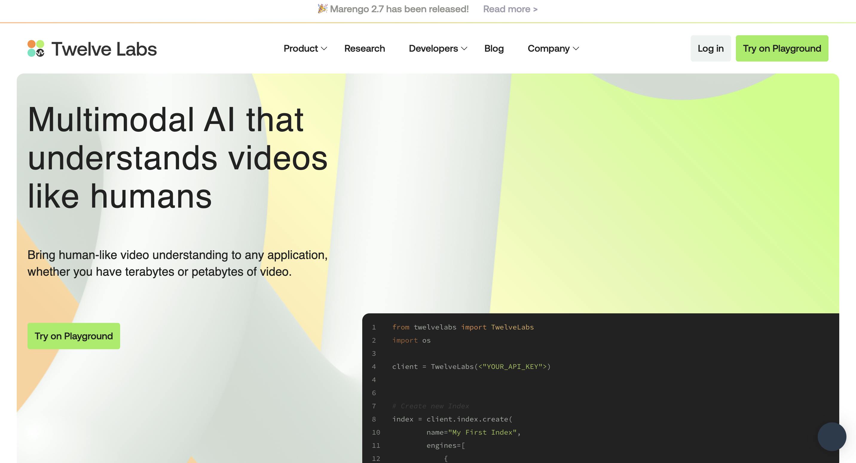
We’re building the best video understanding platform, powered by leading research in perceptual reasoning. Put another way, we make AI models that specialize on understanding video data.
Video is a really hard problem for AI to solve—and understanding video is the key. We don’t reduce it to just image or speech understanding. That’s the wrong approach.
From the start, we’ve taken a video-first approach—because that’s the only way to truly solve the problem. We build foundational models and APIs to help developers bring video understanding into their workflows, whether it’s for video production or internal video libraries. The goal: make those processes faster, smarter, and more efficient.
In a sea of GenAI noise, we’ve focused on substance. We’ve built two foundational models—Marengo and Pegasus. Marengo lets you search for specific moments in your videos using natural language. Ask it anything like “find when the person enters the room,” and it’ll pull up that clip instantly.
Then there’s Pegasus that enables analysis— it lets you analyze videos and generate text from them. You can ask: “Can you summarize this video for me?”, “Can you break it into chapters?” or “Can you write a catchy headline for this video?”
It’s basically video-to-text. Our models watch your video like a human can—and understand it.
A lot of folks misunderstand what we do at first. But once developers, editors, or media producers actually try it, it clicks—because it solves the real pain points they face. Instead of scrubbing through hours of footage, tagging, or taking notes manually, they get straight to the insights.
Image Courtesy by Pentagram
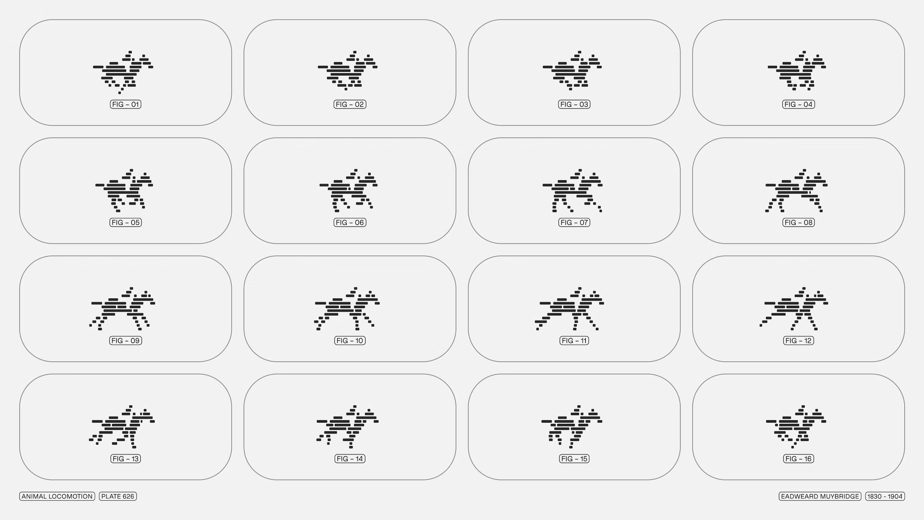
Image Courtesy by Pentagram
How do you reduce AI error in video understanding—and how do you build trust with users who don’t see what happens behind the scenes?
One way we address this is through our Playground—a visual way to demo our search and analyze APIs. We also have an embed API that lets users directly access the embeddings—essentially the statistical representations our models create when processing a video.
Imagine you're a movie studio. You’ve got a huge library of footage, and you want to find a moment—like "cars driving in a desert dystopia." With natural language search, you just type that in and our model pulls up the exact moment—maybe it’s Mad Max, maybe another film entirely. It works across genres.
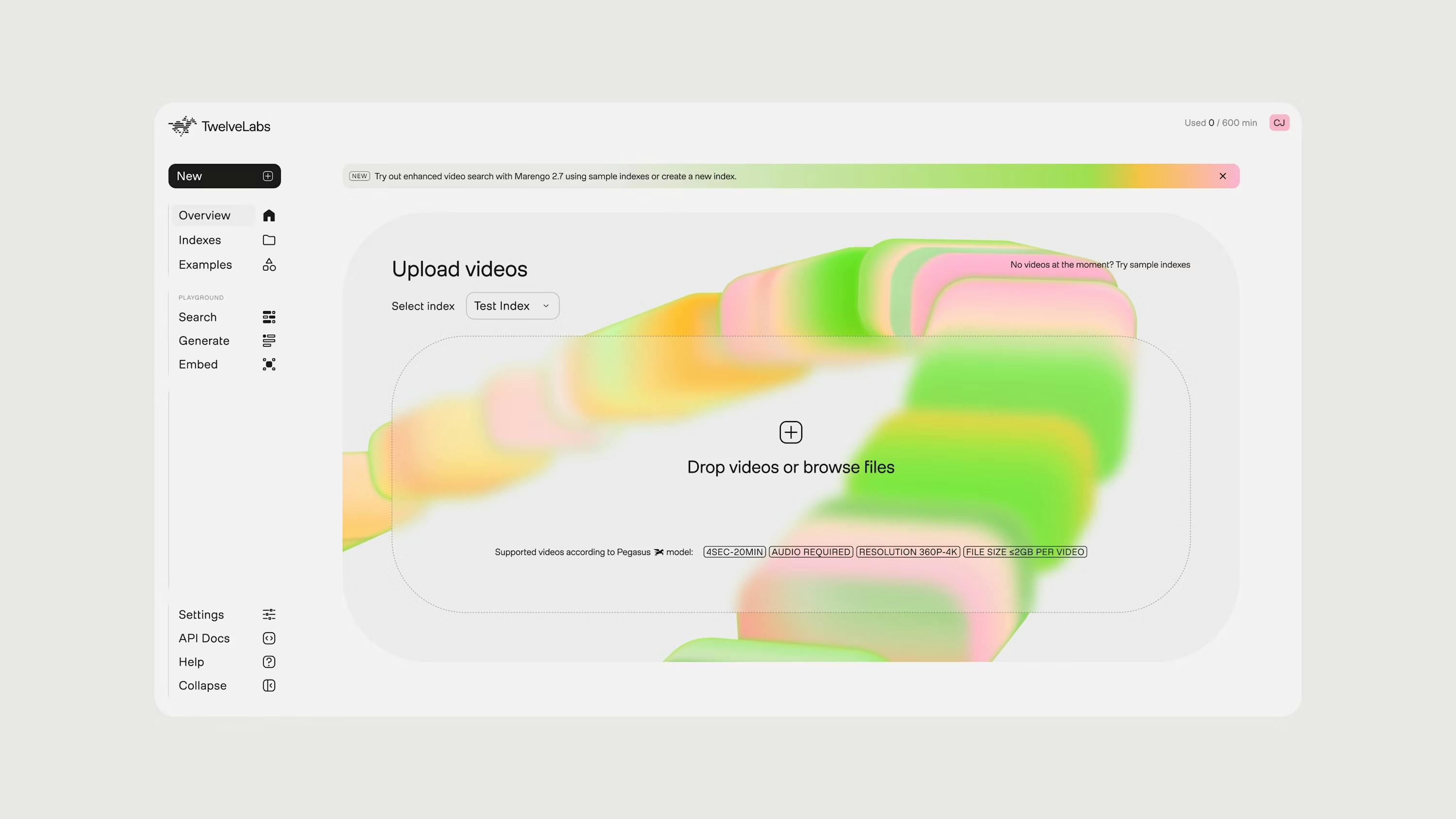
Image Courtesy by Pentagram
You could also search for something like “find me a man wearing a helmet.” You might get results ranging from a Roman gladiator to a World War II soldier to a space astronaut. Sometimes results are perfect. Sometimes, they’re close but not quite right. That’s where ranking comes in—we try to present results in a way that helps users decide if it’s the right match.
We know there can be false positives, so we’re constantly improving the models by learning from how users interact with them. We want to make sure that over time, the results get more accurate.
Just like other AI models, ours are always learning. You prompt it, it returns a result, and behind the scenes we’re fine-tuning things to make sure that next time, it’s even better.
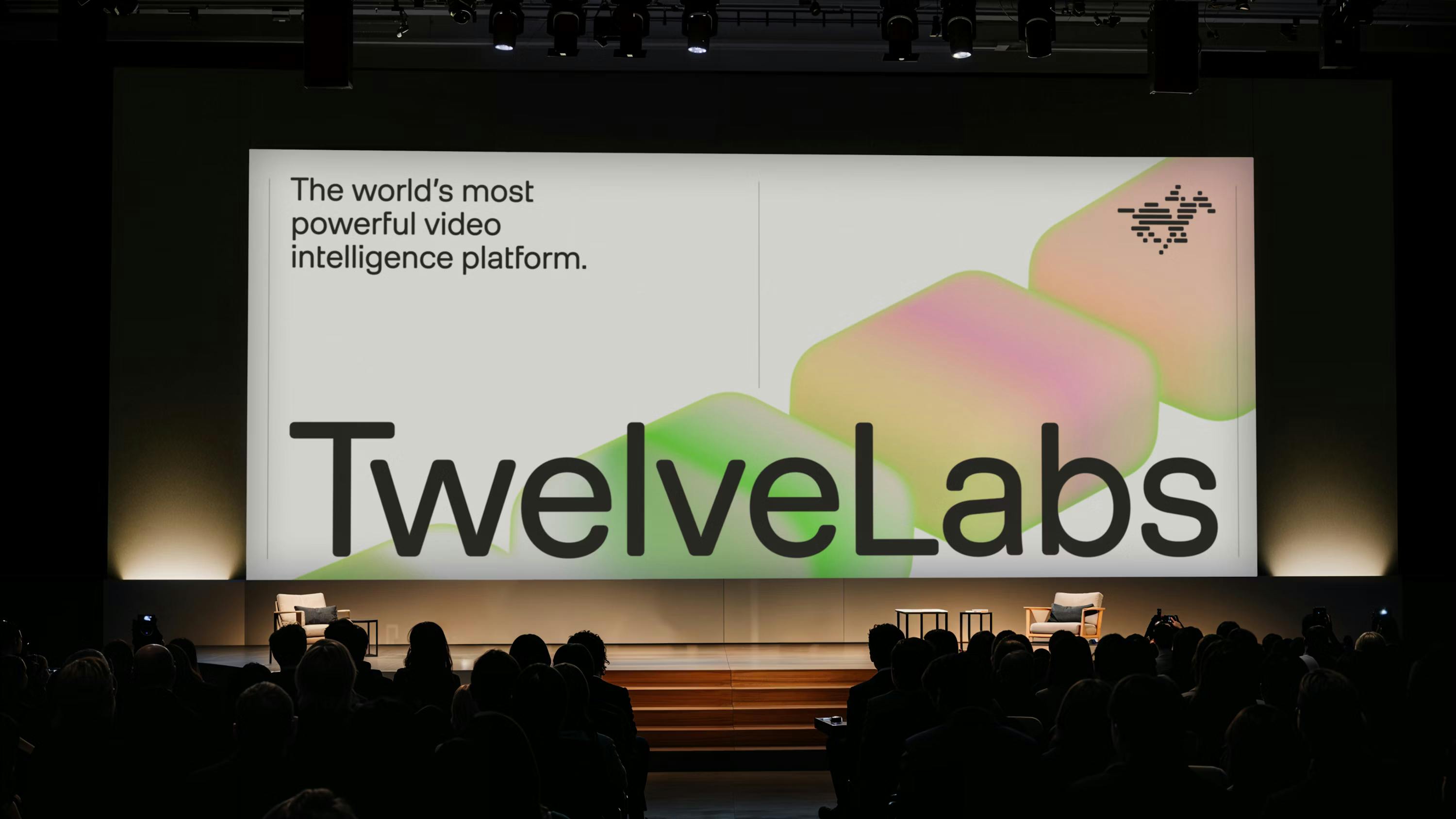
Image Courtesy by Pentagram
The new logo features a pixelated horse. Why a horse—and what does it symbolize in the context of video and AI?
The original logo was inspired by RGB—video as color—and sound waves as audio. But the new logo, with the jockey and horse, is an homage to one of the earliest pieces of motion capture: a galloping horse captured with 12 cameras in the 1800s.
That footage was part of a scientific debate about whether a horse ever lifts all four feet off the ground mid-gallop. Leland Stanford, the founder of Stanford, hired photographer Eadweard Muybridge to prove it—no relation to us, but the spirit of innovation stuck.
"So our logo is a nod to that early moment in film history, symbolizing movement, progress, and technological curiosity."

Image Courtesy by Pentagram
The horizontal strokes represent threads—weaving the past into the future—and the horse captures the energy of our foundational models. The jockey symbolizes human control, guiding the system forward. It’s all about constant motion and continuity—like the engines of AI always running.
We worked with Jody and his team at Pentagram to develop it. Funny enough, we originally wanted to avoid horses entirely. But when they came back with this concept and showed us the animation, we couldn’t say no.
"We looked at it and couldn’t say no—it was just so cool. Then they animated it and our minds were blown."
Image Courtesy by Pentagram
Image Courtesy by Pentagram
You worked with Pentagram—one of the most iconic design studios. What was non-negotiable for Twelve Labs in that process?
We were very open to collaborating with them—and gave them a lot of freedom, which they appreciated. But we also had a really neat and intricate design system we’d outgrown, and we knew it was time for a change.
That was one of the reasons we rebranded in the first place. Through a mutual friend in the AI space, our CEO was introduced to Jody and his team, and made contact with them. In terms of non-negotiables—there were two things we were clear about. The first was our models. They wanted to rename Marengo and Pegasus, or at least asked if we’d be open to it—and we said no. Part of the reason is because those names are deeply tied to our API and model infrastructure, so changing them would’ve meant a lot of rework behind the scenes.
The general consensus was: we liked those names. Marengo is actually the name of Napoleon’s horse, and Pegasus is, well, a Pegasus, the mythical horse of Greek mythology. Most people love the story behind Marengo. We even had a naming contest in the office—that’s how it came about, and we stuck with it.
We also have an AI agent framework called Jockey, so the horse motif kept reappearing. When we landed on the new logo, it just felt like a natural continuation of everything we’d built.
Despite trying to get away from it, we eventually rode on back.
The new palette introduces unexpected brights—green, peach, pink. What narrative or feeling were you hoping to convey with this shift?
We had a very intricate brand and color system before, and our brand is deeply rooted in video and rich color depth. What we wanted to do was create better harmony with the colors. We felt that what we had before wasn’t quite working in that sense.
Jody’s team proposed using the LCH color space—which stands for lightness, chroma, and hue—to better balance and unify the spectrum. This approach made the palette feel both vibrant and consistent.
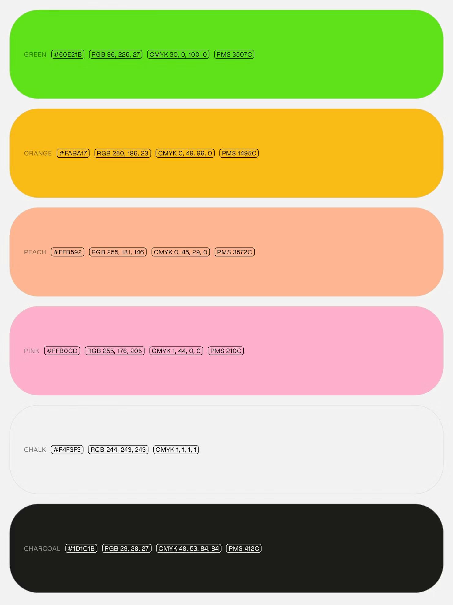
Image Courtesy by Pentagram
We also introduced secondary colors mapped to specific product features. Each product now has one dominant hue and one supporting hue. The dominant color represents the product itself, while the supporting one enriches the system for product thread renders and diagrams.
That was really the impetus: to take what we had, refine it, and build a color system that feels more balanced and harmonious.
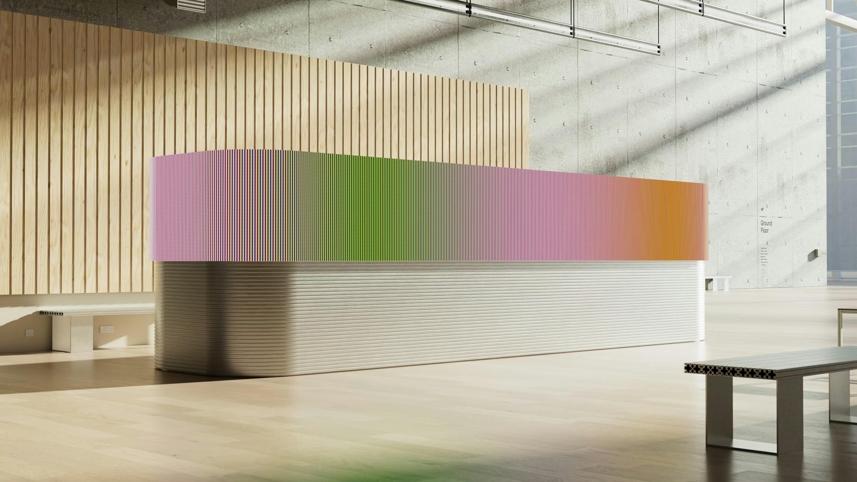
Image Courtesy by Pentagram
Image Courtesy by Pentagram
Your website and product visuals lean into a modular, almost brick-like layout for displaying video content. What inspired that recurring motif?
We call them “threads.” It all starts with a concept we use internally: a volume. The way we analyze video is through what we call temporal-spatial reasoning—we look at the full video from start to finish, rather than slicing it up frame by frame. Other AI companies typically analyze video one frame at a time. We look at it temporally—as a whole.
So when we were designing our visual identity, we started with that idea of a volume, which eventually became the basis for how we visualize video itself.
In that framework, threads represent your entire video corpus. We created 3D, isometric, and 2D versions of these threads so they could flexibly support how videos are displayed across our product and website. It gave us a creative, modular system—and a way to express our color palette through the threads themselves.
How does this rebrand shape how you want Twelve Labs to be seen externally in the long run?
We see it as a work in progress. We’ve built a really strong system. But we’re not done—we want to keep refining it with the help of research.
We’ve recently conducted a lot of user research and received some really interesting feedback—from both customers and people who hadn’t interacted with us before. We’re taking all of that in and using it to make the experience better.
Right now, we think the rebrand is helping tell a much clearer, more compelling story.
Image Courtesy by Pentagram
Image Courtesy by Pentagram
We’ve seen people get genuinely excited when they encounter the new visual identity and the narrative behind it.
It sparks curiosity. It gives people different ways to imagine what we are. And that’s what we’re aiming for: making it quicker and easier for folks to understand what TwelveLabs does, what we offer, and how we can help them better understand video.
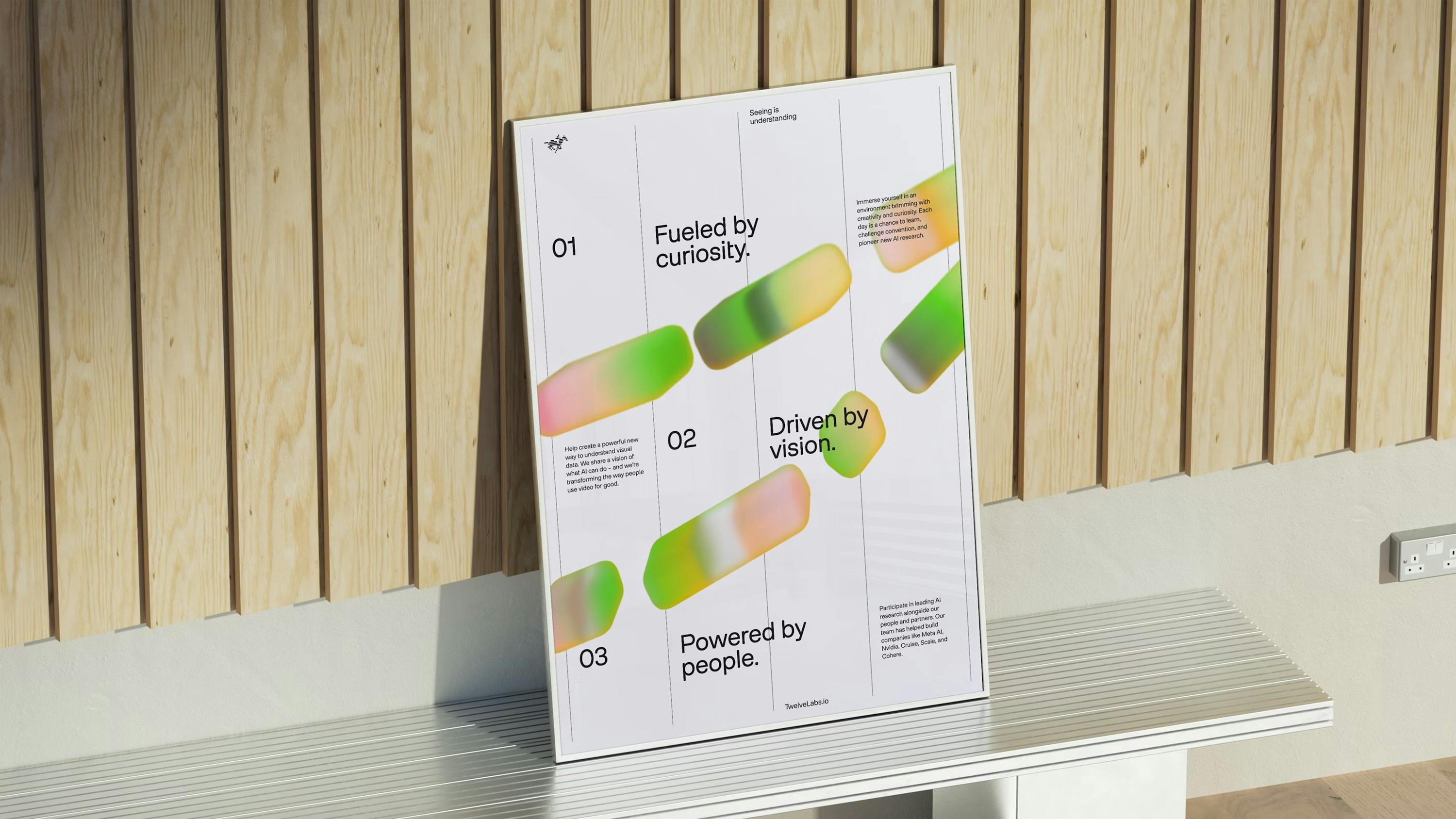
Image Courtesy by Pentagram
Image Courtesy by Pentagram
Looking back at the rebranding journey, what surprised you the most—either creatively or emotionally?
From my perspective, it was the support and involvement from the co-founders—especially Jae, our CEO—that stood out. They brought strong perspectives to the table, which makes sense—TwelveLabs is their baby—but they were also open and curious throughout the process. I think, in some ways, the process was therapeutic. It pushed many of us to rethink how we present ourselves, how we communicate, and how much we’ve grown since our seed-stage days. Now we’re post-Series A, and we’re moving forward with a stronger identity.
Seeing how the team responded to that challenge—and how we came together with Pentagram to build this new brand narrative—was really rewarding.
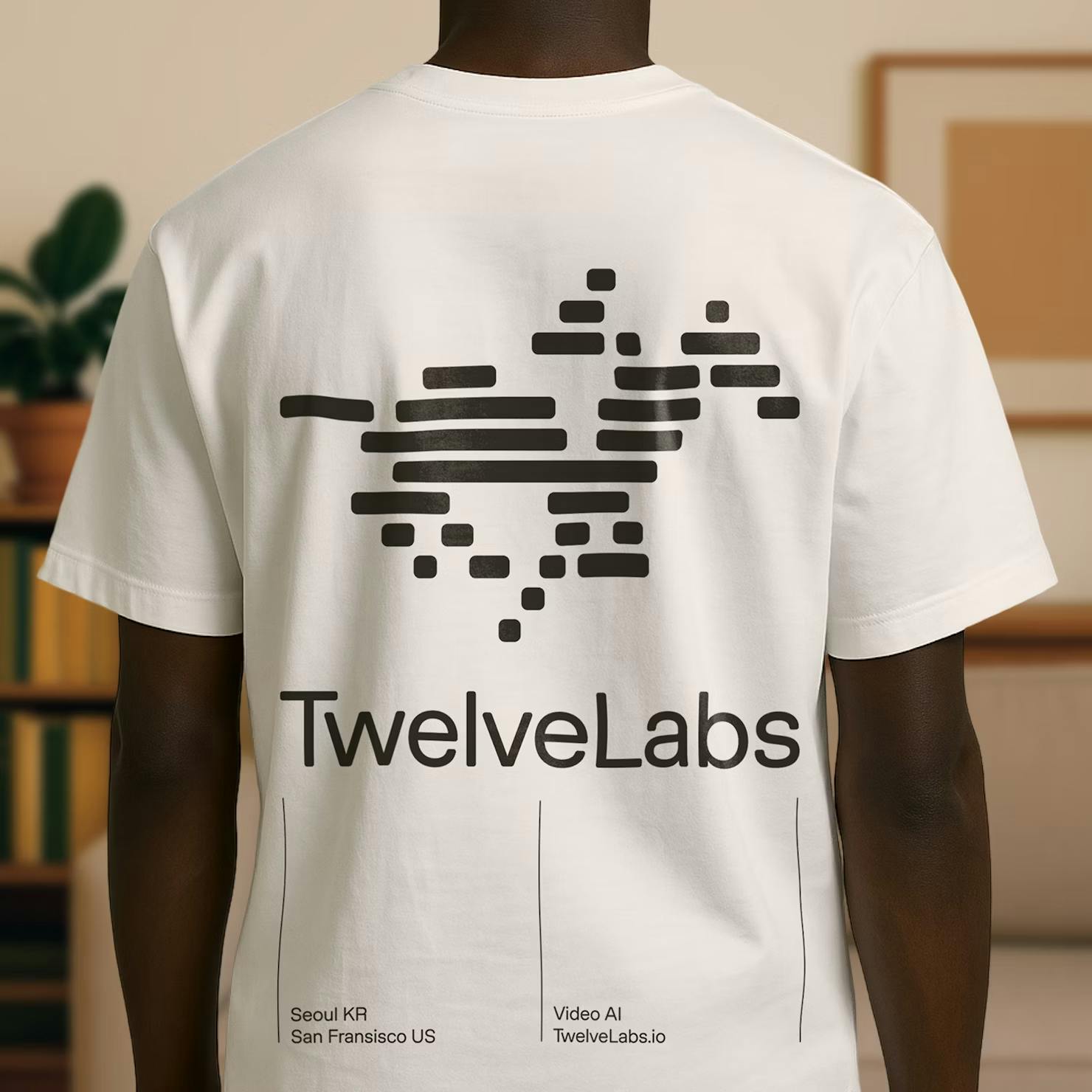
Image Courtesy by Pentagram
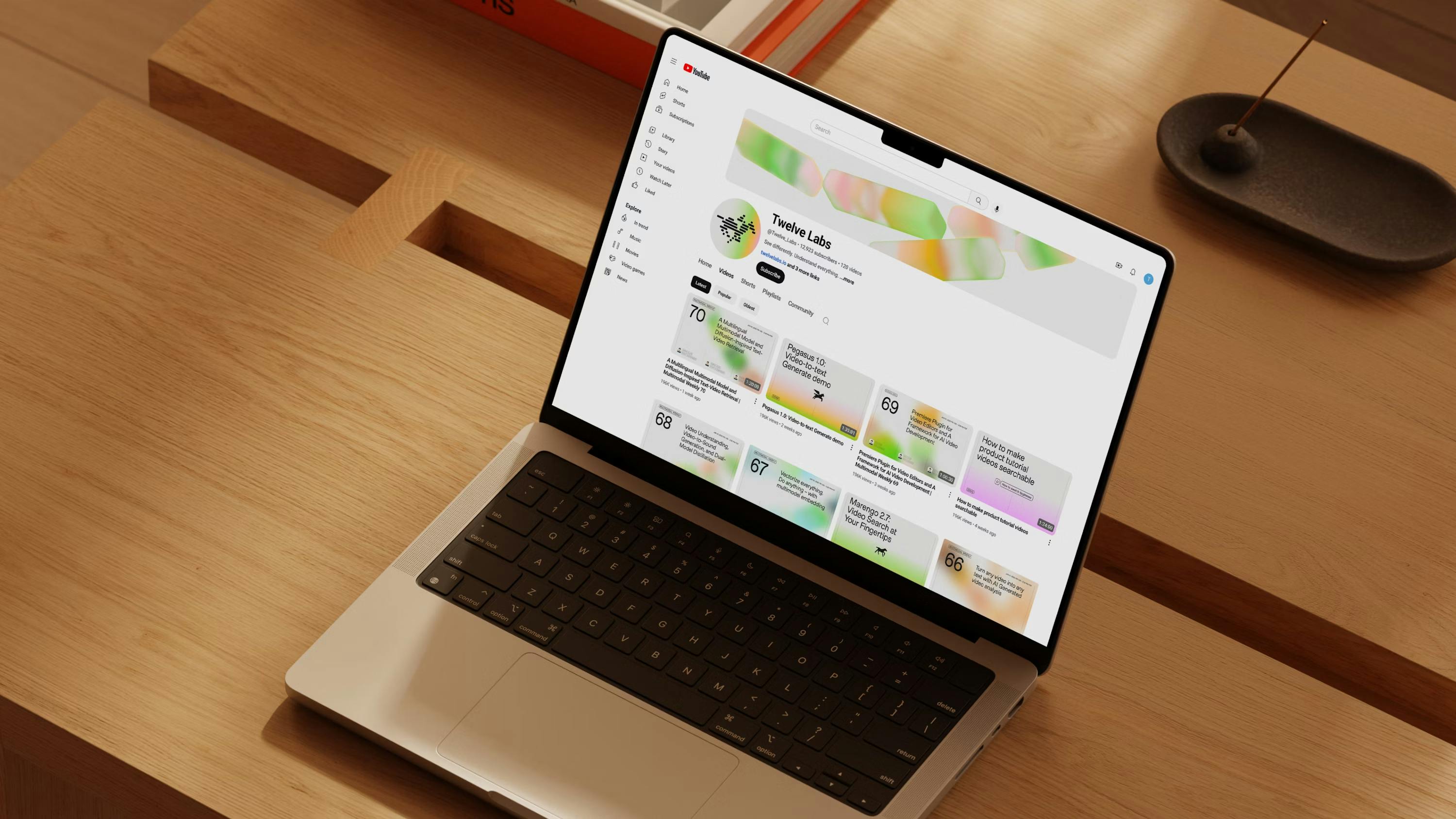
Image Courtesy by Pentagram
One of the things that stood out was working with Pentagram. Jody and his team were thoughtful collaborators—responsive, open to ideas, and a pleasure to work with. I’ve been inspired by Pentagram’s design work for over 20 years, and it was a privilege to experience their creative process firsthand.
It gave us a new perspective on how to approach design at this scale. It felt like a good fit for where we were in our journey, and we appreciated the structure and thinking they brought to the table.
I wouldn’t say I was surprised by their greatness—we expected that. But they delivered on every level. It reminded me that even when you expect the best, the journey still takes work.
