
before

after

We spoke with David Hooker, Brand Director at Printify and Printful, about the thinking behind the rebrand, narrowing the brand’s focus, and how it all connects to customer growth.
Can you walk us through the early days of Printify and how the company has evolved since?
Printify was founded in 2015 by three guys from Riga, Latvia—one of them being James Berdigans, who’s still our Executive Chairman today.
Before Printify, James ran a business selling personalized accessories for Apple products—mainly laptop and iPad sleeves. The idea was that you could customize them with your name, a quote, or your own design. They figured out how to personalize the products, but the catch was they had to order huge amounts of inventory upfront. James ended up storing all of it in his mom’s garage, hoping it would sell—but most of it didn’t.
They made some sales, but it quickly became clear how hard it is to predict demand. That’s when James discovered there were print houses around the world offering what’s now known as Print-on-Demand (POD). With POD, a customer places an order, pays for it, and then the product is printed and shipped—tailored exactly to their size, color, and design.
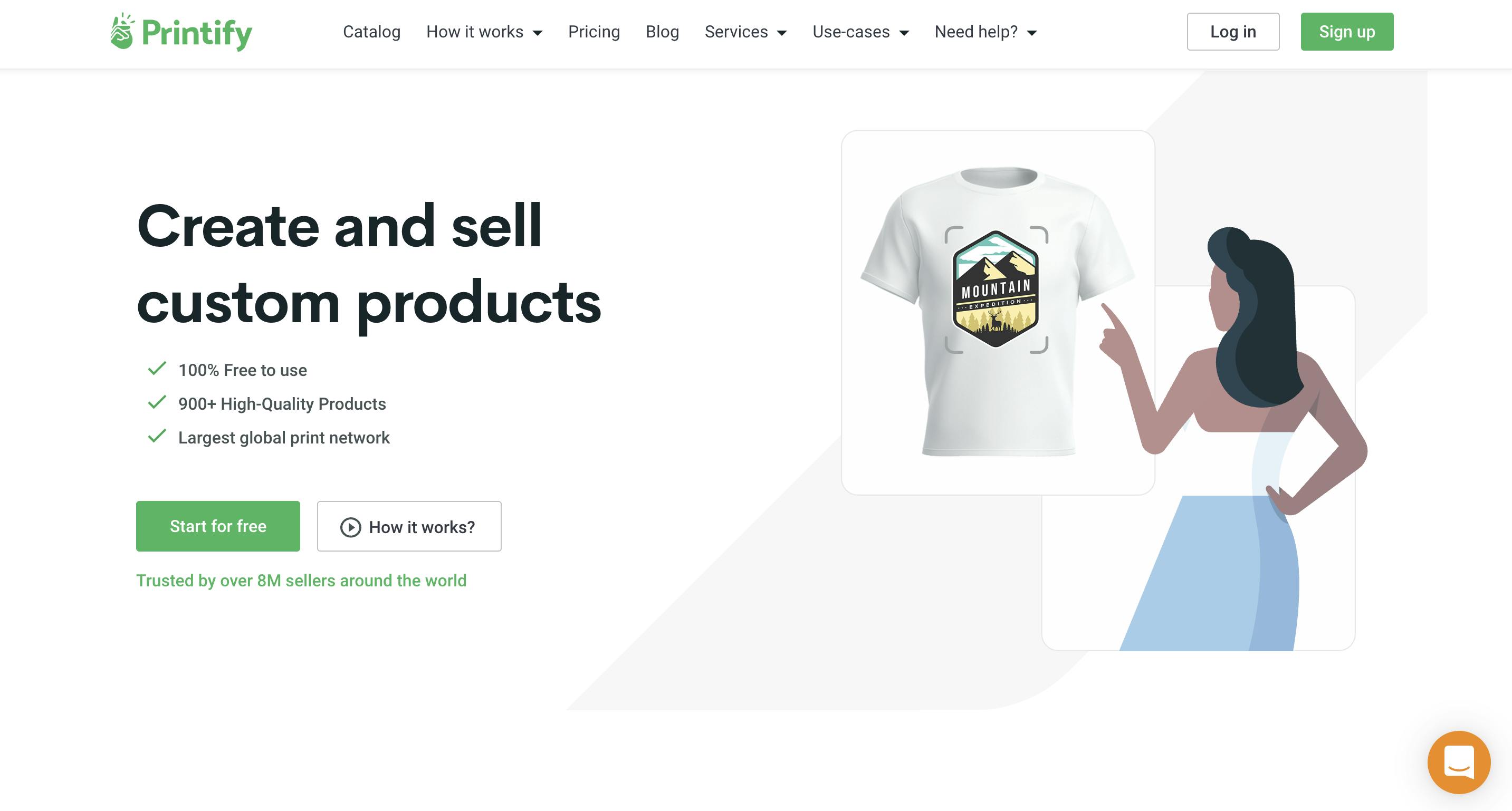
Printify' Old Homepage
That insight is what sparked the journey we’re on today. Since then, between Printify and Printful (which started around the same time in 2014 and in November 2024 merged with Printify), we’ve printed and shipped well over 150 million orders to more than 190 countries. We’ve even delivered items to Antarctica—so we really mean everywhere.
What we enable is the ability to start a business completely risk-free. You can go to Printify or Printful, sign up for a free account, choose a product, add your design, connect it to your sales channel—Etsy, Shopify, Amazon, TikTok, wherever—and start selling to anyone, anywhere, with zero upfront investment.
What I love most about working here is the stories. One that stands out is Cassie, from the Midwest. At the start of the pandemic, she and her husband lost their jobs. With two small kids at home and nowhere to go, she found print-on-demand, started designing, and began selling online. Today, she’s made over a million dollars in sales.
That’s real success—and she’s just one of hundreds of thousands of merchants we’ve helped get started. Stories like hers are the reason we do what we do.
What specific goals or challenges led to the decision to rebrand Printify? Was it tied to the merger with Printful?
Actually, the Printify rebrand was something we’d been planning long before the merger with Printful was even on the table. We spent about two years working on it—defining our story, refining our messaging, and figuring out how to visually express that. It wasn’t just about a new logo or color palette—it was about building a visual identity that matched the scale and complexity of what Printify really is.
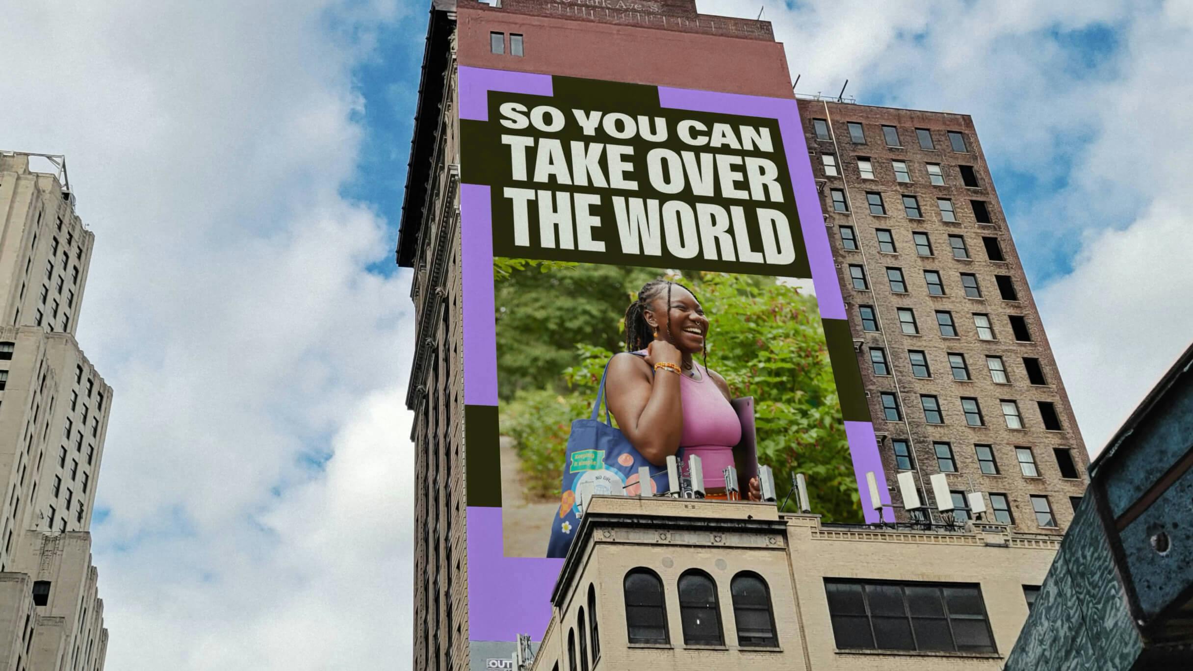
Image courtesy by Printify
If you visit Printify, you’ll see it’s much more than just a website. There’s a product catalog with over 1,300 items and more than 40,000 SKUs when you factor in variations like sizes and colors. We’re also an app where you can design products directly. So rebranding meant redesigning thousands of screens across multiple platforms—it was a massive, complex undertaking that had already been set in motion well before the merger.
It just happened that we launched the rebrand in October last year, and then the merger with Printful was announced the following month, in November. Some of us knew the merger was coming by the time we launched, but the two initiatives weren’t directly connected.
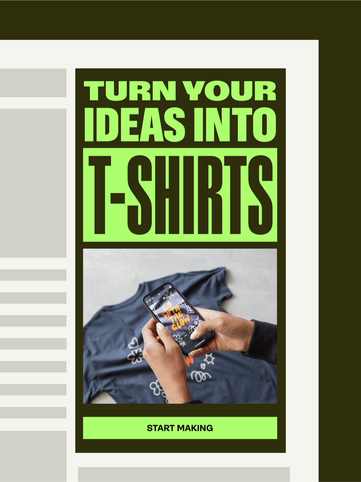
Image courtesy by Printify
Why did Printify and Printful decide to merge, and how do the two companies complement each other?
The reason for the merger itself was simple: Printify and Printful empower similar purposes but in different ways, and we saw an opportunity to create more value together. Both companies help businesses fulfill orders—ranging from small sellers like Cassie to major brands like Netflix, CBS, and Warner Bros. But we approached fulfillment differently.
Printify connects merchants to a network of over 85 print providers with 117 printing facilities globally. Printful, on the other hand, owns and operates its own large-scale facilities—in the U.S., Mexico, Canada, Europe, the UK, and beyond. So with Printify, you get access to a wide, third-party network. With Printful, it’s a first-party operation, which gives us a lot of control.
Image courtesy by Printful
By coming together, we’re bringing the best of both worlds: Printify’s massive selection and reach, combined with Printful’s operational excellence and quality. For example, Printful’s reshipment rate last year was just 0.19%, which says a lot about customer satisfaction. The merger lets us offer our customers a wider range of products, higher quality standards, and better overall service. It’s really about delivering more value to more people.
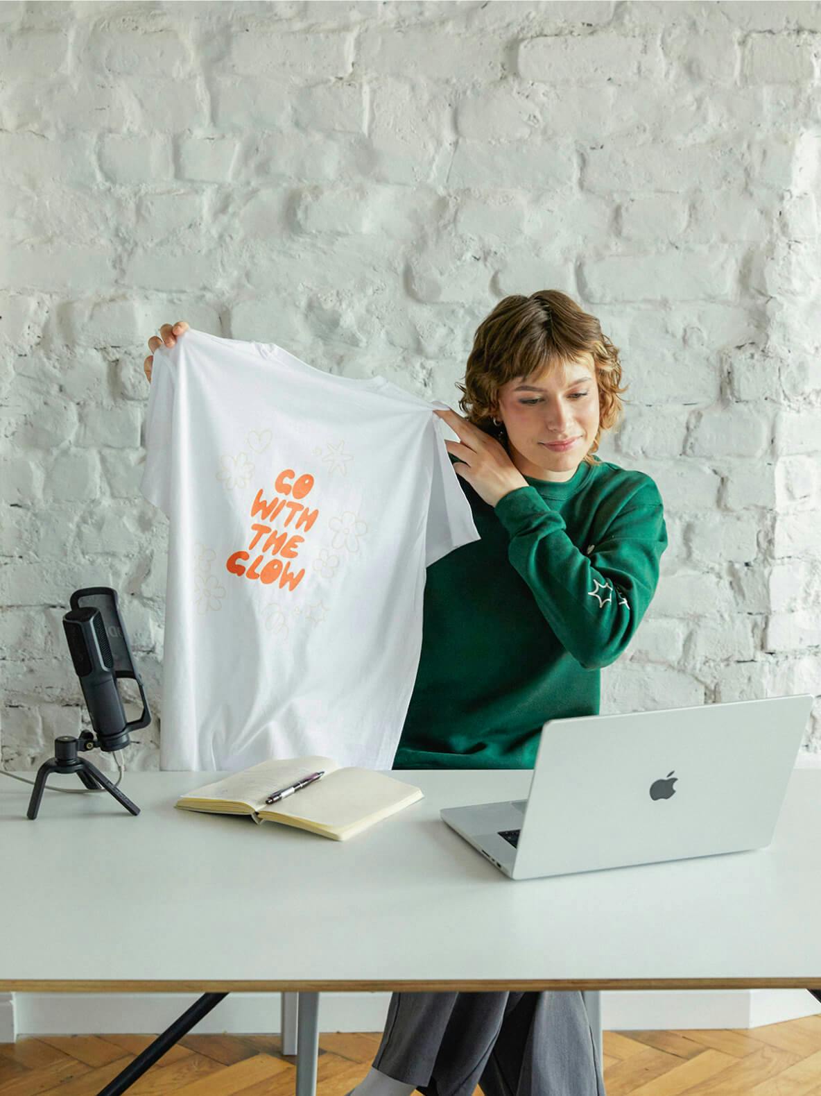
Image courtesy by Printify

Image courtesy by Printify
The new logo looks very different from the old one. What led to retiring the iconic “snap finger” and moving toward geometric typography? What made you head in this direction?
The snap-finger icon definitely felt like something people associated with our brand—but when we started talking to merchants, we were surprised by how many of them hadn’t really noticed it. A lot of them asked, “Snap? What do you mean?” Some thought maybe it meant the service was quick or easy. But many hadn’t even noticed it.
The thing is, we wanted a brand that tells a stronger, more meaningful story. That’s what the best brands do, right? They tell stories that resonate. Like I mentioned with Cassie, Printify isn’t just a platform—it’s a way for people to change their lives. So for us, the brand needed to reflect that kind of impact.
As we spoke to hundreds of merchants, a clear theme kept coming up: freedom. We boiled it down to what we call the three shots at freedom. When someone opens a Printify account and builds a successful store, we’re helping them unlock one or more of those freedoms. The first is time freedom—being able to work when and how you want. The second is career freedom, being able to choose what you work on, and the last and biggest one, is financial freedom—earning money in a way that gives you control over your life.
Our new logo reflects that. Every edge slopes slightly upward and to the right. If you look at the illustrations on our site, they’re all composed to follow that same movement—starting small, then moving upward and growing. That’s the direction we want our merchants to go: up and to the right. Even our stacks of coins in the visuals tilt that way. It’s all intentional—it’s a visual metaphor for growth.
The shift from bright green to a deeper, more olive tone is a bold move. What message were you aiming to convey with the new color palette?
Well, we’ve actually made the green brighter too. Look, we’ve always used green for Printify, but this time we went greener—not because we just wanted to stay on-brand, but because green is the color of money. Since financial freedom is such a core part of what we offer our merchants, we wanted to double down on that message. So we have a more luminescent green, as well as the deeper green makes that connection stronger. In fact, we call that ‘olive green’ - khaki.
The choice of this color came from the reality that most of our packages are delivered in boxes. It represents the physical side of our business. There’s this duality in what we do: it’s a digital experience that results in a real product shipped to someone’s door. So the color scheme was designed to reflect both worlds—digital and physical.
It was a thoughtful process rooted in the story we want to tell and the value we bring to our customers. That extended beyond color into how we present our products—our photography team works to make them look desirable, showcasing not just blank items but ones with real designs in real-life settings. We capture use cases across different niches so our visuals feel relevant and relatable, reflecting how people actually use Printify.
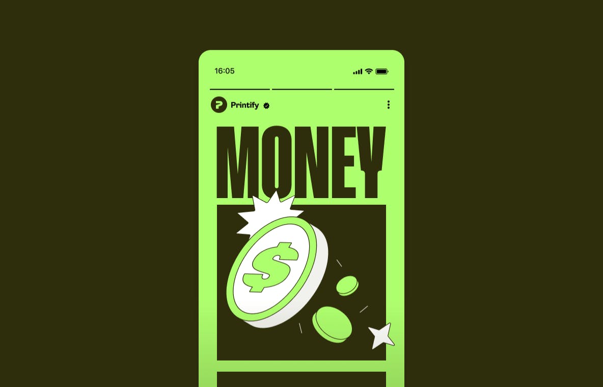
Image courtesy by Printify
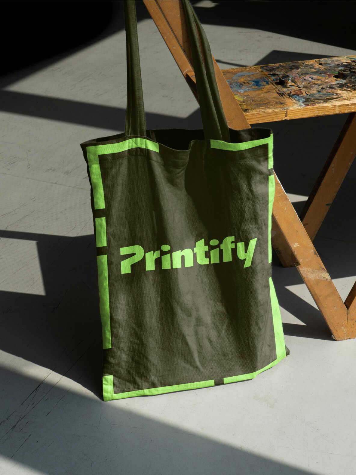
Image courtesy by Printify
What were the biggest challenges during the rebrand, and how did you navigate them?
We partnered with a design agency—DesignStudio—to develop the visual identity, but refining it for our needs and rolling it out in-house was the real challenge that we undertook with our own team. Between our website, app, and catalog, we had thousands of products, hundreds of pages, and nearly 2,000 SEO-optimized pages (think “custom hoodies,” “custom mugs,” etc.). Every screen in the app and every line of copy on the site needed updating, and the rebrand literally touched every department.
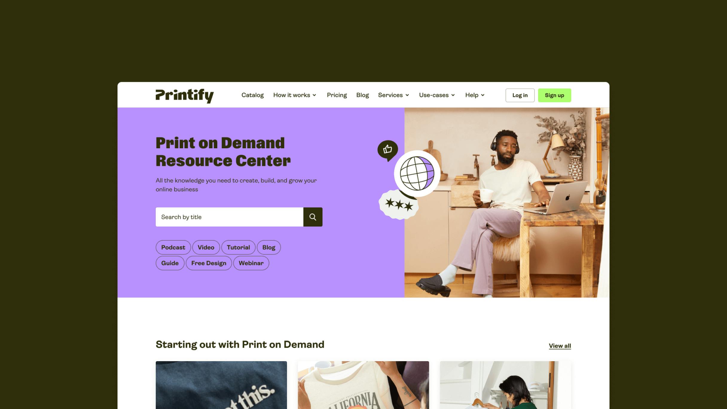
Image courtesy by Printify
Managing it required extreme organization—Monday.com boards, Gantt charts, spreadsheets, and even a battery-style progress tracker to keep everyone motivated. Still, you have to be relentless. There were days we were obsessing over a tiny part of a single, only to launch and realize we missed a page that gets 1000s of visits a week. And that’s just part of it.
"You have to accept that perfection doesn’t exist, just do what you can to get as close as possible and be relentless."
Printify’s new slogan is “Make It Your Way.” What does it represent, and how is it different from the old brand identity?
I was actually the first dedicated brand person at Printify—before that, no one was really looking after the brand in a focused way. So, we didn’t have a singular tagline to compare back to. There were a few scattered phrases like “helping merchants make more money with less effort,” which is fine if you already identify as a merchant—but if you don’t, it doesn’t really connect.
Like many brands, we were trying to be everything to everyone. Whether you were starting a store or just needed merch for your company, we’d try to speak to all of it. When I joined, I wanted to shift that. Instead of trying to be something for everyone, we focused on being everything to someone—to the people we bring the most value to. That doesn’t mean we’re turning others away, but we stopped building the brand around edge cases. We started designing the experience for our core audience.
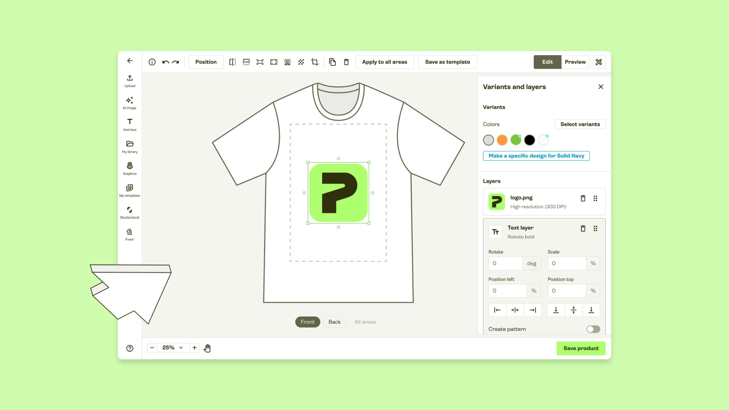
Image courtesy by Printify
“Make It Your Way” is really our first universal tagline. It speaks directly to that core user—the independent creator or entrepreneur—who’s building something for themselves, in their own way. It’s about their story, not ours.
Image courtesy by Printify
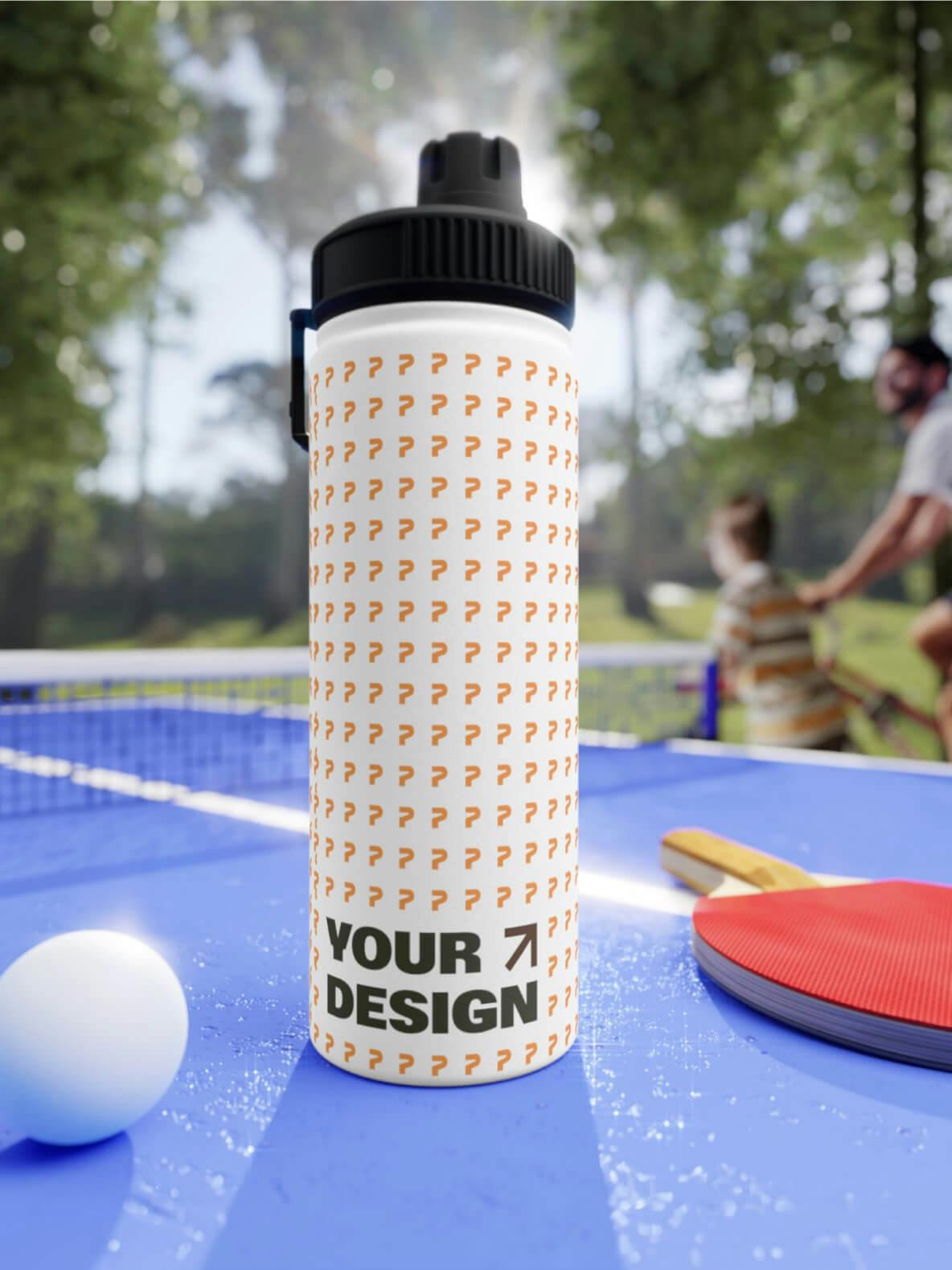
Image courtesy by Printify
What’s the long-term goal for the brand after the rebrand?
Great brands help great companies grow—that’s our purpose. We’re here to support the company’s growth and our customers’ growth. That’s why our brand visuals point up and to the right—it’s all about progress.
"The goal today is to grow tomorrow, and the day after that. That’s always going to be the goal."
