before
after

In conversation with Kevin, Content Creator Specialist from Forest Carbon about their rebrand that transforms sound into a visual story of the forest.
Can you introduce us to Forest Carbon and share the story of its early development?
Forest Carbon was founded in 2010 by Jeffrey Chatellier, initially as a consultancy. At the time, we weren’t developing projects ourselves— we were leveraging our expert team to provide technical assistance to major carbon projects being developed in Southeast Asia, mainly in Indonesia.
That began to shift in 2016 when we launched our first full-scale project: the Sumatra Merang Peatland Project, which remains our flagship today. We partnered with Global Alam Lestari to develop it as a full environmental asset project. Based in South Sumatra, it spans 22,000 hectares of wetland and focuses on restoration, conservation, and reforestation. If you recall the massive fires in South Sumatra in 2015, which sent smoke as far as Malaysia and Singapore—our work has helped restore that ecosystem. Since then, endangered species have returned, and over 31% of the forest canopy has been restored.
That project gave us credibility with investors and stakeholders. In 2017, we secured our first major loan—$6 million from the Athelia Climate Fund—to fund the Sumatra Merang project. Four years later we manage to repay investors from the Athelia Climate Fund
Since then, we’ve acquired projects in Kalimantan and more recently in Papua, where we’re transforming acquired companies into conservation and restoration-focused operations.
Today, Forest Carbon operates with just under a hundred employees, spread between our on the ground camps across Indonesia and our headquarters in Jakarta.
What inspired/sparked the conversation of Forest Carbon to rebrand at this point in your journey?
Since Jeff founded the company, we weren’t very vocal about our projects or the stories from the communities we work with. At the time, our founders simply didn’t prioritize content or the creative side of the business— they were locked in on developing a high-quality, impactful project that eventually became a globally accepted model of peatland restoration, an important step in the evolving carbon market.
But about a year ago, things started to shift. With the carbon market in Indonesia developing and major transitions on the horizon, they saw the need to speak up and share more openly. That’s when the idea to rebrand began—driven by a desire to boost brand awareness and bring our story to the forefront.
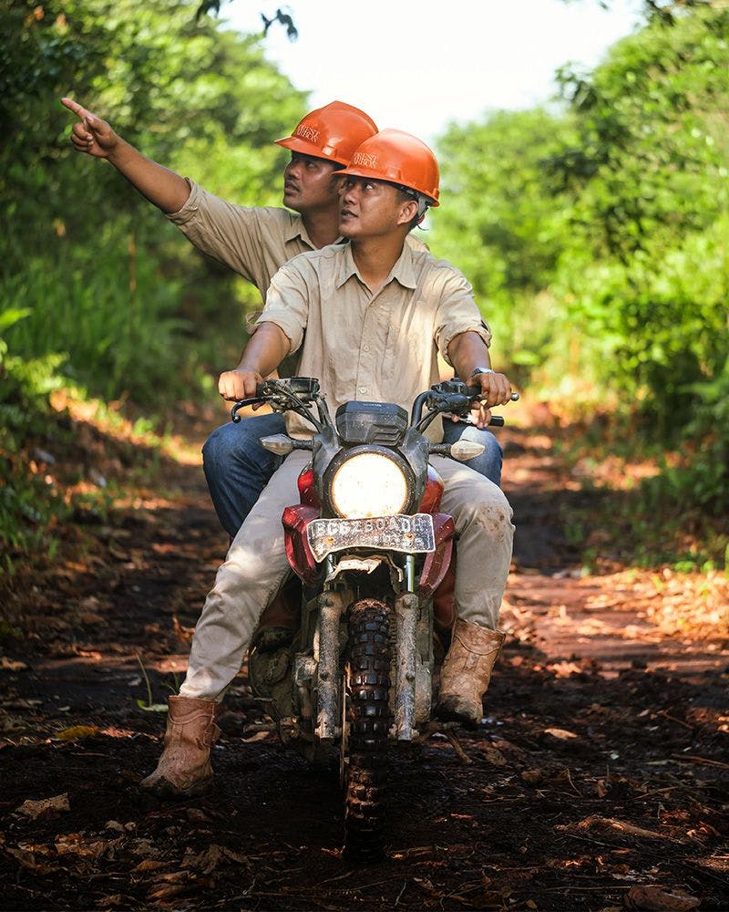
Image courtesy by Forest Carbon
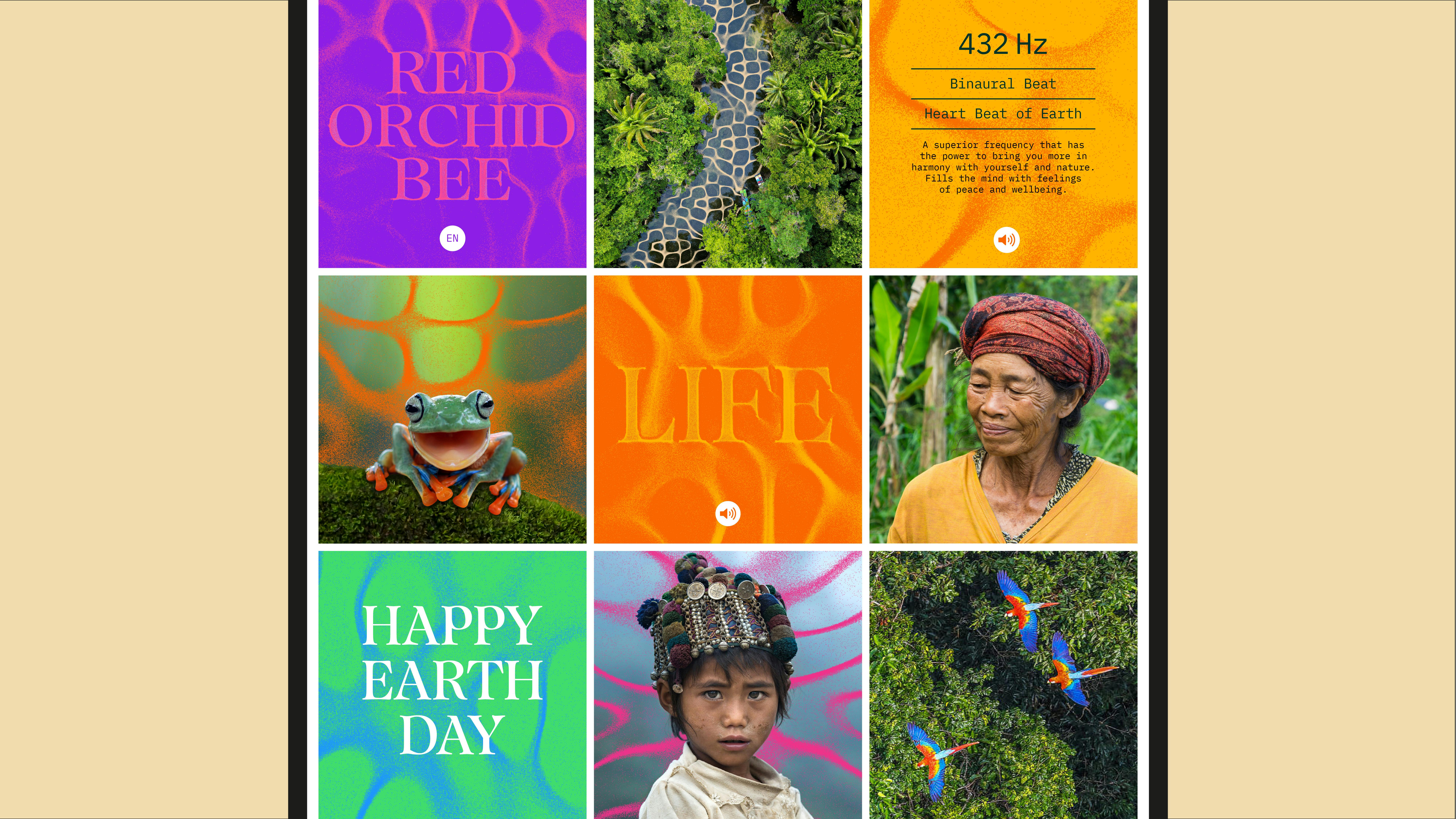
Image courtesy by Forest Carbon
In the new logo, the letters are more connected, almost like they’re growing together. Was this done on purpose? What feeling or story did you want the new logo to show?
We have a quote in our office that says, “All lands dream of becoming a forest.”
The idea is that when land is left untouched, it naturally moves toward becoming a forest—because that’s what it’s meant to be. We truly believe in the independence of nature. That’s why we focus on nature-based solutions. We don’t force anything—we simply help bridge the gap between nature and technology, but ultimately, we trust that nature will heal itself.
Image courtesy by Forest Carbon
The new logo was inspired by that belief in nature’s independence and interconnectedness. If you look closely, the shapes resemble tree root systems, all connected to a single source. It reflects how every part of nature supports the whole—everything working together in a complete ecosystem.
This visual also mirrors our mission: to bridge communities, technology, conservation, and biodiversity into one unified system. So, it’s not just about nature—it’s also about the people living near the projects, the tech we use, and the animals that exist within these ecosystems. The logo expresses that synergy, and it also ties back to our core values: together, impact, perseverance, and excellence.
Forest Carbon collaborated with Design Bridge and Partners for this rebrand — what was that collaboration like? Were there any challenges along the way? If so, how did you overcome them?
Design Bridge is based in Singapore, and we’re in Indonesia—so the connection came through internal networks. From there, we started collaborating, and the rebrand process had actually been underway for almost a year before I joined the team. I came on board specifically to support that rebranding effort.
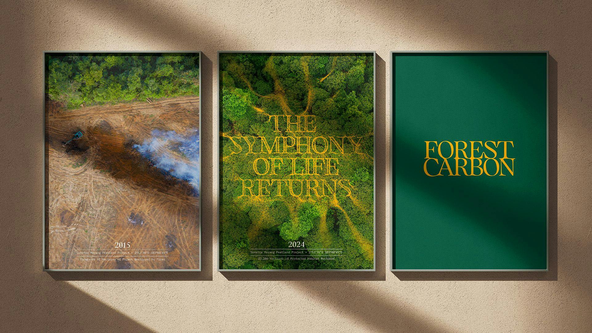
Image courtesy by Forest Carbon
One of the key challenges was the technical side, starting with the physical distance between us. But beyond that, a bigger challenge was the nature of our industry. The carbon market is still very new and complex, especially in Indonesia, and a lot of what we do is deeply technical. Things like how we collect and interpret data, how we restore ecosystems—those aren’t things you can easily grasp from the outside. It took a lot of collaborative meetings to get aligned, making sure we shared the same understanding before shaping the new brand direction.
So I’d say the biggest challenge was explaining our industry and our work in a way that made sense—not just to the agency, but to the audience we’re trying to reach. Getting everyone on the same page before jumping into design was essential.
Forest Carbon’s mission is to restore and protect damaged wetland forests, and the new branding uses a really fresh, trendy color palette. What inspired Forest Carbon to play with these colors, and what story are you hoping they tell?
When we think of nature, the default color is usually green—and that’s true for most nature-based companies too. So from the start, we knew we wanted to do something different and stand out.
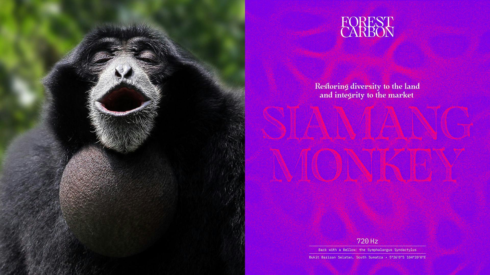
Image courtesy by Forest Carbon

Image courtesy by Forest Carbon
Our inspiration actually came from the field—specifically, from the endangered species living in our project sites. For example, the Sumatran Tiger, which is far from green, and the Rhinoceros Hornbill, known for its striking orange casque. Nature, while dominated by greens, is full of unexpected, vibrant colors if you look closely—through insects, birds, plants, and even tree bark.

Image courtesy by Forest Carbon
That’s what we wanted to capture with our color palette. It’s a way of telling a deeper story—one that’s rooted in real, living elements of nature. The bold, vibrant colors invite people to see nature differently, and help us break away from the expected visual language of the environmental space.
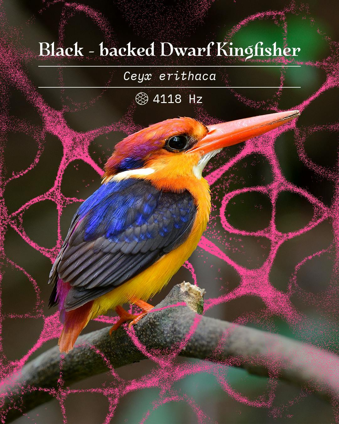
Image courtesy by Forest Carbon
The new branding introduces these beautiful, almost organic-looking patterns — they feel very fluid, like ripples or vibrations captured in a moment. Could you tell us what inspired this idea, and what these patterns are meant to express about Forest Carbon?
The patterns are actually called soundscapes—they’re visual representations of sounds. We wanted to take something that’s usually invisible, like sound, and turn it into something people can see. Each pattern is unique, created using recordings from our project sites, which makes them deeply connected to the landscapes we work in.
The idea came from our field experiences. In a thriving forest, it’s not just visually alive—it’s acoustically alive too. The sound of a burnt forest versus a restored one is completely different. That contrast really stuck with us. We realized that the sound of nature is an untapped form of storytelling—something not many brands use to express their connection to the environment.
So we explored how to visualize those sounds, and that led us to the Chladni method—a scientific technique where sound frequencies are played under a thin metal plate covered in sand or salt. The vibrations cause the particles to move and form distinct patterns, depending on the frequency.
We used this method with actual animal sounds from our project sites, layering those patterns with the vibrant color palette inspired by nature. The result is a set of designs that feel alive—just like the ecosystems we’re working to restore. The patterns express the uniqueness and vibrancy of nature, and that same idea sits at the heart of our rebrand.
How has the rebrand changed the way people (partners, local communities, the public) connect with Forest Carbon?
The rebrand has been a great enabler for our company. Before this, not many people fully understood what Forest Carbon actually does—especially when it came to our website. But now, with the new identity, stakeholders and investors are finally able to get a clear sense of who we are and what we stand for.
We’ve created a bold contrast to the traditional look of the industry, and that really helps us stand out. It grabs attention and sparks curiosity—which then leads people to want to learn more about our work.

Image courtesy by Forest Carbon
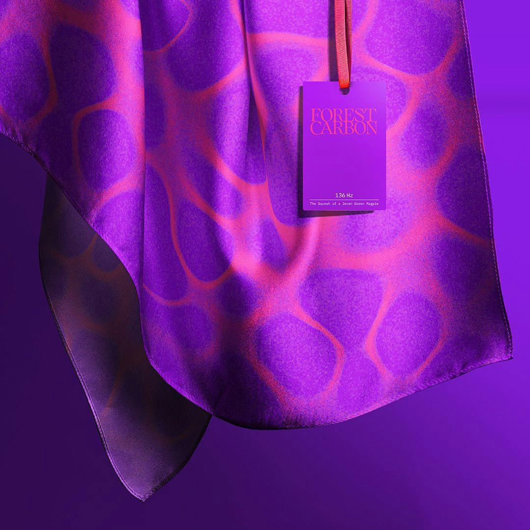
Image courtesy by Forest Carbon
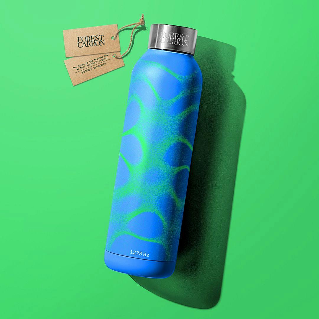
Image courtesy by Forest Carbon
Right now, we're focused on activating the brand through our social media channels. We finally have the tools, the materials, and the community behind us to spread brand awareness more intentionally.

Image courtesy by Forest Carbon

Image courtesy by Forest Carbon
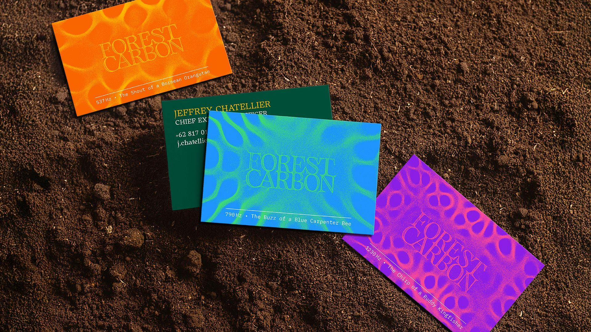
Image courtesy by Forest Carbon
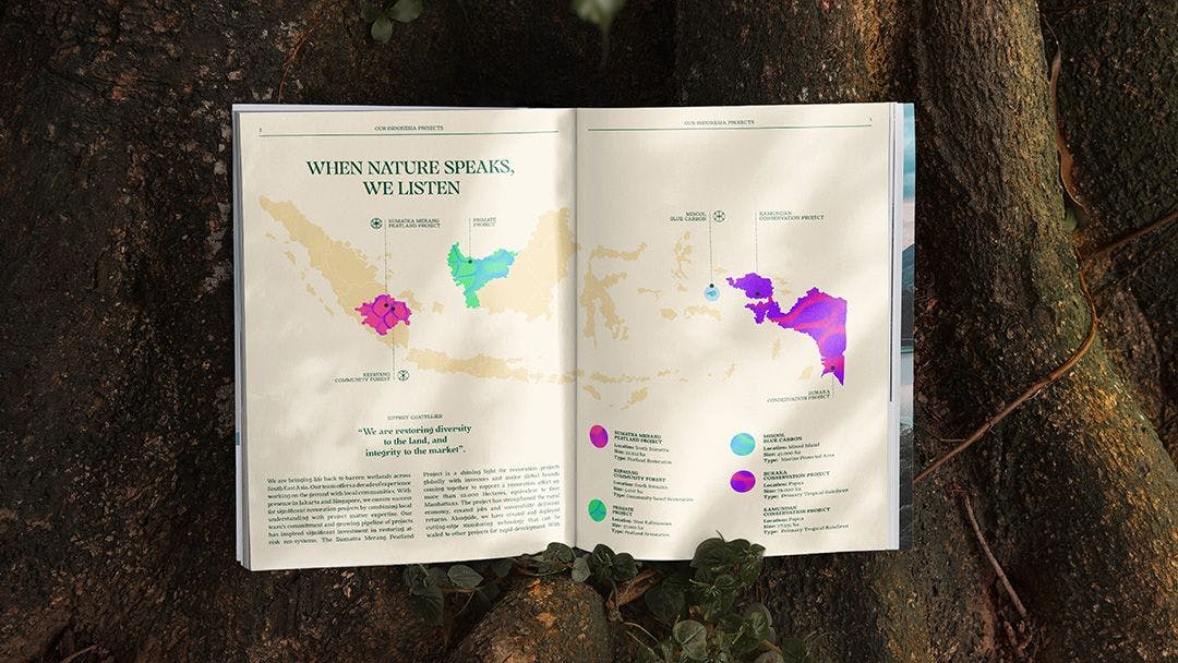
Image courtesy by Forest Carbon
Looking back, what part of the new branding are you most proud of?
Personally, what I’m most proud of is how we were able to blend the scientific and technical elements—like sound and data—into something creative. That balance isn’t easy. It’s a challenge to take something so complex and make it both digestible and visually compelling for an audience. But I think we managed to do that in a way that still feels true to who we are.
"Blending something scientific like sound with something creative—it’s hard to make that digestible and beautiful, but I’m proud we did."