
before
after

An interview with Georgie Burks, Brand Marketing Lead at Allica Bank, on how their in-house team brought warmth and character to the brand.
Can you share with us the history and development of Allica Bank? How has the brand transformed over the years?
Allica Bank has been operating in its current form since 2019, when we got our banking license—which is quite difficult to do in the UK. From the start, our mission has been to support a specific group of customers: established businesses, typically those with around 5 to 250 employees. These aren't micro-businesses, freelancers, or startups, and they aren't big corporations either. They're somewhere in between and often overlooked by traditional banks.
In the UK, banking is mostly controlled by four big banks, which focus on personal accounts for individuals or banking for large corporations. This leaves a gap in service for smaller but growing businesses that have more complicated banking needs. Our founders saw that these businesses weren't getting the attention they deserved. So, Allica Bank was built specifically to serve their unique needs.
Allica Bank Old Homepage
We combine technology with a personal touch. Many traditional banks have moved away from offering personal support, like bank managers or relationship managers. But we realized technology alone can't solve every financial issue, especially since money matters can be stressful and emotional for business owners. So, we invested in bringing back real people—someone our customers can directly contact instead of waiting in call-center queues.
Since then, we've grown rapidly. Initially known for lending, we’ve now added deposits and current accounts, becoming a full-service bank. Today, Allica Bank offers businesses a real alternative to the big banks, which makes us quite unique in our market.
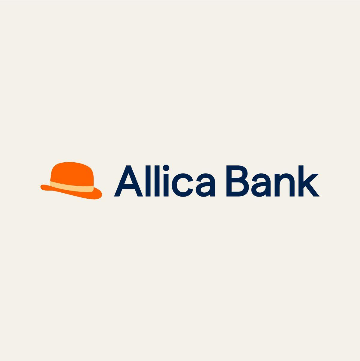
Allica Bank New Logo
What key challenges or reasons led to the decision to rebrand Allica Bank?
I joined Allica in 2023 to strengthen our brand, this was highlighted as a strategic priority in our mission to capture 10% market share in the coming years. Especially in banking, people trust us with large sums of money, so brand awareness and trust are essential.
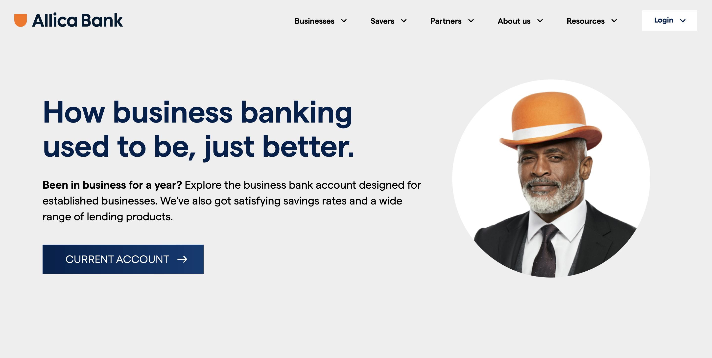
We initially tested a campaign featuring a bowler hat, which resonated immediately with people. Through focus groups, we realized that the hat perfectly symbolized our blend of modern banking with traditional values—like having dedicated bank managers. Recognizing this, we centered our visual identity around the bowler hat, moving away from a corporate navy look toward a warmer, distinctive orange.
The rebranding was iterative, done step-by-step and tested thoroughly at each stage. In my experience with rebrands, there's usually some negative feedback, but this time, surprisingly, we didn't receive a single negative comment. That's been extremely rewarding for us.
Can you tell us the story behind choosing the bowler hat as Allica Bank’s mascot and what message you aimed to communicate through it?
The bowler hat is deeply tied to UK culture, especially in London—it’s traditionally seen as the banker’s hat. Because of this, it naturally symbolizes banking in a way that's widely understood here.
Initially, the idea of the bowler hat was pitched by our creative agency for our first campaign. We featured it prominently in our TV ad and outdoor advertising, showing business owners wearing different hats. The core message was clear: when it comes to your finances, put on your "money hat" with Allica. The hat resonated strongly with people, performing exceptionally well, so we decided to integrate it into our brand identity long-term.

Image Courtesy by Allica Bank
The specific message behind the bowler hat is a blend of old-school banking values with a modern twist—captured visually through our vibrant orange brand color. When we tested it in focus groups, the feedback reflected exactly who we are: a mix of traditional reliability and modern innovation. This combination communicated quickly and clearly what Allica Bank stands for.
Was Allica Bank’s rebrand handled in-house or did you collaborate with creative agencies? How did that process unfold?
We collaborated with a few different agencies initially. Our first creative agency introduced the bowler hat concept, and later we worked with a branding specialist agency on other elements. Eventually, we brought most of the work in-house, using our own studio, which I managed directly. We also partnered with a specialist freelancer for logo development because logos have unique design challenges that often require focused expertise.
Ultimately, the rebrand was predominantly done internally. I think this approach is becoming more common because,
"No one knows your brand better than the people building it every day."
If you have the right resources and talent internally—and we're fortunate to have both—it gives you greater control and ownership of your brand.
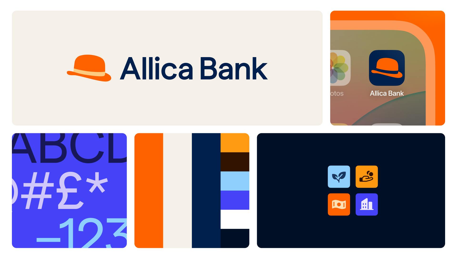
Image Courtesy by Allica Bank
What influenced the selection of the new color palette?
We didn’t want to completely change the color palette since navy and orange were already part of it. No other UK bank really “owns” orange, so we decided to lean into it more, make it the focus, and dial down the navy. The goal was to warm up the overall look.
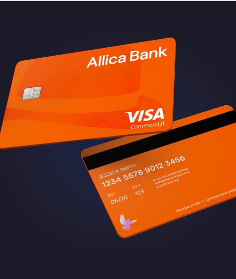
Image Courtesy by Allica Bank
Before, the brand felt quite cold. But when you think about Allica’s culture—human, down-to-earth, and very regional—we needed something that felt more approachable and friendly. The color shift helped reflect that.
The palette now feels much more like us. It brings out that warm, welcoming energy we have as a team and as a business. It doesn’t feel cold or transactional—just like working at Allica.
How did you approach all the photography?
It was really intentional. While we’re a tech-driven business, we’re also all about people. So, we wanted to show our actual relationship managers—the real people who work with our customers every day.
Especially now, with the rise of AI-generated visuals, we’ve chosen to stick with what’s real. If your brand is built on trust and real human connection, using AI-generated visuals just doesn’t make sense. We might use AI for some other things, but when it comes to showing who we are, we always use real customers and real team members. That’s what Allica is about.

Image Courtesy by Allica Bank
What specific elements of the rebrand set Allica Bank apart from competitors in the private banking space?
The first big one was color. We leaned into orange—a bold choice that’s not commonly used by other banks in the UK, which helped us stand out right away.
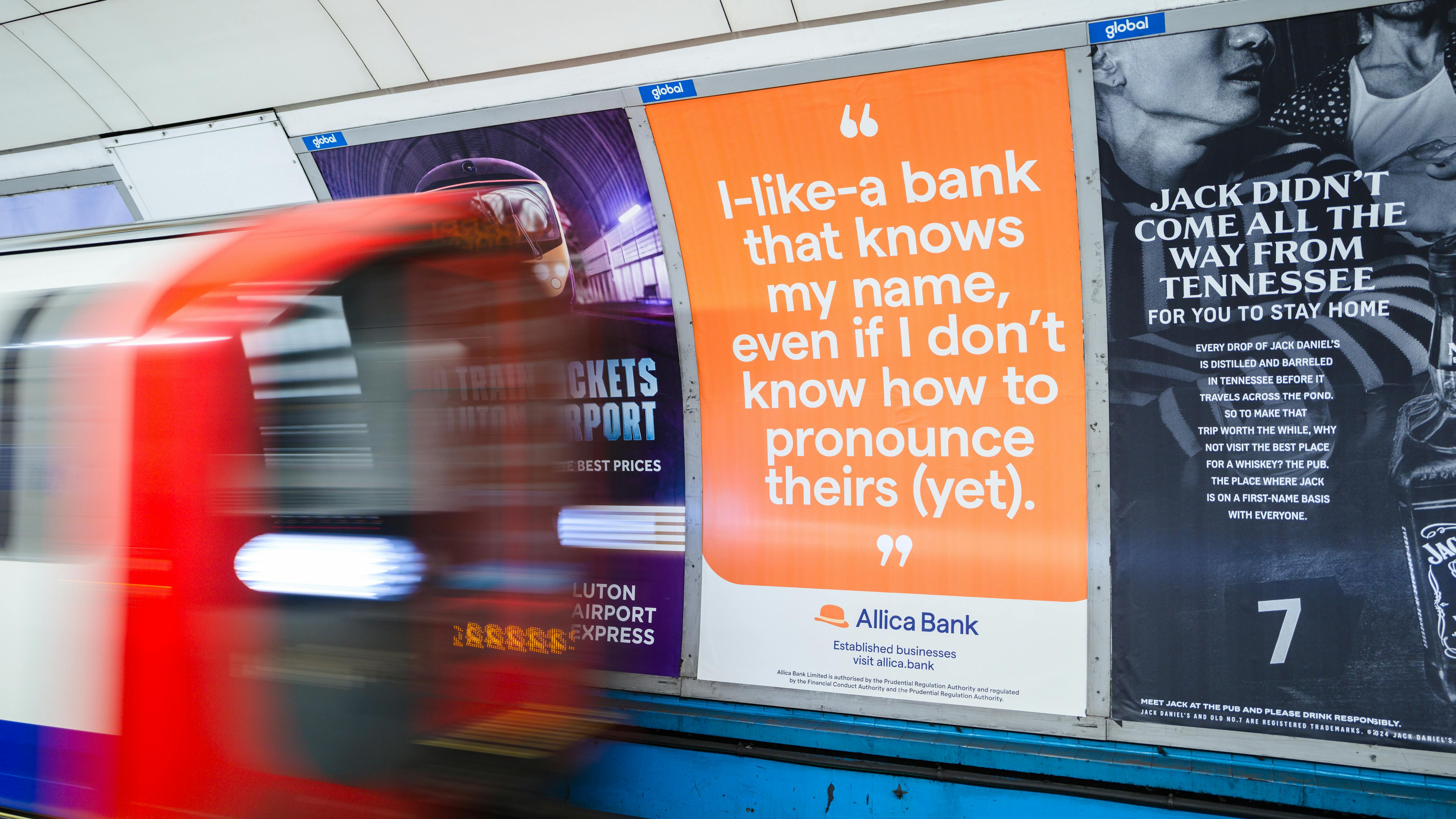
Image Courtesy by Allica Bank
The bowler hat also played a big role. In the UK, big banks like Lloyds have a black horse, Barclays has an eagle—so using a strong visual symbol is a common move in banking. We followed that idea but did it in our own way, using the hat to reflect both modern and traditional values. Our main goal wasn’t to look like other fintechs. In fact, our biggest competitors are the big banks, not challenger banks like Revolut, Starling, or Monzo.
So by leaning into orange, introducing a clear mascot, and showcasing real people, we created a brand that feels distinct in a space that often looks and sounds the same.
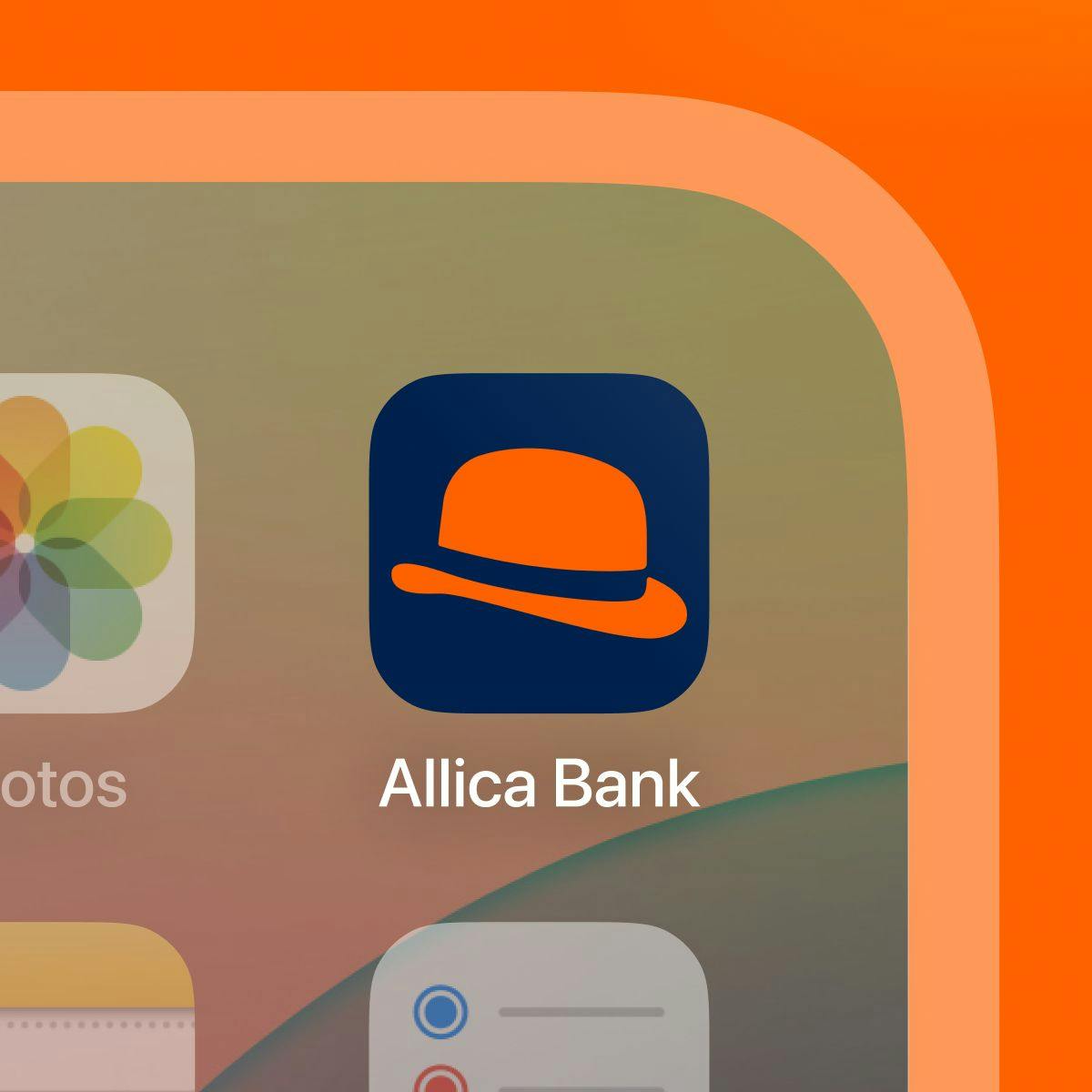
Image Courtesy by Allica Bank
Was there a particular part of the rebrand that felt especially rewarding or significant to you?
There are two things that really stood out.
First was seeing how much the team embraced it. We’re a company of over 700 people, so it mattered to me whether they felt excited about the new brand. And when we launched, they really were. A lot of people already knew Allica was an amazing business, but the old brand didn’t reflect that. Now, people can proudly say, “I work for Allica, this fast-growing fintech,” and the brand finally lives up to that energy.

Image Courtesy by Allica Bank
The second was being able to deliver most of it in-house. So many companies hand off their branding to agencies, but this one truly had our team’s stamp on it. I saw our designers grow so much throughout the process—it was a huge challenge, and they came out of it with something they could really own. That made the whole thing even more meaningful.
