before
after

We spoke with Mindbody’s Creative Director, Christina Libertini about what it really took to rebrand a wellness leader, blending movement, simplicity, and a deeper focus on the people they serve.
Could you briefly walk us through Mindbody’s journey—from its early days as a scheduling tool to becoming the comprehensive wellness platform it is today?
Mindbody started about 20 years ago as a basic scheduling tool, designed to make it easier for people to book classes. Back then, it was much harder—you had to call, maybe even look through a phone book. Nobody was really offering an easier way, so it was a big shift at the time.
The software was built to simplify that process, and over time we grew alongside the booming boutique fitness industry. We've been there every step of the way, evolving into a full-scale wellness platform—covering fitness, spas, wellness businesses—and expanding constantly. Today, we operate in tons of countries and continue to grow.
Mindbody old homepage
We’ve gone from a simple scheduling tool to a full one-stop platform, offering everything from marketing and payments to staff management and client engagement. Not only do we support businesses with services, but we also have the Mindbody app, connecting users with even more businesses. Our mission has always been about spreading wellness and helping our customers grow. That's really been at the heart of everything we do.
What specific factors or motivations prompted your decision to rebrand in 2025? Why now?
Over the past few years, our product has evolved a lot. We've made major updates to how it looks and feels—modernizing it to better fit where we’re headed. We felt it was time for the brand to reflect that growth, and to be ready for the future we’re building toward.
At the same time, the way people think about wellness has shifted. It used to be a bit of a niche, but now it's something essential—people are more connected to wellness than ever before.
"We wanted our brand to feel more modern, more fluid, and instantly recognizable—but most of all, to feel good no matter what kind of experience you’re looking for."
The shift is about broadening what wellness means—and how Mindbody can support it in all its forms. It’s about embracing a wider range of wellness offerings. The rebrand reflects how we plan to support even more types of wellness and more communities, with a brand that feels current, clear, and meaningful.
Ultimately, we want to express growth and connection. We want the brand to feel good—no matter who you are or how you use it.
The new logo features a dynamic, fluid 'm' symbolizing movement and connection. What was the inspiration behind this design choice?
We love the idea of capturing movement. One of our main goals as a company is to help our customers grow, make progress, and move forward—and movement really symbolizes all of that. It's at the heart of what our customers do. Whether it’s physical movement or the growth of a business, we wanted the logo to reflect that momentum.
The “m” was designed to feel fluid and flexible while making our brand more instantly recognizable. We wanted something simple and powerful that also stood out in our space.
It was important to us that the new look wasn’t too narrowly tied to fitness or beauty. We wanted it to work across a wide range of wellness businesses, no matter the type. It’s about forward motion—for everyone.
Considering Mindbody’s significant scale, you chose to undertake the rebrand in-house. What drove this decision, and what were the main challenges and insights gained from handling it internally?
We’re incredibly proud that we did this in-house. This is our team—people who’ve been with the company and the brand for a long time. We’ve built strong relationships with our customers, our mission, and the brand itself. That deep understanding is hard to outsource. So, we felt it was important to take this on ourselves and approach it with intention.
Doing it internally meant we could really take our time, be iterative, involve stakeholders, share ideas with leadership, and make sure we were connecting with key customers throughout. At one point, we had a few different concepts on the table and got feedback directly from partners like Orange Theory, F45, and the Lash Lounge. We asked them, “Does this feel right to you? Would this meet your needs?”
We listened to a lot of voices and gathered a lot of feedback. Keeping it in-house allowed us to pivot, explore different directions, and ultimately land on something that felt right. That flexibility was a big plus.
Of course, the challenge of being so close to the work is that it’s easy to get stuck in your own perspective. We had to check ourselves for bias. But in the end, we asked: “What feels the most like us? What makes us feel good?” And we created something we truly believe in.
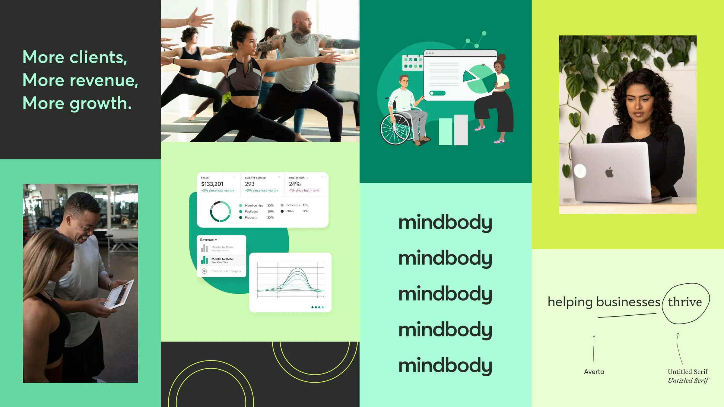
Image courtesy by mindbody
Can you walk us through the rebrand process and how long it took?
We pulled a ton of references, looked at a lot of directions, and figured out where we wanted to go. Early on, we decided we wanted to lean into the “m” or possibly “mb” to build brand recognition.
We also wanted to make the brand feel more connected to our name—something instantly recognizable. That led us into exploring a whole universe of “m” concepts. We eventually landed on a few promising directions and brought them to our executive leadership to get their feedback.
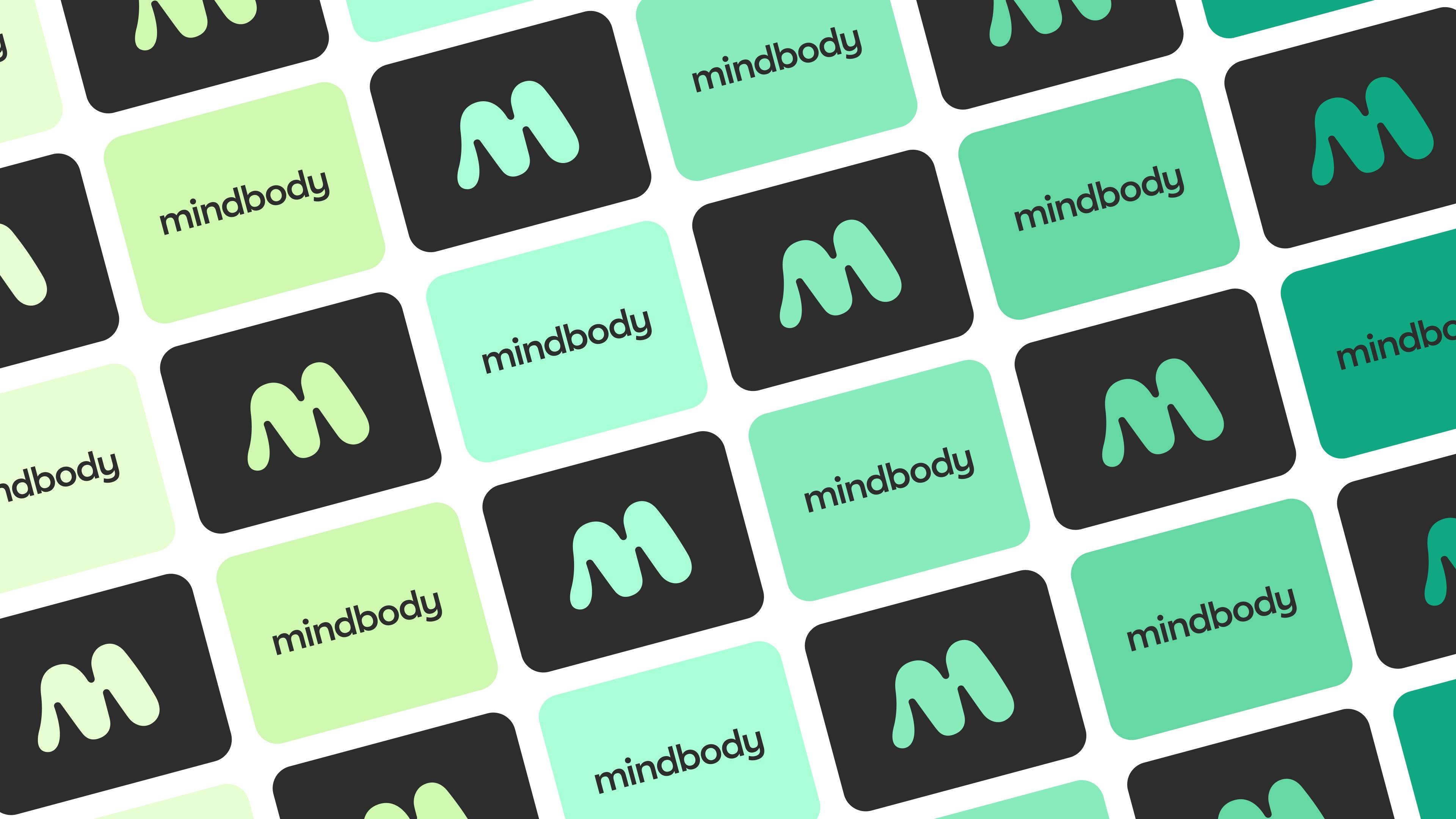
Image courtesy by mindbody
From there, we tested and refined. We talked to customers and also ran anonymous online user testing, where people reviewed different design prototypes and ranked them. That feedback was eye-opening—some options felt a bit too “fitnessy,” others felt too buttoned-up and not fun enough. So we took all of that input and kept iterating.
Honestly, it was such a privilege to have the time and space as a creative team to go through that process.
The updated color palette uses green mint and charcoal. What emotions or messages are you aiming to convey through these colors?
There were a few reasons behind the palette. First, we wanted something that felt fresh and bright. We kept coming back to the idea of vitality—something that suggests growth, like plant life. Green felt like the natural choice, and we explored a number of different shades.
We leaned most into spearmint. Paired with charcoal, it gave us great contrast and visual clarity. But beyond aesthetics, we were also focused on accessibility. We wanted to make sure the palette would work for everyone.
We tested color combinations to ensure they met contrast standards. That process really opened our eyes. It’s surprisingly tough to make certain colors—like orange—work accessibly. So the goal was to create a palette that captured energy and growth, but also prioritized inclusivity at its core.
How did you approach crafting a brand tone that felt inclusive, culturally aware, and true to the communities you serve?
Because we handled this in-house, we were able to draw on years of listening—conversations with our customers, teams, and broader community. That ongoing dialogue gave us a solid foundation.
We kept hearing consistent themes: growth matters, peace of mind matters, and trust matters. Those insights helped shape where we wanted to take the brand voice. One of the biggest shifts was leaning into a tone that’s confident yet supportive. We want to sound enthusiastic—because we love what we do and we want others to love it too.
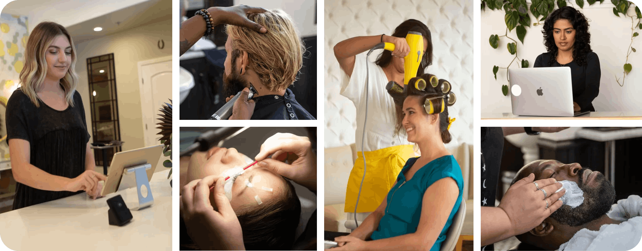
Image courtesy by mindbody
So we made very intentional language choices. For example, we prioritized super accessible language to make sure that, especially in localization and translation, our tone still connects. We avoided jargon, knowing our users range from very tech-savvy to not tech-savvy at all. Our goal was to make everyone feel supported—and to do it in a way that builds confidence and encourages growth.
Image courtesy by mindbody
Are there any new features launching alongside the rebrand? How do they connect with your refreshed brand vision?
Absolutely—we’ve been rolling out new features and tech updates alongside the visual refresh. It’s all part of making the product more modern and forward-looking. We’ve already been ahead of the curve with AI-driven tools, and we’re continuing to expand on that.
We’re regularly updating things like our reporting, payment systems, and marketing tools. It’s not just about looking modern—it’s about delivering value that helps our customers grow faster and work smarter.
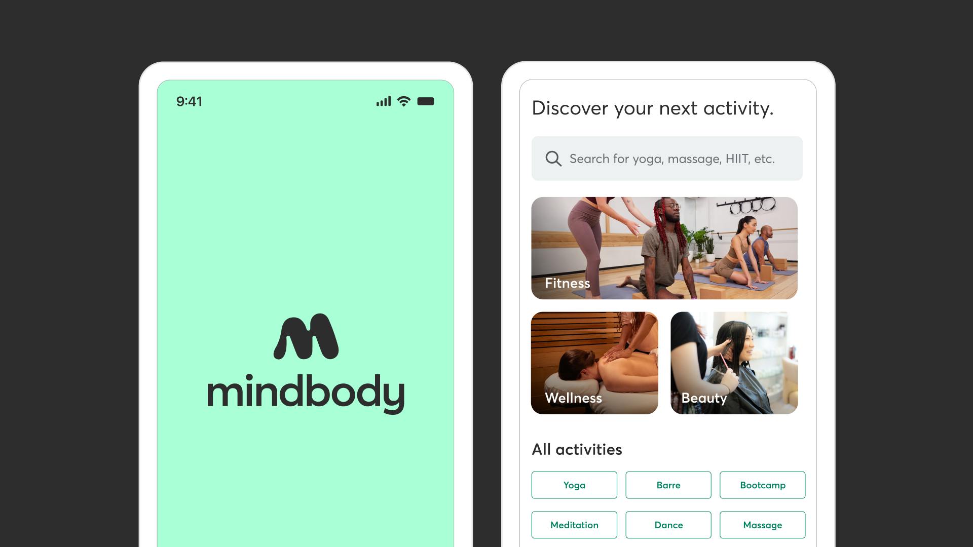
Image courtesy by mindbody
One tool we’re especially excited about is our analytics platform. It keeps getting better. With AI, we can surface insights like who your top spenders might be, or which clients may be at risk of churning. We have more data than most in this space—and we want to use that to truly support our customers’ businesses.
Beyond visuals, how does your rebrand help Mindbody stand out from other wellness platforms in today’s crowded market?
It goes deeper than aesthetics. One of the biggest things we want to communicate to our customers is that we’re here for the long haul. We’ve been around for a long time, and we’re not going anywhere. We’ve built reliable software, we offer expert support, and we’re seen as leaders in the industry.
The wellness space is crowded—there are lots of startups offering surface-level solutions. We want to stand out by combining proven tools with our experience, and pairing that with momentum and vision for the future. This rebrand is a reminder that we’re always evolving, but still fully committed to helping our customers grow.

Image courtesy by mindbody
How does the Mindbody x ClassPass collaboration work, and what makes it valuable for businesses and customers?
Internally, we always say: “Better together.” That’s not something we promote outwardly, but it really captures how we feel. Mindbody and ClassPass are two distinct brands, but there’s a lot of crossover. Many businesses on ClassPass use Mindbody, and many Mindbody businesses list themselves on ClassPass.
If you're a Mindbody customer using ClassPass, it all syncs up—analytics, reporting, insights—it just makes everything seamless. It’s a way to get a more complete view of how your business is performing.
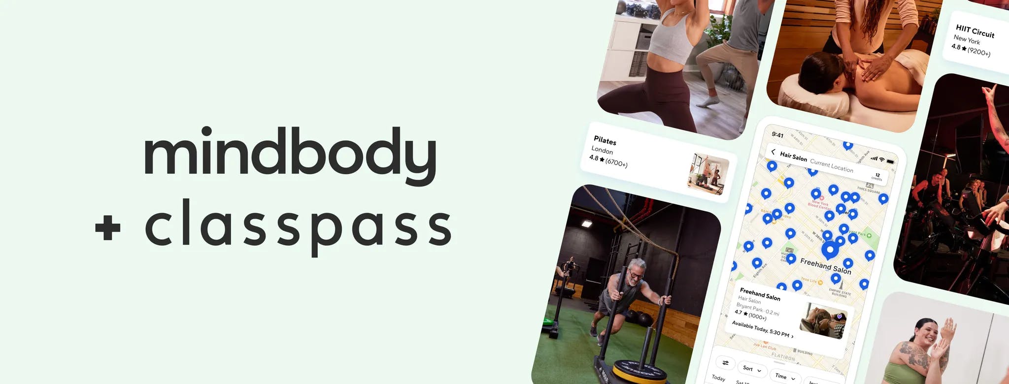
Image courtesy by mindbody
Though our brands are different, we’re aligned in our mission to bring more wellness to more people. That’s what ties it together. ClassPass has a slightly different audience—some users might not even use a booking system—but there’s still a lot of overlap.
It’s been fun working closely as two teams. We’ve learned a lot from the differences and similarities, and we’re always looking for ways to make the experience better—especially for those customers who use both platforms.
Image courtesy by mindbody
What part of this rebrand are you personally most proud of? Any standout moments or stories?
What I’m most proud of is that we pulled this off entirely in-house—with so much care and collaboration. We listened to a lot of people and worked hard to create something meaningful, inspiring, and rooted in real stories. There was so much intention behind it.
The fact that we actually did it—and did it well—says a lot about who we are. The feedback from employees, customers, and long-time partners was incredible. It was one of those rare moments in your career when everyone rallies around a shared vision.
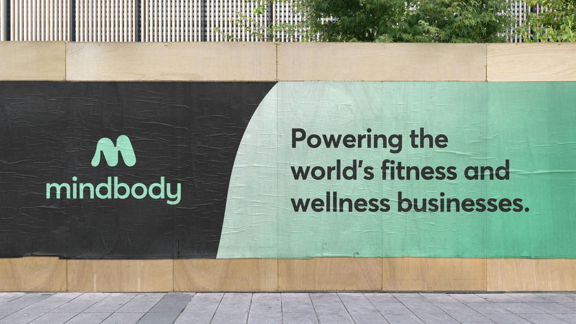
Image courtesy by mindbody
The reveal moment really stood out. During our monthly all-hands meeting, my team and I got to unveil the new logo and say, “As of today, this is our new logo.” That announcement went out across all our platforms and to all our customers—it was a big moment. And it was a surprise for many, since we’d kept it under wraps.
We’re a big organization, and coordinating that across so many people was no small thing. But the energy was amazing. Everyone felt part of it. You don’t get moments like that often, and it meant everything that we could say: “We did this ourselves, as our own team.”