


Courtney Hurley, Marketing & Partnerships Manager at Ground News talks about how their new visual identity is a nod to technology and old newspapers.
Can you introduce us to Ground News and the exciting things it is doing these days?
Ground News is the world’s first news comparison platform. Every day, we process around 60,000 news articles from 50,000 news outlets and gather related stories in one place so readers can easily compare coverage.
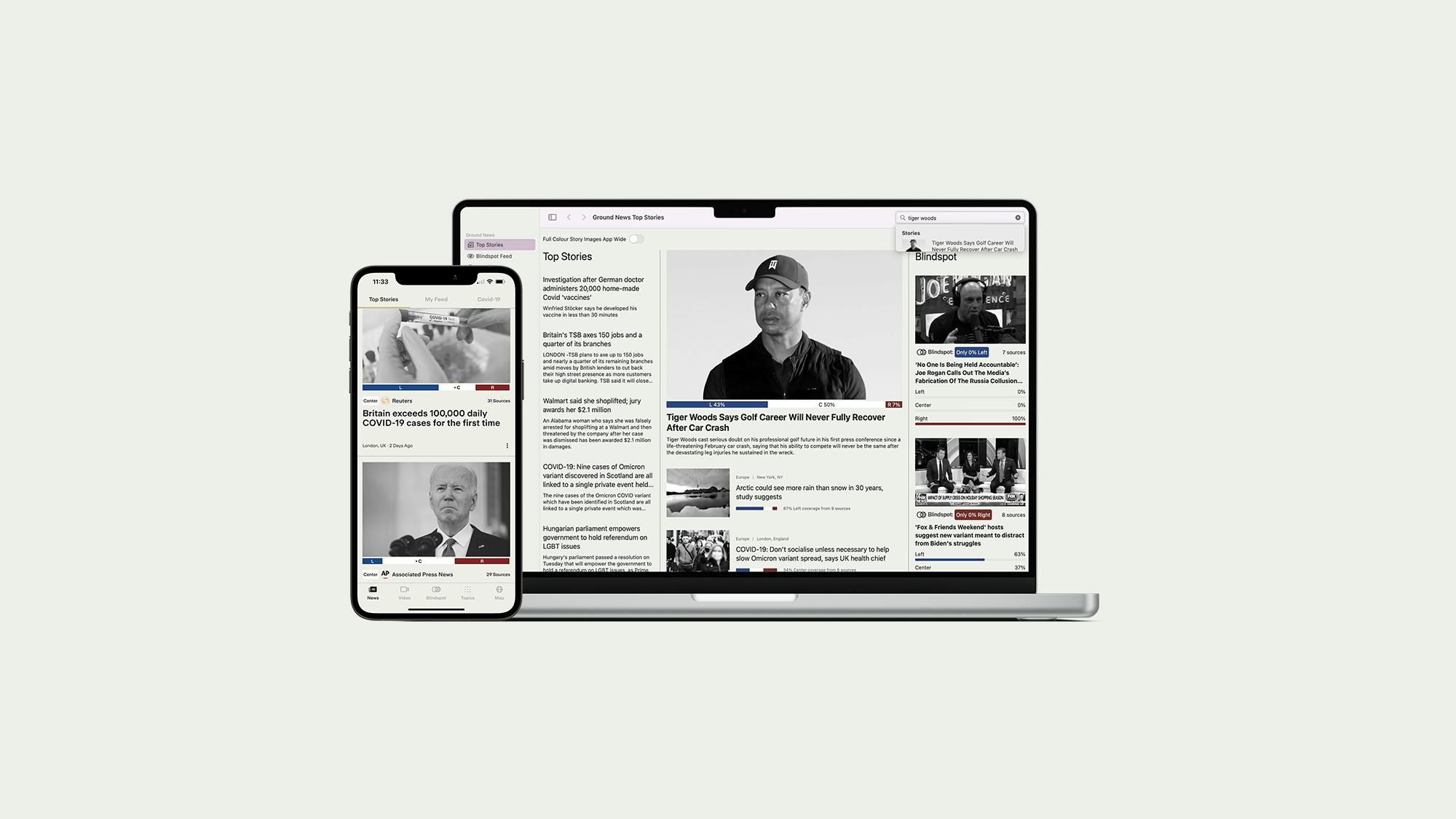
At the beginning of the year we launched not only our rebrand but a complete redesign of the UI on both our website and app. We added a ton of new features focused on empowering readers to navigate the modern media landscape.
Walk us through your company’s brand identity through the years. How were the past brands conceptualized?

Ground News was launched in 2018. The initial design was clean, bold, and techy. It really reflected startup culture. The logo was the electrical symbol for ground, inspired by our engineering roots. People who were familiar with the symbol absolutely loved it.
About this current rebranding, how did it come about? How did that conversation start?
The decision to rebrand was directly tied to our growth. As we started to reach new audiences, we wanted our brand to be more accessible. We also wanted it to better reflect who we are and what we do.
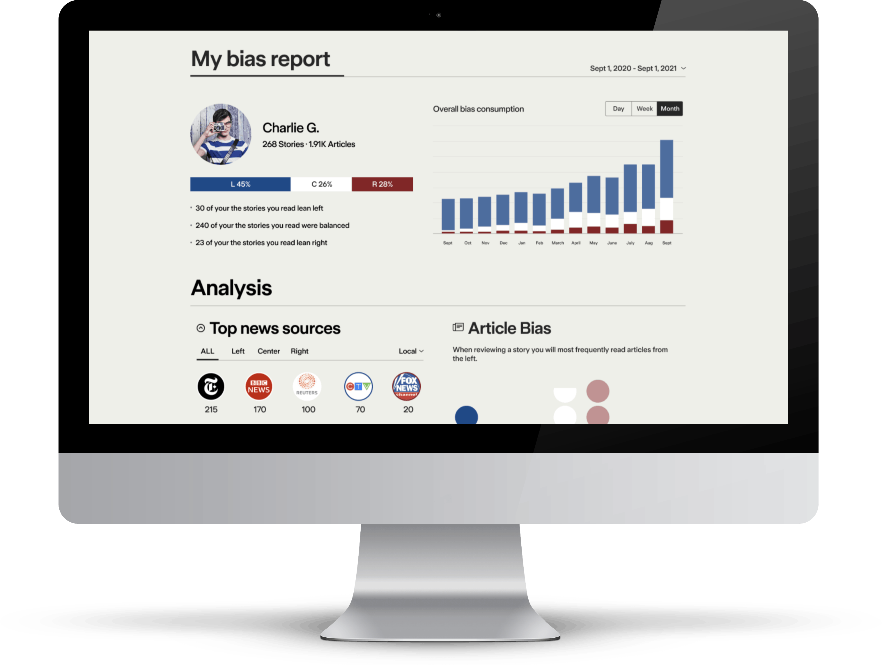
Yes, we are a news product, but as a company tech is our biggest strength. Our ability to look at the news landscape and help readers peek behind the curtain using a data-driven process is unmatched. We wanted to create a design that would present all that data in a very clear and accessible way.
How did the rebranding process go? Was it all smooth, or did you encounter challenges?
As a small team, the rebranding process was challenging in terms of its scale. We probably have the most comprehensive product suite of any news platform - website, apps, browser extension, Twitter tools, multiple newsletters, and a prominent Instagram channel - everything had to be completely redesigned.
One of the challenges we faced was how drastic the change was for our readers. Not only do we look entirely different, but key elements of our product have changed. When you have a really dedicated audience who shares your mission it’s understandable that change would be hard. These are people who care deeply about the issue of political polarization and see Ground News as a solution.
As a subscriber-supported product, they’re quite literally invested in Ground News. We don’t sell advertising because we don’t want to build a product that is addictive and optimizes for eyes on the screen. Every decision we make is tied to whether it improves the reading experience.
That’s exactly what we tried to do with this rebrand.
Can you tell us how the new logo was conceptualized? What’s the story behind it?
The Ground logo was inspired by news headlines. The designers studied fonts in print media with the goal of creating something ownable and new in the digital news space.
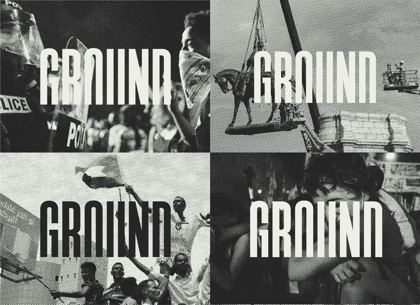
The cropped letterforms symbolize groundedness: being physically and emotionally in tune with the world around us. An aspiration that we hope our readers share.
It was mentioned that inspiration for this new visual identity is schematics and blueprints. What about these design elements spoke to the brand?
Transparency is one of our core values so we were drawn to the utilitarian design of schematics and blueprints. Diagrams have been used since ancient times to represent complex information simply and clearly. They are maps that eliminate assumptions and empower you to make educated decisions.
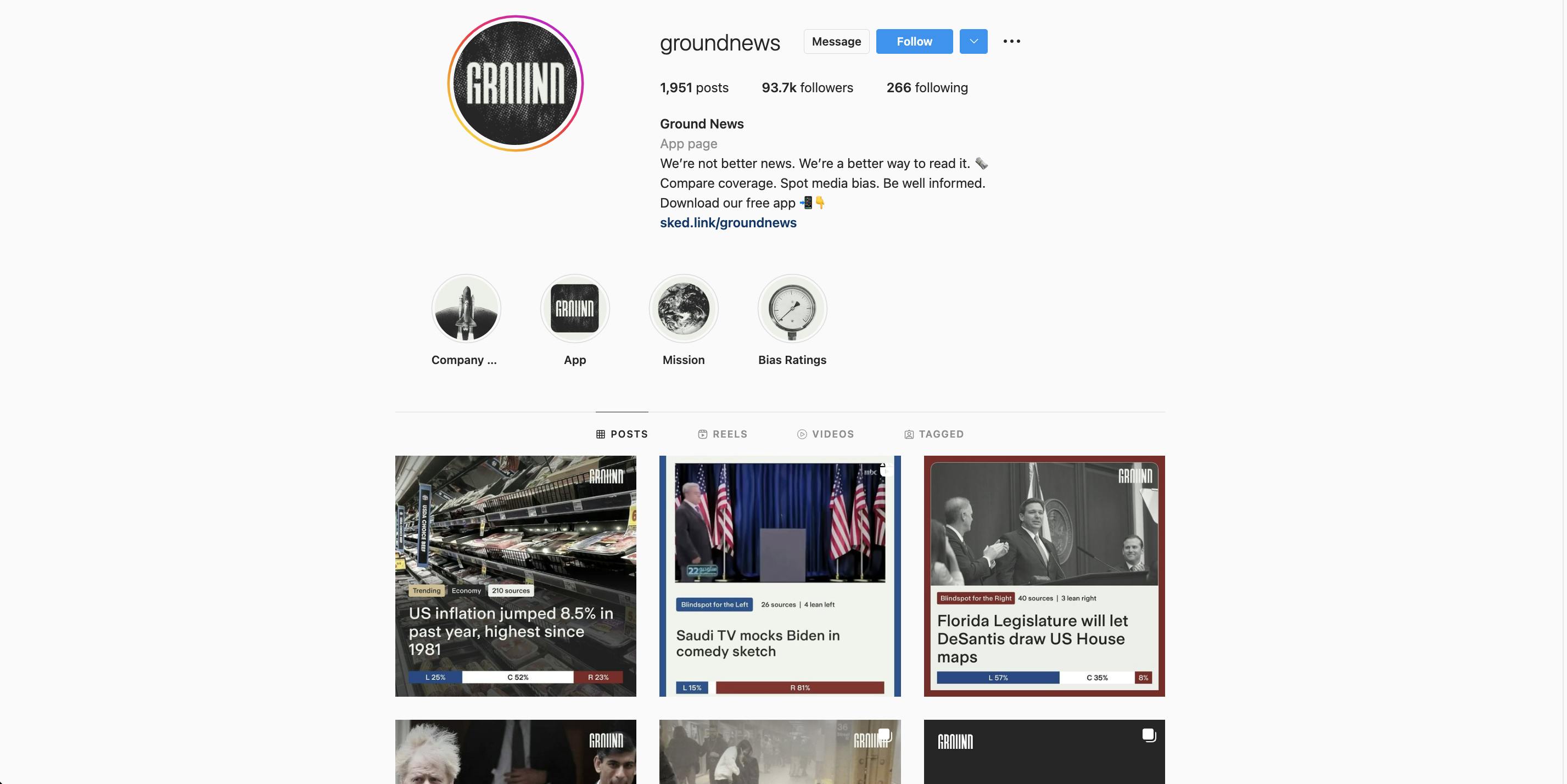
This design philosophy comes through in every aspect of our brand, from text that prioritizes legibility and functionality to a simple color scheme that tones things down to focus on information.
How about your new color palette? How did you land on these colors and what do they say about Ground?
The color palette is called Parchment & Ink. Inspired by the soft, ink-like blacks of the printing process and the natural discoloration that occurs on newspapers, it’s a subtle nod to the history of news.
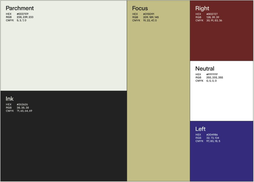
That primary palette helps tone things down, while the secondary colors - red, blue, and white - quickly and effectively communicate political bias.
What is your major takeaway from this experience? Or, do you have any advice for brands or designers embarking on rebranding projects themselves?
The major takeaway is to stay the course. We have a lot of contact with our readers and are very responsive to their feedback. We’re constantly trying to improve the product based on their input and experience.
With the rebranding, it was challenging to decipher valuable feedback from a resistance to change. Ultimately, I think we found the right balance, adjusting where needed but keeping the intention behind the new brand.


