


Chance Higgins, Art Director at Lucid, talked about rebranding their entire suite of products, learning from what had and hadn’t been successful for other brands, and his team’s main takeaways from the experience.
Can you introduce us to Lucid and the exciting things it is doing these days?
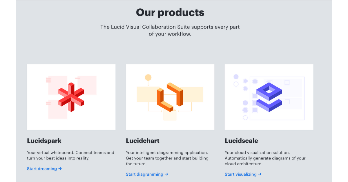
Lucid is a SaaS company, offering a leading Visual Collaboration Suite. All of our applications are aimed at helping teams clearly see and communicate what needs to be built, from initial idea to reality. Our suite is really built for an end-to-end journey.
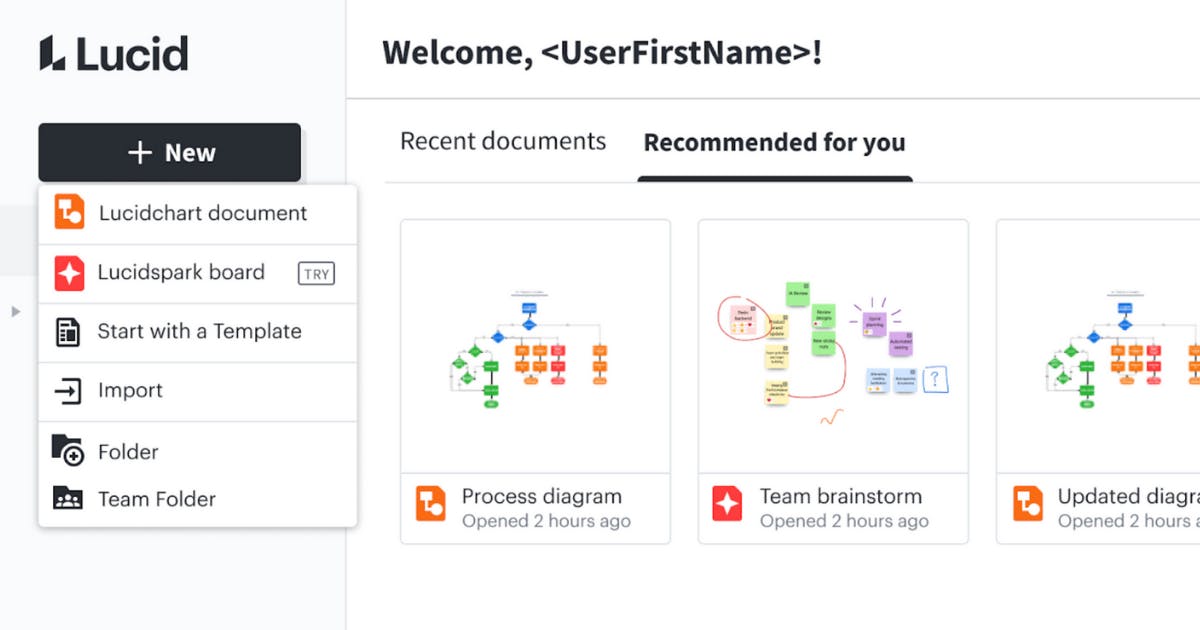
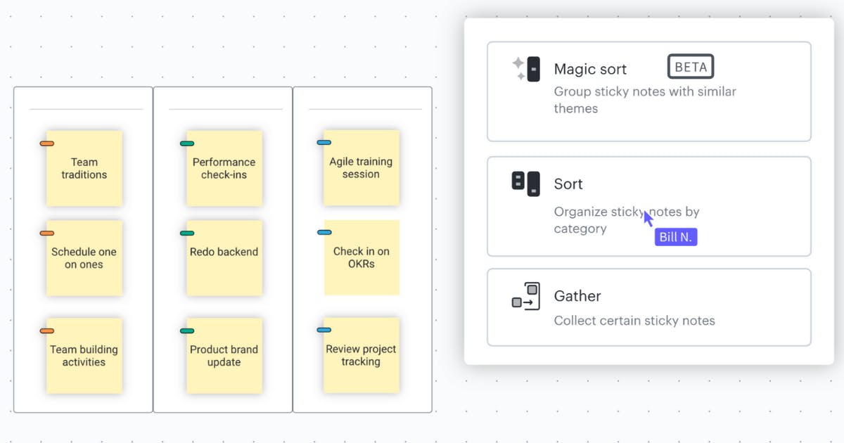
We have Lucidspark, which is a virtual whiteboard. You can collaborate with your team, add sticky notes, comment, have voting sessions, intelligently sort your stickies; it also has tons of integrations with other programs like Jira to seamlessly move those ideas into action plans.
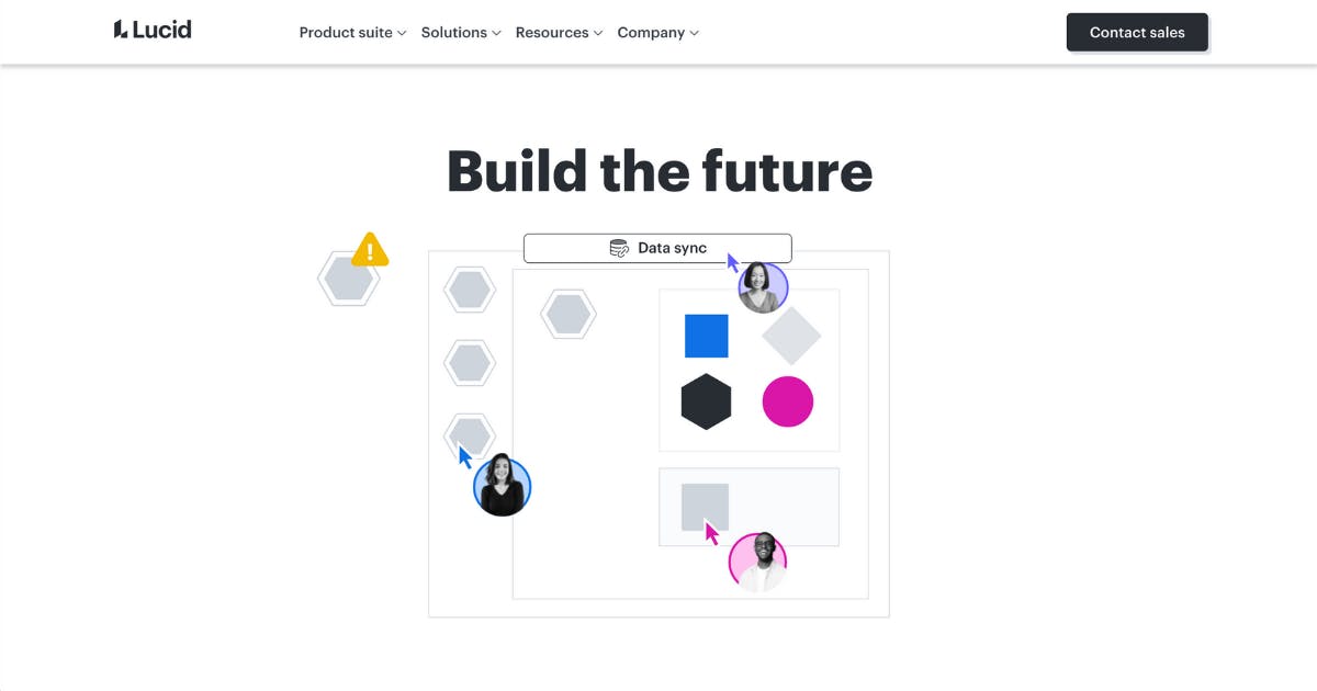
Then you can move to Lucidchart, our flagship product that’s one of the leading players in the intelligent diagramming space. You can build charts, map out flows, and system processes. We have several shape libraries and templates built in that you can use, so you can come in with your own ideas or start from a template.
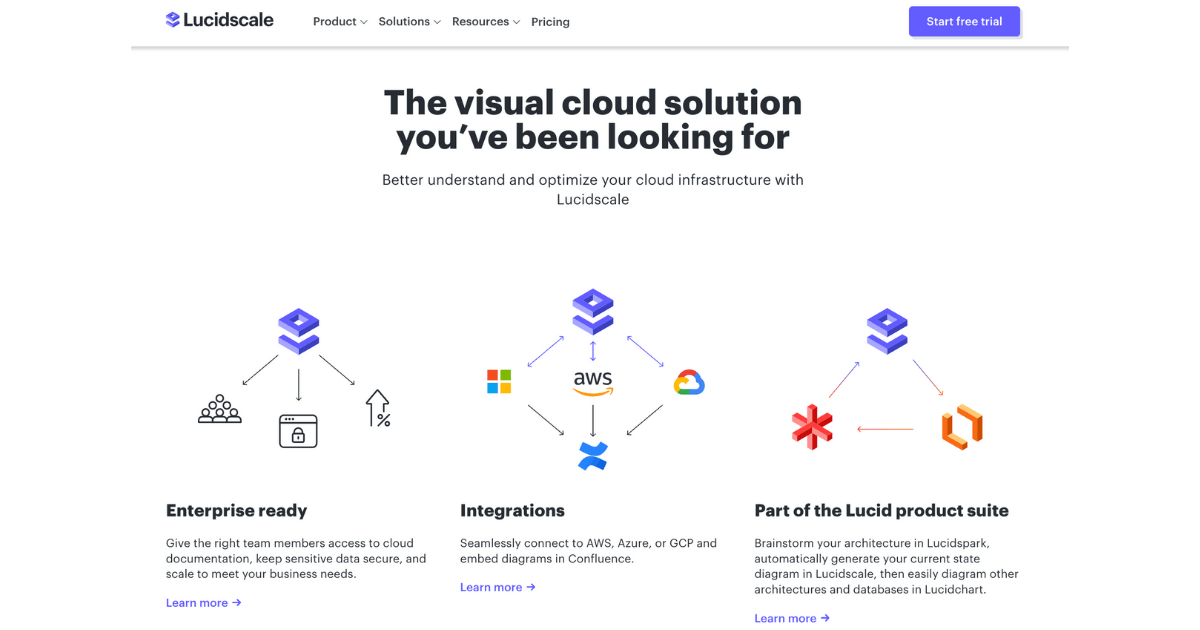
Then we have Lucidscale, which is a unique cloud visualization solution within the Lucid Visual Collaboration Suite that’s tailored to cloud architects. It’s a hugely powerful application that saves our users hours, days, even weeks because they don’t have to manually draw their cloud diagrams anymore.
Whether brainstorming on a virtual whiteboard, diagramming out new processes, or visualizing cloud architecture, we’re all about helping teams work together in a visual manner.


Walk us through your company’s brand identity through the years. How was the initial branding conceptualized? Why ‘Lucid’?
Ben Dilts, our CTO and one of the co-founders, recognized an opportunity to help people visually see diagrams in a more digestible and readily available fashion. And then Karl Sun, our current CEO, who was an early leader at Google, recognized the value of those opportunities Ben uncovered. They started working together, and that’s how Lucidchart started a little over a decade ago.
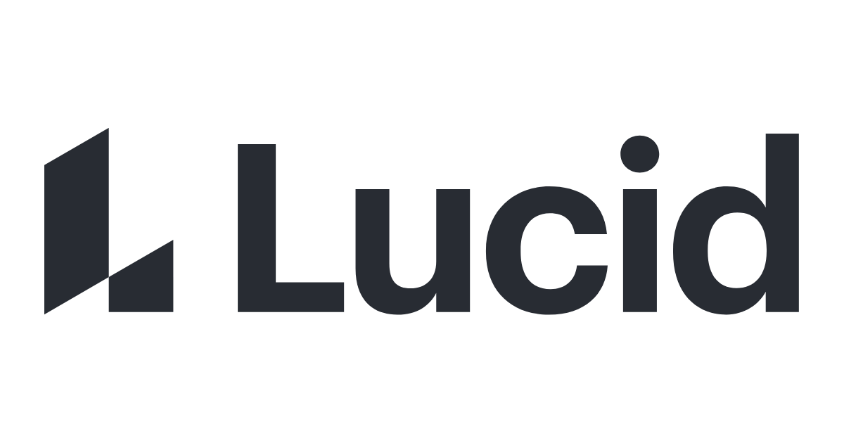
The name ‘Lucid’ came about because Karl and Ben saw how well Lucidchart was doing and had quickly earned some brand equity. It’s that whole idea of “a picture’s worth a thousand words.” When you see something, you just get it.
The concept of ‘Lucid’ is that when teams are collaborating visually, there’s more clarity, understanding, and alignment.
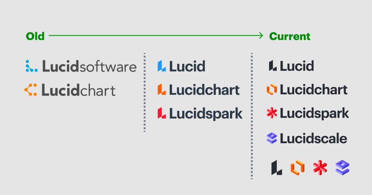
The first iterations of the website were very interesting. It was a bubbly logo that morphed into a molecule-looking logo that a lot of the products used. And then it changed into dots that morphed and spread into each other. The brand has definitely been iterated on a bunch since then, and it's been an interesting progression.
The rest of the brand identity was a bit rushed early on out of necessity, so we’ve really been taking the opportunity and time lately to catch up and reflect on who we are through this refined brand identity.
Now about this current rebranding, how did it come about? How did that conversation start?
Necessity. The launch of our second product, Lucidspark, introduced additional problems and challenges in terms of brand recognition and product identification. We were aware of many issues back in the summer of 2019 when we started a brand audit.
The problem we were trying to solve was really clear right off the bat. We needed something that would scale with us while also differentiate Lucid’s products both from each other and within the market while creating that cohesive visual identity. Everyone from the brand team to the executive team were aware of it. Everyone was willing to go down this road and see what a fresh update would entail. We, as the design and brand team, knew what needed to happen, and the executive team knew it needed to happen.
At the time, we identified consistency as the most important and immediate thing to achieve. We also recognized that lack of alignment and buy-in was one of the main reasons for the inconsistencies with the original identity system, so we decided to simply go with a shared logomark across products in the first round of the brand update.
We initially decided the identifiers would all use the same L brandmark and just have different colors. Obviously, really quickly, that was not sustainable. Being able to distinguish between the products kind of went out the window. Just having one color isn't a great thing to lean on for product identification.
The shared logomark addressed some immediate needs while giving us additional time to build bridges and credibility, as well as to develop a scalable identity system. Once Lucidspark launched in the fall of 2020, we formally reached out to partners and stakeholders across the company (i.e. executives, Product/UX team) to formulate the needs, requirements, and constraints of the new identity system and to kick off the process.
To add, a key skill for a designer to have is being able to meet the stakeholder where they’re at and speak their language.
Knowing how to talk to executives, to project management, to the product team, and leaning on project management to help facilitate some of these meetings were key to this. We found that working with a project manager or a facilitator is super helpful in these situations. If you can’t find one, then taking on that role of the facilitator becomes a huge skill to use because you have to know how to communicate with your audience.
If you’re going to talk to a CMO or to the executive team, they will want to know the objectives and goals you are going to hit and how it will affect the business. It’s harder for them to take things conceptually and to get their buy-in to put resources behind initiatives unless there’s clear, measurable objectives.
With us, for example, Lucid is a very engineer-heavy company. When we talk to engineers, or product and UX designers, we try to speak their language a bit more. They live in the world of research and qualitative and quantitative data.
So that’s something I learned–it’s super helpful to speak the language of your audience. It’s going to resonate more and help you build your case.

How did the rebranding process go? Was it all smooth sailing, or did you encounter any challenges?
It was a massive effort, and I think it went really well. Not only did we do user testing and research during development for qualitative data, but we have had time since the rollout to hear from the company as a whole and from actual users, so from a metrics and goals perspective we hit a lot of what we set out to do.
Our key players were the executive team who were our final decision-makers, the brand design team which I am on, members of our UX and product teams, and project management to run everything.
In-house, we did all of the voice and tone, all the personality, archetypes, characteristics, et cetera. And then we used that to help guide us when we found an external illustrator for the rebrand.
I worked on this for the better part of a year, and others on the team worked longer than that before me, so “smooth sailing” wouldn’t be quite the phrase I might use, but honestly it was surprisingly efficient most of the time.
There were lots of surprises and new challenges that popped up during the process. Every once in a while, we would meet with executives and show our progress, do gut checks, and get buy-in. At one point, the executive team was really excited and they wanted to announce it at a company-wide meeting. While we didn't feel like we were ready to present, we worked with that nudge from the executive team and showed it to the company. And we got a lot of excited comments about the redesign.
One challenge I very much enjoyed was the opportunity to give a 45-minute presentation and Q&A during our engineering team’s weekly tech talk. It was interesting to tailor a talk for that audience and really explain the design team’s entire process through setting objectives and research to the actual designing itself.
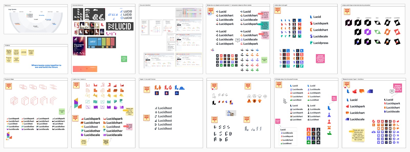
That presentation was really heavy on the discovery and research phase and then we shared a little bit of the design process. We had Lucidspark boards that our whole team worked in, and they were massive. You’d look at them and they would have hundreds or thousands of little sketches. I showed that to give them a sense of scope and scale, how many stones we turned over, that we didn’t just do things willy nilly.
It really ended up helping generate a good buzz internally about the changes and about the work our team does.
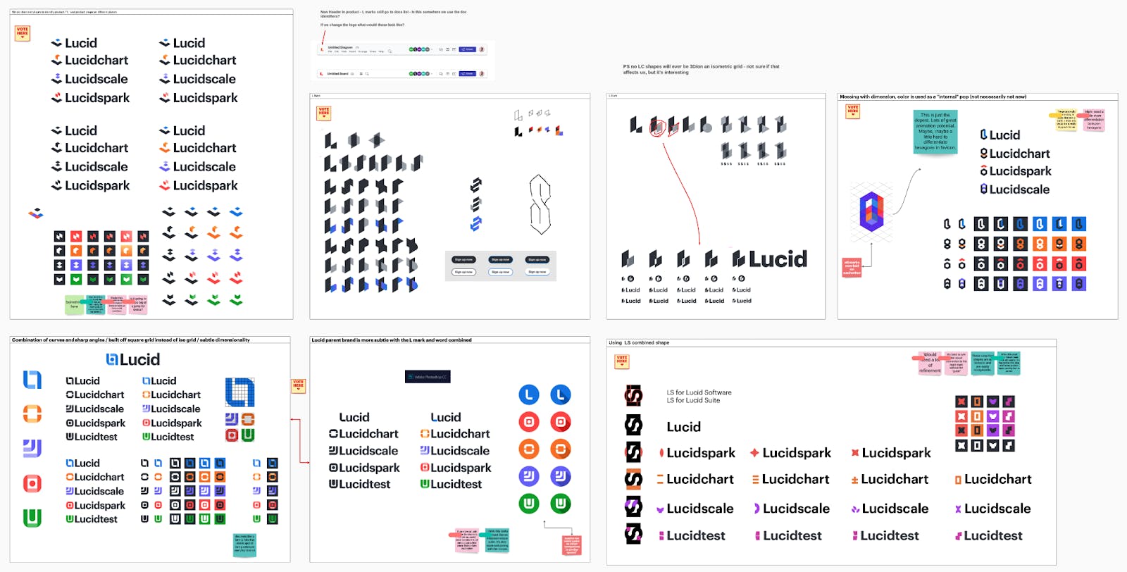
How did the logos for Lucid, Lucidchart, Lucidscale, and Lucidspark come about?
The brand team and I cast a pretty wide net to start with. Nothing was off the table, and we even had license to explore changing the main Lucid mark if necessary.
After key stakeholders had set the brief and we had an official kickoff, we spent several weeks designing and coming together at a regular cadence to talk about learnings and discoveries. We set up several boards in Lucidspark so the entire design team could be in one place together and see what everyone else was doing. We held critiques and voting sessions and began to narrow down directions.
One of the most important insights we uncovered during our research phase was how to relate the product logos to the parent logo. We looked at several companies we thought were successful in this area and broke down why and how. That led us to exploring a foundational grid in two ways, one to contrast the parent logo and one to complement it.
The main Lucid ‘L’ is based off of the isometric grid, and that affords lots of possibilities with its use of 30 degree angles and straight verticals. To us, it made the most sense to stick with the grid that made the parent logo so strong. We felt like it was a good system, a great foundation to build off of, that would allow us flexibility and a lot of adaptability.
But as far as the design itself goes, this is where talking with the executives, the business strategists, and the people leading product strategy was super helpful because in our meetings with them, they said a lot of things like, “Lucidspark is the hub where people come together. Lucid is how you build things.” We started to pull out these words that were super important to us.
We went in that direction and came up with these building block-like structures. When we would show them to the executive team, they would say things like, “This is really speaking to me because it’s our mission to see and build the future.”
It’s really interesting because the software product that we offer is flat, it’s on a screen. Having this contrast of 3D shapes, this push and pull contrast is something more to grab onto metaphorically.
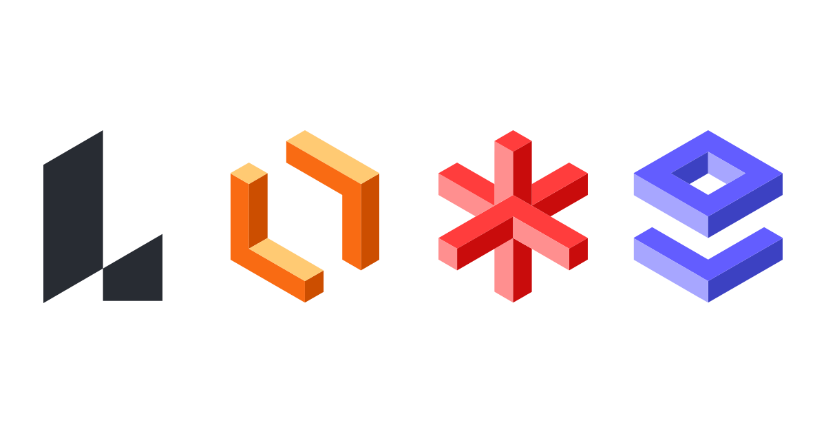
Each brand’s mark tells a bit about the brand. Lucidchart is a frame coming together to add structure to your plans. Lucidspark is a hub of activity gravitating around a center location as well as an ignition point. Lucidscale is a viewport that gives you insight into complicated architectures, as well as these pieces that feel like they could snap together with perfect precision.
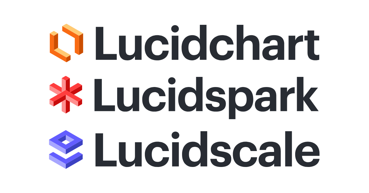
Like building blocks, these marks have enormous potential. And for any eagle eyes out there, each mark is composed of L shapes that allude back to the Lucid name.
Colors are used as identifiers for your different brands. How did you land on these colors?
The parent brand, Lucid, used to have a lot of light blue, but during the audit we determined that the color did not look high-end enough or feel like the right tone, so we transitioned to gray. The main Lucid brand now is a dark gray with white as its core colors with dark blue as a secondary color.
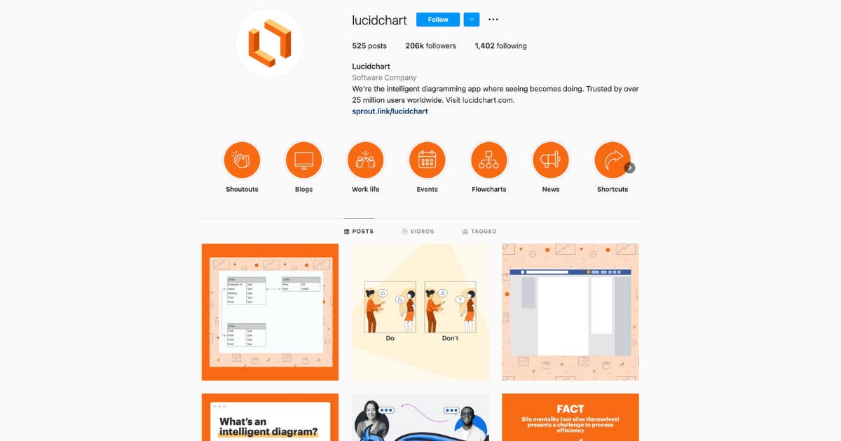
Lucidchart has always been orange and there’s a lot of brand equity built in with that, so we knew that was going to stay orange.
Also during that brand audit, our Creative Director made this really massive brand color scale. He identified colors, different hues, that would work with each other and then scales of tones so you can go up and down the value spectrum.
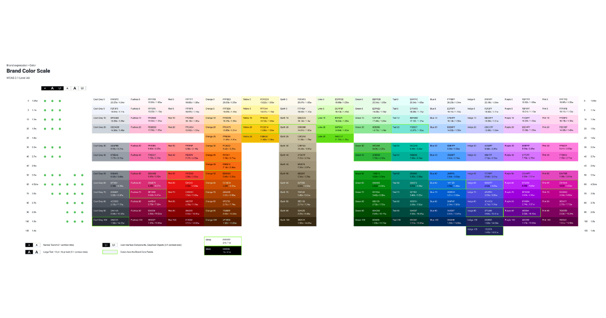
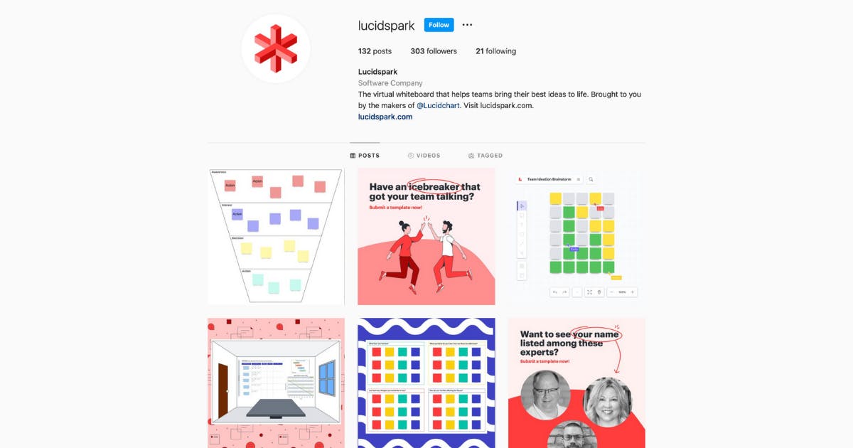
Lucidspark as a product was developed to be tailored to the specific audience and their needs, but it still came from our main color umbrella and retained the overall color vision. The updated mark was based around variants of primary colors (red, blue, and yellow) with red being its core color. The red we selected is very vibrant, fun, and energetic to reinforce that brand. It’s interesting because it’s kind of saying the product is this foundational thing where you build ideas, so using these primary, foundational colors is a nice nod to that.
The primary color for Lucidscale is indigo and was purposely pulled from that main color scale. It was picked because of it’s digital-first nature, ability to stand out in that space while not feeling unfamiliar, and associations of wisdom and authority that indigo has.
Another function of that indigo color is to help it stand its ground in the suite of products. You already have red and orange for our other products so we obviously weren't going to do yellow or something like that, because then you start to really lose that differentiation.
You also make use of illustrations and icons. Did you work with illustrators or other designers?
When we launched the original brand update back in January 2020, we spent a lot of effort defining the brand’s values, personality, voice & tone, and visual principles. Based on that work, we went out and looked for an illustrator with a style that spoke to who Lucid is.
We worked with an illustration partner, and he developed a set of custom illustrations for us. We then created a character illustration system that we now use to compose a wide variety of illustrations with ease.
As for the icons, we were able to find a stock set that aligns well with our illustration style. Because the illustrations and icons were designed around the brand core we established earlier on, we only had to make incremental changes in color and style for the newest brand iteration.
With different brands under Lucid, was it like rebranding essentially 4 different brands? How did you go about it?
We talked to people at the company and our users, did user research and user testing. We also looked at companies who are doing similar things, or are in similar spaces, and then broke that down to what we thought was successful and what was not working.
A huge part of our process is synthesizing and then putting that research into usable form. So actually using Lucidchart or Lucidspark is super helpful. We use it all the time internally to share our ideas and to break things down. During this rebranding, we were trying to forge our own path but also look to what has been done previously and done so successfully.
We thought a lot about the suite’s brand identity and ultimately framed it in the context of a family. Lucid is the parent that passes traits and values on to the children (Lucidchart, Lucidspark, Lucidscale), and while the children share these traits, they manifest them differently and to varying degrees.
The naming convention was something that was super important to the executives because Lucidchart had all that brand equity with it. So when they came up with the idea for Lucidspark, that started the nomenclature of Lucidchart, Lucidspark, and Lucidscale.
At some point, it was floated that maybe we just use ‘Chart,’ or just ‘Spark,’ but obviously, those were too generic. It would never work–you can’t own those.
Knowing what brands you can own and working with strategists on your team that can help you decide on the name is super important.
Since our current marketing strategy is to approach our products as a full suite of solutions, and the products are complementary to each other within the Lucid Visual Collaboration Suite’s workflow, cohesion across product brands is paramount to that strategy.
We know everything is cohesive. We know our products work together. They add up to more than the sum of their parts when you use them together. So that marketing strategy comes from there, and we want to show these things as a suite and how they work together and show how teams can benefit from using all of them together.
However, each product has its unique purpose and audience, so the branding approach was more about relating to the respective audiences rather than differentiating between product brands. While it’s a suite, and you can get the benefit from using all of the products, at the end of the day, someone who uses Lucidscale may or may not use Lucidspark all the time, and vice versa.
We have set a lot of our branding guidelines on a spectrum to help us be flexible. That way, if we are talking about just one brand we can lean to that end, but if we are talking about a brand in context of the suite, we can move down the spectrum.
We did that with all kinds of brand elements. We have a messaging spectrum, we have a coloring spectrum. We even have a spectrum for how we present our product UI as far as whether it’s information or if it’s conceptual and just trying to get an idea across.
What would you say is your main takeaway from this experience, or any advice you may have for other designers embarking on rebranding projects themselves?
Some important lessons that were reinforced were:
- The work doesn’t always speak for itself; being able to meet stakeholders where they are and communicate in terms they value is a key skill for a designer.
- The most successful design is a compromise, whether it be between form and function, time and resources, opinions and data, etc.
- It’s important to be comfortable with a level of ambiguity. It’s unlikely to know all edge cases or go in with perfect knowledge, so being able to identify key points and act on those is paramount.
- Sharing work often and keeping stakeholders informed will make the process smoother and eliminate many roadblocks.
- When you’re building for flexibility and scalability, try to keep an eye on what’s next.