


Lindie Gerber, Executive Creative Director at Movable Ink, talked about Movable Ink's brand evolution, how they use magenta as a powerful differentiator, and the five-year-long process of evolving their brand.
Can you introduce us to Movable Ink and the story behind its initial branding?
Movable Ink was founded in 2010 by Vivek Sharma and Michael Nutt when they recognised the need for email to be a more dynamic and relevant communication channel for marketers and consumers.
We were intentional with standing out from all others in the martech brandscape by being approachable and fun all while remaining innovative and creative.
This dedication to our brand attributes set the foundation for our brand as a whole and is reflected in our initial logo with the use of a sans serif type combined with a magenta inkblot as a symbol.

When our founders assessed the landscape of email, it was revealed that email service providers were mainly geared toward the infrastructure and data side of email marketing. But, customers don’t experience data, they experience content. And as a result, exposing the need for personalized content as a focus.
So Movable Ink activates any data into personalized content in any customer engagement. The platform easily connects to all relevant data updates (no matter where it lives) based upon a recipient's most recent interactions, and is auto-generated by the platform.
You call this a ‘brand evolution’, instead of a rebranding. What would you say is the difference?
As the business matures, the brand responds.
It is important to note that a brand evolution is not a rebrand. A rebrand is a full overhaul of the brand’s identity.
A rebrand typically involves a massive visual shift and often implies the failure of the previous identity to align with the business it represents.
An evolution, however, retains all of the visually recognizable components and brand architecture from its previous version to retain brand recall, resonance, and value that were previously established.
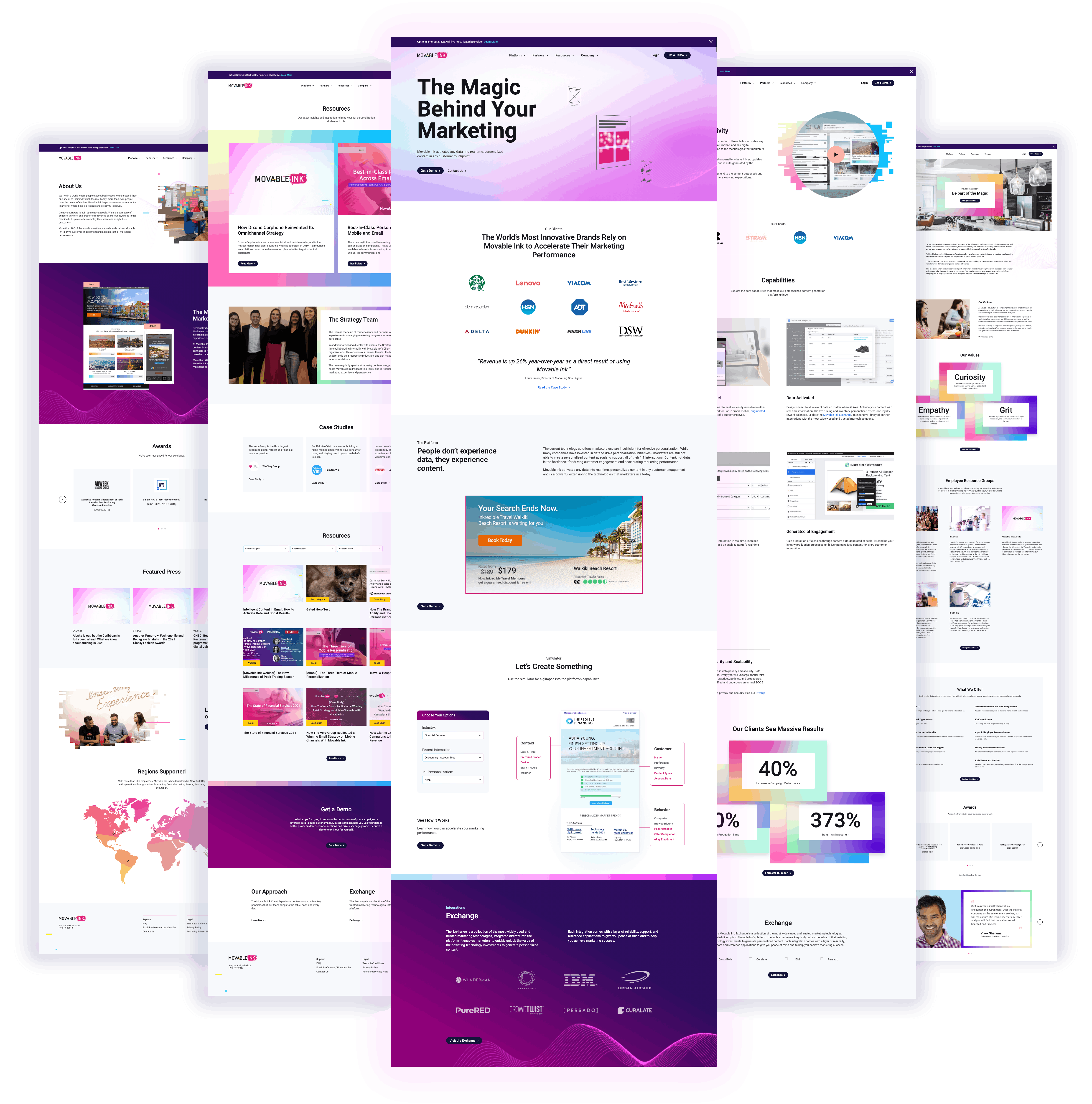
An evolution retains primary brand identifiers such as color, shapes, and symbols and aims to adjust line and form gradually and subtly without losing visual recognition.
Evolution is about bridging the gap between strategy and creativity.
It aligns the brand with the business and marries the visual representation of the brand with the vision and mission of the organization.
Can you walk us through the brand evolution process?
When I joined Movable Ink, the young startup had undergone several growth stages, and naturally, the brand had taken shape to suit the evolving business needs.
A business isn’t born a brand. A business becomes a brand when it transcends its original category and discovers its true essence, defined by its values, voice, and relationship with its customers.
Transcending from business to brand is inevitable for this reason. It is a defining moment. Investigating the stages of transcendence for Movable Ink was a clear first step on the path to brand evolution.
We started with a research synthesis phase where it became clear that the Movable Ink brand had been fully aligned with its target audience. However, the brand in itself was incomplete.
From there the branding process began. I knew exactly which areas to define and add to the brand discovery and development phase to achieve a fully complete brand.
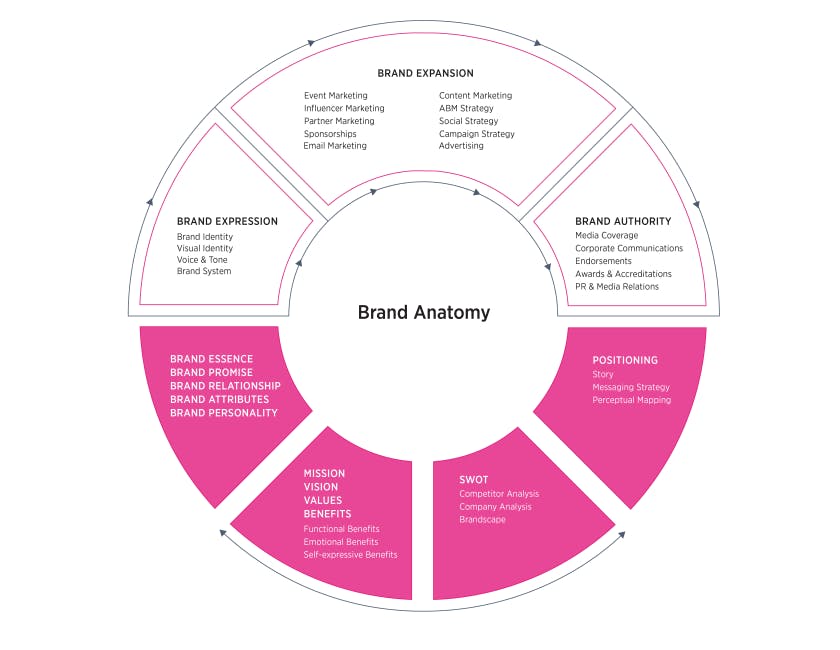
We next moved onto a discovery phase that involved brand awareness exercises, workshops with key stakeholders, and surveys distributed to the entire organization as well as some of our most tenured clients.
After spending several months in this phase, the brand’s foundation had been fully established with the brand’s essence: Movable Ink is magic.
It is the combination of creativity, fun, and innovation. It is the kind of natural, technological magic that inspires and delights. The magical force that pioneers the future.
The development of the brand identity system started with an audit of the brand’s expression to inform the overall requirements of the new system.
The process culminated in the development of templates, photographic and graphic styles informed by the brand’s personality, and custom image filters with image selection guidelines.
We also developed voice, tone, and copy guidelines informed by the brand’s relationship with its audience along with fundamental brand identity elements such as color, typography, and logo sets.
Next, was to turn back time and redo everything, conducting a wide-ranging internal audit of all existing branded materials and re-designing all touch-points for consistency across the company.
Can you tell us more about your use of magenta in your visual identity?
In the development phase of our brand evolution, the brand foundation would be used to inform the development of the identity. The visual expression of magic. And with it, the Movable Ink magenta.
We worked to define the exact magenta we would eventually use. As you can imagine, magenta as a spectrum can be quite vast ranging from True Blood to Victoria’s Secret.
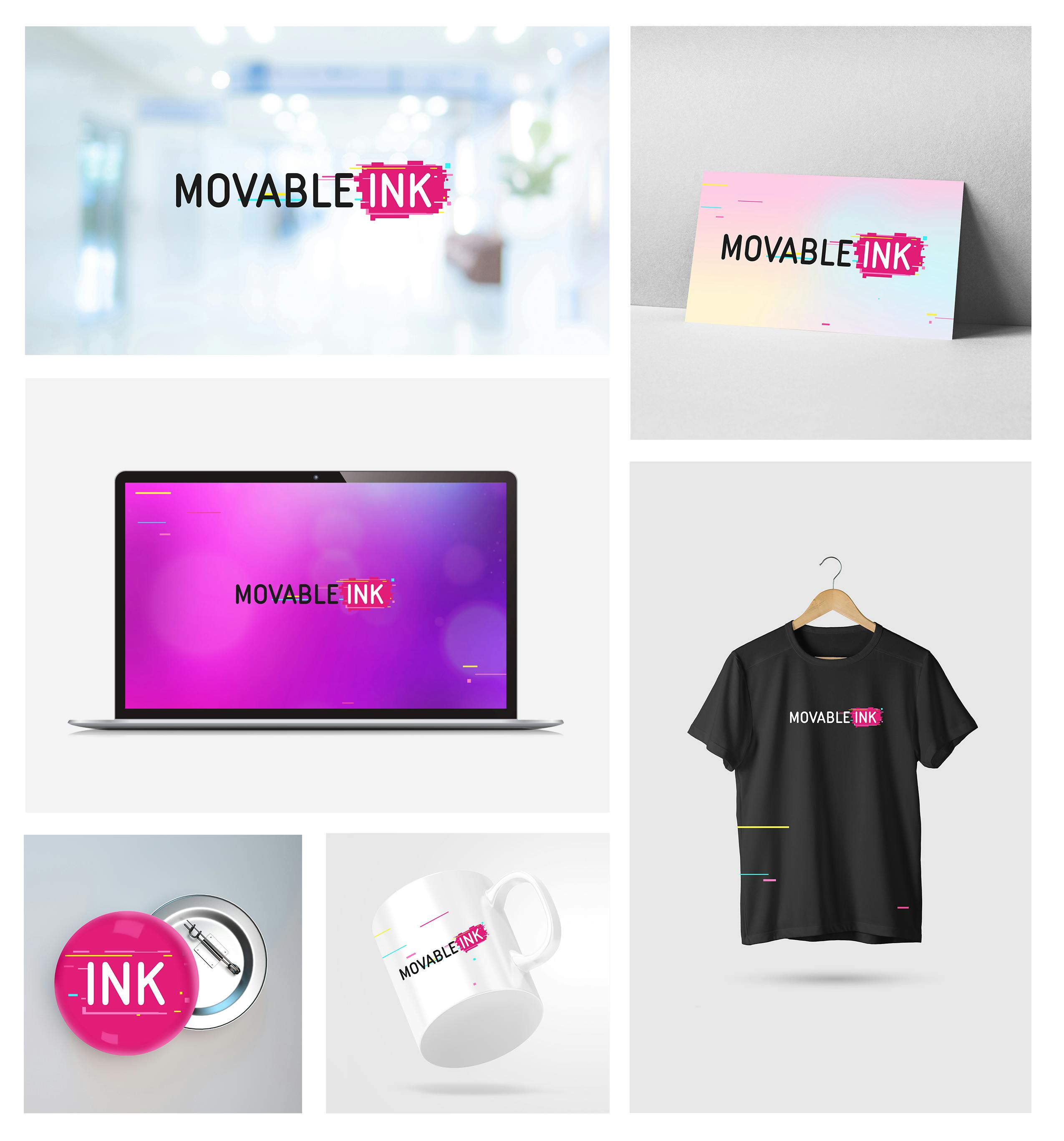
Our very scrappy, very startup-like process involved borrowing Pantone books from friends at agencies, snapping a few pics on our phones of all the magenta palettes, and sending these to friends in the print industry asking them to print us the exact swatches we had photographed, and so on.
Multiple agency trips, a plethora of swatch photos and print samples later, the Movable Ink Magenta was born.
One thing was certain: In a sea of blue martech identities, Movable Ink’s magenta certainly stands out.
As we focus on content, we also pay tribute to the origin of the production of content, of type, of traditional printing.
Our magenta is taken from CMYK, the colors found in traditional printing and is inspired by the past while we pioneer the future of digital technology.
What about the story behind your new logo? Can you tell us more about this?
Once we had a fully complete brand, we were able to evaluate it against our existing logo.
Visual analysis revealed that our initial logo no longer aligned with who we were as a business or a brand and the decision to enter the logo design process was made.
It kicked off with a visual analysis of our current logo, which led to the conclusion that our logo is composed of 2 rectangular shapes: one black; one magenta.
It was important to retain these shapes in our evolution since visual recognition is key to a successful evolution.
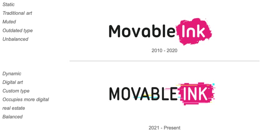
It was a very difficult decision to retire our magenta blot, however, our analysis revealed that the blot appears static, outdated, muted, rendering the logo unbalanced.
We explored ink to its full capacity.
We explored all our brand attributes, we explored magic, abstract geometry, science, art, color application, minimalism, abstraction, to name but a few. We always found ourselves going back to technology, creativity, and innovation.
Our evolved logo retains the essence of its predecessor and remains visually recognizable, retaining brand affinity previously established in clients and prospects.
It is composed of digital bars and pixels all colored in CMYK - paying tribute to the origin of Movable Ink’s logo as a magenta inkblot and the conventional printing press using cyan, magenta, yellow, and black.
The Movable Ink Magenta is the primary color and occupies a shape similar to the original inkblot.
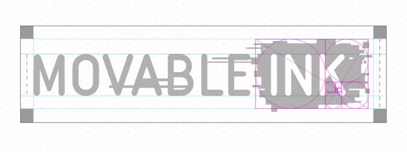
The evolved typeface retains its approachability through rounded edges and weight distribution while all caps occupy more vertical real estate in application. I wanted our new type to not be an existing type, and instead be something custom crafted specifically for Movable Ink.
How did the slogan ‘Magic Behind Your Marketing’ come about?
We had to fully establish our brand before we could craft a relevant tagline that would resonate with our audience.
The process in crafting our new slogan included several brand workshops that generated a series of relevant brand attributes we tested against an external audience to finally inform our new slogan.
Our slogan is informed by our brand essence: Magic. It is evocative, yet descriptive of what we do and fully aligned with how our clients and partners describe us.
It is important to note that a tagline is not the positioning, the mission, or the value proposition, however, it is informed by these brand foundations.
What are your biggest takeaways from this experience?
Trust in the process. Don’t dive into it blindly.
I would often find myself making the mistake of skipping past the process, past the research, and instead design logos I thought would work. Every time I did this, I learned more about our logo, balance, weight, and different techniques.
And every time it failed. The logos looked great, but none of them were relevant.
Critique often and with honesty.
Self-awareness and the ability to critique your work can be one of the hardest things to face as a designer, however, it is crucial to personal growth and development and the overall outcome of the project.
Revision and countless variations form part of the process. Although it may feel like an endless cycle at some times, it is all worth it in the end.
Every pixel added and shifted changes everything. So does color selection. Test everything. Often, and with diligence.
Don’t rush it.