


Jens Marklund, Head of Design at Ogilvy New York talks about the experience of rebranding the legendary New York Philharmonic.
Can you tell us how this project came about? How did that conversation start with the New York Philharmonic?
There’s a long relationship between Ogilvy and the New York Philharmonic actually. We found letters from David Ogilvy dating back to 1959 in their archives, where David is asking to help bring sponsorships to the Philharmonic.
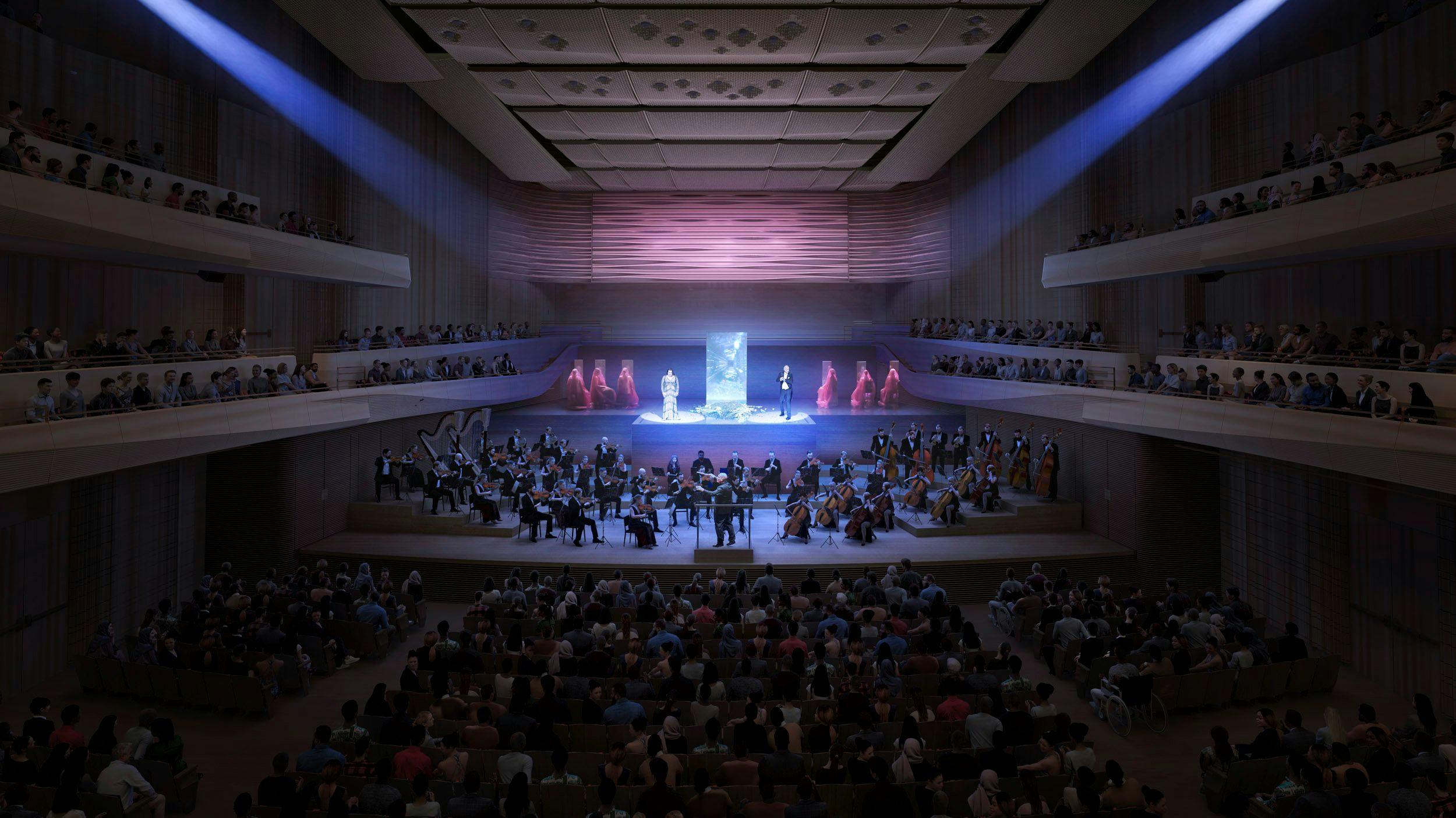
The rebrand came out of their massive renovation of David Geffen Hall. The pandemic had made them take a step back and think about their place in New York. One of the main focuses of the new hall was to bring a much broader audience to the shows. Our first meetings with them focused on inclusivity and building a brand that would bring all types of New Yorkers to visit.


How did the rebranding process go? Can you tell us more about it? Where did you start?
The obvious direction when designing for a brand like this is to design around the idea of music. We had a ton of ideas around how we could visualize it, and we executed a lot of them.
When designing for music it’s easy to make it either playful or theoretical, both of which relate closely to music schools — not the sophistication that is a philharmonic orchestra.
Instead, we started treating the identity similar to an institution or a museum, while still placing the performers and concerts at the heart of it.
Were there surprising challenges you encountered along the way?
One of the big challenges I see with a lot of rebrands, which we also encountered, is creating a design system that will stand out while also being easy to work with.
A lot of studios make these crazy complicated systems in order to flex their design skills, and then hand it off to an in-house team consisting of 1-2 designers. Good luck!
A big change was to the logo. Can you tell us how it was conceptualized?
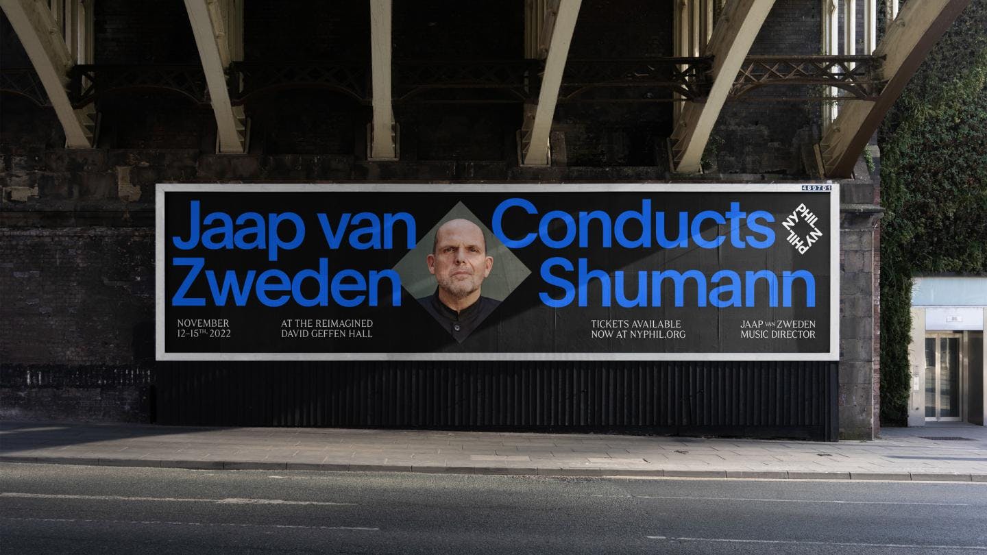
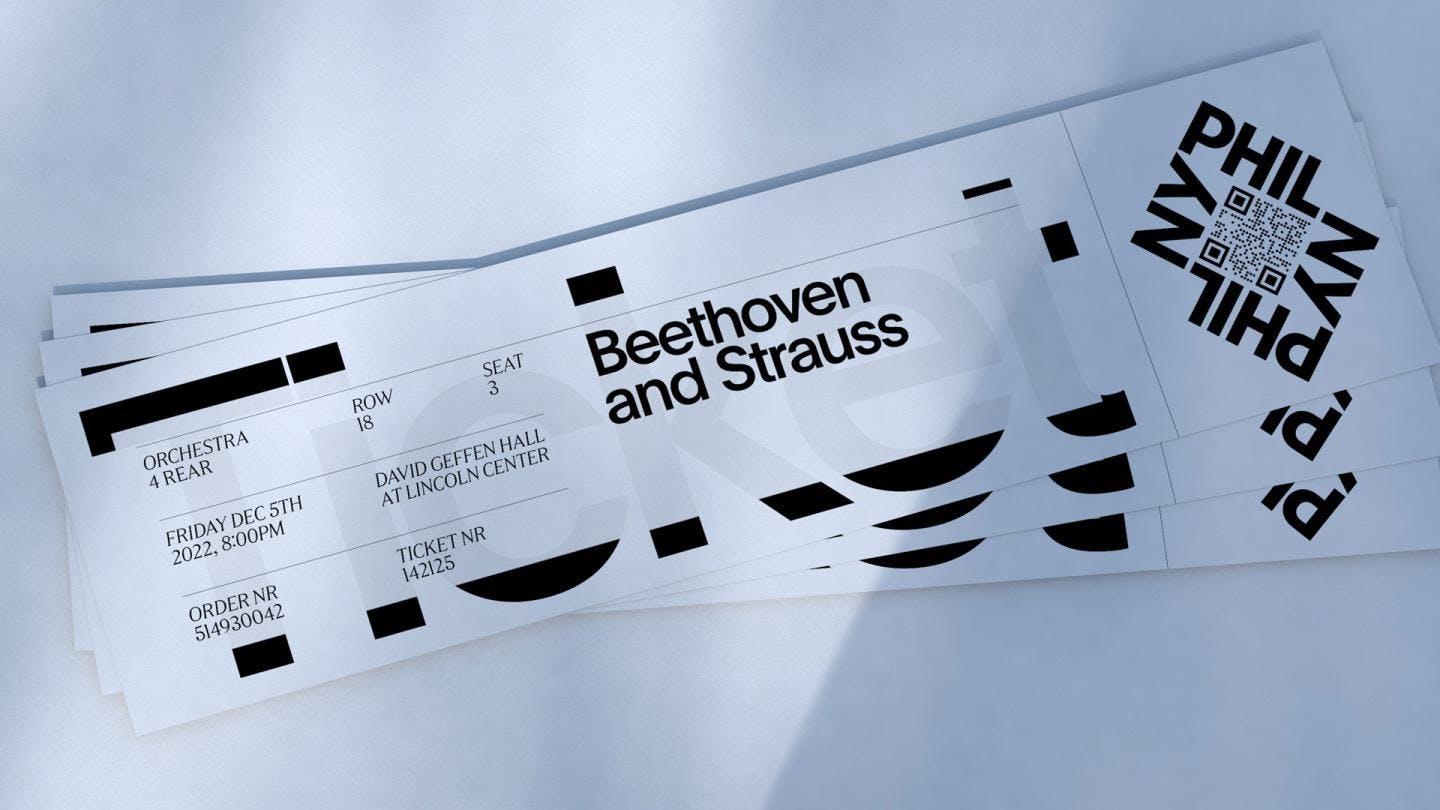
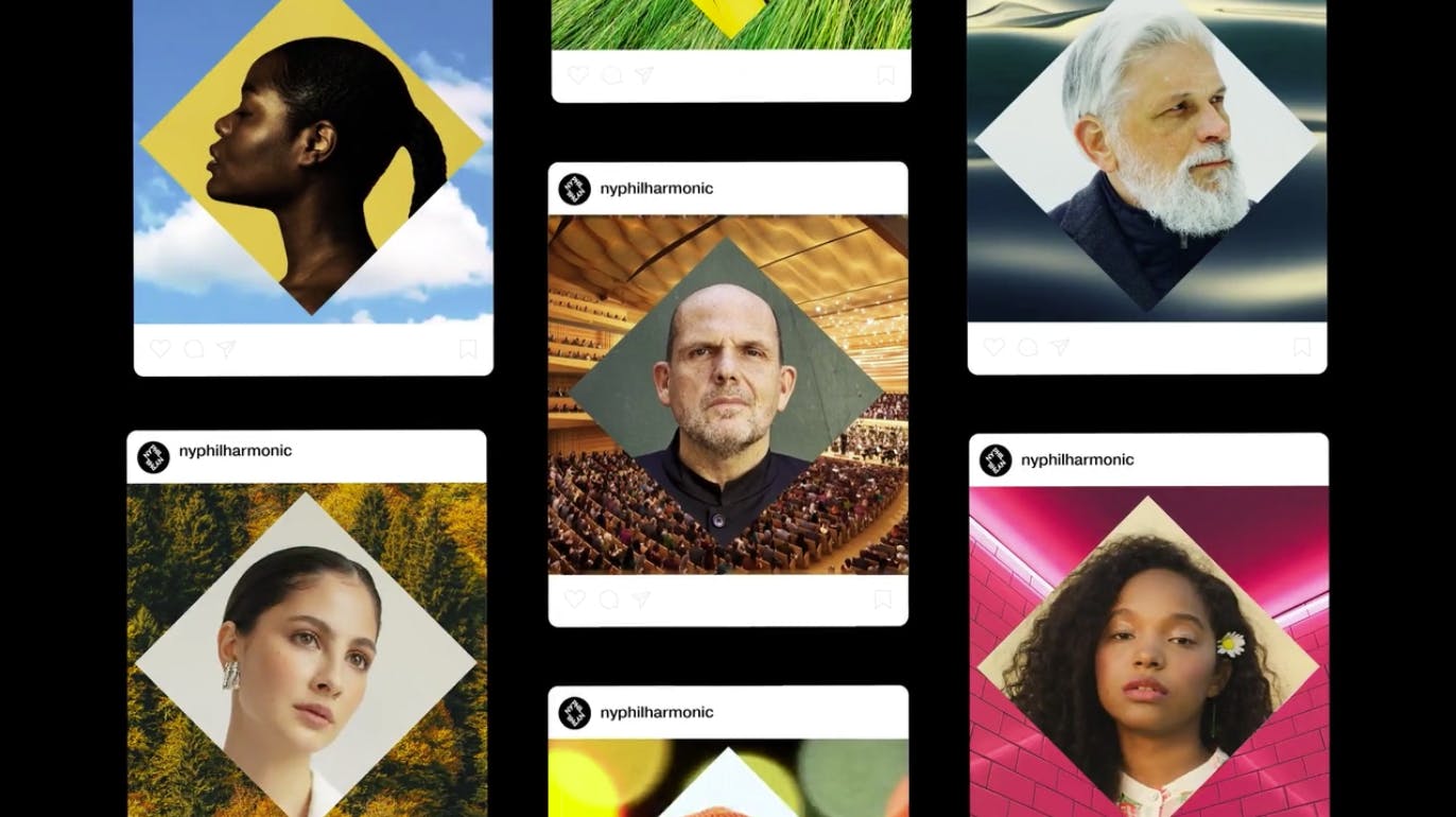
With the rebrand came a new name: NY Phil. New Yorkers often refer to them as “the Phil” or “NY Phil”, so the clients brought us this new name before we started the design process. The idea behind the logo came with the new hall. Bringing the stage forwards towards the center and letting the audience surround the orchestra.
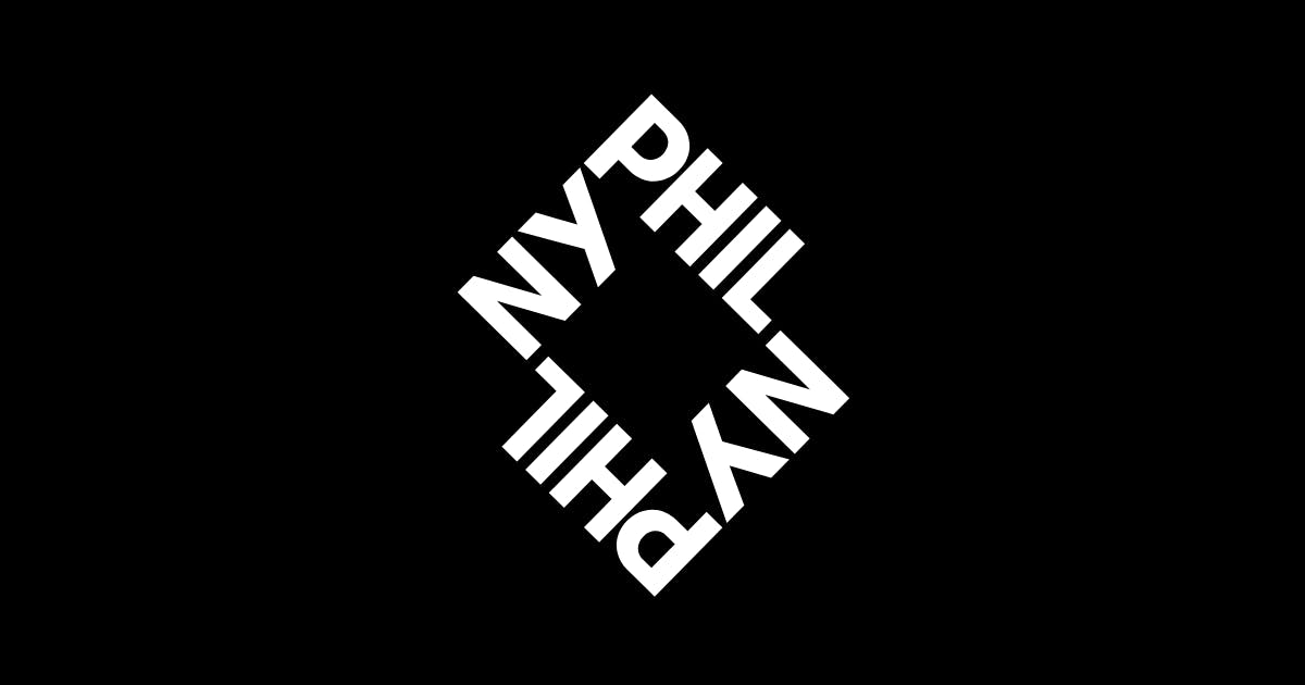
We wanted the logo to represent this idea of surrounding a stage. The logo can be used to frame photography and create that sense of intimacy the new hall brings. The square is a nod to the location of the hall — the Lincoln Center, a rare square inside the rectangular grid that is New York.
The typography is also a standout in this new visual identity. How did you choose or develop the typography?
For the logo, the type had to be custom to make it work the way we wanted it to. Things like having the N and the L align, as well as creating a perfect square inside the logo meant we had to find a good balance between all characters’ width and spacing.
It was important for us to create a brand that would live on for years to come. You see a lot of projects today where the entire identity is based on whatever the latest typeface is, which often gets old quickly once others start using it.
Instead, we looked to museums for inspiration of creating a system that felt contemporary without being trendy. We paired Optimo’s Plain with F37’s Drago.
Having both a serif and a sans-serif in their arsenal was something the clients loved, as they had felt a bit cornered by their previous identity that used many weights of one typeface.
The visual identity relies heavily on photos as well. What is the photo direction for this rebrand?
We wanted the focus to be on the individual performers, creating intimate moments by framing them inside the logo. Previously there had been a lot of photography showing big groups on stage, which took away from the intimate experience you have when going to a concert.
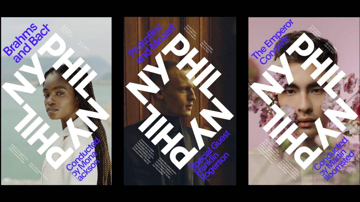
We also added direction for abstract photography and 3D illustrations, which can be used in places where they don’t necessarily want to highlight any one performer, or moments where there’s no high-resolution photography of a guest performer, for example.
Recognizing these instances helped us create a much broader system than we initially had created.
People always get vocal when it comes to rebranding. How has the reception been so far for you? Any feedback that has stood out?
We’ve had really positive reactions. The main thing that stood out was most comments being around the new name NY Phil — which was something I never even thought about. I guess because we’ve gotten used to it for the past year while working on it.
I was hoping for more controversy, but I guess it’s a good thing when someone nit-picks the details of a Storm Trooper helmet in a poster. If that’s the main critique, we’ll take it!
Lastly, do you have any advice or tips for designers embarking on branding projects like this?
Stay away from mood boards, and listen to what the clients are trying to tell you.
