
before

after

A conversation with Nicolai Reuland, Program Lead at Swisscom, on co-creating with Wolf Ollins, aligning teams across the company, and evolving a national brand without losing its identity.

An interview with Pascal Frey, Creative Director at Swisscom, on aligning teams across the company, and evolving a national brand without losing its identity.
Swisscom has a pretty rich history. Can you give us a quick overview of how it grew from telegraph roots to becoming Switzerland’s top telecom provider?
Swisscom was originally Swiss PTT, short for Post, Telephone and Telegraph Services. It started as a state-owned company, and in the 2000s transitioned into a private company—though the state still holds 51% of the shares. Over time, it became the Swisscom we know today.
Swisscom has always had deep roots in Swiss culture and values. That’s something we still carry forward—values like innovation, quality, and trustworthiness.
The Swiss telecom market is more of an oligarchy—there are just a few key players. Besides us, the biggest ones are Sunrise and Salt, and we pretty much share the customer base between us.
Swisscom leads across all sectors—mobile, fixed internet at home, and telephony. And now, we’re also seeing more providers enter the market.

Image courtesy by Swisscom

Image courtesy by Swisscom
What sparked the decision to rebrand? Why now?
Usually, rebrands happen because of big shifts—like mergers—but for us, it was different. We were already in a really strong position. We’re the market leader, with a high reputation and strong NPS scores.
That’s what made it special: we weren’t fixing something broken. We started from a place of strength. It wasn’t obvious to rebrand, but to stay on top, you have to keep pushing forward—reinvent yourself, double down on your strengths. That’s really what kicked off this project.
At the same time, we knew we had to be careful. When your reputation is strong, the last thing you want to do is lose trust. So we focused on evolving, not reinventing—building on what people already love, while making it future-proof for the next five to ten years.
"We weren’t fixing something broken. We started from a place of strength—and to stay on top, you have to keep evolving."

Image courtesy by Swisscom

Image courtesy by Swisscom
Swisscom partnered with Wolf Ollins for the latest rebrand. How did that collaboration work in practice—and how did you build on the foundation set by earlier design partners?
We teamed up with Wolf Ollins from London—they led the visual direction for our new positioning. During the pitch phase, we saw a range of radical concepts from different agencies, but Wolf Ollins struck the right balance. They managed to combine bold ideas with a clear vision that felt right for us.
We were looking for a highly collaborative process. Even during the pitch, we were already imagining, “Imagining to co-create this brand together?” That mindset made a big difference. It took a little time for both sides to sync, but in the end, the process worked really well.
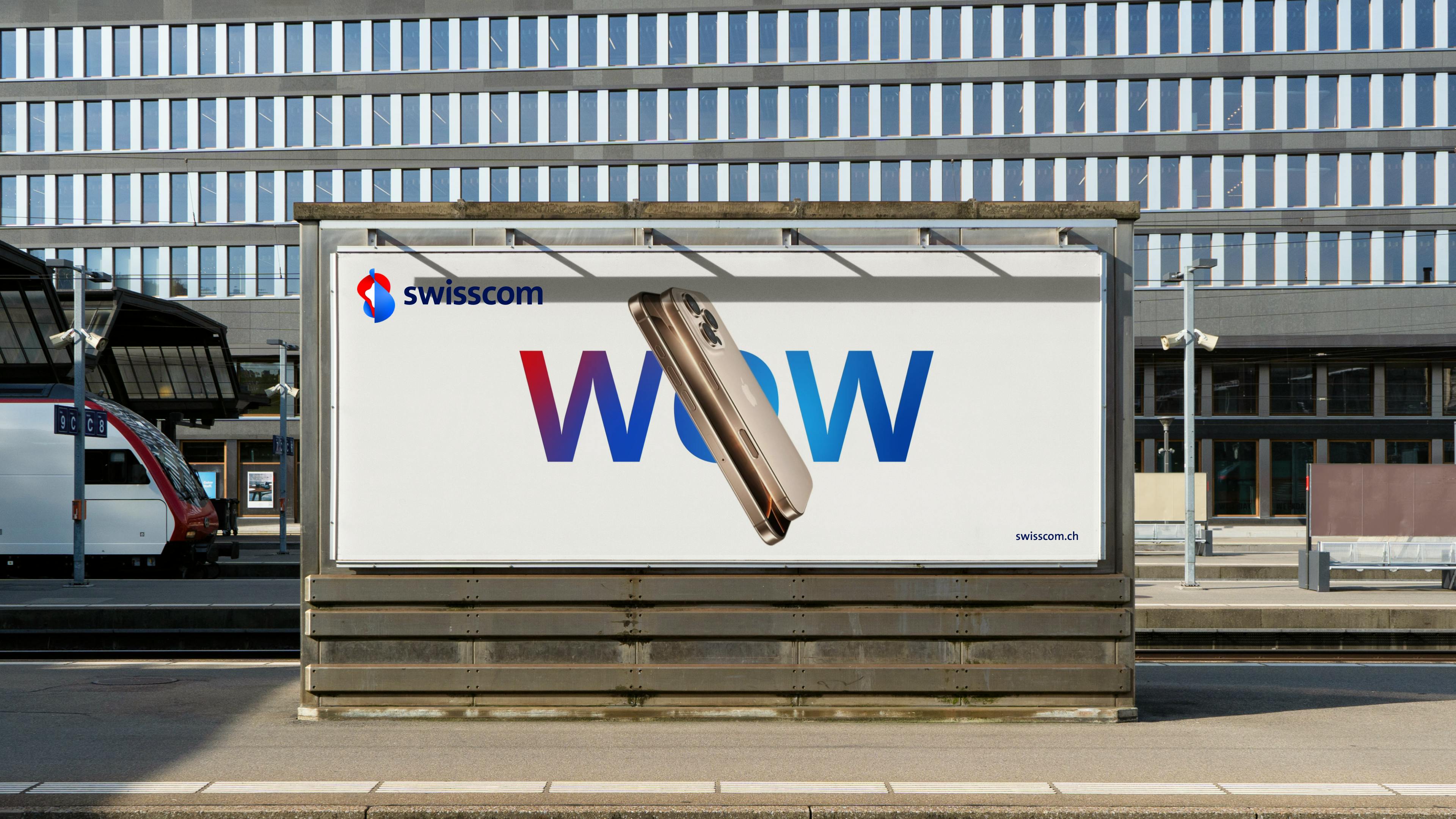
Image courtesy by Swisscom
Of course, we were very clear about what mattered to us from the beginning. We told them we wanted to stay true to our core values—innovation, quality, and trustworthiness. That was the line we wouldn’t cross. Even as we tried to get closer to people’s lives with more dynamic campaigns or creative ideas, we didn’t want to lose the Swisscom identity or lower the bar on what we stand for.
So in a way, this new rebrand with Wolf Ollins builds on that history. Over the years, we’ve seen a shift toward simplification—logos and brands all starting to look the same. For us, it was important to protect what made Swisscom distinctive, while also evolving into something fresh and meaningful for today’s world.

Image courtesy by Swisscom

Image courtesy by Swisscom
The new logo is more bold and striking. Can you share with us the story behind this logo?
Before diving into the new version, it’s worth noting the logo has evolved over time. Back in 2008, Swisscom introduced the iconic “moving” logo—cutting-edge for its time, especially pre-smartphone. That identity was refined again in 2019 with Re Agency, before evolving into today’s version.
The logo actually has deep roots—it started as a visual simulation of how Swisscom communicates with users through IP. The agency at the time created a symbol to represent that idea, and that’s how this flowing, dynamic form was born. The straight line in the middle represents stability and trust, while the motion around it reflects customer interaction and connection.
Image courtesy by Swisscom

Image courtesy by Swisscom
We believed in that concept, so we kept it. And it has incredible recognition—about 98% of people in Switzerland recognize the symbol. Even without the name, if you just show the logo, people know it. That’s powerful.
So there was no real reason to change it completely. Instead, we simplified and refined it. The new version comes with motion assets, more dynamic visuals, and a design that’s lighter, more digital, and better suited to today’s screens—not just print. It’s a subtle evolution, but one that makes it more future-ready.

Image courtesy by Swisscom
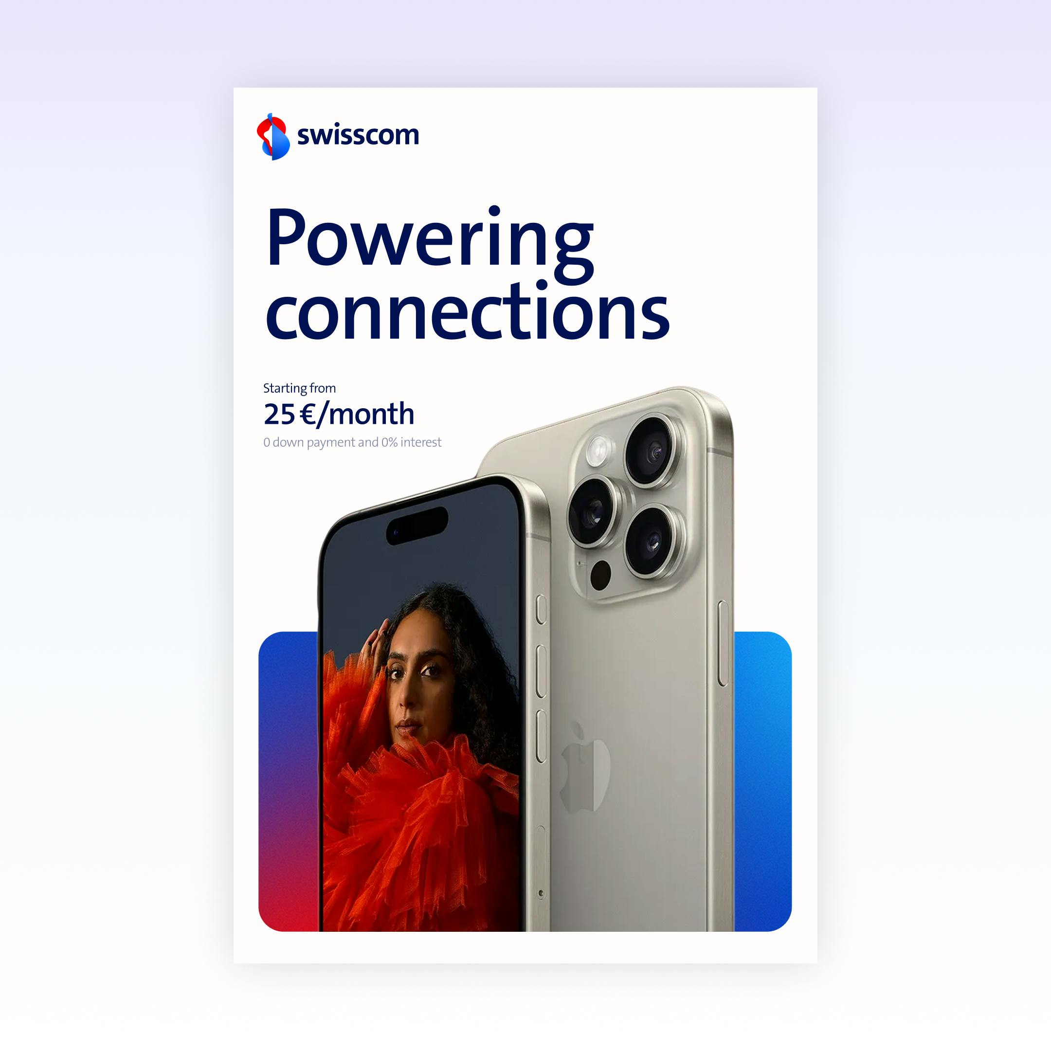
Image courtesy by Swisscom

Image courtesy by Swisscom
The logo update wasn’t originally part of the plan. What else changed during the rebrand—whether in brand strategy, features, or how Swisscom presents itself to customers?
Funny enough, we actually told all the agencies in our briefings: don’t touch the logo. But of course, once agencies start working with it, they can’t resist—and eventually, it made sense to adjust it alongside everything else.
What really changed was our positioning. We wanted to be closer to our customers, more dynamic, and more confident. Those three values shaped the entire rebrand—from the visual assets to the tone of voice. Beyond the logo, we introduced new colors, layout systems, and a new brand campaign built around the line: “Discover your possibilities.”

Image courtesy by Swisscom
That was a big shift for us. Our previous tagline was “Ready”, which served us well—especially during COVID when people needed to feel prepared for whatever came next. But looking ahead, “Ready” started to feel static. Like a runner on the blocks who never takes off.
“Discover your possibilities” is about movement. It’s about that next step. And that’s what we want to offer customers—not just readiness, but the space to explore what’s next.

Image courtesy by Swisscom

Image courtesy by Swisscom
Was there any moment in the rebrand process that felt especially rewarding, risky, or personally meaningful to you?
For us, the most rewarding and meaningful part was how quickly we pulled this off. We had a very clear process and frequent alignment with leadership, which meant we avoided unnecessary loops or confusion around goals. That made a huge difference.
Another big moment was working across the entire organization. That might sound obvious—you expect to collaborate across departments during a rebrand—but in a company with over 20,000 employees, it’s a whole different scale. Teams are spread out, and getting everyone—from B2C and B2B to employer branding and events—on the same page is no small task.
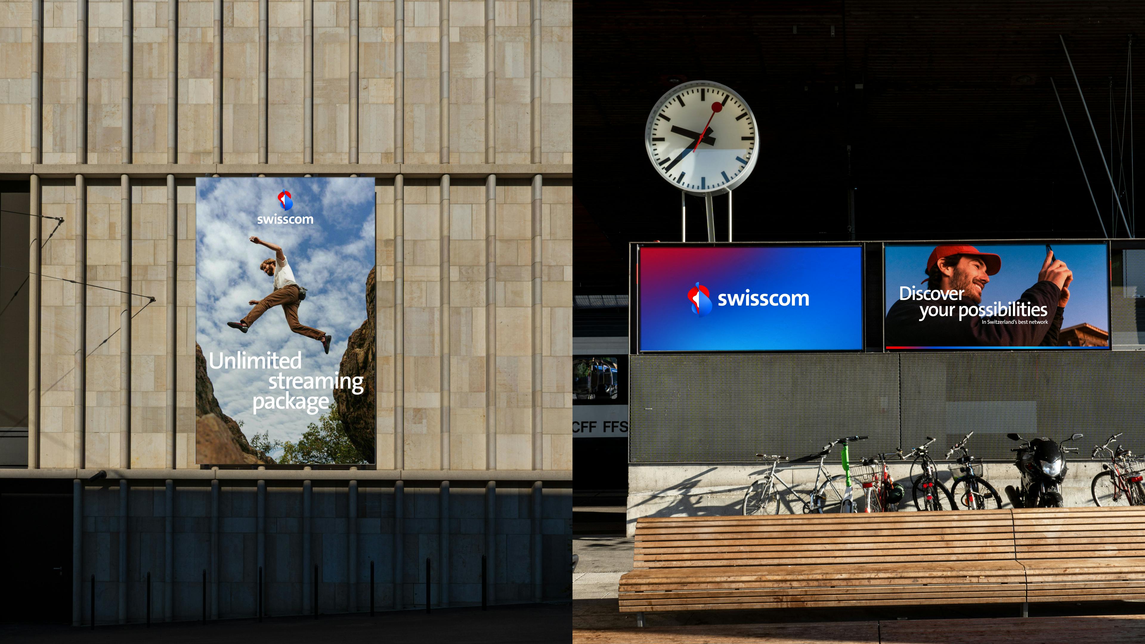
Image courtesy by Swisscom

Image courtesy by Swisscom
We had to make sure they all understood the new positioning and were using the same assets and principles. In the end, we achieved a very consistent brand activation across all touchpoints. That was especially meaningful for us—bringing together so many different teams and interests, and making it all feel unified.
