
before
after

In conversation with Alastair Oloo, Creative Director at SOUNDBOKS, on choosing not to blend in but to leave the category behind.
Can you share the story behind SOUNDBOKS’ early development? What makes it different from other speakers out there?
It all started with festival culture in Europe—especially in Denmark. At festivals like Roskilde, the music on the main stage would end around midnight, but the party would keep going at the campsites. The louder your speaker, the bigger your party—and the more people you'd attract.
Our founders—Jesper, Christopher, and Hjalte—wanted to build a speaker just for that. The first one they made actually died after 20 minutes because someone spilled beer on it. So the next year, they came back with a tougher, more waterproof version. People loved it. They started asking if they could buy one.
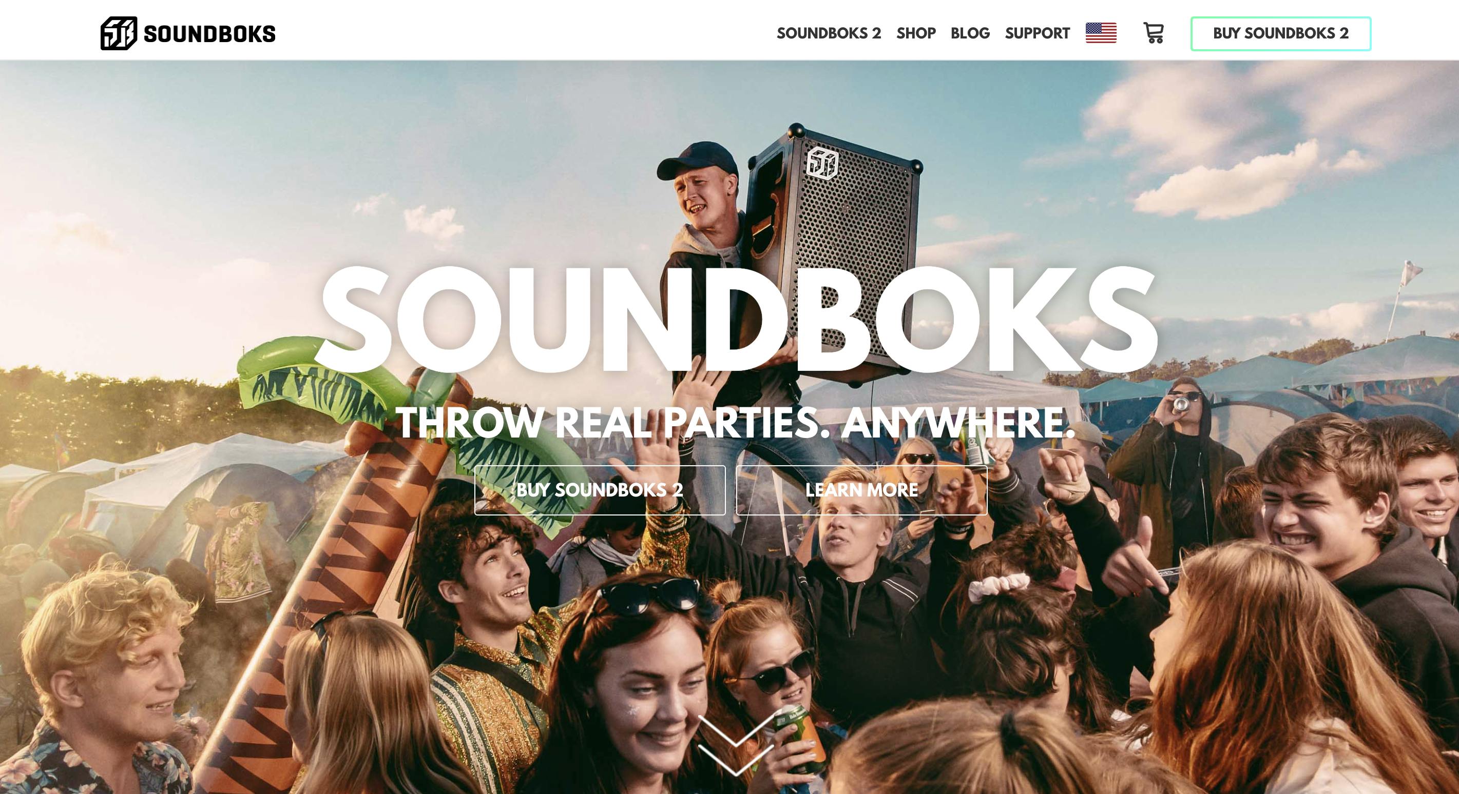
Soundboks' Homepage in early days
The guys put up a sign-up form thinking they'd get maybe 20 orders, but ended up with 300. That night, they scrambled to build every unit with help from friends. That’s when they realized this could be more than a side project—it could be a business.
They went on to create SOUNDBOKS and eventually got into Y Combinator. Only the third Danish company to ever do so—and one of the rare hardware startups there. That was 10 years ago. We just celebrated our 10th anniversary.
What makes SOUNDBOKS different? It’s a portable, insanely loud, rugged speaker built to survive anything. You don’t need power—it runs 40 hours on battery. Whether you're at a campsite or on top of a mountain, you can bring the party with you.
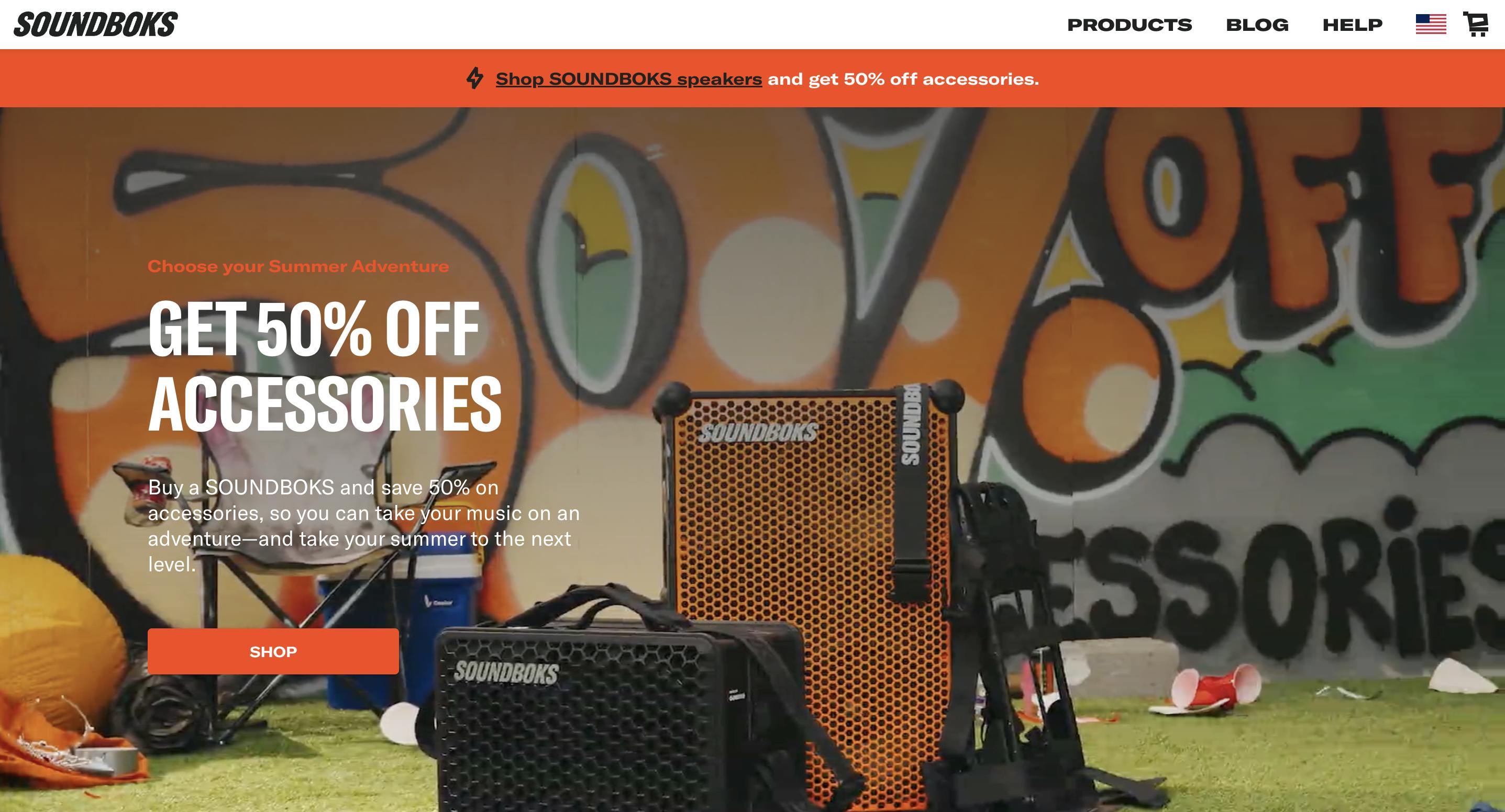
Soundboks Previous Year Homepage
What sparked the motivation to rebrand?
Most brands update their visual identity every few years. Design trends evolve, and even tech giants like Google make small shifts—like tweaking gradients or logos—to stay current.
At SOUNDBOKS, we realized we had spent years focusing heavily on performance marketing—things like paid ads and email. But we hadn’t invested enough in brand: in the art direction, photography, and overall visual identity. That started to hurt us.
When we looked around, we saw how strong our competitors’ brands had become—whether direct or not. Beats by Dre, Bose, Sony, even Marshall—they’ve all refreshed their look recently. We felt like we were falling behind.
So, we decided it was time to catch up. And while the logo change might look minor, the rebrand was actually massive. We moved to Shopify, overhauled our backend, rewrote all our copy, updated the photography, refreshed the colors, redesigned the app—every touchpoint was updated.
From my perspective, it was a big rebrand, even if the logo change was subtle.
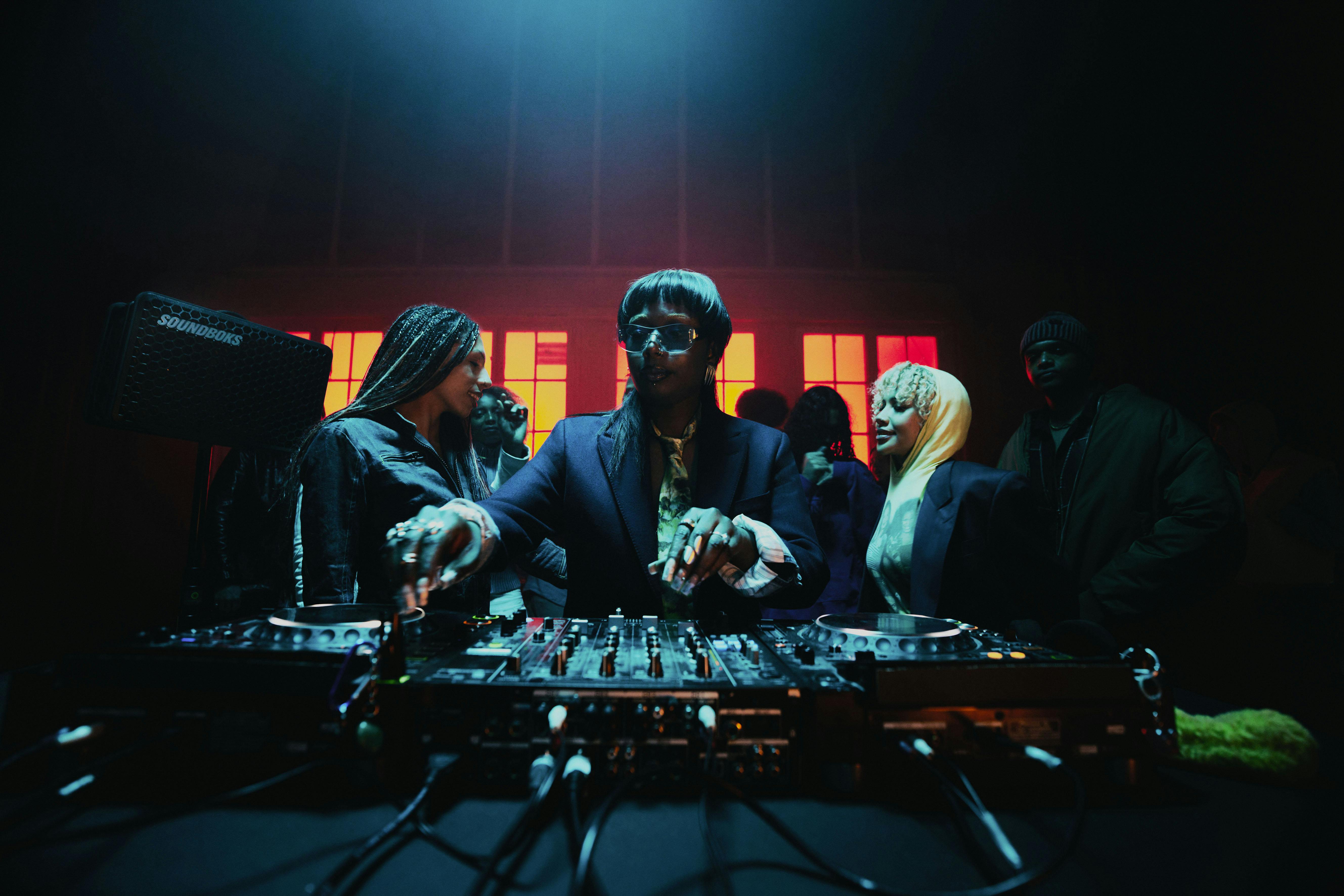
Image courtesy by SOUNDBOKS
The updated SOUNDBOKS logo keeps much of the original wordmark, with only a slight change in the italic angle. What led to the decision to make such a minimal adjustment instead of a full redesign?
Rebrands are always a risk. When you do a complete overhaul—like when Facebook became Meta—it takes a massive marketing push to reintroduce the brand and build recognition all over again.
For us, SOUNDBOKS is still relatively unknown in markets like Asia, but we’re well-established in places like Denmark and Germany. We have a loyal customer base there, and we didn’t want to lose the brand equity we’ve built over the years.
We did consider a full logo redesign. There were some concepts on the table, and we had serious conversations about it. But in the end, we chose to make a subtle update—slightly adjusting the italic angle—while keeping the overall wordmark.
Instead of starting from scratch, we added depth by expanding our brand assets. Now we have the full SOUNDBOKS wordmark, a simplified “SB,” and a base mark. That gave us room to evolve the visual identity and art direction without losing recognition.
So yes, a full rebrand was on the table—but we chose evolution over reinvention.
Image courtesy by SOUNDBOKS
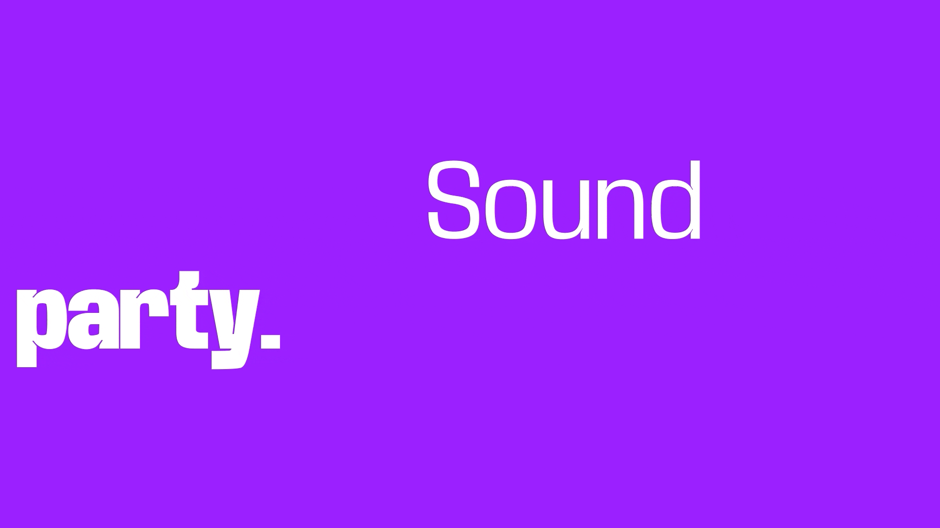
Image courtesy by SOUNDBOKS
It looks like the rebrand was handled in-house. What was the most challenging part of managing the entire rebrand internally instead of working with an external agency or studio?
We did start by working with a creative agency—they were talented and did solid work. But sometimes, even with a great agency, the fit just isn’t right.
They helped define the brand voice and meaning, which wasn’t bad. But the visual design they delivered didn’t meet our expectations. I had to decide: do we go live with something we’re not proud of, try to salvage it, or start fresh?
We couldn’t afford to bring in a new agency, so we chose to build everything in-house. That was a massive challenge. We were basically starting from scratch, under huge time pressure.
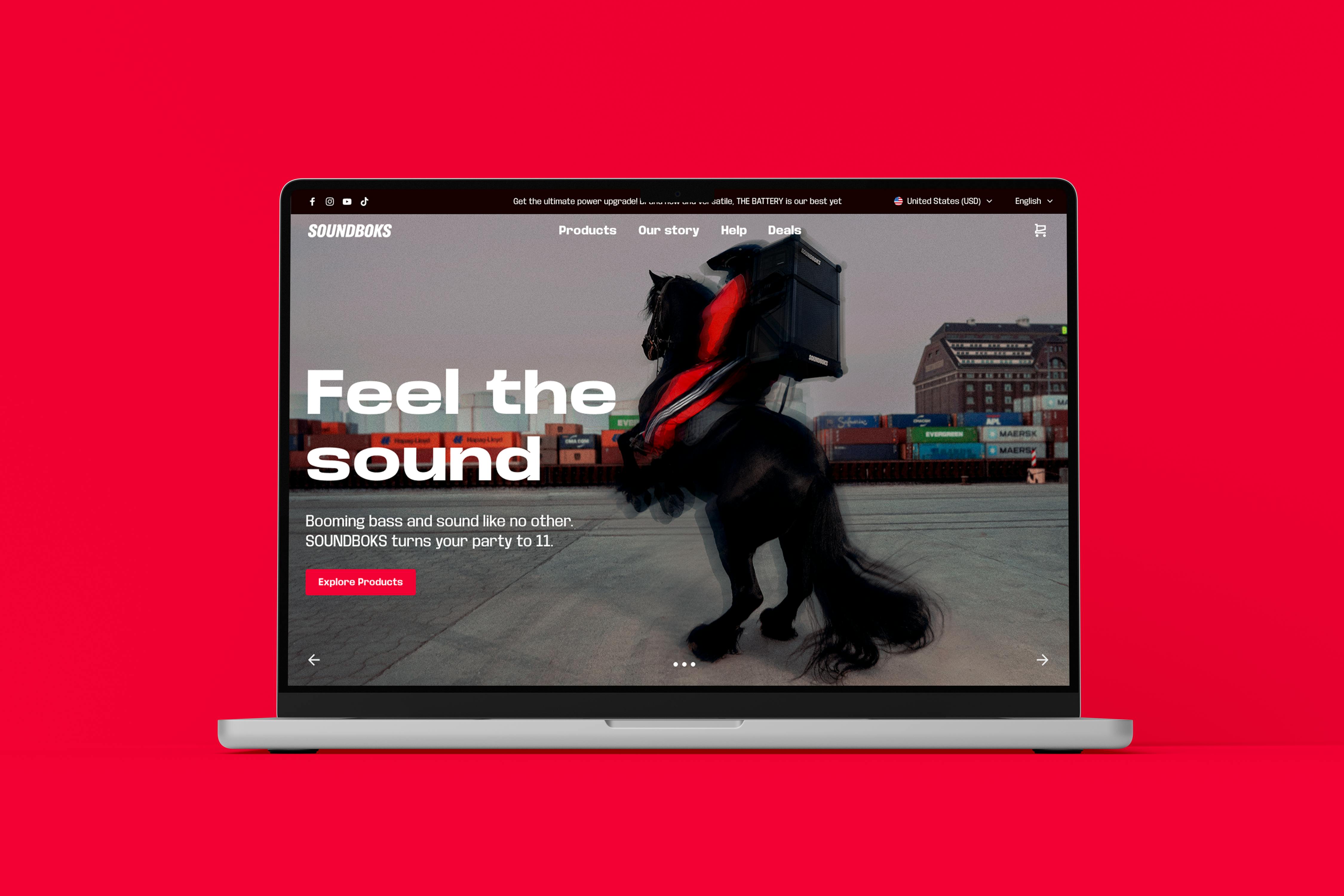
Image courtesy by SOUNDBOKS
They initially asked if I could pull it off in five months, which I knew was impossible. The original plan was to launch in December—but I pushed for more time, and we finally launched at the end of March. It was intense. On my first day on the job, I had to make that call. From there, it was a non-stop sprint, even through Christmas.
Sometimes agency relationships just don’t work out. And in our case, it meant we had to take full ownership to get the rebrand right.
Image courtesy by SOUNDBOKS
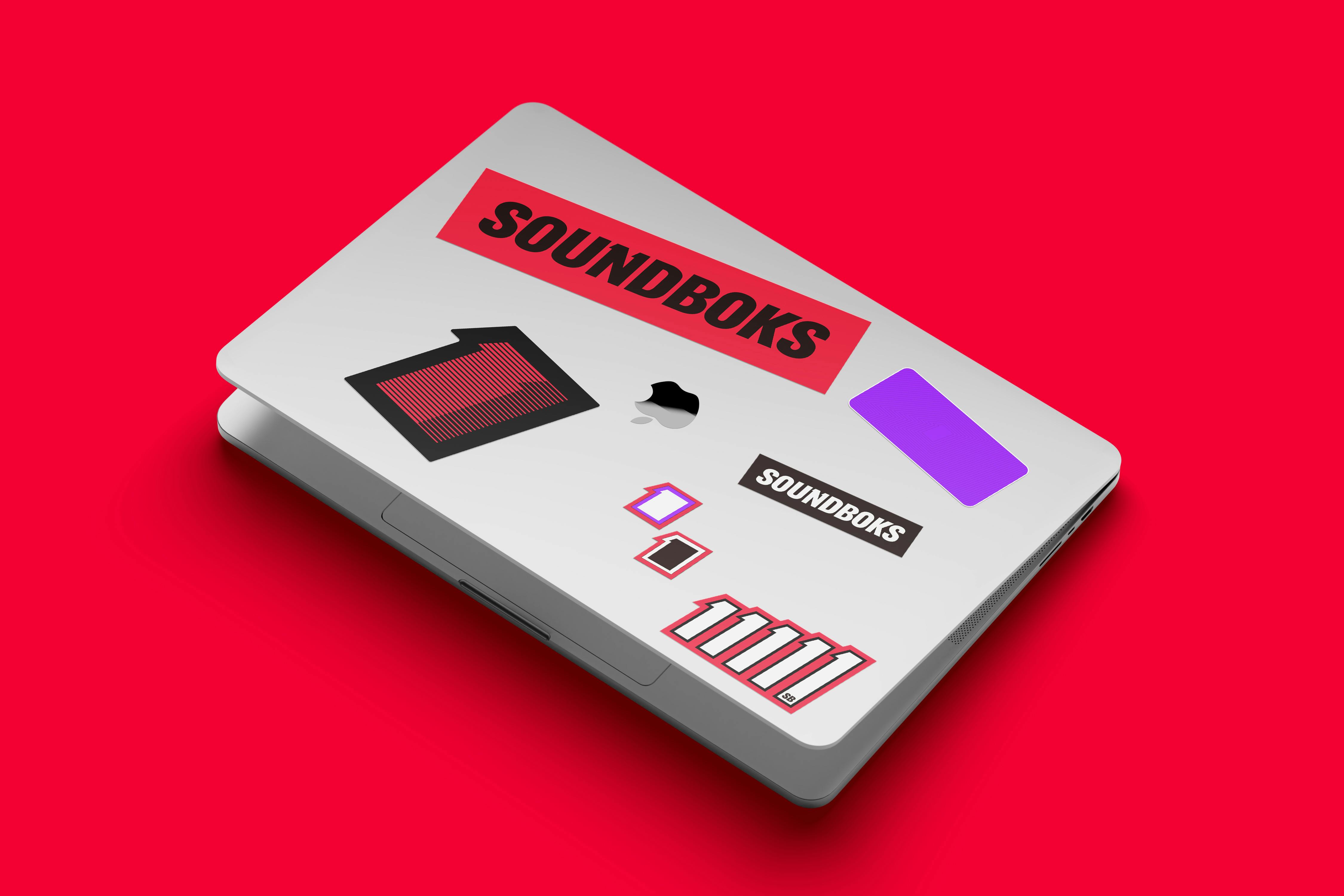
Image courtesy by SOUNDBOKS

Image courtesy by SOUNDBOKS
The new color palette feels bolder, especially with the introduction of what you call 'Ecstasy Red' paired with purple. What inspired this direction, and what do these colors represent for the brand?
There were two main reasons. First, we wanted to stand out. A lot of competitors—like JBL, Turtlebox, and others—use orange. It’s popular because it feels sunny, warm, fun. But the market was starting to feel very same-same. So we knew we needed to break away visually.
Second, we were also reworking our tone of voice from the ground up. SOUNDBOKS has always been a bit punk, a bit rebellious—more fun, more youthful. We’re not a legacy brand like JBL or Sony. They’re massive, billion-dollar companies. We’re the disruptor in this space.
So the colors had to reflect that. We chose “Ecstasy Red,” purple, and pitch charcoal to be louder, bolder—more in-your-face. These colors represent our personality: edgy, energetic, and unapologetically bold.
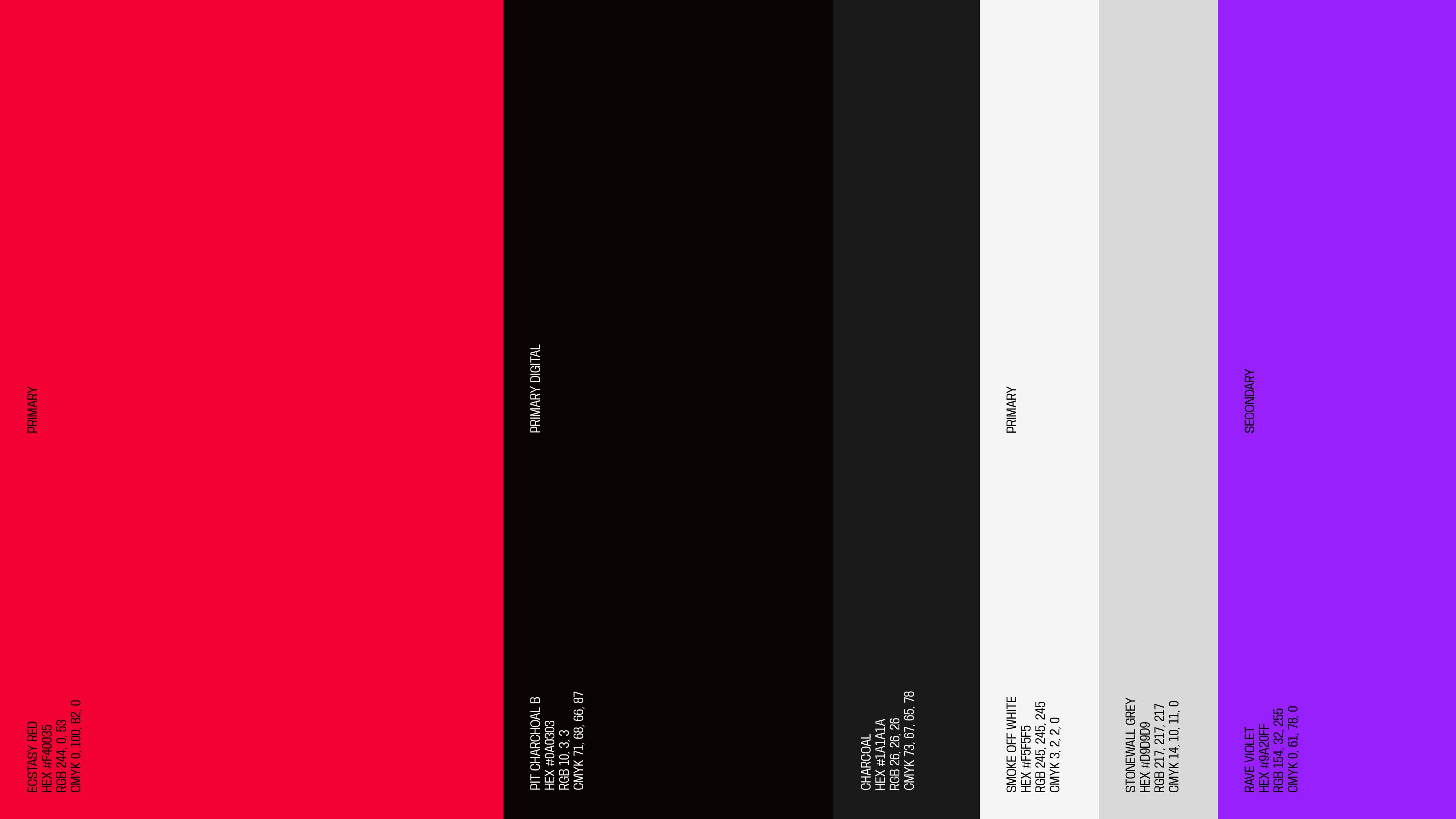
Image courtesy by SOUNDBOKS
The rebrand features a distinctive pattern of repeated animated lines used to frame images and content. What’s the story behind this visual element, and what does it represent within the brand?
Before the rebrand, we didn’t have much art direction. We had a logo and an orange color—nothing else. That made everything else feel flat. The website, videos, paid ads—they all lacked a cohesive visual system.
The old brand leaned heavily on the idea of “11”—as in, turning the volume up to 11. It’s a phrase from the ‘70s movie Spinal Tap, meaning to go all out. The speaker itself even reflects this, with its volume dial skipping numbers and ending on 11. But that reference is pretty niche today. Most people don’t know about it.
So, I decided to keep the “11” idea internal—a part of our story, but not front-and-center in our brand messaging anymore.

Image courtesy by SOUNDBOKS

Image courtesy by SOUNDBOKS
We needed a new visual language—something that could bring consistency to all our assets. That’s when we created what we now call the basemark. It blends the product’s silhouette with the shape of the number one—a subtle nod to the “11” legacy without relying on the reference directly.
One of our designers, Marcus, started playing around with it—repeating the basemark into a pattern. We tried a lot of ideas before that: sound waves, circles, blobs—you name it. But when we saw that repeated pattern, it clicked. With animation and motion, it became dynamic and flexible. Now we use it across videos, newsletters, and other assets to visually stitch the brand together.

Image courtesy by SOUNDBOKS
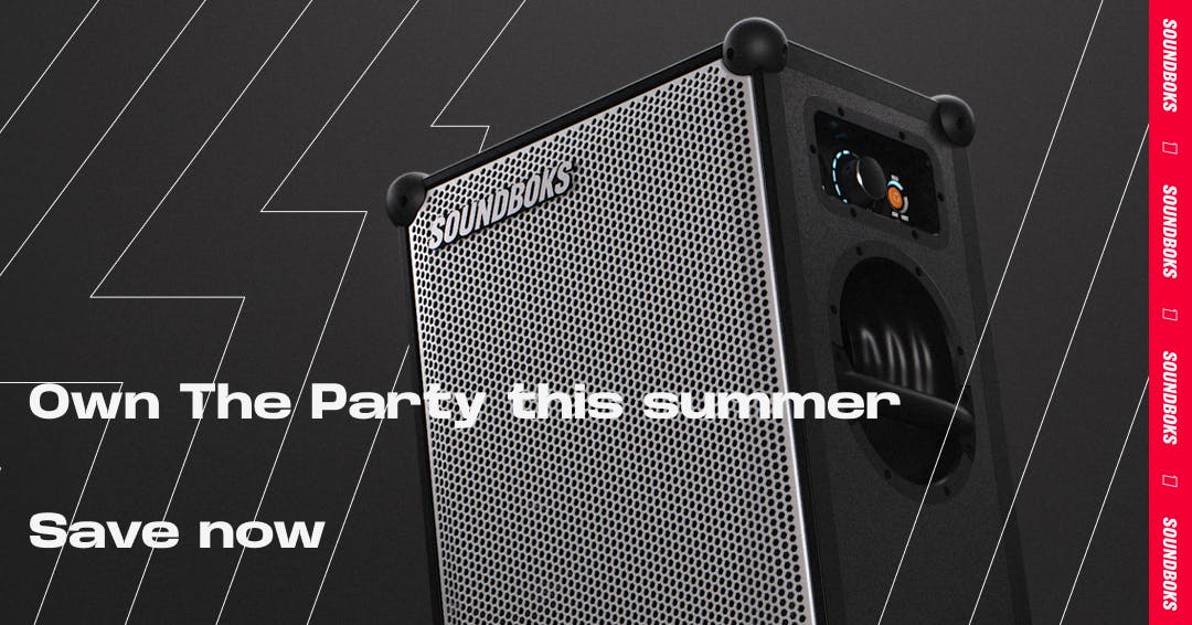
Image courtesy by SOUNDBOKS
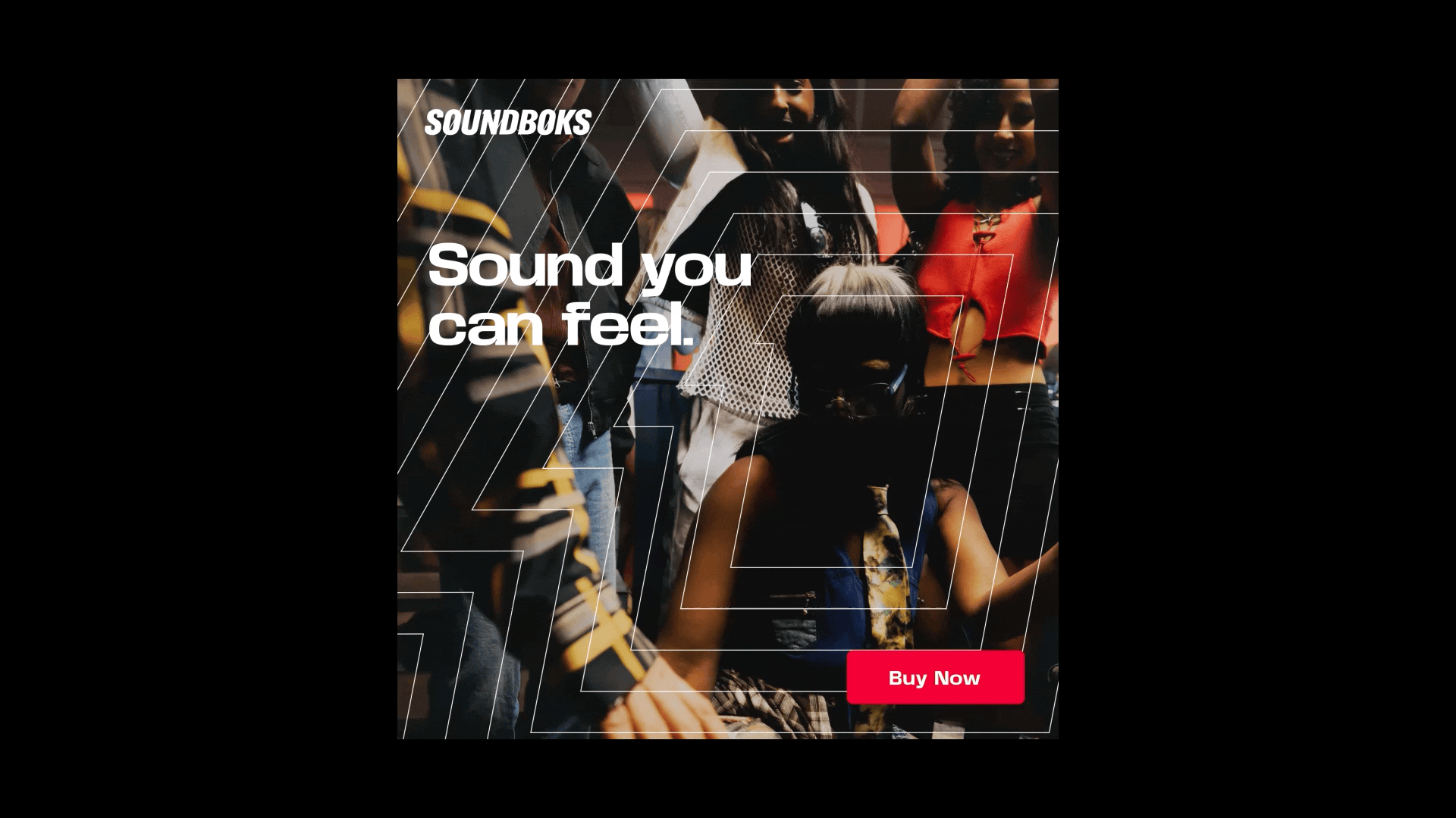
Image courtesy by SOUNDBOKS
The new branding leans into fun, youth, and party energy. Was this a shift from your previous identity?
Yes, definitely. The old brand tried to be everything—music, skateboarding, snowboarding, surfing. It was too broad. People weren’t sure what SOUNDBOKS really stood for because we were trying to appeal to everyone at once.
With the rebrand, we decided to focus. We zeroed in on what we do best: music, parties, festivals, community, and having a great time with friends. That’s our zone, and that’s where we want to lead.
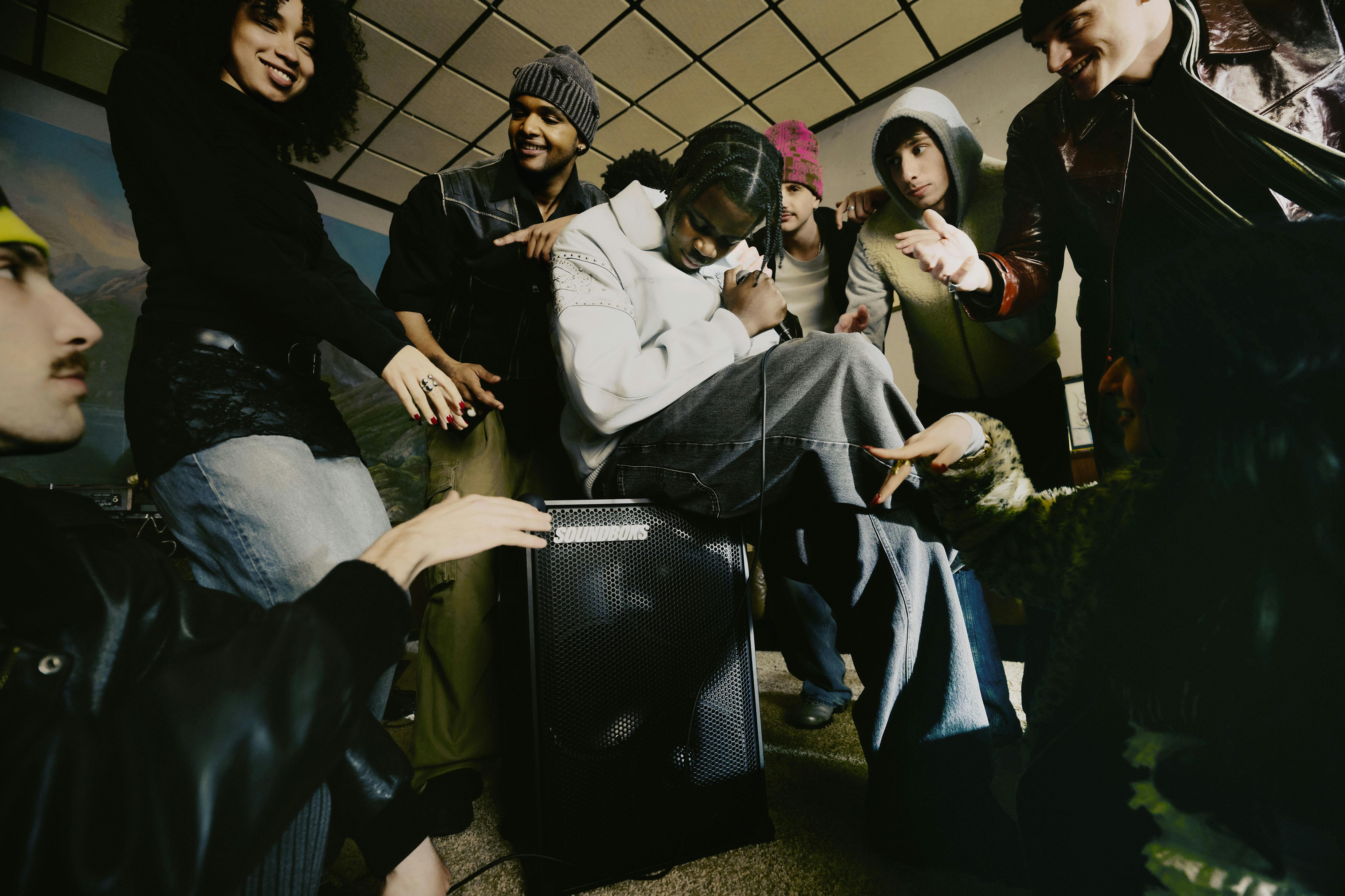
Image courtesy by SOUNDBOKS
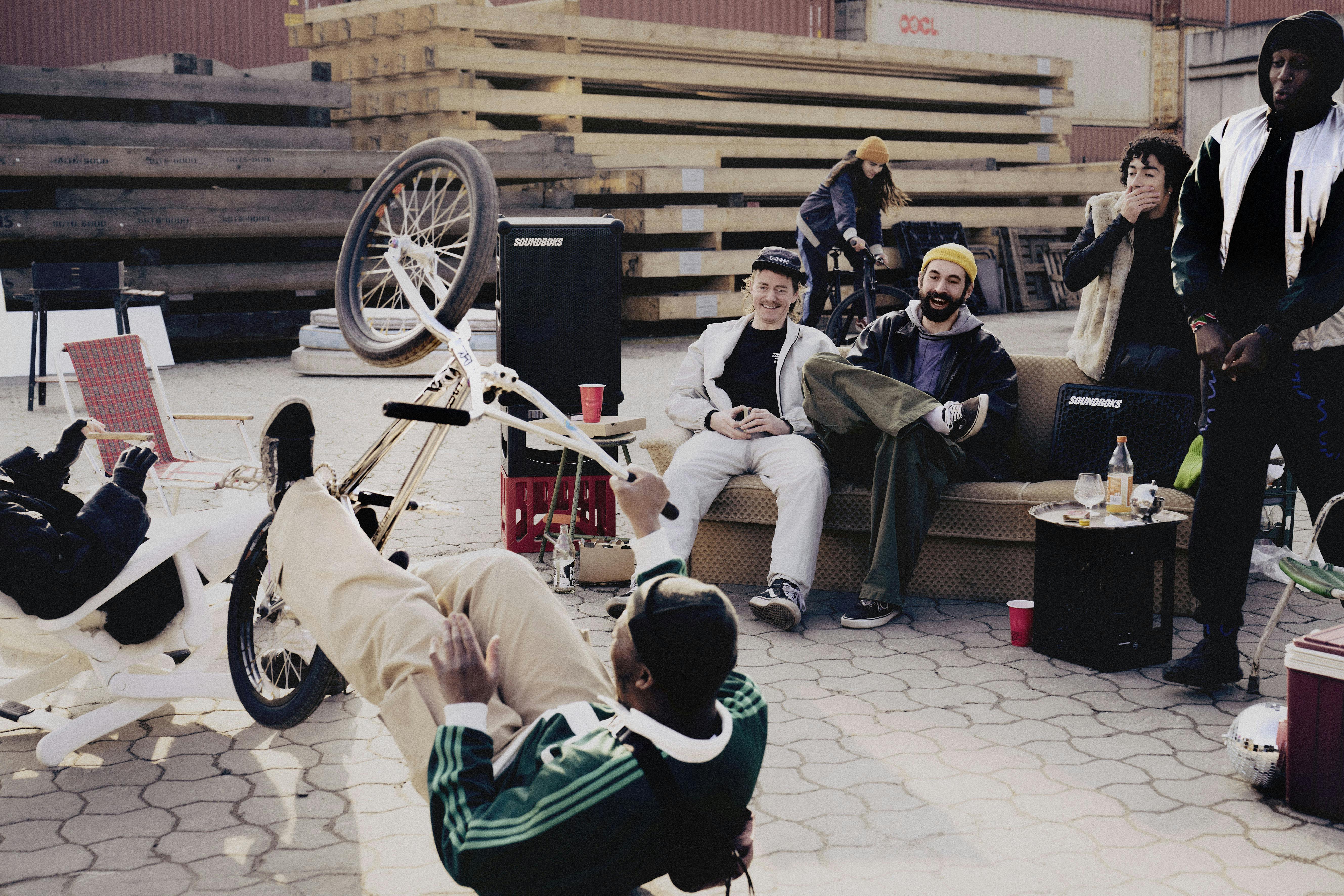
Image courtesy by SOUNDBOKS
Our new tone of voice reflects that. We have a line we use—“Own the party”—and it sums up our approach. We give you the tools to create an unforgettable time. How you do it is totally up to you.
It’s all about the right ingredients: friends, good music, good vibes. We’re just the conduit. The real magic comes from the people, and we want our brand to highlight that.
"The speaker is just one part of the lifestyle. The real story is about community, music and culture."
Image courtesy by SOUNDBOKS
Image courtesy by SOUNDBOKS
As Creative Director at SOUNDBOKS, what parts of the rebrand do you believe truly set the brand apart from competitors in the speaker space?
When we started this rebrand, my vision was clear—and it’s still a journey. But here’s the truth: we don’t see ourselves as a consumer electronics company. With all respect to brands like Bang & Olufsen or Bose—they make amazing products—but we’re not trying to compete in that lane.
We see SOUNDBOKS as a lifestyle brand.
That shift in mindset shaped everything. We weren’t looking at other speaker brands for inspiration. We were looking at Palace Skateboards, Carhartt, Nike, Adidas. Brands that represent culture, not just products.
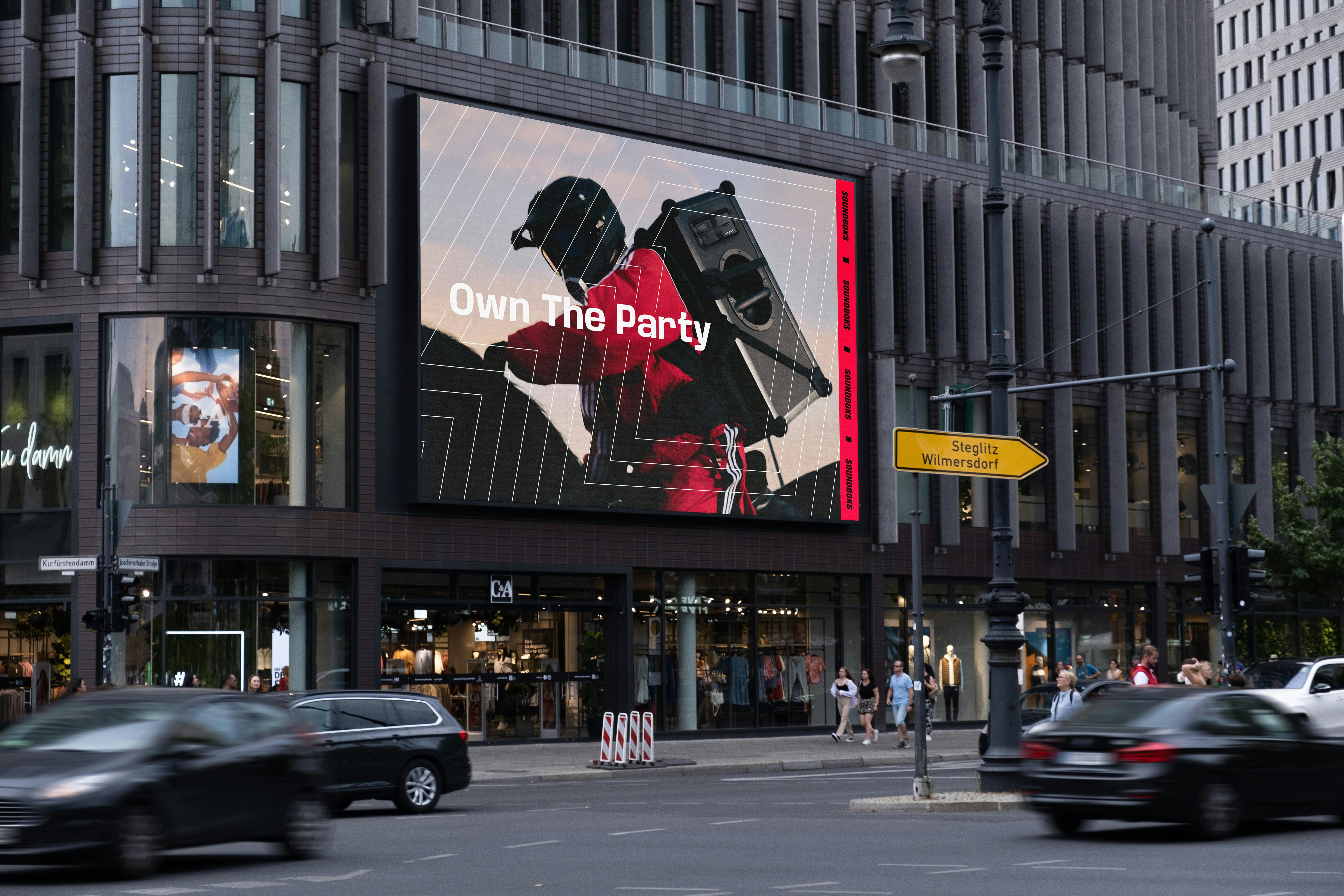
Image courtesy by SOUNDBOKS
The speaker is just part of the lifestyle—part of hanging out, going to parties, being with your friends. We wanted the rebrand to reflect that. That’s why we focused heavily on art direction, photography, and video. One of our biggest moves was a massive shoot in Berlin with Spin Guhns and a creative production agency.
We’re not just thinking about sound—we’re thinking about style, vibe, energy. That’s why we're also working on merch, and there may be more products coming soon. This rebrand is about embedding SOUNDBOKS into music, fashion, and culture—not just electronics.
We don’t want to be just another speaker brand. We want to be in a whole different conversation.
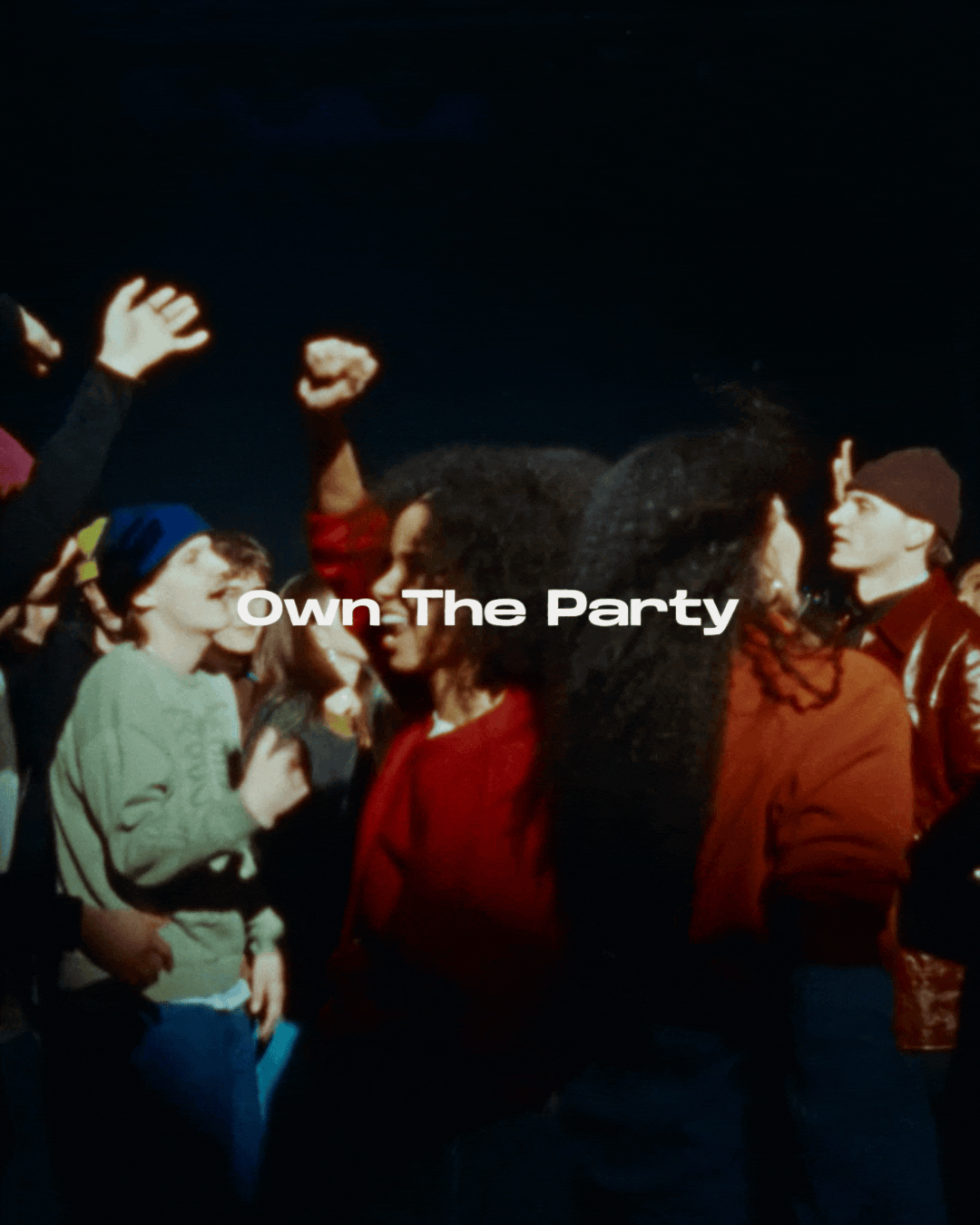
Image courtesy by SOUNDBOKS
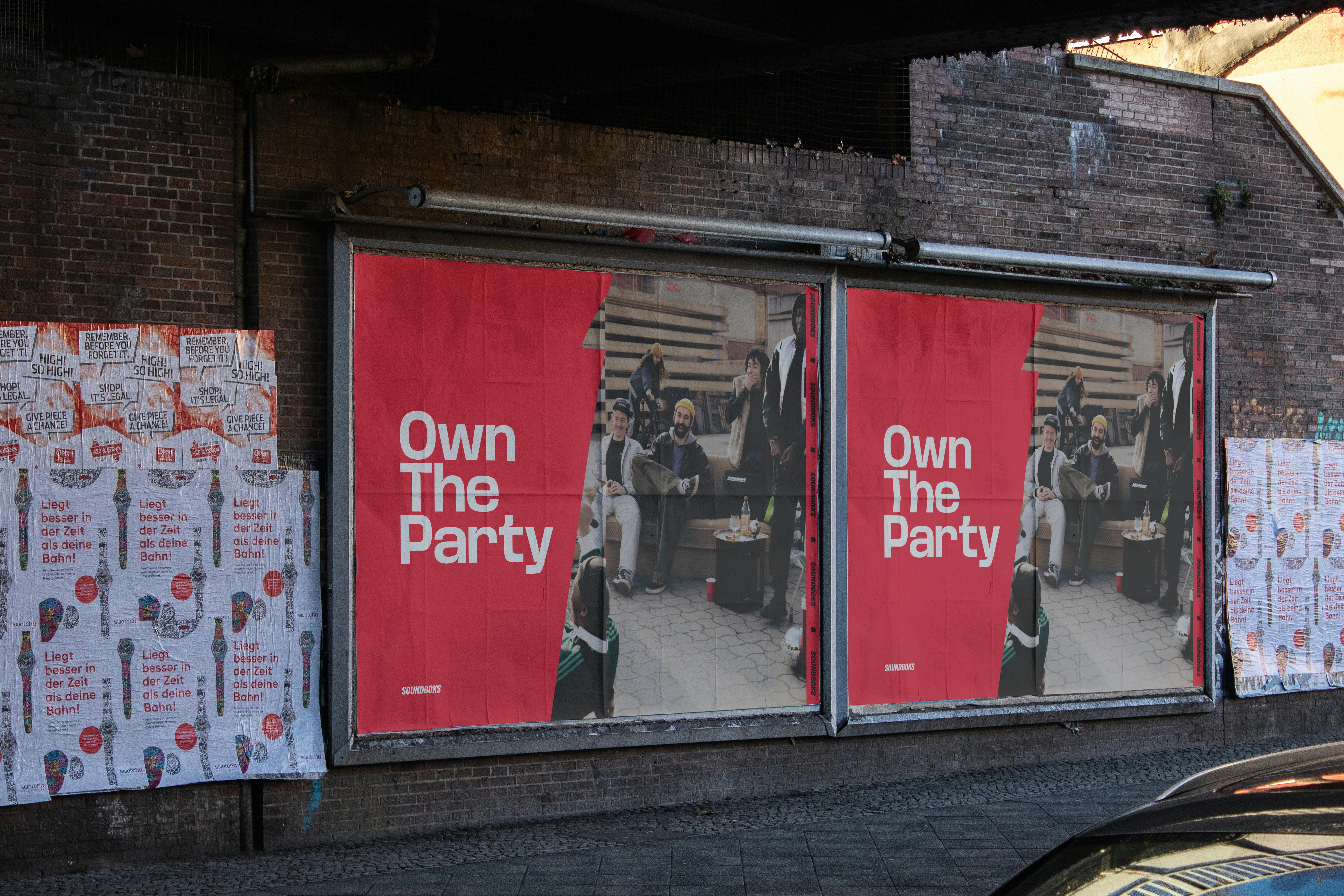
Image courtesy by SOUNDBOKS

Image courtesy by SOUNDBOKS

Image courtesy by SOUNDBOKS
Was there a particular part of the rebrand that felt especially rewarding or significant to you?
It was intense—high stakes and really stressful. I had just started as Creative Director, and naturally, I was scared. There’s always that fear: What if people hate it? What if it bombs?
At my previous company, Native Instruments, we rebranded with Pentagram—huge agency, great work—but people still hated it online. That’s the thing with rebrands: no matter how good they are, people often react negatively at first.
So before launch, I was nervous—not just about how the public would respond, but also how our own team would feel. But when I presented it internally, everyone was pumped. The energy was incredible.
Then we launched it publicly—and honestly, I’ve never been part of a rebrand that got this much love. People messaged us directly, saying how much they loved the new look and the colors. It felt amazing. After months of stress and hard work, that kind of feedback was just incredibly rewarding—and a huge relief.
